Landsat-8 - 2018
Landsat-8 Imagery in the period 2018
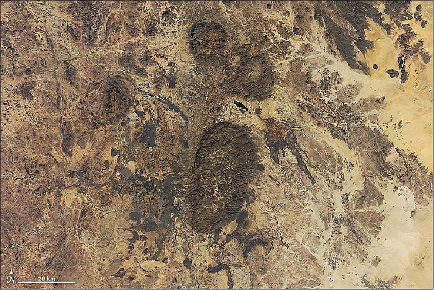
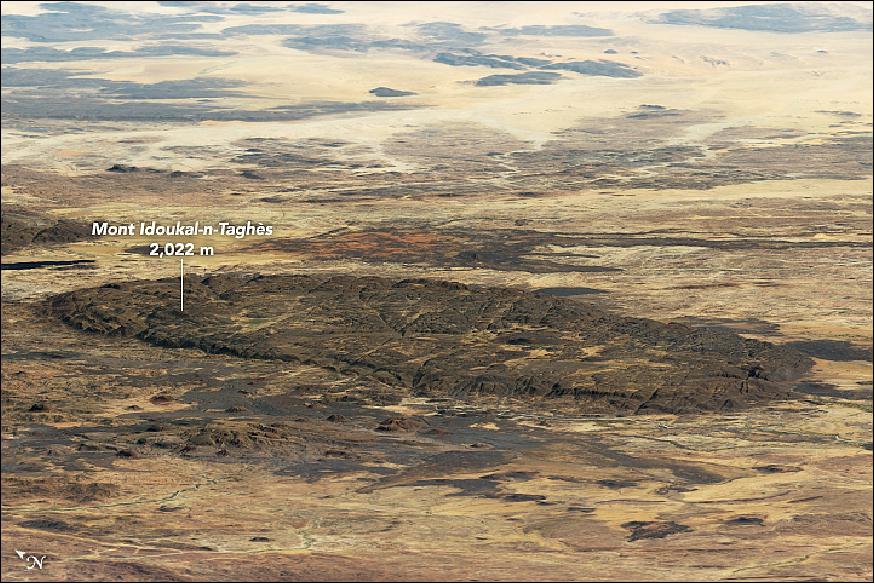
• December 22, 2018: Dispersed across the Sahara Desert in northern Niger, the Aïr Mountains rise sharply from the low-lying sea of sand to provide unique scenery, aesthetically and geologically. The mountain range hosts volcanic peaks, is traversed by deep valleys, and makes up one of the world's largest ring dike structures—a rare circular feature born from early volcanic activity. 1)
- The formation of this range dates back to Precambrian times, the earliest of Earth's eons. The Aïr Mountains formed when magma flowed into pre-existing cracks and caverns in the bedrock, a geologic formation called a dike. Ring dikes are bubble-shaped mounds that form when the ceiling of a magma chamber collapses, leaving a circular crack that is later filled again with magma. Through time and the constant movement of Earth's crust, such magma intrusions get lifted and moved together to create mountains.
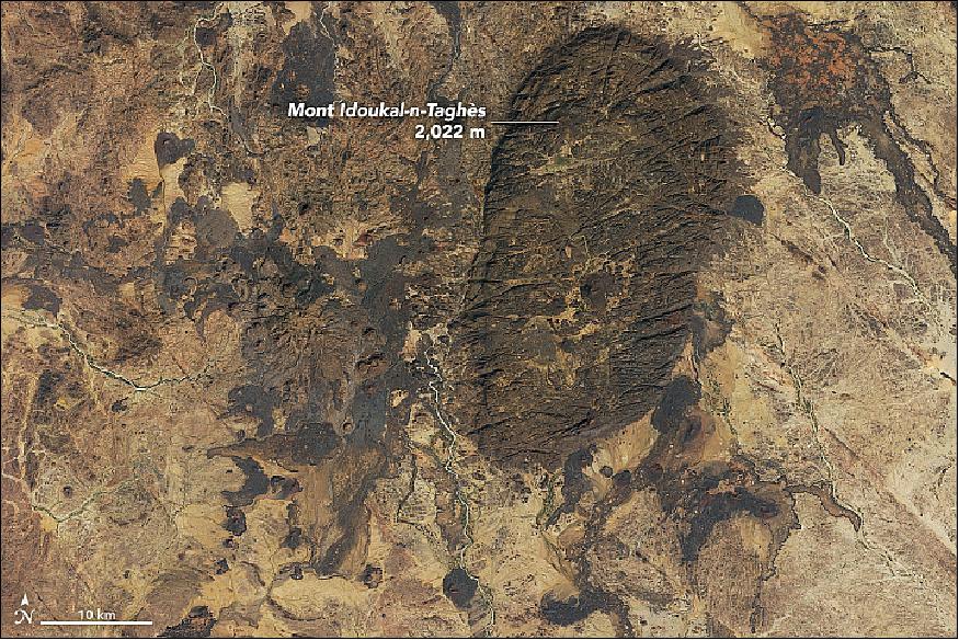
Compared to the surrounding desert, the Aïr Mountains are a relatively green region that supports a variety of wildlife and fauna that have been eliminated in other regions of the Sahara and Sahel. The mountains are an ecological island of Sahel climate—hot and sunny, with seasonal rains. The mountain landscape provides a habitat for three threatened antelope species, as well as important populations of the fennec fox, Rüppell's fox, and cheetah. Several seasonal streams support farming and livestock grazing. The region also includes hot springs, uranium mines, and ancient rock carvings dating from 6,000 BCE to 1000 CE.
Because of its unique landscape and wildlife, the Aïr and Ténéré Natural Reserve was designated as a UNESCO World Heritage site in 1991. One year later, it was placed on the List of World Heritage Sites in Danger. The Aïr Mountains sit within one of the largest protected areas in Africa.
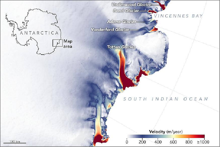
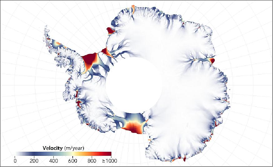
• December 11, 2018: If the thick ice cover over East Antarctica were to melt, it would reshape coastlines around the world through rising sea levels. But scientists have long considered the eastern half of the continent to be more stable than West Antarctica. Now new maps of ice velocity and elevation show that a group of glaciers spanning one-eighth of the East Antarctic coast have been losing some ice over the past decade. 2)
- Glaciologists have warned in recent years that Totten Glacier—the fastest moving ice in East Antarctica—appears to be retreating due to warming ocean waters. Totten contains enough ice to raise sea level by at least 3.4 meters. Researchers have now found that four glaciers to the west of Totten, plus a handful of smaller glaciers farther east, are also losing ice.
- "Totten is the biggest glacier in East Antarctica, so it attracts most of the research focus," said Catherine Walker, a glaciologist at NASA's Goddard Space Flight Center. "But it turns out that other nearby glaciers are responding in a similar way to Totten."
- Walker and colleagues found that the surface height of four glaciers west of Totten, in an area facing Vincennes Bay, has dropped by an average of nearly three meters since 2008 (there had been no measured change in elevation for these glaciers before then). To the east of Totten, the surfaces of some glaciers along the Wilkes Land coast have dropped by 0.25 m/year since 2009, about double their previous rate.
- Such levels of ice loss are small when compared to those of glaciers in West Antarctica. But still they speak of nascent and widespread change in East Antarctica.
- "This change doesn't seem random; it looks systematic," said Alex Gardner, a glaciologist with NASA's Jet Propulsion Laboratory. "And the systematic nature hints at underlying ocean influences that have been incredibly strong in West Antarctica. Now we might be finding clear links of the ocean starting to influence East Antarctica."
- The maps of Figures 4 and 5 show the velocity of outlet glaciers along the coasts of Antarctica, as measured between 2013 to 2018 in thousands of Landsat images. The image of Figure 4 focuses on the area around Totten Glacier that was studied by Walker, while the continental view provides the wider context (note that the white hole in the middle of the continental map of Figure 5 is an area not reached by Landsat satellites).
- Walker combined simulations of ocean temperature with actual measurements from sensor-tagged marine mammals and Argo floats. She found that recent changes in winds and sea ice have resulted in an increase in the amount of heat delivered by the ocean to the glaciers in Wilkes Land and Vincennes Bay.
- "Those two groups of glaciers drain the two largest subglacial basins in East Antarctica, and both basins are grounded below sea level," Walker said. "If warm water can get far enough back, it can progressively reach deeper and deeper ice. This would likely speed up glacier melt and acceleration, but we don't know yet how fast that would happen. Still, that is why people are looking at these glaciers, because if you start to see them picking up speed, that suggests that things are destabilizing."
- "Heightened attention needs to be given to these glaciers: We need to better map the topography and we need to better map the bathymetry," Gardner said. "Only then can we be more conclusive in determining whether, if the ocean warms, these glaciers will enter a phase of rapid retreat or stabilize on upstream topographic features."
- There is a lot of uncertainty about how a warming ocean might affect these glaciers because the area is so remote and poorly explored. The principal unknowns are the topography of the bedrock below the ice and the bathymetry (shape) of the ocean floor in front of and below the ice shelves. Both govern how waters circulate near the continent and bring warm ocean currents to the ice front.
- Gardner and colleagues have been creating new maps of ice velocity and surface height elevation as part of a NASA project called ITS_LIVE (Inter-mission Time Series of Land Ice Velocity and Elevation). The new initiative is using new computing tools and multiple satellite missions to assemble a 30-year record of changes in the surface elevation of glaciers, ice sheets, and ice shelves, and a detailed record of variations in ice velocity.
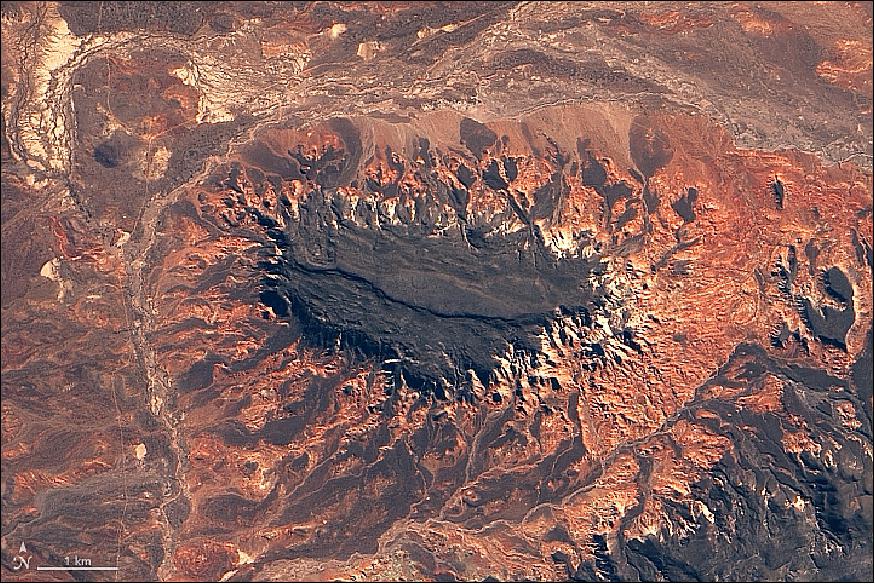
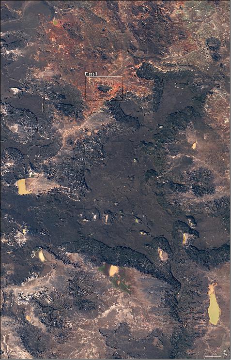
• November 27, 2018: The Patagonian Andes are a continental landmark easily visible from space. But areas to the east of the volcanic mountain chain have their own geologic intrigue, as shown in these images of prehistoric lava fields in northern Patagonia. 3)
- The climate here is complex. The Andes receive plenty of precipitation in winter months, as humid winds blow east from the Pacific Ocean, hit the mountains, and drop their moisture. That leaves little moisture for areas to the east, which see less than 200 mm (8 inches) of rain in an entire year. As a result, the desert landscape in these images appears to lack green vegetation.
- Other colors, however, make up for the absence of greenery. According to Johan Varekamp of Wesleyan University, the darkest colors are volcanic rocks from the Oligocene-Miocene, or about 25-30 million years old. The rocks are part of a lava plateau known as the Meseta de Canquel (Meseta is a Spanish word meaning "plateau."). Lava plateaus in this area historically were much more extensive, but erosion has removed large sections of rock from their edges. Some of the plateau edges display a rumpled appearance, produced by successive slumps and debris falls.
- The detailed image of Figure 6 shows an area where erosion has isolated a segment of the plateau, creating an island mountain or "inselberg." Debris from the black lava fills the stream valleys and gives the mountain "a spider-like appearance, with black tentacles spreading around it," Varenkamp said. He notes that the red and yellow rocks are much older; they contain iron and have been oxidized, "giving it the wild colors."
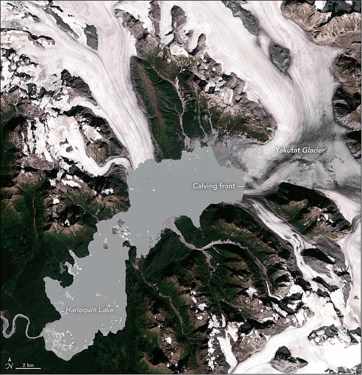
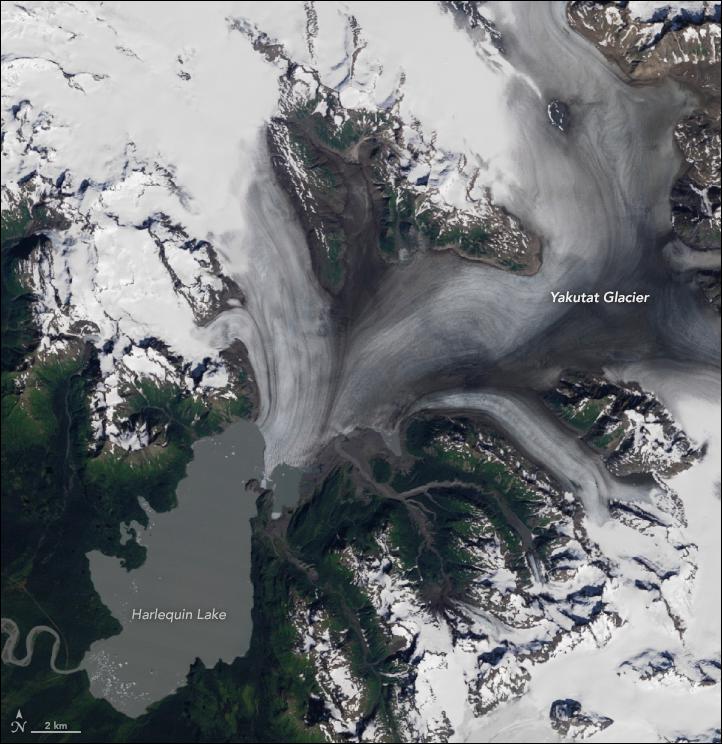
• November 26, 2018: When Alaska's Yakutat Glacier was measured during a survey in 1894, its terminal moraine sat on dry land on a coastal outwash plain. Within a decade, the glacier started retreating and a small meltwater lake—Harlequin Lake—emerged at its end. Since then, the lake has expanded dramatically as the ailing glacier has shrunk. 4)
- During the past few decades, changes at the terminus have been particularly rapid. The Operational Land Imager (OLI) captured the image of Figure 8 on September 21, 2018. The Yakutat Glacier has retreated more than 10 km (6 miles) since 1987 (Figure 9).
- Scientists who watch Yakutat Glacier closely expect the rate of retreat to slow in the coming years. Still, they say it is just a matter of time until the glacier disappears. The icefield that nourishes Yakutat formed hundreds of years ago during the Little Ice Age, a period when Earth's climate was significantly cooler. Over time, the icefield has contracted, losing key connections with high-elevation areas that were once important sources of fresh snow and ice.
- "What remains today is an icefield that lacks a high-elevation accumulation area," said Mauri Pelto, a glaciologist at Nichols College. "Its summit no longer receives a significant accumulation of snow."
- In 2013, Barbara Trüssel and Martin Truffer from the University of Alaska estimated that Yakutat Glacier would not survive past 2100 if present-day climate conditions persisted. If warming continues at a rate climatologists expect, the glacier will be gone sooner—perhaps 2070. Reversing the retreat would require a cooling of 1.5 °C , or an increase in precipitation of 50 percent or more—both scenarios that the scientists consider unrealistic.
- So far, their estimates have been right on target. "What we have observed is just short of where we estimated the terminus would be in 2020," said Truffer. "We've been expecting this, but it's still astonishing to see so much ice disappear in such a short time."
• November 6, 2018: Orbit Logic Inc. of Greenbelt, Maryland delivered their mission planning and scheduling system, the STK (Systems Tool Kit) SchedulerTM, for the Landsat program. 5)
Orbit Logic announced today that they have delivered their STK Scheduler software and CPAW (Collection Planning & Analysis Workstation) software to General Dynamics Mission Systems for mission planning and scheduling for the LMOC (Landsat Mission Operations Center) for Landsat-8 and -9. Orbit Logic is now in the process of integrating the software into the Landsat ground system. The U.S. Geological Survey (USGS) awarded the Landsat Multi-satellite Operations Center (LMOC) contract to the General Dynamics team to develop and carry out operations of the Landsat-9 Mission Operations as well as assuming operations of the on-orbit Landsat-8 observatory. Landsat-9 will be the next satellite in the Landsat series that images the Earth's surface. It is currently scheduled for launch in December 2020. Orbit Logic software will streamline and modernize the mission planning and collection planning process, taking over for the Generic Mission Planning System and the Collection Activity Planning Element (CAPE) that was previously developed and operated by USGS. Orbit Logic's STK Scheduler will produce a deconflicted schedule for satellite communications between the Landsat satellites, U.S. and international ground stations, and TDRSS satellite communication nodes. Orbit Logic's CPAW software will be used for Landsat-8 and -9 to generate validated, deconflicted, and optimized high fidelity imagery collection plans. A significant number of requirements were satisfied out of the box with Orbit Logic's COTS software products. Plus, Orbit Logic provided engineering services to integrate with other elements of the ground system and develop models of the Landsat spacecraft bus and sensors. Additionally, Orbit Logic's planning software solution provides a multi-mission planning system to support LS-8 and LS-9 simultaneously. |
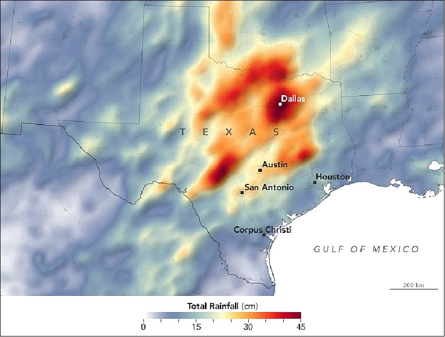
• November 5, 2018: After making landfall in northwestern Mexico, Hurricane Willa quickly weakened over rugged, dry terrain. But the remnants of that category 3 storm pushed a stream of moisture and rain northeast toward Texas. 6)
- While Willa did not bring overwhelming rain to Texas, the infusion of moisture was unwelcome in a state already in the grips of severe flooding. Since September 2018, a series of storms have delivered historic amounts of rain to central Texas. One particularly potent cold front in mid-October dropped more than a foot of rain in some areas.
- The deluge saturated soils, overfilled lakes and reservoirs, and pushed rivers over their banks. One river even flowed backwards. In a series of proclamations issued throughout October, the Texas governor declared a state of disaster for 111 counties because of the flooding and severe weather.
- Storm after storm rolled through and dumped record rainfall in parts of Texas. Several satellites observed the deluge and its aftermath.
- The map of Figure 13 depicts spaceborne measurements of rainfall from 1-31 October 2018. The brightest areas reflect the highest rainfall amounts, with many places receiving 25 to 45 cm or more during this period. The measurements are a product of the NASA/JAXA GPM (Global Precipitation Measurement) mission. These rainfall totals are regional, remotely-sensed estimates. Each pixel shows 0.1 degrees of the globe (about 11 km at the equator), and the data are averaged across each pixel. Therefore, individual ground-based measurements within a pixel can be significantly higher or lower than the satellite average.
- The Dallas Fort Worth Airport recorded 39.77 cm of rain in October 2018, making it the wettest October on record there, according to the National Weather Service. While the statistics are still being finalized statewide, it is likely that October will go down as the second wettest month in Texas on record.
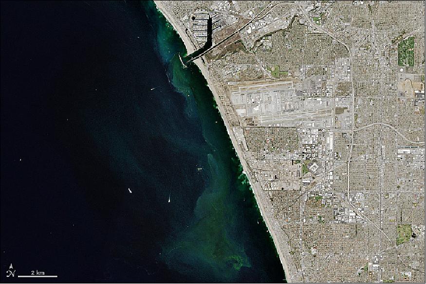
• October 30, 2018: As Rebecca Trinh cruised around Santa Monica Bay, just a mile offshore from Los Angeles, the smell of chlorine and sewage flooded her nostrils. Seagulls fed on debris in the ocean, while a plume of wastewater bubbled to the surface. Most people would turn and cruise away from the scene, but the stench was precisely what brought the microbial oceanographer here. 7)
- Trinh and a team from NASA's Jet Propulsion Laboratory were part of an effort to help LA Sanitation monitor water quality during maintenance of the city's oldest and largest wastewater treatment plant. The Hyperion Water Reclamation Plant serves around 4 million people, treating wastewater from sinks, showers, toilets, and surface runoff from storm drains. From September 21 to November 2, 2015, plant operators had to shut down Hyperion's main discharge pipe in order to make repairs to the internal structure.
- The main outflow pipe normally transports wastewater five miles offshore, a distance where the seawater is deep enough so that waste (effluent) can be naturally diluted before reaching the surface—"The solution to pollution is dilution," Trinh noted. During the repair, plant operators were forced to use their one-mile backup discharge pipe, which releases effluent much closer to the shore. Researchers like Trinh worked to observe and learn from the event. They published their findings in the scientific journal Frontiers. 8)
- "The one-mile pipe is closer to shore and in much shallower water," said Trinh, "so there were a lot of human health impacts and ecological impacts that people were worried about." Using satellites, the team was able to monitor the area in near-real-time and provide LA Sanitation with insight on potential biological hazards.
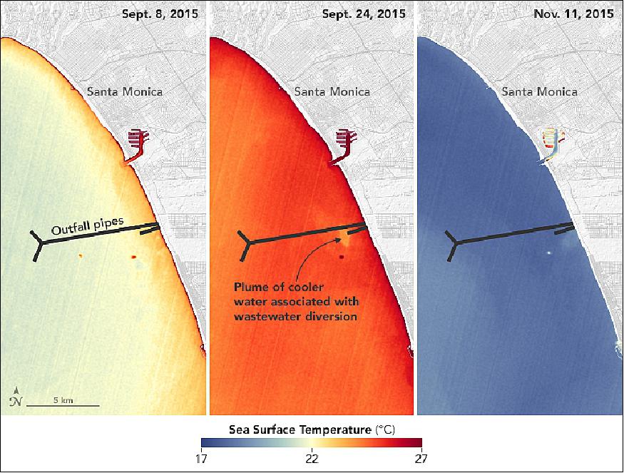
- "We knew that along with the change in temperature, we were going to get all the excess nutrients and the potentially harmful bacteria and chemicals associated with the pipe's effluent," said Trinh. Researchers had two main worries about the excess nutrients. First, that they would stimulate toxic phytoplankton blooms. Second, that they could lead to eutrophication—when extreme growth, and subsequent death, of algae, phytoplankton, or other plant life severely depletes the oxygen supply for other marine animals.
- Measuring chlorophyll-a concentrations in coastal environments is challenging. Water temperatures fluctuate quite a bit, waters are often rich with sediment and land runoff, and there is usually a higher concentration of phytoplankton than in offshore waters. Trinh's team developed a new satellite algorithm to decrease the "signal-to-noise" ratio in tricky coastal waters and to provide more accurate chlorophyll-a measurements. The improved algorithm integrates data collected by Trinh and her team from ship-based instruments with data from Landsat-8 (Figure 16).
- "The satellite component gave a new perspective on the situation because usually Hyperion just monitors from the ship in a very small area around the pipes," said Trinh. "We're showing that these wastewater diversions can have wide spatial impacts, and you wouldn't know that without something like a satellite data set."
- Trinh and colleagues helped guide LA Sanitation on where to collect water samples to test for harmful bacteria. For instance, satellite data showed higher chlorophyll concentrations along the southern shoreline of Santa Monica Bay, so water quality monitors collected samples from Topanga Canyon to Malaga Cove. In this area, they found that 10 percent of the samples contained fecal bacteria in amounts that exceeded state water quality standards. Multiple beaches were temporarily closed as a result.
- Trinh said this study was a good demonstration of how satellites can aid in monitoring water quality, especially in coastal areas with a lot of human activity and near wastewater outflows. "If a plant's pipes don't stay functional or have a catastrophic blowout," she said, "we already know what type of instruments and satellites we can use to make water quality monitoring as efficient as possible."
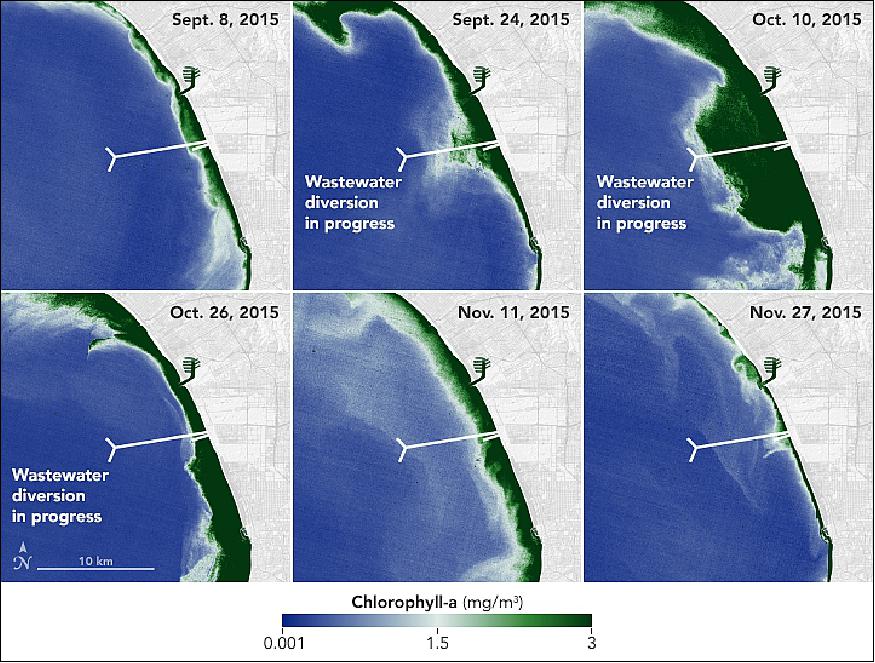
- A NASA team was able to use satellite imagery to observe effects of a repair of Los Angeles' largest wastewater treatment plant.
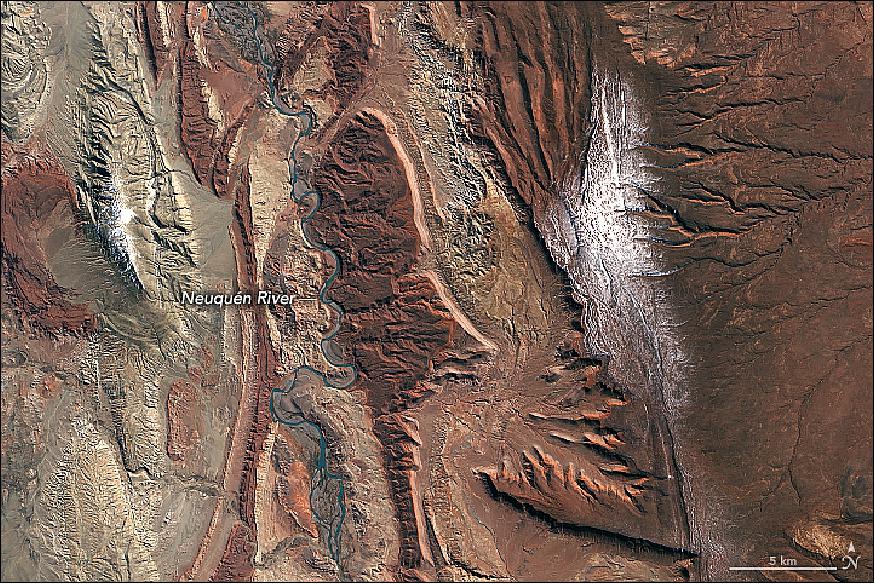
• October 19, 2018: As the Neuquén River winds its way from the Andes through west-central Argentina toward the Atlantic Ocean, it passes a spectacular series of rock formations in the Neuquén Basin. For paleontologists, the basin is a great place to find fossils, particularly dinosaurs. And for those in the oil business, it is fertile ground for gas and oil exploration. 9)
- From space, boundaries between some of the major groups of sedimentary rock formations are visible. In the first image, the deep reds of the Candeleros Formation—a sequence of sandstones formed roughly 90 to 100 million years ago in a braided river system—dominate the landscape. These rocks are flanked in some areas, especially near the river, by a green-yellow sequence of rocks that are part of the younger Hunical Formation, formed during drier times. The older Royosa Formation, meanwhile, peeks through in some areas where erosion has scraped away overlying rock layers (see Figure 18).
- Paleontologists have uncovered quite a menagerie of fossilized fauna in Candeleros rocks, including ancient species of fish, frogs, snakes, turtles, small mammals, and several types of dinosaurs. Few of the fossilized creatures have received the notoriety of Giganotosaurus carolinii—a carnivorous theropod thought to be larger and faster than Tyrannosaurs Rex.
- Petroleum geologists are more interested in what lies beneath the Candeleros Formation. Several layers of rock, formed when the area was covered by an ocean, contain gas and oil. While drilling has been ongoing here since 1918, the recent discovery of a large deposit of shale gas and oil in the Vaca Muerta Formation has made the Neuquén Basin one of the few regions outside of the United States where companies are pursuing horizontal drilling and hydraulic fracturing.
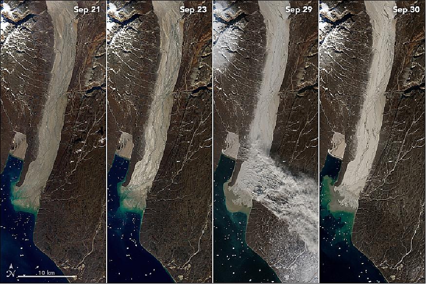
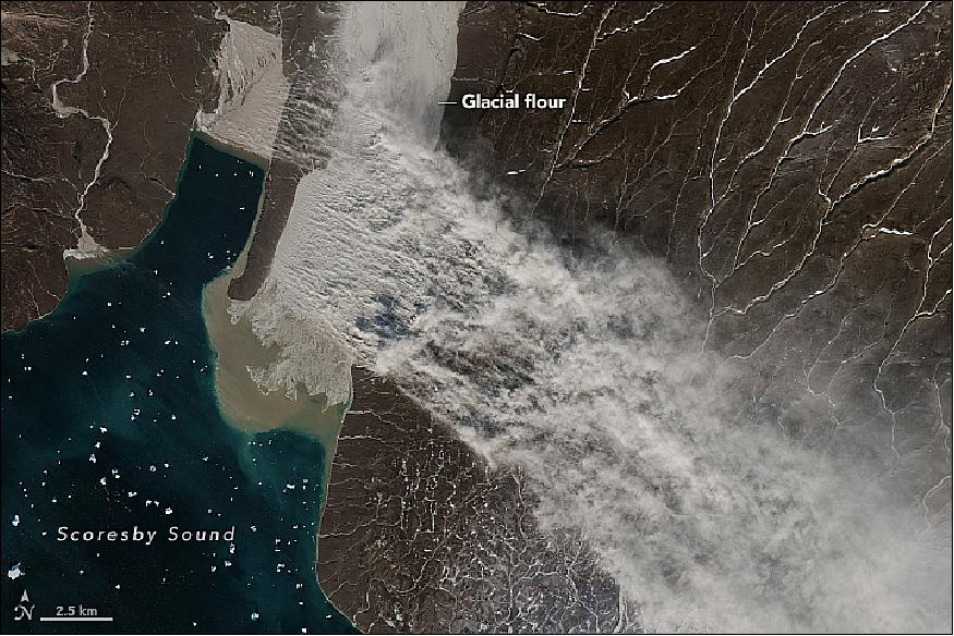
• October 17, 2018: Satellites captured a rare image of a plume of dusty glacial flour streaming from eastern Greenland. Dust is probably the last thing that comes to mind when you think about Greenland, an island mostly covered by ice. Though Greenland's dust events are nothing like the massive clouds of dust and sand that can darken skies over the Sahara Desert for days, winds in Greenland are occasionally strong enough to send plumes of sediment streaming from dried-out lakes, river valleys, and outwash plains along the coasts. The dust in Greenland is mainly glacial flour, a fine-grained silt formed by glaciers grinding and pulverizing rock. 10)
- For more than a century, researchers have sporadically reported high-latitude dust events in expedition logs and scientific publications. But only during the past decade have scientists attempted to study them systematically. The Arctic and high-latitudes can be tough to study even with satellites, and a recent study noted a dearth of Greenland dust observations.
- No longer. The Moderate Resolution Imaging Spectroradiometer (MODIS) on NASA's Terra satellite and a sensor on the European Space Agency's Sentinel-2 collected imagery on September 29, 2018, of a sizable silt plume streaming from Greenland's east coast. The source was a braided stream valley about 130 kilometers (80 miles) northwest of Ittoqqortoomiit, a village at a latitude of 73 degrees North. That puts the village north of the northern coast of Alaska.
- "This is by far the biggest event detected and reported by satellites that I know about," said Santiago Gassó, an atmospheric scientist at NASA's Goddard Space Flight Center. He first noticed the storm on October 3.
- "We have seen a few examples of small dust events before this one, but they are quite difficult to spot with satellites because of cloud cover," said Joanna Bullard of Loughborough University. "When dust events do happen, field data from Iceland and West Greenland indicate that they rarely last longer than two days."
- The glacial flour was likely made by several glaciers farther up the valley, then carried south by meltwater streams and deposited in the floodplain. As stream water levels dropped in autumn, the floodplain dried out and became susceptible to scouring by the wind. In this case, Bullard noted, the winds were triggered by the combination of a low-pressure system crossing the Greenland ice sheet followed closely by a ridge of high pressure.
- Since high-latitude dust events are poorly understood, they are typically not included in atmospheric and climate models. Gasso hopes that eventually they will be included because they could have effects on air quality, the reflectivity of snow, and even marine biology.
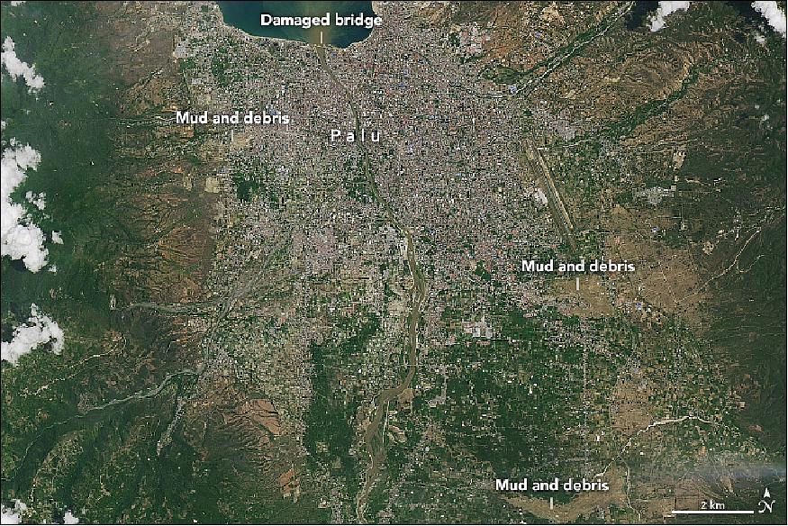
• October 02, 2018: The powerful, shallow earthquake of magnitude 7.5 that rattled the northern coast of Sulawesi island on September 28, 2018, caused tremendous damage. Homes throughout Palu, Indonesia, have been flattened. A series of tsunami waves decimated the coastline. Destructive flows of mud and soil destroyed several inland areas in the city of 300,000 people. 11)
- While coastal areas took heavy damage because of the tsunami, the image also reveals three large inland flows of mud that caused severe damage in densely populated areas. Intense shaking from the earthquake may have triggered liquefaction and lateral spreading, processes in which wet sand and silt takes on the characteristics of a liquid. These processes, which are especially common near streams and on reclaimed land, can produce destructive mudslides even in relatively flat areas.
- Scientists were surprised that the earthquake generated such a big tsunami. Normally, large tsunamis occur after megathrust earthquakes that cause vertical displacement. But the Sulawesi earthquake occurred along a strike-slip fault, meaning the motion was horizontal. Some scientists suspect that a submarine landslide, shaken loose by the earthquake, may have provided the energy that fueled the destructive tsunami. In addition, the narrow, finger-like shape of Palu Bay likely amplified the fast-moving surge of water and made it even more dangerous.
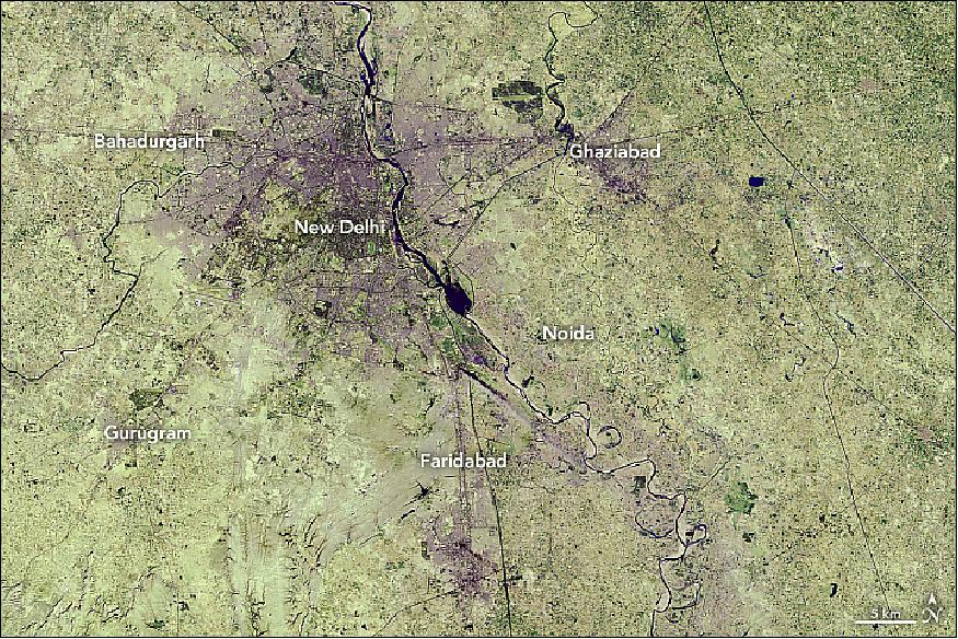
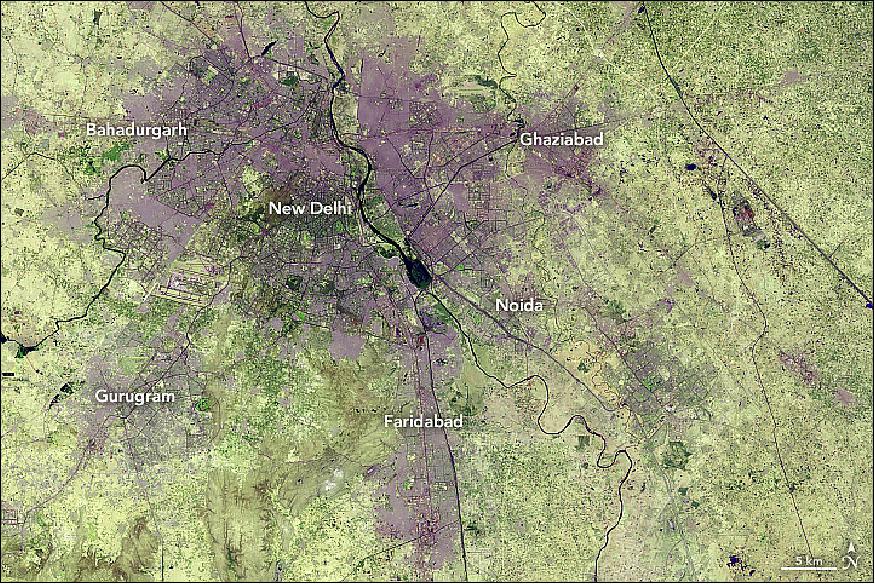
• September 27, 2018: The capital of India, New Delhi, has been experiencing one of the fastest urban expansions in the world. Vast areas of croplands and grasslands are being turned into streets, buildings, and parking lots, attracting an unprecedented amount of new residents. By 2050, the United Nations projects India will add 400 million urban dwellers, which would be the largest urban migration in the world for the thirty-two year period. 12)
- These images show the growth in the city of New Delhi and its adjacent areas—a territory collectively known as Delhi—from December 5, 1989, (Figure 22) to June 5, 2018 (Figure 23). These false-color images use a combination of visible and short-wave infrared light to make it easier to distinguish urban areas. The 1989 image was acquired by the Thematic Mapper on Landsat 5 (bands 7,5,3), and the 2018 image was acquired by Operational Land Imager on Landsat-8 (bands 7,6,4).
- Most of the expansion in Delhi has occurred on the peripheries of New Delhi, as rural areas have become more urban. The geographic size of Delhi has almost doubled from 1991 to 2011, with the number of urban households doubling while the number of rural houses declined by half. Cities outside of Delhi—Bahadurgarh, Ghaziabad, Noida, Faridabad, and Gurugram—have also experienced urban growth over the past three decades, as shown in these images.
- With a flourishing service economy, Delhi is a draw for migrants because it has one of India's highest per capita incomes. According to the latest census data, most people (and their families) move into the city for work. The Times of India reported that the nation's capital grew by nearly 1,000 people each day in 2016, of which 300 moved into the city. By 2028, New Delhi is expected to surpass Tokyo as the most populous city in the world.
- The increased urbanization has had several consequences. One is that the temperatures of the urban areas are often hotter than surrounding vegetated areas. Manmade structures absorb the heat and then radiate that into the air at night, increasing the local temperature (the urban heat island effect). Research has shown that densely built parts of Delhi can be 7°C (45°F) to 9°C (48°F) warmer in the wintertime than undeveloped regions.
- Additionally, sprawling cities can have several environmental consequences, such as increasing traffic congestion, greenhouse gas emissions, and air pollution. From 2005 to 2014, NASA scientists have observed an increase in air pollution in India due to the country's fast-growing economies and expanding industry.
- India is one of many countries with fast-growing cities. By 2050, China is projected to add 250 million people in its urban areas, and Nigeria may add 190 million urban dwellers. In total, India, China and Nigeria are expected to account for 35 percent of the world's urban population growth between 2018 and 2050.
• September 26, 2018: The last big eruption at Hokkaido's Kuttara volcano happened roughly 40,000 years ago, about the time Neanderthals were going extinct and a bit before people had begun to domesticate dogs. 13)
- Earlier eruptions at the Japanese stratovolcano had produced thick andesitic lavas that flowed into two large tongue-shaped lobes immediately north of the volcano. Silica-rich, viscous magma blocked the vent, so pressure built up in much the same way it does in a soda bottle after it is shaken. When the pressure grew intense enough, it blasted a vent at the top of the volcano and sent a large plume of ash shooting into the air. Fast-moving jumbles of ash, gas, and other debris—known as pyroclastic flows—swept down the southwestern slope of the volcano.
- That explosive eruption—and the slumping of rock into the emptied-out lava chamber—sculpted the bowl-shaped caldera that now sits at the top of the mountain and holds Lake Kuttara, one of the roundest and clearest lakes in Japan.
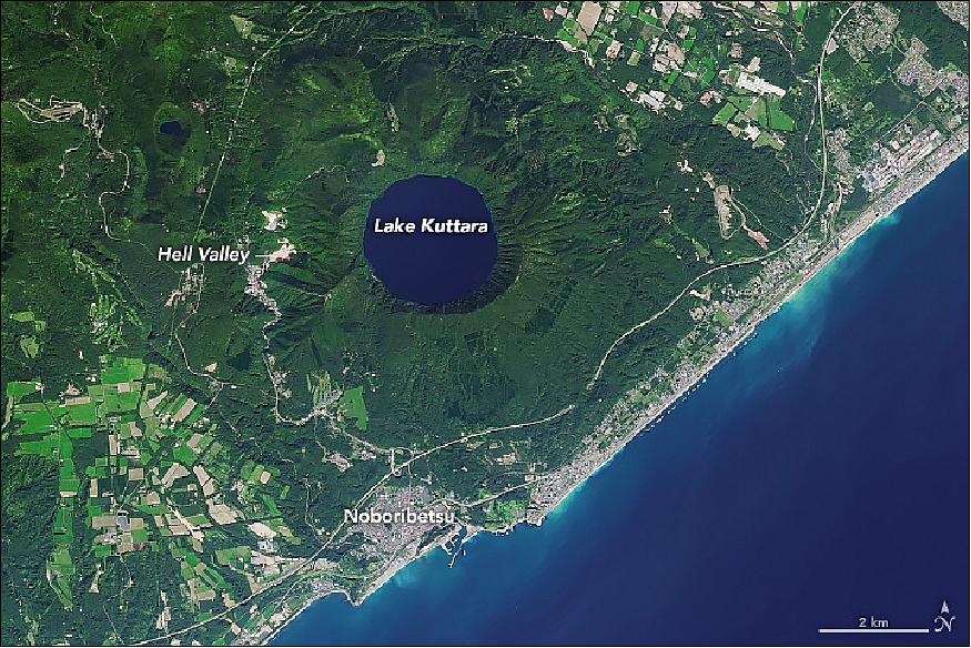
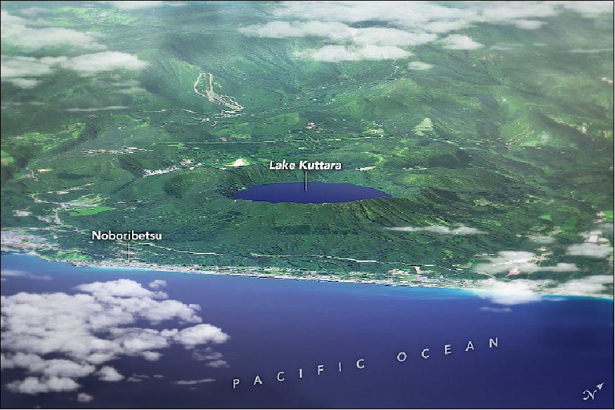
- Following that explosive eruption, volcanic activity at the caldera calmed and geothermal activity shifted to the southwestern slope of the volcano. About 15,000 to 20,000 years ago, viscous lava began to bulge upward into a lava dome, and a series of small steam explosions gouged several craters into a valley of fumaroles, geysers, streams, and ponds.
- This exotic, steaming landscape persists today. Known in Japanese as Jigokudani (Hell Valley) for its rusty red and black terrain, visitors can follow a walking path through the treeless valley, along a hot creek with a popular natural foot bath. They eventually arrive at sulfurous Lake Oyunuma, which has a surface temperature of 50ºC (122ºF).
- The lingering volcanic activity in the area has fueled the development of several onsens, or hot spring spas, that have made Noboribetsu one of the most famous spa towns in Hokkaido. Millions of people visit each year to soak in the natural mineral-rich waters from Lake Oyunuma and Hell Valley.
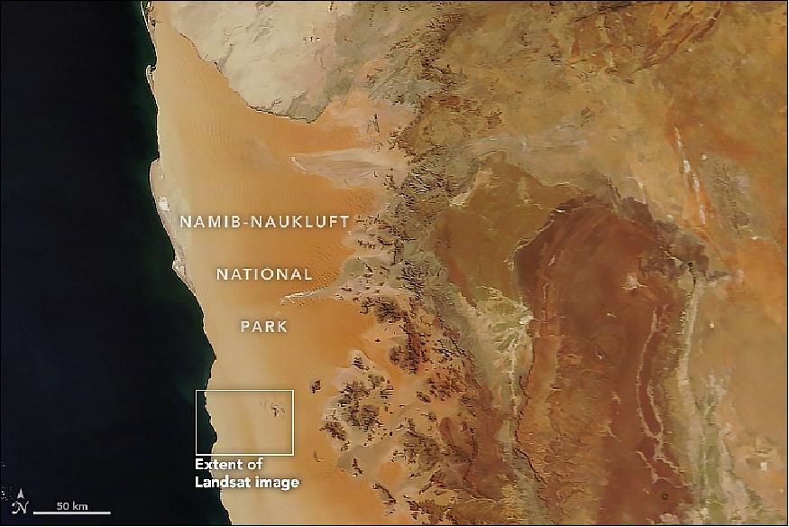
• September 4, 2018: Scattered in a sea of sand, inselbergs in Namibia host ecology uniquely influenced by fog. The Namib Sand Sea stands at the heart of Namib-Naukluft National Park, which is located on the coast of Namibia. Most of the terrain is dominated by sand, but one percent features inselbergs, or isolated raised hills. 14)
- According to a UNESCO World Heritage Center report, the inselbergs receive more rainfall than the surrounding lower-elevation dunes. That is because warm air gets pushed up the mountains from winds blowing past, causing water vapor to condense into clouds. Also, the raised land catches more fog coming from the ocean. Fog is the primary source of water for the Namib Sand Sea, which is the only coastal desert in the world to contain large dune fields influenced by fog.
- The wetter microclimate results in more abundant and diverse vegetation on inselbergs than sand dunes. Hauchab primarily has vegetation found in the palaeotropical Nama Karoo biome, which fosters shrubs and grasses, and the temperate Succulent Karoo biome, which is famous for its spring flowers.
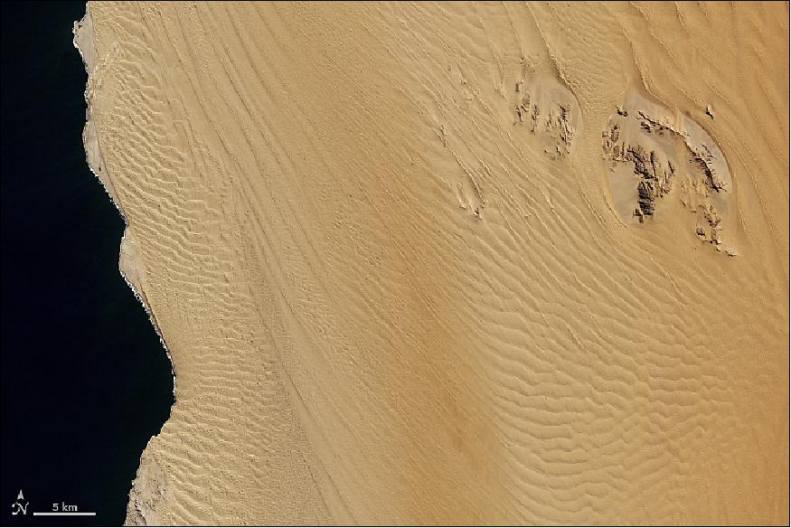
- The sand sea of Figure 27 covers over three million acres (1,215,000 hectare) inside the Namib-Naukluft Park. The national park is the combination of the Namib Desert, thought to be the world's oldest desert, and the Naukluft Mountains, which serve as a sanctuary for endemic Hartmann zebras.
- The sand sea consists of two dune seas, one on top of the other. The foundation is an ancient sand sea that has existed for about 21 million years. That has been covered over with younger sand that has been active for the past 5 million years. Sand seas in other parts of the world are generally formed through erosion of hard bedrock underneath, but the Namib Sand Sea is unique because the materials were transported from thousands of kilometers away. Carried by river, ocean current, and wind, sediments were transported along the Orange River to the coast, where they were lifted by winds and deposited inland.
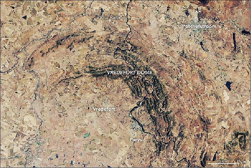
• September 1, 2018: The world's oldest and largest known impact structure shows some of the most extreme deformation conditions known on Earth. About two billion years ago, an asteroid measuring at least 10 km across hurtled toward Earth. The impact occurred southwest of what is now Johannesburg, South Africa, and temporarily made a 40-kilometer-deep and 100-kilometer-wide dent in the surface. Almost immediately after impact, the crater widened and shallowed as the rock below started to rebound and the walls collapsed. The world's oldest and largest known impact structure was formed. 15)
- Scientists estimate that when the rebound and collapse ceased, Vredefort Crater measured somewhere between 180 and 300 kilometers wide. But more than 2 billion years of erosion has made the exact size hard to pin down.
- "If you consider that the original impact crater was a shallow bowl like you would serve food in, and you were able to slice horizontally through the bowl progressively, you would see that the bowl's diameter will decrease with each slice you take off," said Roger Gibson of University of the Witwatersrand and an expert on impact processes. "For this reason, we are unable to categorically fix where the edge now lies."
- According to Gibson, the uplift at the center of the impact was so strong that a 25-kilometer section of Earth's crust was turned on end. The various layers of upturned rock eroded at different rates and produced the concentric pattern still visible today. Vredefort Dome, which measures about 90 km across, was observed on June 27, 2018, by OLI (Operational Land Imager) on Landsat-8.
- Notice that only part of the ring is visible. That's because areas to the south have been paved over by rock formations that are less than 300 million years old. The young rock formations have begotten fertile soils that are intensely cultivated.
- The darker ring in the center of this image, known as the Vredefort Mountainland, has shallow soils with steep terrain not suitable for farming, so the area remains naturally forested. Along the ridges in the Mountainland you can see white lines: these are the hardest layers of rock, such as quartzite, which resist erosion. The outer part of Mountainland has exposed rocks that are roughly 2.8 billion years old; this is the Central Rand Group, source of more than one-third of all gold mined on Earth.
- Visitors to the impact site today can witness geologic time by traversing just 50 km from Potchefstroom toward Vredefort. The journey would take you from shallow crustal sedimentary rocks deposited between 2.5 and 2.1 billion years ago, ending with 3.1- to 3.5-billion-year-old granites and remnants of ocean crust that were once about 25 km below Earth's surface.
- "Such exposed crustal sections are incredibly rare on Earth," Gibson said. "The added bonus here is that the rocks preserve an almost continuous record spanning almost one-third of Earth's history."
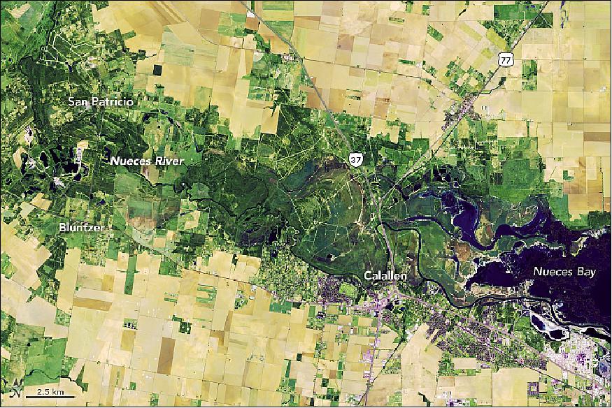
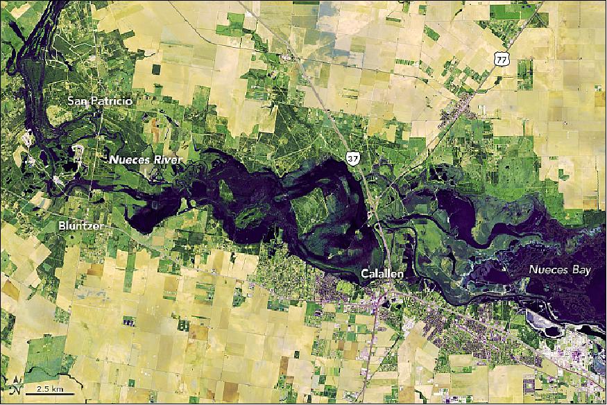
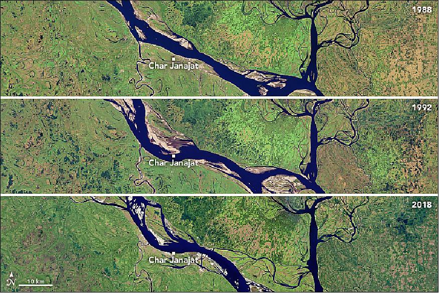
• August 28, 2018: The Padma is one of the major rivers of Bangladesh, flowing across the rich, fertile, flat land of South Asia. Sometimes the river acts as a pathway for transportation, but other times it has more destructive effects that displace farms, homes, and lives. Every year, hundreds (sometimes thousands) of hectares of land erode into the Padma River. Since 1967, more than 66,000 hectares (660 km2) have been lost—roughly the area of Chicago. 16)
- For the past 30 years, satellites have observed how the river has grown in size, transformed in shape, and changed in location. These natural-color satellite images show the Padma River in 1988, 1992, and 2018. The images were acquired by Landsat satellites: the Thematic Mapper on Landsat 5, the Enhanced Thematic Mapper Plus on Landsat 7, and the Operational Land Imager on Landsat 8. All images were acquired in January and February during the dry season.
- Over the past three decades, the river has changed from a relatively narrow, straight line to meandering to braided and, most recently, back to straight. The upper region has experienced the most erosion, but noticeable change has also taken place near Char Janajat.
- The erosion is indicated by the presence of meandering bends, or the tendency of the river to snake back and forth in an S-shape. Such formations evolve as the river's flow wears away the outer banks, widening the channel.
- In the 1988 image, the river course was narrower and the right bank was slightly convex. A curve started to develop in 1992 and lasted for eight years. The bend then began straightening and has since disappeared. Padma's meandering bends subsided due to chute-off—when the water flows across the land instead of following the curve of the river.
- Researchers are particularly interested in the Char Janajat area because it is the site of a new bridge crossing. As one of Bangladesh's biggest construction projects, the Padma River Bridge will connect the eastern and western parts of the country and shorten travel times between some locations from thirteen hours to three. There have been some concerns that erosion could threaten the construction of the bridge, although other researchers believe it could actually stabilize the banks and reduce erosion once it is finished. The bridge is scheduled to open by the end of 2018.
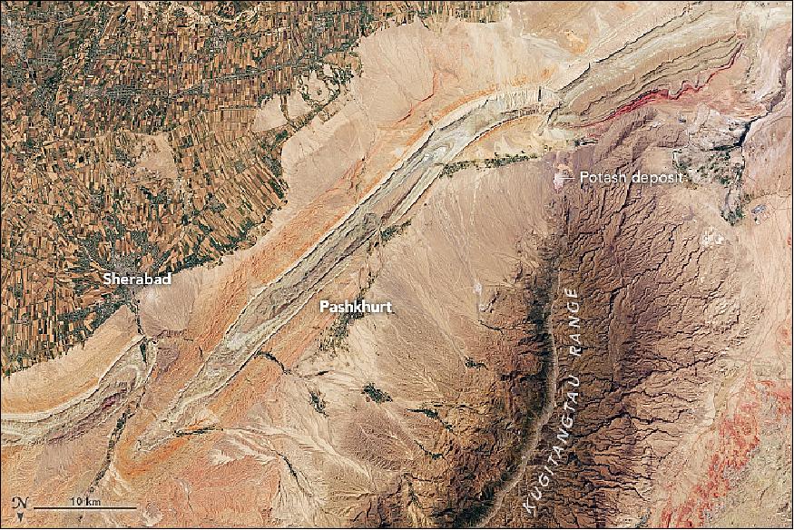
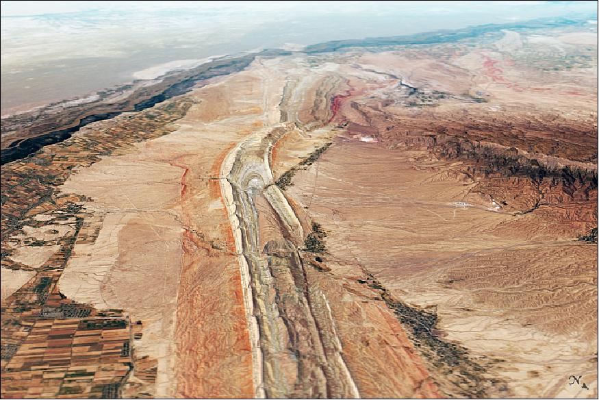
• August 21, 2018: The Surkhandarya province in southern Uzbekistan was once the heart of Bactria, a prosperous kingdom that flourished along the Amu River between 600 B.C.E. and 600 C.E. 17)
- Teams of archaeologists from the Soviet Union began visiting the province in the 1950s to catalogue its archaeological riches—remnants of towns, irrigation networks, burial mounds, pottery, weapons, and many other items. In the past decade, satellites have made a contribution from above as well. Since 2008, Ladislav Stančo of Charles University (Prague, Czech Republic) has led a team that used satellite imagery to systematically survey the area for archaeological sites.
- The researchers relied mainly on declassified spy satellite imagery from the Corona program, but they also gleaned insights from the Advanced Spaceborne Thermal Emission and Reflection Radiometer (ASTER) on NASA's Terra satellite, from Landsat satellites, and several commercial satellites. Stančo and colleagues identified dozens of new sites and followed up with field expeditions to several new sites (Figures 30 and 31).
- The Pashkhurt Basin—the area between the colorful ridges and the Kugitangtau Range—has a handful of villages situated around natural oases, including Pashkhurt, Zarabag, and Gos. The scientists discovered several archaeological sites around these villages, as well as several near Sherabad. Archaeologists think people living in Bactria were attracted to the area partly because of the presence of desirable minerals and metals in the foothills of the Kugitangtau Range. The small white areas are potash deposits, some of which continue to be mined today. People have long used potash to produce glass, soaps, and textiles.
- In current times, cotton is the primary crop grown along the Sherabad River, with much of the river's water getting diverted for the thirsty plant. Intensive irrigation like this is common along rivers that flow toward the Aral Sea, and it has caused that large lake to shrink dramatically in recent decades.
• July 16, 2018: In July 2017, a huge iceberg dramatically broke away from the Larsen C Ice Shelf on the Antarctic Peninsula. But the aftermath has been a bit more drawn-out, as the berg hasn't moved very far. 19)
- In a year, iceberg A-68A moved a relatively short distance from the edge of the ice shelf into the Weddell Sea (Figure 33). In the right image, the berg's western edge is roughly 45 km from the shelf. A-68B, the much smaller fragment of the original berg, is more than twice that distance from its prior location.
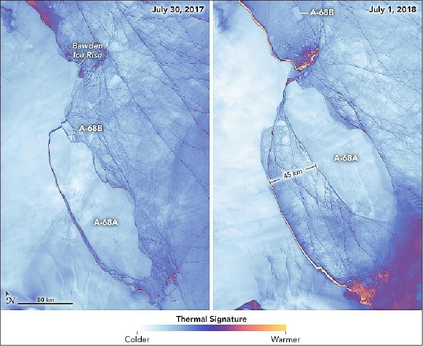
- A-68A's sluggishness is not surprising. When it calved, the berg was about the size of Delaware and weighed more than a trillion tons. Dense sea ice in the Weddell Sea has made it harder for currents, tides, and winds to move all of that mass. The iceberg has also become stuck at times when its north end encounters the shallow water near Bawden Ice Rise, an ice-covered rock outcrop.
- Still, Iceberg A-68A has seen plenty of motion. Throughout the year, tide cycles have shuffled the berg back and forth like a driver trying to get out of a tight parallel-parking spot. Its north end has been repeatedly smashed against Bawden Ice Rise, fracturing and reshaping its northern edge. Also notice how the southeastern edge appears to have grown in area. This is not part of the original iceberg; it is fast ice that has come fastened to the edge of the berg as it shoves through the ice pack.
- A-68A will continue this dance in moonlight, as the darkness of austral winter continues through early August. Thermal images offer one way that scientists can "see" the iceberg during polar night. Radar imagery from the Sentinel-1 satellite also has been an important tool for Adrian Luckman and the UK-based Project MIDAS, which has been monitoring the iceberg and how its calving affects the Larsen C Ice Shelf.
- There's no telling how much longer A-68A will stay "stuck" in the Weddell Sea. The smaller A-68B is a good example of the path taken by many Antarctic bergs, as they are carried by currents out of the Weddell and northward toward South Georgia and the South Sandwich Islands.
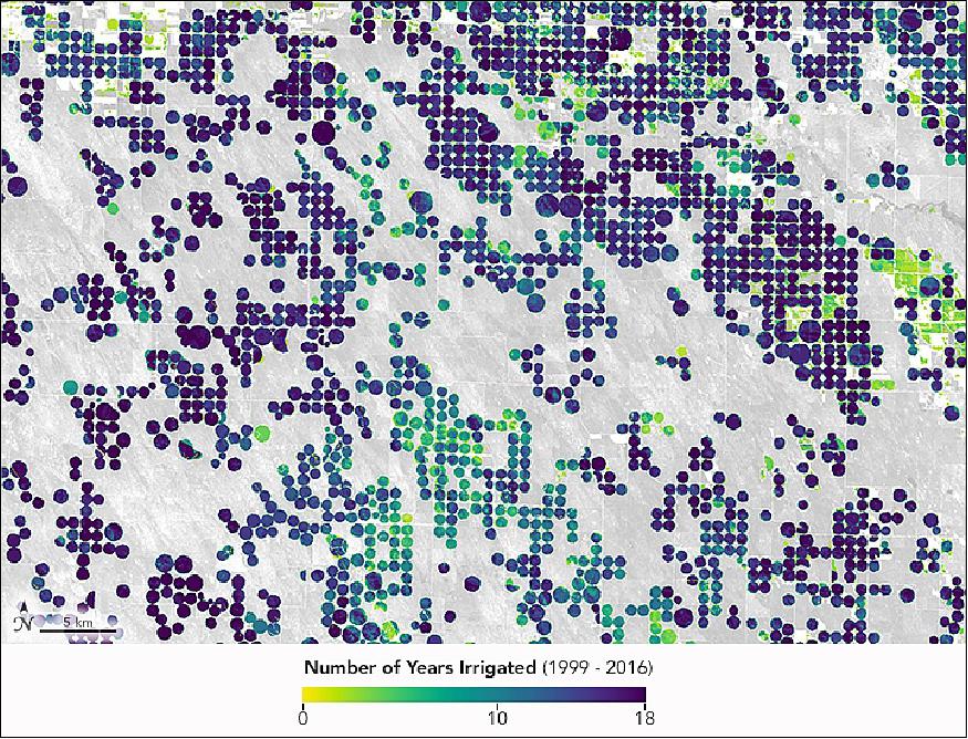
• July 9, 2018: The High Plains Aquifer, also known as the Ogallala Aquifer, is under stress. Farmers today have to drill ever deeper wells in order to pump water for irrigation, and one recent study found the aquifer to be under more strain than any other in the United States. About 30 percent of the water once stored beneath Kansas is already gone, and another 40 percent will be gone within 50 years if current trends continue. 20)
- Nonetheless, pumping continues. Data collected by the MODIS sensors on Aqua and Terra satellites and other sources show that irrigation is increasing in some parts of the aquifer. One study found that 519,000 more hectares were irrigated in 2007 compared to 2002—97 percent of the total added in the United States during that period.
- While MODIS can monitor regional trends, it cannot easily examine irrigation patterns at the level of individual fields. "The higher resolution of the sensors on Landsat give us a more nuanced understanding of the annual and seasonal rhythms of irrigation than is possible with MODIS," explained Jillian Deines, a hydrologist at Michigan State University. Deines and colleagues David Hyndman and Anthony Kendall authored a study in which they compiled nearly two decades of Landsat data to study irrigation trends along the Republican River Basin, which runs through Colorado, Kansas, and Nebraska.
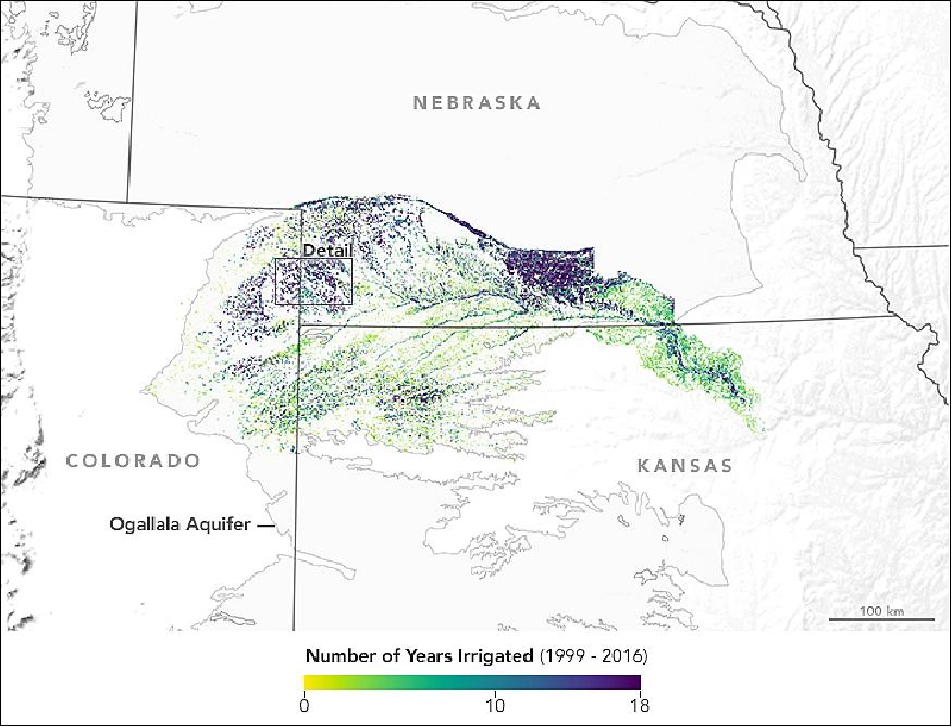
- Water use in the Republican River Basin is a sensitive issue. While there is a compact in place that details how the states should share water, litigation about water use is common. Given the legal context, Deines says it would be helpful for hydrologists and water managers to have a good understanding of exactly when and where irrigation occurs. Ground-based irrigation statistics tend to be decentralized and of varying quality, so Deines looked to Landsat for a more consistent view.
- Examining natural-color and infrared imagery, the team produced high-resolution annual irrigation maps for the entire basin. The maps detail how frequently a field was irrigated, as well as the first and last year it was irrigated.
- After analyzing some economic data, Deines and her colleagues believe some of the variability in irrigation they found was driven by crop prices. (Farmers expand irrigation when prices are high to increase yields and profits.) Rainfall also played a role in the variability. "Farmers ended up irrigating more intensely on a smaller number of fields during drought years," noted Deines.
- Landsat also detected an increase in the number of fields irrigated over the study period. Most of the increase was centered on the eastern part of the basin near the Platte and Republican Rivers, an area where irrigation depends more on drawing water from rivers than drilling groundwater from the aquifer.
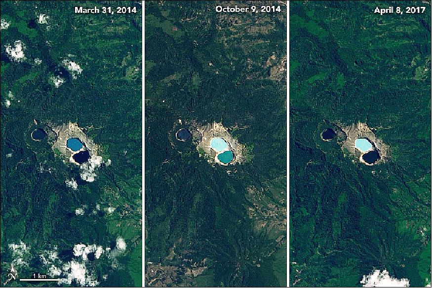
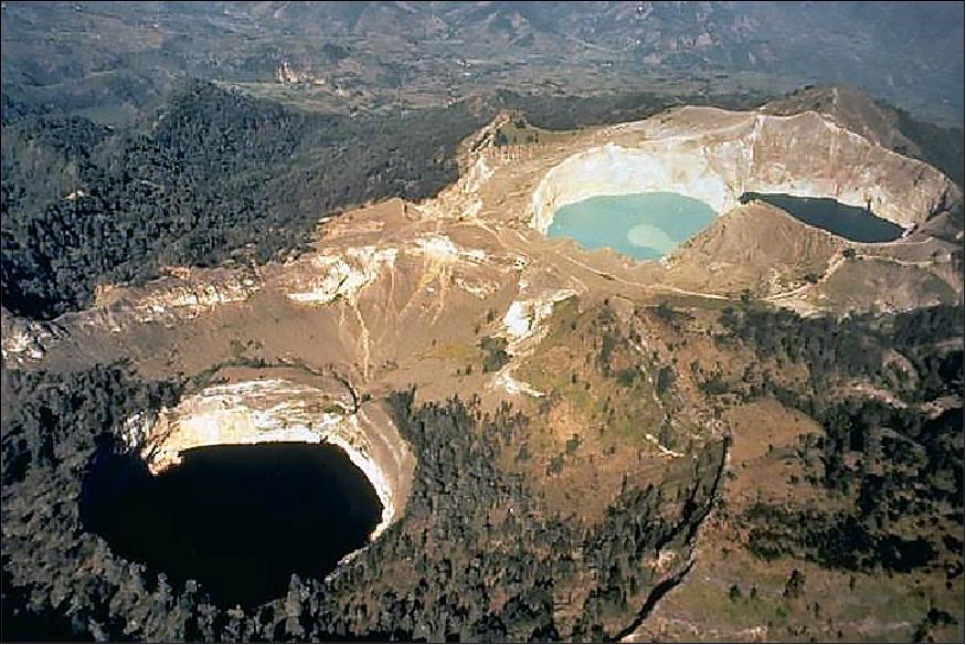
• July 6, 2018: From milky white to vibrant turquoise to blood red, the three lakes at the summit of the Kelimutu volcano are known to unpredictably change color— a phenomenon unique to this volcano on the Indonesian island of Flores. 21)
- The changing colors have been a source of supernatural folklore. Locals say the lakes are the resting place for departed souls. Depending on the good or bad deeds performed in their life, the deceased get placed into the various lakes.
- The westernmost lake known as Tiwu Ata Mbupu (meaning Lake of the Old People) is usually blue. Tiwu Nuwa Muri Koo Fai (Lake of the Young Men and Women) is usually turquoise. The southeastern lake called Tiwu Ata Polo (Bewitched Lake) is usually red or brown. It is believed to be the home of those who have been evil in life. Depending on when you visit, the colors can range from white, green, blue, brown, or black. In 2016, the lakes changed colors six times.
- While other lakes can be colored by species of bacteria, the changing colors at Kelimutu are thought to be caused by fumaroles, or volcanic vents that release steam and gases such as sulfur dioxide. The fumaroles produce upwelling in the lakes, such that denser, mineral rich water from the bottom is brought towards the surface. All of the lakes contain relatively high concentrations of zinc and lead.
- While minerals play a part in the coloring, another key factor is the amount of oxygen present in the water. Like your blood, these lake waters appear bluer (or greener) when low in oxygen. When they are oxygen-rich, they appear blood red or even cola black.
• June 18,2018: Estuaries near the coast of Guinea–Bissau on the west coast of Africa branch out like a network of roots from a plant. With their long tendrils, the rivers meander through the country's lowland plains to join the Atlantic Ocean. On the way, they carry water, nutrients, but also sediments out from the land. 22)
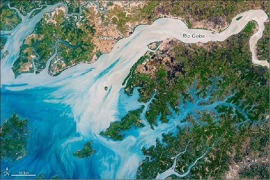
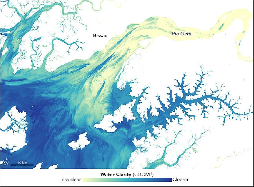
- These estuaries play an important role in agriculture. This small west African country is mostly made up of flat terrain that only stands 20 to 30 m above sea level. The coastal valleys flood often, especially during the rainiest part of the year (summer), and can have damaging effects on infrastructure, agriculture, and public health. But at non–devastating levels, the rains make the valleys good locations for farming, especially rice cultivation.
- Much of the agricultural land is created by destroying mangroves, which acts as a natural barrier between the land and the water. For instance, a lot of rice production occurs along the Rio Geba, which is surrounded by broad valleys and a low, rolling plain carved out of woodlands. As a result, coastal areas have been eroding, which is expected to worsen with rising sea levels. A few projects are focused on restoring mangrove populations, and researchers have been seeing regrowth.
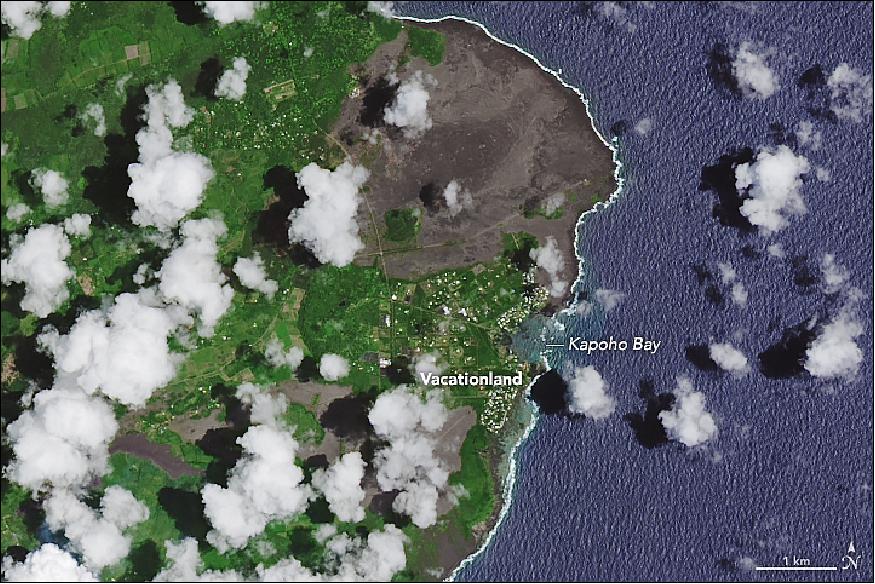
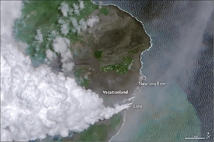
• June 13, 2018: Steaming fissures first began to crack open and spread lava across Hawaii's Leilani Estates neighborhood on May 3, 2018. Since then, more than 20 fissures have opened on Kilauea's Lower East Rift Zone, though most of the lava flows have been small and short-lived. 23)
- Not so for fissure number 8. That crack in the Earth has been regularly generating large fountains of lava that soar tens to hundreds of feet into the air. It has produced a large, channelized lava flow that has acted like a river, eating through the landscape as it flows toward the sea.
- While the fissure 8 lava flow initially remained in relatively narrow channels, it began to widen significantly as it neared the coastline and passed over flatter land. It evaporated Hawaii's largest lake in a matter of hours, and devastated the communities of Vacationland and Kapoho, destroying hundreds of homes.
- On June 3, 2018, lava from fissure 8 reached the ocean at Kapoho Bay on Hawaii's southeast coast. When the Multi-Spectral Instrument (MSI) on the European Space Agency's Sentinel-2 satellite captured a natural-color image on June 7, the lava had completely filled in the bay and formed a new lava delta. For comparison, the Landsat-8 image shows the coastline on May 14.
- Since May 3, 2018, Kilauea has erupted more than 110 million cubic meters of lava. That is enough to fill 45,000 Olympic-sized swimming pools, cover Manhattan Island to a depth of 2 meters, or fill 11 million dump trucks, according to estimates from the U.S. Geological Survey. However, that is only about half of the volume erupted at nearby Mauna Loa in a major eruption in 1984.
- The new land at Kapoho Bay is quite dynamic, fragile, and dangerous. "Venturing too close to an ocean entry on land or the ocean exposes you to flying debris from sudden explosive interaction between lava and water," USGS warns. Since lava deltas are built on unconsolidated fragments and sand, the loose material can abruptly collapse or quickly erode in the surf.
- The plumes that form where lava meets seawater are also hazardous. Sometimes called "laze," these white plumes of hydrochloric acid gas, steam, and tiny shards of volcanic glass can cause skin and eye irritation and breathing difficulties. When Sentinel-2 captured this image, the laze plume streamed west and mixed with clouds.
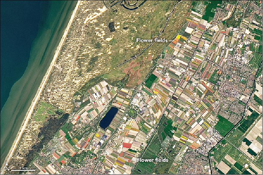
• May 16, 2018: Every year, seven million flower bulbs are planted in the Keukenhof Garden in the Netherlands. When the final winter chill disappears and springtime arrives, the bulbs sprout to produce beautiful rows of reds, oranges, and yellows—including 800 varieties of tulips. 24)
- The season begins in March with purple crocuses, followed by hyacinths and daffodils. It ends with tulips reaching peak bloom in April. The vivid display draws more than a million tourists, who line up for a glance before the flowers are harvested and disappear.
- The landscape in this image—known as the "bulb region"—lies about 20 km from Amsterdam. It contains numerous gardens, including Keukenhof, one of the world's largest flower gardens. The Netherlands is the largest producer of tulip bulbs in the world, providing 4.2 billion annually and exporting half.
• April 30, 2018: In February 2018, the average extent of sea ice in the Arctic was the lowest of any February on record, thanks to a winter warming event. Then, on March 17, 2018, Arctic sea ice extent reached its annual peak; it was the second-lowest maximum on record. 26)
- By the time the image of Figure 44 was acquired in mid-April, springtime sunlight and warmth had advanced the melting to produce some beautiful patterns and textures in the Beaufort Sea, north of Canada. The natural-color image was acquired by the Operational Land Imager (OLI) on Landsat-8 on April 15, 2018. A small part of the image (lower right) was mosaicked in from an April 17 image in order to show more of Mackenzie Bay. In the days before this image was acquired, the region experienced an extended period of generally sunny days, allowing ample sunlight to reach the ice and melt its surface. The thinnest ice appears blue-gray.
- The favorable weather was a boon for NASA's Operation IceBridge, an airborne mission now in its tenth year making flights over the Arctic. Clear skies meant ample data could be collected by instruments on P-3 research plane when it flew over sea ice in the eastern Beaufort Sea on April 14.
- "The main purpose of these IceBridge flights is to measure the thickness of the sea ice," said IceBridge project scientist Nathan Kurtz. "Ice thickness is an important factor which allows us to assess the health of the pack and its ability to survive the summer melt. It is also an important regulator in the exchange of energy and moisture between the ocean and the atmosphere."
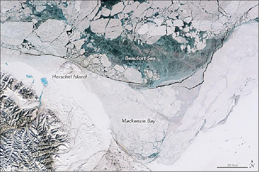
- Sea ice appears static when we view a single satellite image, but in fact, it is almost constantly in motion. The ice pack in the open sea is pushed around by winds and currents, and this fractures it into smaller pieces that are more vulnerable to melting. The animation of Figure 45, composed of images acquired by NASA's Moderate Resolution Imaging Spectroradiometer (MODIS) instrument on the Terra and Aqua satellites between April 4 and 15, captures that motion. Some areas appear to open up and then refreeze. Note how the fast ice—which is still anchored to the shore and more resistant to winds and currents—appears less fractured.
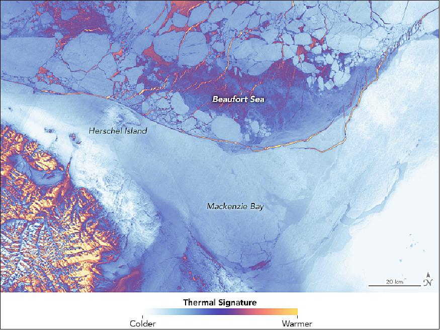
- As the sea ice thins and fractures, you can also see that warmth is also coming from ocean water below the ice. The TIRS (Thermal Infrared Sensor) on Landsat-8 captured the data for this false-color image on April 15 and 17 (Figure 46). It shows the relative warmth or coolness of the landscape. Orange depicts where surfaces are the warmest—areas of open ocean or thin sea ice. Light blues and whites are the coldest areas, which includes the fast ice and the larger, thicker floes.
- This visual array of thicknesses, textures, and motion in the sea ice are a striking example of Earth's beauty that few people get to witness. "As scientists, we have the privilege of witnessing the beauty and mystery of the cryosphere firsthand, even as we work to collect that data," said IceBridge mission scientist John Sonntag. "Often I look out from the windows of our aircraft and see features that I don't immediately understand, but one of my colleagues in the global community of cryospheric scientists can usually explain the processes behind them."
- "While on the flights, I'll stare out the windows for hours looking at the surface. The movement of the ice leads to huge variability over small scales, with many interesting scenes and patterns visible and a variety of color shades," Kurtz added. "But there's only so much that can be discerned with human eyes. That is why we have the sensitive instrument suite on the plane: to map the intricacies of the ice cover which may otherwise be invisible to us and to quantify parameters for scientific interpretation."
• April 25, 2018:The Russian settlement of Surgut lies on the north bank of the Ob River in the cold, swampy lowlands of West Siberia. Just a small village in the 1960s, Surgut has ballooned into a bustling city of 340,000 people, largely because of the development of the vast gas and oil reserves in the area. 27)
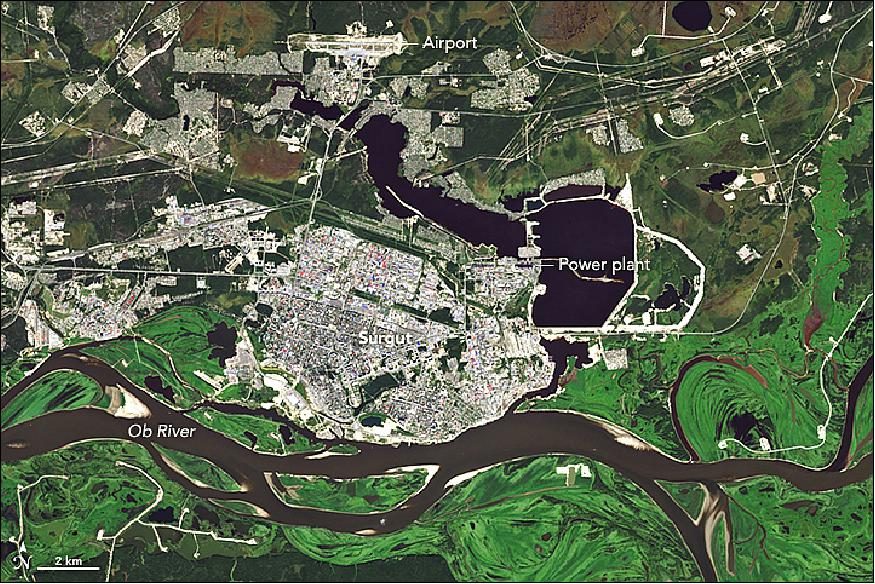
- By analyzing NDVI measurements collected between 2000 and 2016 (Figure 49), Igor Ezau and Victoria Miles of Norway's Nansen Environmental Remote Sensing Center have identified some interesting changes in this area. Most notably, the taiga forests across the northern part of West Siberia have gradually become less green, a trend the scientists attribute to rising summer temperatures.
- However, the opposite is true in pockets of forest around the towns and cities. When the researchers focused on changes to the vegetation within 40 km of 28 cities in Siberia, they found the vegetation had gotten slightly greener (or browned less) than the rest of the region.
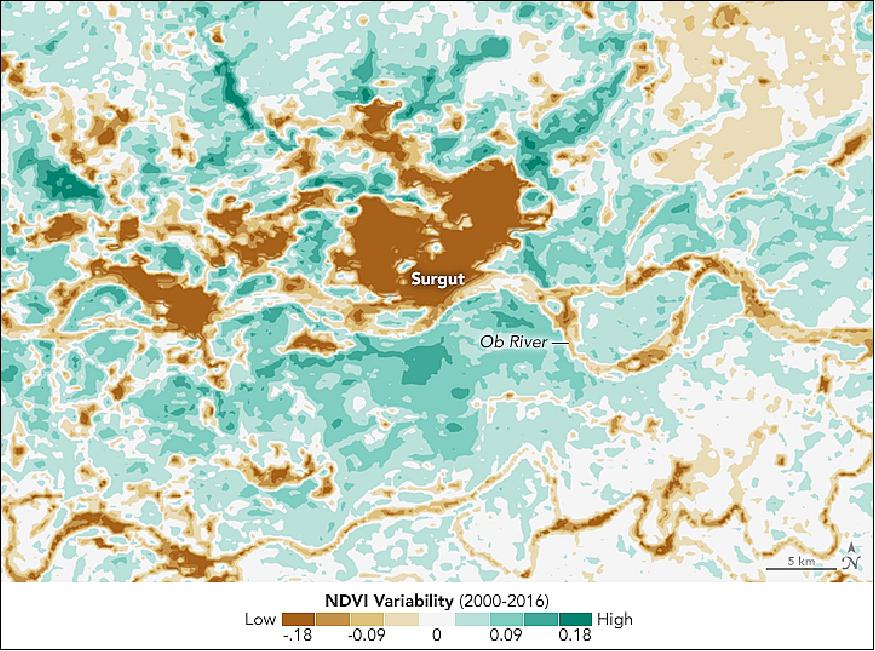
- The effect was particularly pronounced around older cities like Surgut, which have had more time to establish parks and other green spaces to reverse the initial loss of vegetation cover associated with development and urbanization. In the NDVI variability map above, the cities and rivers showed low variability between 2000 and 2016 in comparison to the ring of vegetation surrounding the two cities. The greater variability indicates an increase in greening during the warmer months. Note: to generate the NDVI map, the scientists applied a statistical technique that extracted the local effects from the regional trends.
- The greening trend was driven by other factors, as well. For Surgut and several other cities, development required covering swampy soils with relatively sandy, well-drained soil that was sturdy enough to build on. The sandier soils were not only better for infrastructure, they made it easier for trees to thrive.
- Building materials like concrete and asphalt also created an urban heat island that increased land surface temperatures in the city core compared to rural areas around it. In the Arctic, heat islands warm the soil, which can thaw underlying permafrost and have far-reaching effects on tundra and taiga landscapes. In areas like Surgut with cool and short summers, the added warmth gives many types of vegetation a boost.
- In comparison to other Siberian cities, the intensity of Surgut's heat island is unusual. The city is home to two large gas power plants. One of them, Surgut-2, has an installed capacity of 5597 megawatts, which means it supplies energy to nearly 40 percent of the population in Russia and is among the largest gas-fired power stations in the world.
- "Surgut is now about 10 degrees Celsius above normal, which means that ecosystems around the city have a climate that could otherwise only be found 600 kilometers to the south," noted Ezau.
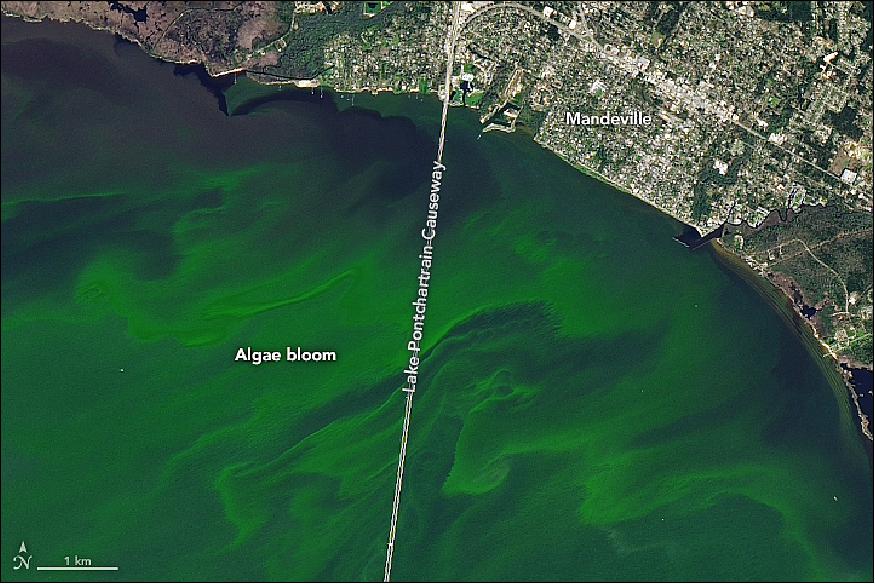
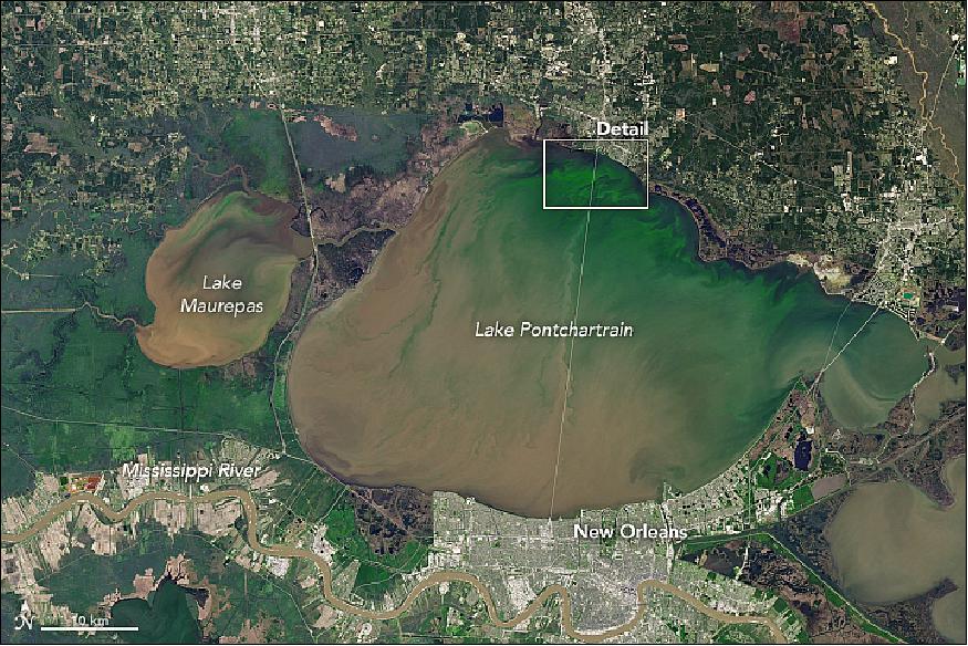
• April 11, 2018: Like plant life on land, phytoplankton in the water flourish under just the right conditions. For phytoplankton in Louisiana's Lake Pontchartrain, those conditions include a combination of ample sunlight and nutrients, a long stretch of warm weather, and calm winds. 28)
- Lake Pontchartrain and other nearby lakes and inlets compose a huge estuary east of the Mississippi Delta; collectively they drain an area spanning 12,000 km2 (4,600 square miles). Unusually warm temperatures in February and March helped spur the early spring bloom shown in Figure 50, even before nutrients from the Upper Mississippi could pour into the region.
- Blooms become more likely when excess river nutrients reach the lake through the Bonnet Carré Spillway. During flood season, the spillway is occasionally opened to divert excess water from the Mississippi River and relieve pressure on levees near New Orleans.
- On March 8, the U.S. Army Corps of Engineers started to open the spillway in response flooding along the Ohio and Mississippi Rivers. The pulse of sediment-laden water is visible on March 14. Such inputs of nutrients—often fertilizer from the Mississippi watershed—can set the stage for large blooms of algae and cyanobacteria—single-celled organisms that can contaminate drinking water and pose a risk to human and animal health. Satellite imagery can help identify the occurrence of a phytoplankton bloom, but direct sampling is required to discern the species.
- The extra nutrients from the Mississippi helped trigger another bloom around March 25. However, cloud cover impeded satellite views on most days.
- By early April 2018, the blooms appeared less vibrant. John Lopez of the Lake Pontchartrain Basin Foundation reported, that wind on the lake helped to break up the second bloom and suppress its growth. But nutrients from the river can persist in the lake for months, making it possible for more blooms to develop later this year.
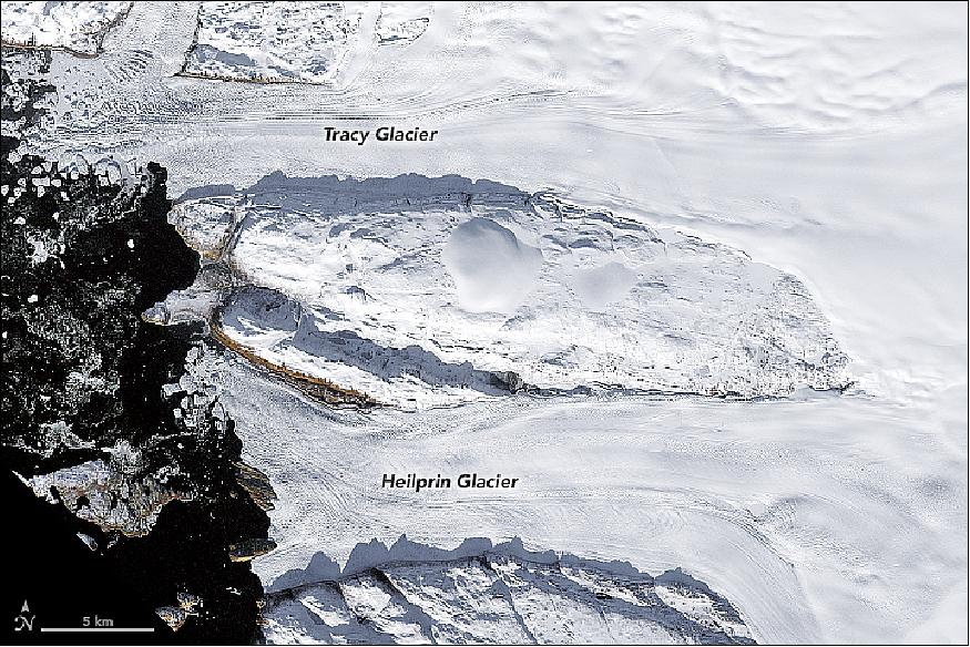
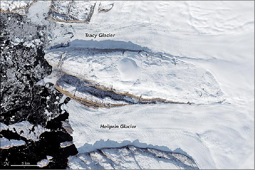
• April 8, 2018: Greenland's coastline is anything but smooth. It is punctuated by rocky outcrops and ice-choked fjords, the outlets through which ice from the interior drains into the sea. The myriad "marine-terminating outlet glaciers" along the coast of Prudhoe Land in northwest Greenland may not be the country's largest, but they are retreating fast. 29)
- This image pair shows changes to two of the more prominent glaciers in this region. Figure 52 was acquired on September 28, 1987, by the Thematic Mapper on Landsat-5; Figure 53 was acquired on September 30, 2017, by the Operational Land Imager (OLI) on Landsat-8. Tracy Glacier (north) and Heilprin Glacier (south) are the largest glaciers draining into Inglefield Bredning, a fjord measuring about 20 km wide.
- According to research published in 2018, scientists found that glaciers in this region have retreated significantly in the 21st century due to atmospheric warming. From the 1980s through the 1990s, Tracy and Heilprin glaciers retreated at similar rates, about 38 and 36 meters per year, respectively. But between 2000 and 2014, their rates of retreat diverged dramatically. Tracy retreated by 364 meters per year. That is more than three times the rate of retreat at Heilprin, which lost 109 meters per year over the same span.
- The difference is likely due to the way the glaciers encounter water. Tracy Glacier flows into a deep channel of seawater (as much as 600 meters deep), making it more vulnerable to melting from below by ever-warming seawater. Heilprin, in contrast, flows into shallower water and is not thinning or retreating as quickly.
- NASA's ship-based Oceans Melting Greenland (OMG) field campaign has been studying the role of the oceans in the melting Greenland's ice. At the same time, Heilprin and Tracy glaciers are among those mapped each year by NASA's Operation IceBridge, an airborne mission to map polar ice. During the 2011 IceBridge campaign, scientist Michael Studinger snapped this photograph of Tracy Glacier.
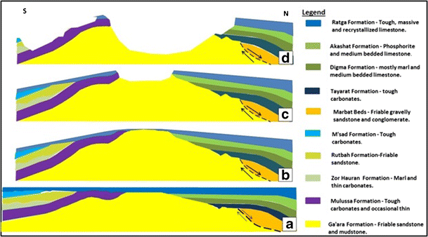
• April 5, 2018: The transformative power of water, wind, and gravity is on full display in Iraq's Ga'ara Depression. The rim of this large, oval-shaped basin near the Iraq-Syria border rises a few hundred meters along its southern and western edges. 30)
- Geologists call the rock at the bottom of the basin the Ga'ara Formation. It is made up of alternating layers of sandstone and soft claystone that formed roughly 300 million years ago, when the area was covered by a shallow sea. Later, types of carbonate rock (dolomite, limestone, and marl) were layered on top of the Ga'ara Formation, and the entire sequence of rock was gradually pushed up into a dome shape by tectonic forces.
- The dome achieved its maximum height about 30 million years ago. Erosive forces have since chipped away at this layer-cake of rock. The combined effects of water, wind, and gravity wore through the thin carbonate layers at the top of the dome, and then hollowed out the oval-shaped depression from the soft, crumbly rock of the Ga'ara Formation, leaving behind a rim of tougher carbonates. These steep cliffs along the southern rim have played a key role in widening the basin over time. The regular stream of landslides and rockfalls that tumble down the cliffs have caused the southern rim to continue moving south over the years.
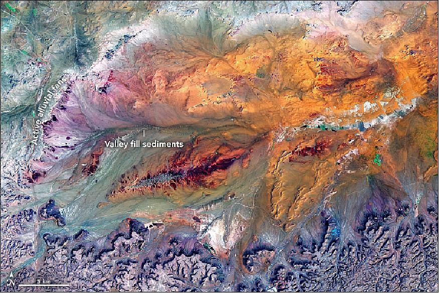
- While rain is infrequent here, it can fall in intense bursts during the short wet season. These sporadic deluges can transform dried-out channels (known locally as wadis) into roaring rivers that, over time, carve the sharp valleys in the limestone plateaus along the western and southern rim. When the rushing streams drain into the Ga'ara's relatively flat interior, they spread out and become braided streams with multiple, interlacing channels that spread sediment over a wide area.
- As the streams slow, their capacity to carry sediment diminishes, causing sandbars to accumulate along the channels. Over time, the channels migrate back and forth, creating fan-shaped deposits of sediment known as alluvial fans. Some of the fans, especially along the southern rim, are older and dormant; others, mainly along the western rim, are smaller and actively growing.
- While geologists think rockslides and flowing water were especially influential in carving out this depression, wind played a key role as well. During drier periods, fine sand on the basin floor often gets lifted by wind storms and blown out of the basin in an easterly direction.
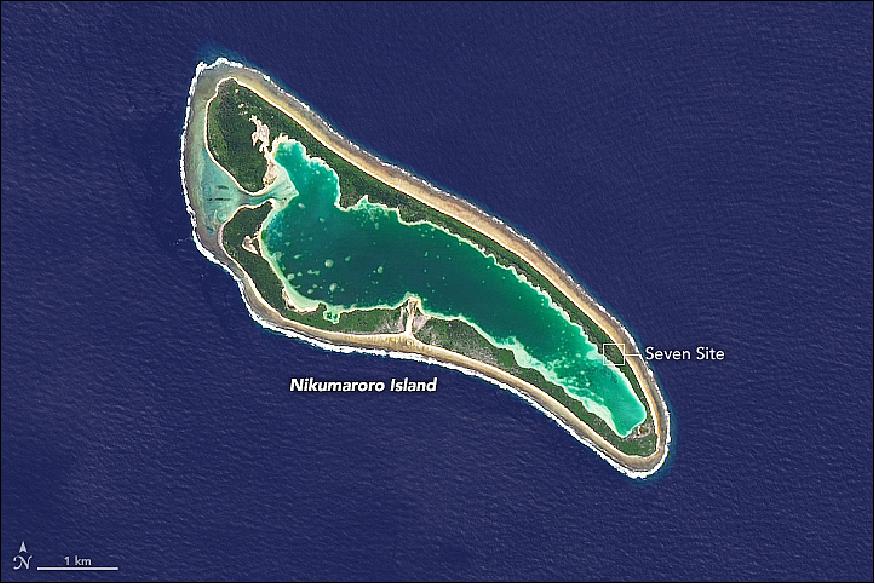
• March 26, 2018: It is one of the most famous patches of coral outside of the Great Barrier Reef. Stretching a mere 7.5 km by 2.5 km and surrounded by deep ocean, it is barely a speck on world maps. Though uninhabited today, Nikumaroro atoll is noteworthy for someone who likely had a short and ill-fated residence there: Amelia Earhart. 31)
- Nearly 1,600 km from Fiji, halfway between Australia and Hawaii, this South Pacific island is essentially a sandbar atop a coral reef atop a subsiding deep-sea volcano. The Operational Land Imager (OLI) on Landsat-8 acquired a natural-color image of the tiny island on July 28, 2014 (Figure 55).
- Once named Gardner Island by American sailors, Nikumaroro is part of the Phoenix Islands in the island nation of Kiribati. The Americans and the British tried several times to colonize the island, attempting to grow coconuts and considering the spot for weapons testing. Thick scrub and stands of Pisonia and coconut palms hold the sandbar in place around a central lagoon. Kiribati declared the island part of the Phoenix Islands Protected Area in 2006.
- The most famous claim to fame for Nikumaroro is that it may be the final resting place for Amelia Earhart and Fred Noonan. The pair of Americans flew out of New Guinea in July 1937 on one of the last proposed legs in their attempt to circumnavigate the world by airplane. Their intended destination was Howland Island (also part of the Phoenix Island chain), but they never made it. Radio transmissions suggested they might have missed their target by several hundred miles to the southeast.
- For decades, forensic scientists, historians, and aviation aficionados have searched for evidence that Earhart landed the Lockheed Electra 10E on Nikumaroro. Many of those efforts have centered around a crest of land called The Seven Site (named for the shape of a clearing). British colonists in the late 1930s found human bones, a woman's shoe, airplane parts, bottles of cosmetics, and a box that once contained a sextant (for navigation), among other items. Later explorations have turned up evidence of campfires and of shells and fish, turtle, and bird bones that appeared to have been eaten.
- But early forensic studies of the remains and artifacts were crude by today's standards and ultimately proved conflicting and inconclusive. Modern scientists no longer have access to the human bones for DNA testing. A new analysis of the old evidence, published earlier this year, concluded that there is enough evidence to call Nikumaroro the final resting place of Earhart, though the debate continues.
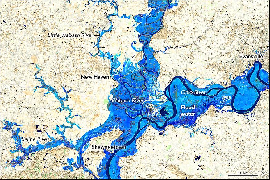
• March 15, 2018: Where the states of Indiana, Illinois, and Kentucky meet, so do the Wabash and Ohio rivers. At this junction, the Ohio picks up water from the Wabash and continues flowing generally southwest until it joins the Mississippi River near Cairo, Illinois. Here, the Ohio River adds a tremendous amount of water to the Mississippi River, making the Ohio River a major source of freshwater that ultimately reaches the Gulf of Mexico. 32)
- The connections in this drainage system, or watershed, is why the heavy rains that spurred flooding in the Midwestern United States in late February 2018 ultimately led to flooding in Louisiana in early March. What happens downriver is largely affected by what happens upriver. The pulse of floodwater on the Ohio helped deliver freshwater and a sediment plume to the Gulf of Mexico.
- The recent flooding at the confluence of the Wabash and Ohio rivers is visible in this image, acquired by OLI (Operational Land Imager) on the Landsat-8 satellite. The image is a composite, showing floodwater on March 3, 2018, combined with an image acquired on November 7, 2017, that shows the typical widths of the rivers. It is false-color (bands 6-5-3) to better distinguish flooded areas (blue) from the surrounding land (tan).
- John Sloan, a watershed scientist at the National Great Rivers Research and Education Center, pointed out that smaller tributaries on the west side of the image have narrower floodplains that become successively larger as the watershed becomes larger. Major rivers, such as the Ohio, have very wide floodplains. This image shows the widespread flooding that can occur in the area around the confluence of major rivers like the Wabash and Ohio rivers.
- Floods can speed up the processes of erosion and sedimentation, increasing the volume and speed of the water flowing through an existing channel. During a flood, water and sediment can spill over a river's natural banks and flow into the adjacent floodplain. In the image of Figure 56, the blue area shows both the river channel and the portion of the floodplain that was flooded in early March.
- As the floodwaters slow and recede, they usually leave most of their sediments behind on the floodplain. Sometimes these add organic matter and fertility to the floodplain. In other cases, land is scoured and thick sand deposits are left behind-for instance, when a levee breaks and water rushes across the floodplain.
- "River flooding is a natural process," said Lois Morton, a professor (emeritus) at Iowa State University. "Floodplains provide important upstream storage, reducing river flows downstream, recharging groundwater supplies, filtering nutrients, and enriching forest and wetland habitats."
- Major flooding most often occurs when heavy, persistent winter rains coincide with snowmelt because the still-frozen ground makes water run off the landscape rather than soaking into the soil. The flood this winter along the Ohio River was the worst in two decades, according to news reports, but not the worst on record.
- "The winter flood of 1937 on the Ohio River was one of the worst to hit the Ohio River Valley, and the Wabash basin was a big contributor," Morton said. Waters rose to "major" flood stage north of the Ohio-Wabash confluence and inundated Evansville, Indiana. They crested well above major flood stage south of the confluence in Shawneetown, Illinois, and destroyed most of the town.
• March 13, 2018: Just over 200 km southwest of Barcelona, Spain's largest river meets the Mediterranean Sea and creates the Ebro Delta. At 350 km2, the delta is the fourth largest on the Mediterranean. It is an important wetland ecosystem and a productive agricultural area. Two large spits flank the delta to the north and south, giving it a distinct shape like a bird in flight. 33)
- The Ebro River drains one-sixth of the Iberian Peninsula (more than 8.5 million hectares) as it makes its way from the Pyrenees and Cantabrian mountains of northern Spain. It winds through the regions of Cantabria, Castile and León, the Basque Country, La Rioja, Navarre, Aragon, and Catalonia, forming portions of those regional boundaries and lending its name to cities and towns throughout. As the Ebro traverses these regions of Spain, it takes pieces of each—sediments, soil, and sand. When the river meets the sea, it loses velocity and deposits its sediment load along the shore, feeding the delta.
- Scientists have estimated that the river first reached the Mediterranean Sea about 13 to 15 million years ago. The peculiar shape of the Ebro Delta reveals that it has had a rich morphologic history, and the delta has experienced tremendous shape-shifting recently.
- Motivated by the complex shoreline, a group of researchers led by Florida State University's Jaap Nienhuis used simple models of river profiles and coastline evolution to understand the delta's development. The authors established that rapid changes to the Ebro Delta began about 2100 years ago, and their results were published in Earth Surface Dynamics.
- "There is a lot of information hidden in that shape complexity that we knew might tell us something about what the delta looked like in the past," Nienhuis said.
- A substantial input of sediments built and shaped the Ebro Delta. Climatic records show that flooding was initially responsible for carrying an abundant amount of river sediments to the coast. But more recent delta growth spurts can be attributed to manmade land-use changes, such as forest clearing and the conversion of land to agricultural fields, which exposed more sediment for runoff into the Ebro River.
- "The Ebro, and many other deltas in the Mediterranean, were some of the first to experience significant human impacts," Nienhuis explains. "Some of the modeling we have done suggests that early land-use changes, like deforestation during the Roman Empire, could have led to its growth. In that sense, we can use the Ebro to learn about coastal response to land-use changes and the longevity of some of these impacts."
- Deltas are categorized into three main groups: river-dominated, tide-dominated, and wave-dominated. Wave-dominated deltas often have a "cuspate" shape, which is created as the sea pushes the river's deposits back towards the shoreline on each side of the main channel. This leads to smooth, curving beaches that extend back to the mainland on both sides. River-dominated deltas are pointy because the river exerts itself into the sea, depositing enough sediment to sustain its river channel and outpacing the ability of waves to push those sediments back to shore. This creates "lobes" of land extending into the sea.
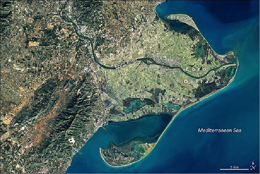
- More than 1,000 years ago, a river-dominated Ebro Delta formed a pointy lobe known as the Riet Vell. Then, around six centuries ago, the river channel changed course (a process called avulsion) and the Riet Vell lobe was abandoned. A new lobe called the Sol de Riu began to form at the mouth of the new river channel. Meanwhile, the abandoned Riet Vell lobe was slowly pushed landward by waves to form a spit at the southern end of the delta. Like a potter working a piece of clay, the constant wave action slowly transported sediments southwest, forming the long curving La Banya spit.
- An avulsion that occurred about 300 years ago moved the river channel yet again, this time abandoning the Sol de Riu lobe, which was in turn worked by waves into the El Fangar spit to the delta's north. It also formed the Mitjorn-Buda lobe that the channel still runs through today. Nienhuis and colleagues speculate that sometime during this period of rapid delta growth, former unnamed spits closed off their protected bays and created the modern Encanyissada, Clot, and Tancada lagoons.
- Humans, who indirectly drove the growth of the delta over the past 2100 years, are today starving the delta. The waters of the Ebro River have been diverted for irrigation, so sediment dynamics have drastically shifted. There are now 187 dams on the river, and most sediments now settle in front of dams instead of reaching the sea. The loss of sediment deposits from the Ebro River means the modern Ebro Delta is now wave-dominated. River damming, combined with sea-level rise and land subsidence, are predicted to take their toll—40 percent of the delta could be submerged by 2100.
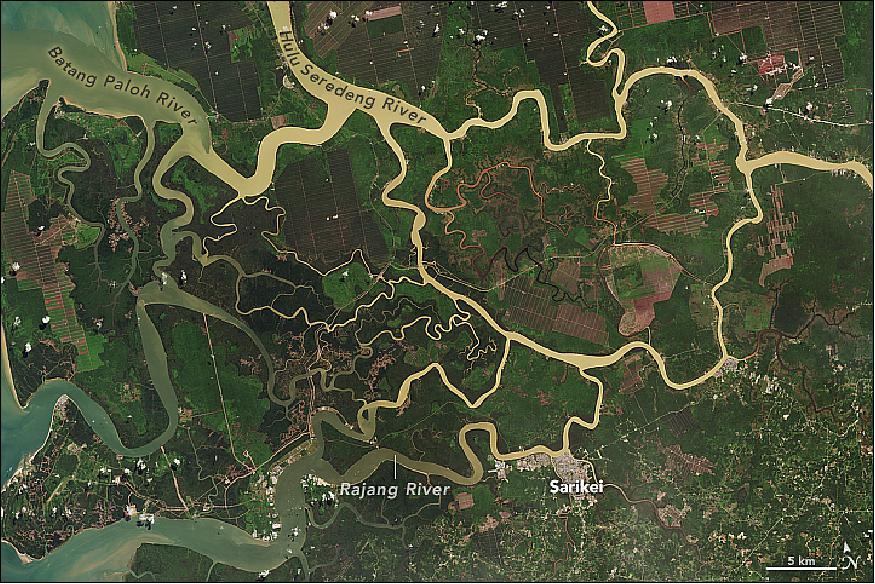
• March 6, 2018: In Sarawak, rivers stem from rivers stemming from even larger rivers. The snake-like nature and sharp turns of these waterways resemble a painting when viewed from space, but the causes of these patterns are rooted in nature. 34)
- On June 16, 2016, the Operational Land Imager (OLI) on the Landsat 8 satellite acquired this image of the Sarawak River Delta on the island of Borneo in East Malaysia (Figure 58). The Rajang River, visible at the bottom of the image, is Malaysia's longest (563 km) and can be navigated from the South China Sea to points far inland.
- The area's unique drainage patterns are most obvious in the top-right quadrant of the image, northeast of Sarikei. Here you can see the Rajang River forking at several sharp T-shaped junctions, heading at times 90 degrees from its previous path, and then turning west and resuming its path toward the sea. According to Robert Gastaldo, a sedimentologist at Colby College, this so called "T-junction splitting" is the result of faults in the Earth's upper crust. The faults cause blocks of land to drop downward, which strongly influences the path that water will take.
- Not all of the rivers pictured here take such sharp turns. According to Gastaldo, the gentle snake-like turns are sculpted by the incoming and outgoing tides, which can be significant in this delta. During a king tide, water can rise and fall by 6 meters within a 12-hour cycle. Tides also influence the shape of a river's mouth. As a tide falls, or "ebbs," seawater rushes seaward. The high speed of that rushing water, combined with the normal seaward flow of river water, sculpts a funnel-shaped mouth. The Batang Paloh is a clear example of this phenomenon, where the mouth is much wider toward the ocean and narrows toward the land.
- You can also see an array of colors in the waters throughout the delta. Light brown "tea-colored" water is caused by humic acids that have leached into the water from the peatlands. (The entire area is blanketed in a layer of thick peat that has been accumulating since about 7,500 years ago.) Yellow-tinged waters contain a mix of this peat and large amounts of suspended sediment. The gradient in color depends on how much sediment remains suspended in the water as it approaches the coast.
- "In the 1960s, the Rajang River flowed clear with a tinge of light-brown tea water," Gastaldo said. "Once logging commenced, the high amount of rainfall in this part of the island could more easily erode the soils, significantly increasing the suspension load."
• February 24, 2018: As recently as 2010, only 3 percent of Cambodia's domestically generated electricity came from hydropower. By 2016, hydropower was the source of 60 percent of it. 35)
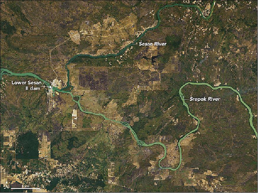
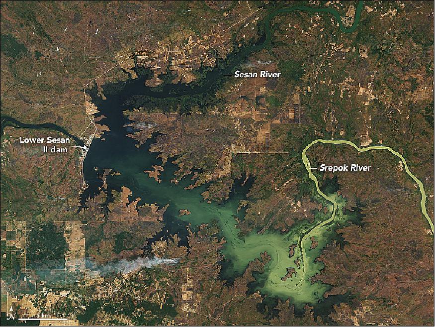
- The completion of the Lower Sesan II dam in Stung Treng province will give hydropower yet another boost. At full capacity, the $800 million project is designed to generate 400 MW of electricity, making it the biggest hydropower station in the country. Water levels began to rise in September 2017, when the dam's floodgates were closed. In November 2017, the first turbine began to generate power. By October 2018, all eight turbines are expected to be operating.
- OLI (Operational Land Imager) on the Landsat-8 satellite captured these before and after natural-color images of the dam and reservoir. They were built near the confluence of the Sesan River (Tonlé San in Cambodian) and Srepok River, both tributaries of the Mekong River. The image of Figure 59 was acquired on February 14, 2017; Figure 60 shows the same area on February 1, 2018. The brown and light green areas in the first image, particularly those with straight edges, were likely cleared recently for timber; some of the smaller tan areas were crop fields near villages. Densely forested areas are green.
- In a country where only 50 % of rural communities have access to the electrical grid, the boost in generating capacity will help with a government-led effort to bring electricity to all Cambodians by 2022. The project is also expected to reduce the cost of electricity.
- However, the dam and its 75 km2 reservoir will also have significant impacts on communities near the river. Though some communities have resisted moving, rising waters have forced thousands of people to leave their villages. Scientists have cautioned that the Mekong Basin could see a 9% drop in the availability of fish.
- The dam is likely a harbinger of things to come. Plans are ongoing to add several more dams along the Mekong River and its tributaries, including two on the Mekong River that would dwarf this one. The Stung Treng dam would generate 900 MW and the Sambor Dam would generate 2,600 MW.
• February 15, 2018: Several hundred years ago, pre-Inca and Inca civilizations grew corn, potatoes, beans, quinoa, and squash on raised beds in the verdant Cayambe Valley. Now greenhouses dominate this landscape, and most of them are filled with roses and other cut flowers that will be harvested, packed, and shipped to the United States. Located in Ecuador's Northern Highlands, the Cayambe Valley has one of the highest densities of greenhouses for rose production in the world, said Gregory Knapp, a geographer at the University of Texas at Austin and a scholar of Ecuador's booming cut flower industry. 36)
- OLI (Operational Land Imager) on Landsat-8 collected these natural-color images of the valley on September 20, 2017. The image of Figure 61 is a detail nadir view of Figure 62, with Cayambe, a town of 40,000 people. Figure 62 features also three inactive volcanoes, lying to the north, including Imbabura (4,630 m). Bands of cloud forests (dark green) ring the lower slopes of the volcanoes.
- Ecuador exports nearly $1 billion (U.S.) in cut flowers each year; the main product is roses, though baby's breath, carnations, and chrysanthemums are also grown. About one-third of the roses that Americans exchange on Valentine's Day come from Ecuador; almost all of the rest arrive from Colombia. Cayambe's rise as an epicenter of rose production mirrors the growth of Ecuador's cut flower industry. In the mid-1980s, Landsat imagery shows very few greenhouses in Cayambe. By 2000, they had sprung up on the outskirts of the town. By 2017, they were ubiquitous. The greenhouses make it possible for rose growers to precisely control temperature and humidity to minimize diseases and pests.
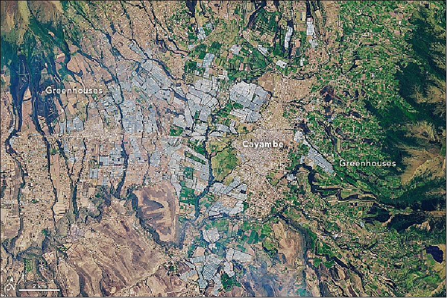
- The valley's location along the equator makes it ideal for growing roses, which benefit from bright light, the roughly equal length of days year round, and the minimal variations in daily and seasonal temperatures. At an elevation of roughly 2,800 m, roses also grow slower than they would if grown at lower elevations, leading to larger blooms and more sugar in the stems (which extends shelf life).
- Wetlands and irrigation systems provide easy access to water; some of the water supply systems date to pre-Columbian times. The valley's fertile volcanic soils are another plus, though the location at the foot of an active volcano comes with the risk of ash falls and destructive mudflows known as lahars.
- "There are certainly questions and concerns about the environmental and health impacts of the pesticides used and the treatment of greenhouse workers (in particular women), but the explosive growth of Cayambe's flower industry—which nobody expected—has had undeniable benefits," said Knapp. "It has created a huge number of jobs in the area and turned Cayambe into a prosperous place."
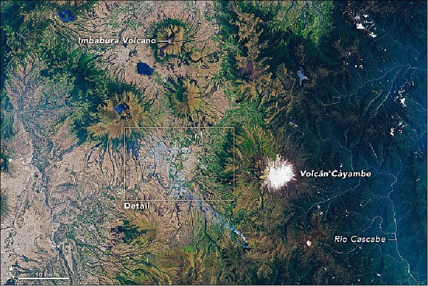
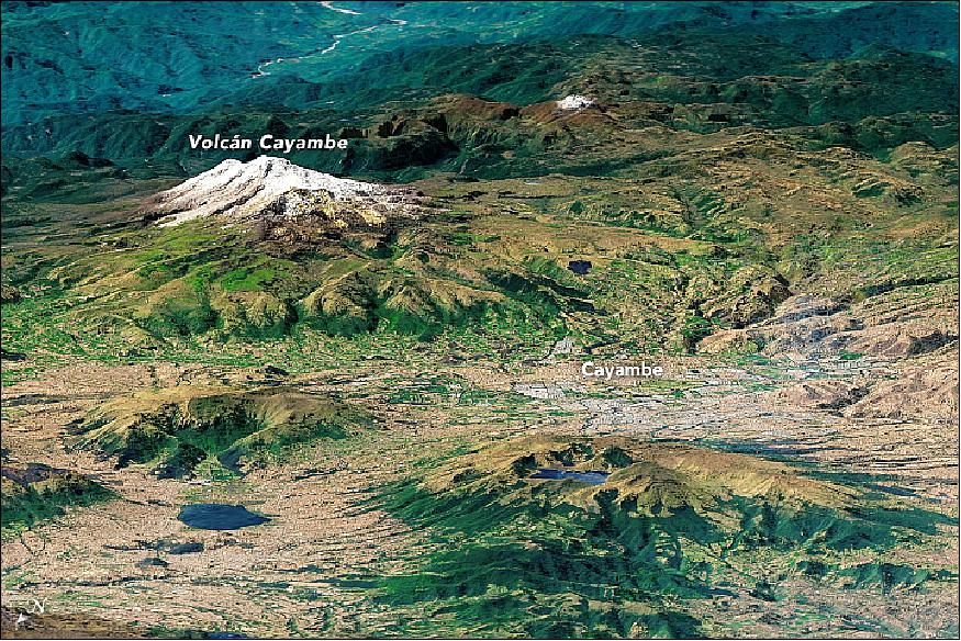
• In its five years in space as of 11 February 2018, the Landsat-8 Earth-observing satellite has racked up some impressive statistics: 26,500 orbits around the planet, 1.1 million "scenes" captured, a motherlode of images that represents 16 percent of all the observations in the 45-year Landsat archive. 37)
- But more impressive and important than any set of numbers, Landsat-8 — which makes global measurements of Earth's land surface — strengthened the program's role as a cornerstone among the growing number of government and commercial programs that capture imagery of Earth from space.
- Landsat-8's global coverage and faster data acquisition rates are enabling significant research and opening up new ways in which scientists, businesses, and resource managers can use the data – including water quality mapping, near-realtime ice velocity detection, and improved tracking of crop health and how much water crops use.
- "I am thrilled by the performance of Landsat 8," said NASA Landsat 8 Project Scientist Jim Irons. "And even more so by the adoption of the data by so many people for important, consequential research and applications."
- The Landsat program is a collaboration between NASA and the USGS (U.S. Geological Survey). NASA oversees the design, build, and launch; USGS takes over operations once satellites are in orbit, and manages the expanding data archive. Landsat 8 is the latest success in this nearly 50 year partnership.
- "If we look back over the five years, have we hit our mark?" said Tom Loveland, Chief Scientist at USGS' EROS (Earth Resources and Observation Science) center. "My answer would be that to date, almost all capabilities that we rely on for Landsat-8 are working superbly."
- Landsat-8, which before launch was called LDCM (Landsat Data Continuity Mission), launched into orbit on Feb. 11, 2013. Once it became operational and was renamed Landsat-8, the satellite continued a streak of engineering and science success unmatched in spaceflight: the succession of Landsat satellites has now made 45-plus years of continuous observations of Earth's surface, without any gaps.
- The length of this record is what makes Landsat a "cornerstone" program in the growing field of land imaging. For scientists that want to compare new imagery or data to previous decades, the unbroken Landsat record offers the one, consistent reference point. This role is furthered by USGS's and NASA's commitment to keeping the entire Landsat data archive free and accessible to scientists and the public. Landsat-9 is targeting a launch in 2020 and will continue that role.
- At a time when more commercial imagers are operating, "Landsat-9 will launch into this mix and continue to provide the stability and reliability necessary to systematically study Earth surface dynamics," Irons said.
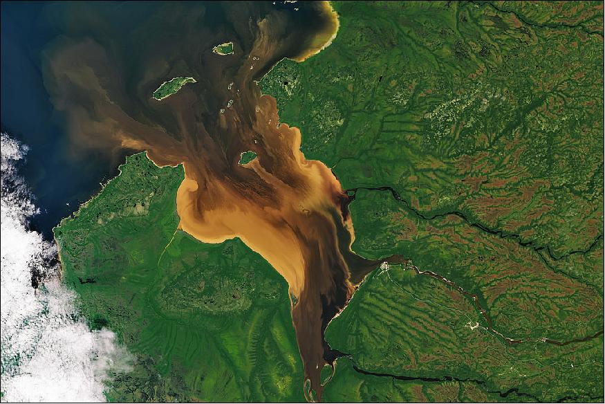
Legend to Figure 64: When OLI on Landsat-8 captured this image of Rupert Bay on July 30, 2016, tannin-stained (dark brown) river water was flowing into the bay at the same time that turbid seawater appeared to be pushing in due to the rising tide. The shallowness of the bay, some suspended mud and sediment kicked up by the tide, and mixing of the stained river water and sea water likely gave the sea water a light brown appearance. Note that the colored plumes and intricate vortices around the islands are pointing inland—an indicator that the tide was likely coming in or that northwesterly winds were affecting the flow of the water. The lowermost image shows a detailed view of von Kármán vortices formed as water flowed past a small island in the bay.
- Landsat-8 benefits from evolutionary technological advances over its predecessors. Landsat- 8's OLI (Operational Land Imager ) collects data in two new spectral bands: a deep blue (coastal/aerosol) band and a cirrus cloud detection band. Both of Landsat-8's science instruments, OLI and TIRS (Thermal Infrared Sensor), can outperform their predecessors' measurement sensitivity due to an improved SNR (Signal-to-Noise Ratio).
- These improvements have been integral to the work of water quality managers who can now use Landsat-8 to map water quality indicators in coastal and inland waters. "We can now pull out detailed maps of water constituents, including chlorophyll, dissolved organic matter, and suspended sediment," says Jeff Masek, the Landsat-9 Project Scientist.
- Landsat-8 has also made mapping the movement of glaciers, ice sheets, and sea ice easier. This in turn has led to the near-realtime global monitoring of glaciers, detailed Antarctic ice sheet velocity maps, and new Antarctic rock outcrop maps, all of which combine to give a better understanding of cryospheric processes.
- Landsat-8 also detects more subtle changes in vegetation health and can help make meaningful measurements of biophysical variables that land managers track, like leaf-area index. And with the launch of the European Space Agency's Sentinel-2 satellites, scientists are now "harmonizing" imagery from multiple missions to observe changes to vegetation on seasonal timescales.
- This five-year launch anniversary also marks an engineering milestone. Landsat-8 was built with a five-year design life. Most missions that survive their first few months on orbit tend to last much longer than their stated design life. Given that Landsat-8 instruments have few moving parts and the OLI instrument in particular has significant redundancy, scientists and engineers think Landsat-8 will continue operating for years to come. "I expect Landsat 8 to last well beyond its design life and continue operations deep into the next decade," Irons said.
- The first three Landsats were built with one-year design lives but the operational life exceeded that by at least four years for all of them. Landsats-4 and -5 were built with three-year design lives, but operated well beyond that – Landsat-5 operated for nearly 29 years (a feat for the record books). And Landsat-7, launched in 1999, was built with a five-year design life and is now in its 19th year of operation, albeit with some degradation.
- Landsat-8's data quality and collection pace add significantly to the Landsat data record. The combined Landsat archive with its depth, quality, and open access has exposed new avenues to better understanding our planet, and this record will continue into the future.
• February 7, 2018: The Cotahuasi Canyon in Peru stands as a potent reminder of the tremendous erosive power of water and ice. Cutting through a towering plateau—a product of repeated volcanic eruptions and tectonic uplift—the canyon is one of the deepest in the world. 38)
- Cotahuasi formed over the course of several million years as rivers and glaciers chiseled into the plateau. The relief from the canyon floor to the rim ranges from 2.5 to 3.5 km (1.5 to 2.2 miles), making Cotahuasi Canyon about twice as deep as the Grand Canyon.
- Evidence of volcanic activity surrounds the canyon. To the south, snow-capped Solimana (Figure 65), an inactive stratovolcano that last erupted about 500,000 years ago, soars above the plateau. Colorful yellow and orange volcanic deposits are visible around the north rim of the canyon.
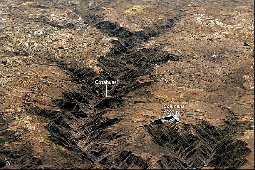
- The image of Figure 66 underscores the stark transitions in environmental conditions and vertical ecology of the canyon. The base (elevation 1200–2300 meters) is a warm, lowland zone where fruits, especially grapes, are widely grown. Higher up (2300–3600 meters), the dominant crop is maize. Farmers also raise more traditional crops such as kiwicha, quinoa, and tarwi. Potatoes and other tuber crops are grown in the cooler, upland areas (3600–4000 meters). Not much can be grown in the arid, cold climate (4000–5000 meters) at the top of the plateau, but farmers use the land to raise alpacas, llamas, sheep, and cattle.
- The canyon is so remote—it's a 12-hour bus ride to Arequipa—that relatively few outsiders make it there. Archaeologists and geologists occasionally visit to catalog Incan and pre-Incan archaeological sites or to piece together the geological history of the area. Some adventurous travelers come to the canyon to raft and hike, but the Cotahuasi River's many rapids are known for being extremely dangerous.
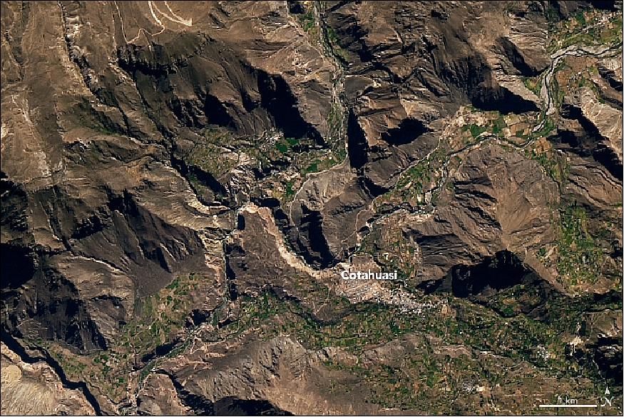
• February 3, 2018: It is one of Central America's most active volcanos. Volcán de Fuego puffs continuously without notice by nearby communities, punctuated by episodes with explosive activity, huge ash plumes, and lava flows. 39)
- The Guatemalan volcano is at it again, beginning its latest bout of unruly behavior on January 31, 2018. On the next day,OLI (Operational Land Imager) on Landsat-8 captured these natural-color images of the eruption. Ash in a volcanic plume typically appears brown or gray, while steam appears white. You can see a wider view of the volcano here. Fuego is located about 70 km (40 miles) west of Guatemala City.
- According to CNRED (Coordinadora Nacional para la Reducción de Desastres), the plume reached an altitude of 6,500 m above sea level and was carried 40 km to the west and southwest by the winds. Falling ash affected tens of thousands of people, primarily in the provinces of Escuintla and Chimaltenango. Lava from two active conduits flowed through four ravines, leading officials to preemptively close National Route 14 to vehicles.
- In addition to ash, the plume contains gaseous components invisible to the human eye, including sulfur dioxide SO2. The gas can affect human health—irritating the nose and throat when breathed in—and reacts with water vapor to produce acid rain. It also can react in the atmosphere to form aerosol particles, which can contribute to outbreaks of haze and influence the climate.
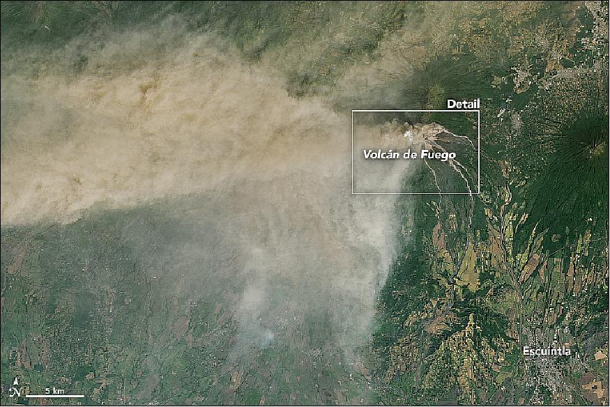
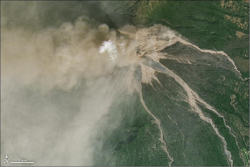
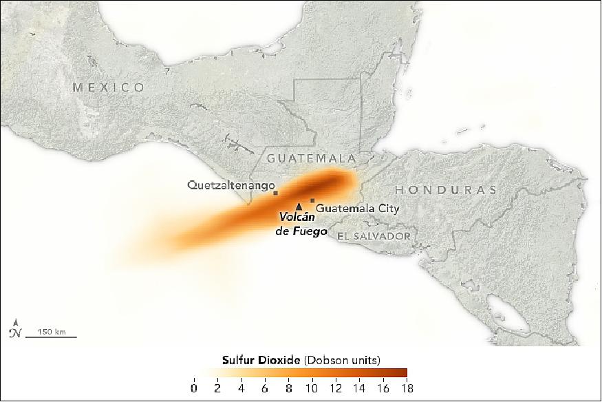
• January 30, 2018: Cape Town—a cosmopolitan city of 3.7 million people on South Africa's western coast—is on the verge of running out of water. According to the city's mayor, if current consumption patterns continue then drinking water taps will be turned off in April and people will have to start procuring water from one of 200 collection points throughout the city. 40)
- With key reservoirs standing at precariously low levels, the city forecasts that this so-called Day Zero will happen on April 12, 2018, though the exact date will depend on the weather and on consumption patterns in the coming months. The rainy season normally runs from May to September.
- Cape Town's six major reservoirs can collectively store 898 x 106 m3 of water, but they held just 26 percent of that amount as of January 29, 2018. Theewaterskloof Dam—the largest reservoir and the source of roughly half of the city's water—is in the worst condition, with the water level at just 13 percent of capacity.
- In practical terms, the amount of available water is even less than this number suggests because the last 10 percent of water in a reservoir is difficult to use. According to Cape Town's disaster plan, Day Zero will happen when the system's stored water drops to 13.5 percent of capacity. At that point, the water that remains will go to hospitals and certain settlements that rely on communal taps. Most people in the city will be left without tap water for drinking, bathing, or other uses.
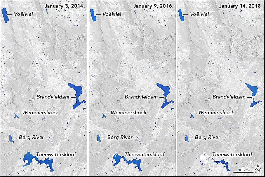
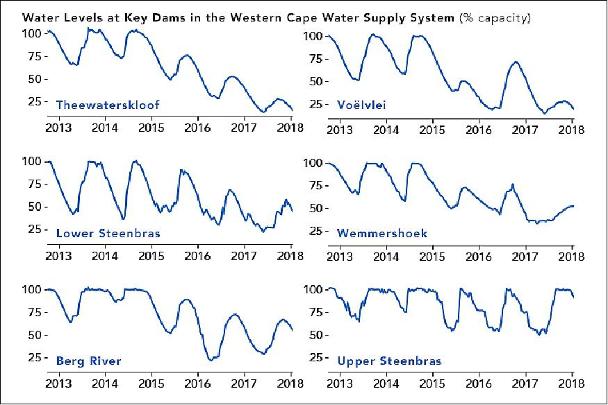
- Piotr Wolski, a hydrologist at the Climate Systems Analysis Group at the University of Cape Town, has analyzed rainfall records dating back to 1923 to get a sense of the severity of the current drought compared to historical norms. His conclusion is that back-to-back years of such weak rainfall (like 2016-17) typically happens about once just every 1,000 years.
- Population growth and a lack of new infrastructure has exacerbated the current water shortage. Between 1995 and 2018, the Cape Town's population swelled by roughly 80 percent. During the same period, dam storage increased by just 15 percent.
- The city did recently accelerate development of a plan to increase capacity at Voëlvlei Dam by diverting winter rainfall from the Berg River. The project had been scheduled for completion in 2024, but planners are now targeting 2019. The city is also working to build a series of desalination plants and to drill new groundwater wells that could produce additional water.
- In the meantime, Cape Town authorities have put tight restrictions on residential water usage. New guidelines ban all use of drinking water for non-essential purposes, while urging people to use less than 50 liters (13 gallons) of water per person per day.
• January 12, 2018: First there was fire. Then rain. And now deadly debris flows are devastating Montecito, California. More than a dozen people are missing or dead, and at least 400 homes have been damaged or destroyed by fast-moving floods that swept mud, rocks, and charred wood left exposed by the Thomas fire. 41)
- OLI on Landsat-8 acquired natural-color imagery of Montecito before and after the fire and debris flows. Figure 73 shows the town on January 10, 2018, after mud and debris tore through the town. The image of Figure 74 was captured on November 23, 2017, before the fire. Charred, debris-covered areas appear brown; unburned vegetation is green. Trails of mud and debris are visible along streams well south of the burn scar.
- Recent fire activity tends to make flash floods, debris flows, and mudflows much more likely. Plants and trees have numerous protective chemicals with which they coat their leaves to prevent water loss. Many of these substances are similar to wax. Vaporized by the heat from fires, these substances disperse into the air and then congeal over the soil surface when the fire begins to cool. Like the wax on your car, they coat the soil, causing water to bead up and run off quickly. The problem is especially pronounced for intense and long-lived blazes such as the Thomas fire.
- Another key factor that made this event so dangerous was the rate at which the rain fell. While the total rainfall was not that exceptional, unusually intense rain fell in and near the burn scar at the beginning of the storm. In just five minutes, 13 mm (0.54 inches) of rain fell in Montecito. Nearby Carpinteria received 22 mm (0.86 inches) within 15 minutes. According to the U.S. Geological Survey, any storm that has rainfall intensities greater than about 10 mm (0.4 inches) per hour poses the risk of producing debris flows. In Southern California, as little as 7 mm (0.3 inches) of rainfall in 30 minutes has triggered debris flows.
1) "The Tallest Point in Niger," NASA Earth Observatory, Image of the day for22 December 2018, URL: https://earthobservatory.nasa.gov/images/144422/the-tallest-point-in-niger
2) "More Glaciers in East Antarctica Are Waking Up," NASA Earth Observatory, Image of the day for 11 December 2018, URL: https://earthobservatory.nasa.gov/images/144361/more-glaciers-in-east-antarctica-are-waking-up?src=eoa-iotd
3) "Volcanic Plateaus in Argentina," NASA Earth Observatory, Image of the day for 27 November 2018, URL: https://earthobservatory.nasa.gov/images/144304/volcanic-plateaus-in-argentina
4) "Watching a Glacier Die," NASA Earth Observatory, Image of the day for 26 November 2018, URL: https://earthobservatory.nasa.gov/images/144272/watching-a-glacier-die
5) "Orbit Logic Delivers Landsat Mission Planning System," Orbit Logic Press Release, 6 November 2018:, URL: [web source no longer available]
6) "Rainy October Soaks Texas," NASA Earth Observatory, Image of the day for 5 November 2018, URL: https://earthobservatory.nasa.gov/images/144195/rainy-october-soaks-texas
7) "Monitoring Outflow and Algae," NASA Earth Observatory, 30 October 2018, URL: https://earthobservatory.nasa.gov/images/144156/monitoring-outflow-and-algae?src=eoa-iotd
8) Rebecca C. Trinh, Cédric G. Fichot, Michelle M. Gierach, Benjamin Holt, Nabin K. Malakar, Glynn Hulley, Jayme Smith, "Application of Landsat 8 for Monitoring Impacts of Wastewater Discharge on Coastal Water Quality," Frontiers in Marine Science, 26 October 2017, https://doi.org/10.3389/fmars.2017.00329, URL: https://tinyurl.com/yaqnwglr
9) "The Geologic Wonder of the Neuquén Basin," NASA Earth Observatory, Image of the day for 19 October 2018, URL: https://earthobservatory.nasa.gov/images/92908/the-geologic-wonder-of-the-neuquen-basin
10) "Glacier Flour in Greenland Skies," NASA Earth Observatory, Image of the day for 17 October 2018, URL: https://earthobservatory.nasa.gov/images/92891/glacier-flour-in-greenland-skies
11) "Devastation in Palu After Earthquake, Tsunami," NASA Earth Observatory, Image of the day for 3 October 2018, URL: https://earthobservatory.nasa.gov/images/92836/devastation-in-palu-after-earthquake-tsunami
12) "Urban Growth of New Delhi," NASA Earth Observatory, image of the day for 27 September 2018, URL: https://earthobservatory.nasa.gov/images/92813/urban-growth-of-new-delhi
13) "Volcanic Hell Makes for Bathing Heaven," NASA Earth Observatory, Image of the day for 26 September 2018, URL: https://earthobservatory.nasa.gov/images/92802/volcanic-hell-makes-for-bathing-heaven
14) "Between the Ripples of the Namib Sand Sea," NASA Earth Observatory, Image of the day for 4 September 2018, URL: https://earthobservatory.nasa.gov/images/92695/between-the-ripples-of-the-namib-sand-sea?src=eoa-iotd
15) "Vredefort Crater," NASA Earth Observatory, Image of the day for1 September 2018, URL: https://earthobservatory.nasa.gov/images/92689/vredefort-crater
16) "Meandering Bends of the Lower Padma River," NASA Earth Observatory, Image of the day for 28 August 2018, URL: https://earthobservatory.nasa.gov/images/92672/meandering-bends-of-the-lower-padma-river
17) "Archaeology from Afar in Uzbekistan," NASA Earth Observatory, Image of the day for 21 August 2018, URL: https://earthobservatory.nasa.gov/images/92634/archaeology-from-afar-in-uzbekistan
18) "Cape Town's Reservoirs Rebound," NASA Earth Observatory, 17 July 2018, URL: https://earthobservatory.nasa.gov/images/92428/cape-towns-reservoirs-rebound
19) "One Year Adrift, but Not Far," NASA Earth observatory, 16 July 2018, URL: https://earthobservatory.nasa.gov/images/92420/one-year-adrift-but-not-far?src=eoa-iotd
20) "Satellites Investigate Irrigation in a Stressed Aquifer," NASA Earth Observatory, 9 July 2018, URL: https://earthobservatory.nasa.gov/images/92387?src=eoa-iotd
21) "Volcanic Mood Rings," NASA Earth Observatory, 6 July 2018, URL: https://earthobservatory.nasa.gov/images/92377/volcanic-mood-rings
22) "The Meandering Estuaries of Guinea–Bissau," NASA Earth Observatory, 18 June 2018, URL: https://earthobservatory.nasa.gov/IOTD/view.php?id=92266
23) "Lava Consumes Vacationland and Kapoho Bay," NASA Earth Observatory, 13 June 2018, URL: https://earthobservatory.nasa.gov/IOTD/view.php?id=92287
24) "Flower Power in the Netherlands," NASA Earth Observatory, 16 May 2018, URL: https://earthobservatory.nasa.gov/IOTD/view.php?id=92148
25) "Deforestation in Paraguay," NASA Earth Observatory, 1 May 2018, URL: https://earthobservatory.nasa.gov/IOTD/view.php?id=92078
26) "Beauty in the Beaufort Ice Pack," NASA Earth Observatory, 30 April 2018, URL: https://earthobservatory.nasa.gov/IOTD/view.php?id=92067&src=iotdrss
27) "A Ring of Green Around Surgut," NASA Earth Observatory, 25 April 2018, URL: https://earthobservatory.nasa.gov/IOTD/view.php?id=92049
28) "Coloring Lake Pontchartrain," NASA Earth Observatory, 11 April 2018, URL: https://earthobservatory.nasa.gov/IOTD/view.php?id=91977
29) "Decline of Two Glaciers in Northwest Greenland," NASA Earth Observatory, 8 April 2018, URL: https://earthobservatory.nasa.gov/IOTD/view.php?id=91956&src=iotdrss
30) "Sculpting a Basin," NASA Earth Observatory, 5 April 2018, URL: https://earthobservatory.nasa.gov/IOTD/view.php?id=91944
31) "Nikumaroro Atoll," NASA Earth Observatory, 26 March 2018, URL: https://earthobservatory.nasa.gov/IOTD/view.php?id=91889&src=iotdrss
32) "Floodwaters at the Confluence of the Wabash and Ohio Rivers," NASA Earth Observatory, 15 March 2018, URL: https://earthobservatory.nasa.gov/IOTD/view.php?id=91839
33) "The Sculpting of Ebro Delta," NASA Earth Observatory, 13 March 2018, URL: https://earthobservatory.nasa.gov/IOTD/view.php?id=91832
34) "Sarawak's Rajang River Delta," NASA Earth Observatory, 6 March 2018, URL: https://earthobservatory.nasa.gov/IOTD/view.php?id=91787
35) "A New Reservoir in Cambodia," NASA Earth Observatory, 24 Feb. 2018, URL: https://earthobservatory.nasa.gov/IOTD/view.php?id=91761
36) "Greenhouses of Cayambe Valley," NASA Earth Observatory, 15 Feb. 2018, URL: https://earthobservatory.nasa.gov/IOTD/view.php?id=91720&src=iotdrss
37) Patrick Lynch and Laura Rocchio , "Landsat 8 Marks Five Years in Orbit," NASA, 9 Feb. 2018, URL: [web source no longer available]
38) "The Dizzying Depths of Cotahuasi Canyon," NASA Earth Observatory, 7 Feb. 2018, URL: https://earthobservatory.nasa.gov/IOTD/view.php?id=91686&src=iotdrss
39) "Fuego Erupts," NASA Earth Observatory, 3 Feb. 2018, URL: https://earthobservatory.nasa.gov/IOTD/view.php?id=91671&src=iotdrss
40) "Cape Town's Water is Running Out," NASA Earth Observatory, 30 Jan. 2018, URL: https://earthobservatory.nasa.gov/IOTD/view.php?id=91649&src=iotdrss
41) "Deadly Debris Flows in Montecito," NASA Earth Observatory, 12 Jan. 2018, URL: https://earthobservatory.nasa.gov/IOTD/view.php?id=91573