Landsat-8 - 2020
Landsat-8 Imagery in the period 2020
• December 30, 2020: The Caspian Sea is the world’s largest landlocked body of water. Stretching 1,200 km (750 miles) from north to south, it intersects five countries in Asia and Europe. The lake passes through several geological landscapes, creating a beautiful array of visual textures. 1)
The first inset (top-left) shows ice forming around the edges of the lake. In the winter, ice typically forms in the north, while central and southern areas remain ice free. The contrast is a result of differences in water depth and salinity. In the north, the lake is shallower and fresher than the south. Freshwater freezes at a slightly warmer temperature than salt water, allowing the ice to form more readily once the temperatures start to drop. The shallower depth also allows water to cool more quickly through the water column.
The second and third images (top row) depict areas around Dead Kultuk Bay. Since the 1990s, water levels in the Caspian Sea have risen and obscured the bay’s coastlines. As a result, water now reaches farther into the bay and creates waterlogged marshes. The surrounding area also contains oil fields.
The fourth image (bottom-left) shows the Buzachi Peninsula, south of Dead Kultuk. The peninsula is a low-lying desert environment, with some areas 30 meters (100 feet) below sea level. The northern part of the peninsula contains many salt marshes and salt lakes. The area has also become a popular site for oil and gas drilling.
The fifth image (bottom center) shows part of the Mangyshlak Peninsula, which is also very dry, low in elevation, and contains little vegetation. It is mostly uninhabited desert, but it includes Mount Otpan-tau, the highest point in Mangystau province at 530 meters (1,700 feet) above sea level. Today, a historical and spiritual complex sits atop the mountain. Legend holds that in the past, fire was lit at the peak to warn locals about a potential attack or danger.
The sixth image (bottom right) shows green swirls in the Caspian Sea, which contrasts with the lake’s typically bluer waters. The swirls could be phytoplankton blooms, which occur in the Caspian Sea when there is adequate sunlight and nutrients. The blooms are usually harmless and can be an important food source for marine life.
• December 29, 2020: Roughly 70 million years ago, the land that is now Washington County, Georgia, was covered by a shallow tropical sea with a chain of young mountains nearby. As erosion wore away at the mountains over tens of millions of years, large deposits of mineral-rich silt accumulated in deltas, bays, and estuaries along the ancient coastline. 2)
- The process left behind deposits of a silica- and aluminum-rich mineral clay called kaolin in a narrow band along the coastline, which is marked today by the “fall line” that runs diagonally across Georgia and divides the hilly piedmont region from the flatter coastal plain. The soft white rock is widely used in the production of glossy papers, ceramics, bricks, cosmetics, paint, and many other products.
- While kaolin deposits are present in several places in Georgia and other southeastern states, few areas have deposits that are as pure, white, and easily mined as those in Washington County. According to the U.S. Geological Survey, Georgia mines $1 billion worth of the clay every year, more than any other state.
- Kaolin mining has a long history in the U.S. Southeast. Before Europeans arrived, the Cherokee people used the white clay in their homes and in pottery. As early as 1767, an English potter negotiated a deal with the Cherokee Nation to ship five tons of Georgia clay back to the Wedgewood, a pottery company in England, for use in porcelain. Still, it was not until the 1950s that companies set up large-scale mines and processing facilities similar to those in this image.
- Kaolin has had a particularly strong impact on the town of Sandersville, which brands itself as the “kaolin capital of the world.” Each October, the town hosts a festival that includes a parade of heavy mining machinery, kaolin mine tours, and a beauty pageant that crowns Miss Kaolin. There is even a long-running tradition of locals eating kaolin, particularly women during pregnancy.
• December 26, 2020: If you accidentally stumbled upon the town of Huacachina, you might think it is a mirage. Huacachina is centered around a lagoon lined with lush vegetation—all located in the driest desert in the world. Snuggled between the biggest sand dunes in South America, it is the only natural oasis on the continent. 3)
- Roughly translating to “weeping woman” in Quechua, Huacachina has several mythological origin stories. One legend says a beautiful Incan princess named Huacachina was mourning the loss of her lover, and her tears created the lagoon. One day, a warrior saw her and startled the princess, who ran into the water to hide for hours. When she tried to leave, she had transformed into a mermaid. Another version says the princess was holding a mirror and admiring herself when the warrior saw her. When she ran away startled, the mirror fell and shattered. The glass became the tiny pool in the desert and consumed the princess, turning her into a mermaid. Many legends say Huacachina still lives in the pool and comes out at night to tempt swimmers.
- The oasis is actually formed by water from underground aquifers that seeps through the sand and helps promote the growth of palm trees, eucalyptus, and carob trees around the pool. The lagoon, which only covers about 2 acres, is encircled by businesses, hotels, and restaurants on its rim. The oasis town has a population of around 100 year-round residents. In recent years, water levels in the lagoon have decreased due to the drilling of nearby wells and increased evaporation during the hot summers. Consequently, the town has been feeding water into the lagoon from outside sources.
- Located about a five-hour bus ride from Lima, Huacachina has served as a popular tourist destination for more than 70 years. The town entertained many of Peru’s financial elite in the 1940s, and today entertains tens of thousands of tourists per year. Once called the “oasis of America,” Huacachina was featured on the 50 Nueva Sol currency note until 2006.
- The soaring sand dunes beyond the oasis rise several hundred feet in elevation—as tall as small mountains. They provide excellent sandboarding adventures: Adrenaline junkies can slide down the dunes like tubers or snowboarders. Visitors can also ride dune buggies across the dunes or hike, although the sand makes hiking strenuous.
• December 19, 2020: The Sea of Galilee in northern Israel—one of the lowest-lying bodies of water in the world—has long been a source of religious inspiration and intrigue. It was along the shores of the shallow freshwater lake where the Christian gospels say Jesus performed some of his ministry and certain miracles. Jewish settlers established the first kibbutz nearby. And it appears in certain Islamic prophesies. 4)
- Some underground springs drain into the lake, but most of its water arrives through the Jordan River, which flows from Lebanon in the north to Israel and Jordan in the south. The Sea of Galilee (sometimes called Lake Tiberias or Lake Kinneret) lies within the Jordan Rift Valley, a narrow depression that began forming tens of millions of years ago as the Arabian plate tore away from Africa. Many of the marshy floodplains around the lake and to the south have been converted into farmland, which appears bright green.
- The Sea of Galilee has long been a popular destination for pilgrims. Yet the condition of the lake has grown increasingly tenuous in recent decades. Water levels dropped significantly during the past two decades, nearly hitting an all-time low in 2018. Less water causes the lake to become saltier, making it less viable as a source of drinking water. Such changes also threaten fish populations and encourage problematic algae blooms.
- The Sea of Galilee has long been a popular destination for pilgrims. Yet the condition of the lake has grown increasingly tenuous in recent decades. Water levels dropped significantly during the past two decades, nearly hitting an all-time low in 2018. Less water causes the lake to become saltier, making it less viable as a source of drinking water. Such changes also threaten fish populations and encourage problematic algae blooms.
- Understanding those declining water levels and finding ways to keep them stable is a topic of much research in the region. Explanations for the decline include a lack of rain, increased water usage upstream in Lebanon, rising temperatures (which increase evaporation), and the expansion of farmland and irrigation around the lake. One research team recently investigated all of these possibilities by analyzing meteorological data, information from stream gauges, and Landsat satellite observations to estimate farmland extent. They found the expansion of agriculture and diversions for water use in Israel over the past two decades to be the best explanation for the decline.
- Recent years have been better, as two wet winters have helped the lake rebound considerably. The water level stood at 209.9 meters (688.6 feet) on December 16, 2020, high enough that hydrologists consider it nearly full. The last time it reached such heights was nearly two decades ago. Israel’s water authority has considered opening a dam at the southern end of the lake to prevent flooding, according to The Jerusalem Post.
• December 8, 2020: Svalbard, an archipelago between mainland Norway and the North Pole, is known as something of a mecca for geologists. It is one of the few places in the world that has easily accessible rocks from nearly every geological time period. There is little soil or vegetation to cover up the remarkable geologic diversity. And despite the Arctic location, ocean currents moderate the weather enough to keep much of the land clear of snow in the summer. 5)
- The red color is due to an abundance of sediment that has sloughed off from a particularly iron-rich layer of rock that formed roughly 400 million years ago (during the Devonian Period). Sometimes called the Old Red Sandstone, the rock layer formed on land when sand and other sediments were trapped in a basin enclosed by series of mountain ranges. The mountain ranges emerged when several of the world’s land masses were smashed together in a supercontinent called Laurussia, sometimes called the Old Red Continent.
- “The red Devonian rock is fairly soft and erodes easily,” explained University of Edinburgh geologist Geoffrey Boulton. “Glacial grinding produces a great deal of silt. These very small—and in this case red—particles are easily suspended in flowing meltwater and take a long time to settle in still water.”
- The silty meltwater pooled first in a shallow lake that had formed behind Holmström’s push moraine—a dam-like pile of sediment bulldozed by the front of the glacier when it surged about a century ago. Since then, a drainage stream has carved a narrow channel through the folded sediments of the moraine. The stream eventually widens and meanders some as it moves through mud flats as it approaches the sea. “When the silty water reaches seawater in Ekmanfjorden, it stays at the surface because the freshwater has a lower density than saltwater,” explained Boulton.
• December 2, 2020: Within an expanse of boreal forest in northwestern Alaska, two treeless stretches of sand stand out—the Great Kobuk Sand Dunes. With crests that rise as high as 100 feet (30 meters) above the surrounding forests, the dunes look like they belong in the Saharan Desert more than in the Arctic. 6)
- The dunes owe their existence to glacial ice. During recent ice age cycles, massive sheets of ice bulldozed mountains and other rocky surfaces in the region, creating an abundance of sand, silt, and loess that collected along the banks of glacial streams. Over time, sediment-laden streams and dust-filled winds deposited much of that material in the ice-free Kobuk Valley, which is sheltered by the Baird Mountains to the north and the Waring Mountains to the south (Figure 11).
- One notable group has made the journey to Kobuk: geologists who study dunes on Mars. Since the Great Kobuk dunes are frozen and crusted with snow and frost for much of the year, they move quite slowly in comparison to dunes in warmer areas. They are akin to sand dunes on Mars, some of which have ice-like layers of frozen carbon dioxide frost during the winter. In fact, scientists from the Southwest Research Institute first discovered that sand dunes on Mars can move by using a satellite-based technique that they initially developed and tested among the Great Kobuk dunes.
• November 28, 2020: Along with the plentiful harvest of crops in North America, one of the gifts of autumn is the gorgeous palette of colors created by the chemical transition and fall of leaves from deciduous trees. It is an aesthetic wonder from the ground, from the mountaintop, and from satellites. 7)
- The region of rolling hills and valleys is part of a geologic formation known as the Valley and Ridge Province that stretches from New York to Alabama. These prominent folds of rock were mostly raised up during several plate tectonic collisions and mountain-building episodes in the Ordovician Period and later in the creation of Pangea—when what is now North America was connected with Africa in a supercontinent. Those events created the long chain of the Appalachians, one of the oldest mountain ranges in the world. The Appalachians once stood as tall at the Rockies and Alps, but hundreds of millions of years of erosion have worn them down.
- The river valleys between and beside these mountains are quite popular with fishermen. Spring Creek is considered one of Pennsylvania’s best trout fisheries and is a popular destination for fly fishing. Fishermans Paradise was the first special regulation area for trout in the United States, and Penn State was the first university in America to offer credited courses in fly fishing.
• November 23, 2020: When he first encountered Lituya Bay in 1786, the French explorer Jean-François de Galaup La Pérouse was intrigued by an odd line in the forests that surrounded the narrow fjord in southeastern Alaska. It was as though the forests “had been cut cleanly with a razor blade,” he noted in his log. 8)
- It was the first clue that the seemingly placid, protected waters of the bay had a more destructive side. Another came when he dispatched three small boats to measure the depth of the water near the entrance of the bay. Despite the weather being calm, two of the three boats capsized after being drawn into roiling tidal currents that had been amplified by the fjord’s narrow shape. Twenty-six men lost their lives, their remains never to be found. It was in their honor that the lone island in the bay was given the name Cenotaph, a Greek word meaning “empty tomb.”
- The name turned out to be all too fitting. In 1899, an earthquake triggered a giant wave that destroyed a native village and drowned 5 people on the island. Another tsunami wave hit in 1936. But it was in 1958 that Lituya Bay’s unpredictable waters reared up in truly apocalyptic fashion. After a 7.8 earthquake throttled the nearby Fairweather Fault, a rockslide sent 90 million tons of rock plunging into the bay—an amount equivalent to 8 million dump truck loads.
- Eyewitness reports describe a chaotic and surreal scene: Intense shaking for several minutes, an explosive boom, and a shattered glacier soaring hundreds of feet into the air. Then a series of giant waves dotted with hunks of ice raced through the bay. One fisherman described his boat being lofted over a forested spit on the crest of one wave and looking down at trees below. The wave obliterated a cabin on Cenotaph island and swept away a lighthouse near the mouth of the bay. One couple that had been fishing when the wave hit were never heard from again.
- The damage line in the forest—geologists call it a trimline—generally extended to an elevation of 700 feet (200 m) around much of the bay. On one ridge opposite the slide, waves splashed up to an elevation of 1,720 feet (524 m)—taller than New York’s Empire State Building. The event at Lituya Bay still stands as one of the tallest tsunami waves known to science. The photo above, taken in 1958 after the tsunami, shows the ring of damage around much of the bay.
- Lituya Bay’s steep walls, the geometry of its seafloor, and the fact that it intersects a fault that is often a source of earthquakes suggests that Lituya Bay will see more tsunamis in the future. After scrutinizing the bay’s geology and history for years, one scientist calculated giant waves happen there once every quarter century—a 1 in 9000 chance on any given day. The threat from the tidal currents that thwarted La Pérouse is more constant. Since the 1958 wave, an average of one fishing boat has been lost at the entrance of the bay per year, reports Philip Fradkin in the book, Wildest Alaska: Journeys of Great Peril in Lituya Bay.
• November 21, 2020: Across most of Earth’s coasts, tides typically vary no more than two meters from high to low. At Broad Sound, though, daily high tide can stand as much as ten meters above the low—the largest tidal swings on the eastern shore of Australia. 9)
- Explorer Matthew Flinders first documented the unusual bay tides in the early 1800s. At new and full Moon, he noted the tide was “not less than thirty, and perhaps reache[d] thirty-five feet” and occurred hours later than expected. Other researchers in the 20th century also observed the bay’s daily tides are six times higher and occurred three hours later than anywhere else on the eastern shore. Peculiar local geography plays a key role in the phenomenon.
- Broad Sound is a large funnel-shaped bay near the southern end of the Great Barrier Reef. It is 50 km (30 miles) long and stretches to about 20 km (12 miles) wide at its greatest extent. The bay contains 48 islands, collectively part of Broad Sound Islands National Park.
- In this image, suspended sediments and phytoplankton trace the water flow into the bay, around islands and other shallow spots. The sediments near the shore are likely mud from the erosion of rocks on land, while sediments near the outer reefs are coarse-grained carbonate. Since no major rivers flow into the bay, the sediments are mainly stirred up by incoming tide.
- The gravitational pull of the Moon causes tides in Broad Sound like everywhere else on Earth, but these tides are further amplified by the shape of the bay and shallowness of the nearby Great Barrier Reef. The reef network inhibits the normal astronomical tidal patterns, concentrating the flows through nearby channels—Flinders Passage to the north and Capricorn Channel to the southeast. The delayed tidal flows from these channels converge in Broad Sound and cause waters to rise significantly. Due to the shape and size of the bay, different areas may experience higher tide than others. The head of the bay experiences the greatest tidal range, sometimes exceeding ten meters.
- Due to the high tidal range and the turbidity of the water, seagrass is not common in Broad Sound. However, the area serves as a nesting habitat for Australian east coast flatback turtles. It also supports Australian snubfin dolphins, humpback whales, koalas, and a variety of land and sea birds.
• November 12, 2020: Four blackwater rivers—the Waccamaw, Pee Dee, Black, and Sampit—feed into Winyah Bay, an estuary in eastern South Carolina. All of them flow through swamps, wetlands, and forests that are rich with decaying vegetation and other organic matter. The dead leaves and debris stain the rivers and wetlands a transparent brown color as several natural chemical substances found in plants—tannin, phenol, and humic acid—seep into the water. The same process gives tea its yellow or brown color. 10)
- When measuring the phenomenon with optical instruments, scientists describe heavily stained waters as being high in colored dissolved organic matter (CDOM). On October 1, a National Oceanic and Atmospheric Administration water quality monitoring system at North Inlet-Winyah Bay National Estuarine Research Reserve measured CDOM levels that were roughly 50 percent higher than the long-term average for that date, said Erik Smith, the head of the research reserve.
- Blackwater flows can have important consequences for aquatic ecosystems because they change the color of the light available to phytoplankton for photosynthesis. “The compounds that make up CDOM absorb blue light wavelengths extremely well, so blue light does not penetrate very deep into the water. The red wavelengths are the ones left behind, hence the brownish-red appearance of the water,” explained Tammi Richardson, an oceanographer at the University of South Carolina. “If phytoplankton do not have pigments that can absorb red light, then they will not be able to photosynthesize.”
- Since phytoplankton photosynthesis is a centerpiece of the ocean food web, CDOM levels can affect the productivity of the entire Winyah Bay estuary. In practice, cryptophytes and diatoms tend to do well in blackwater, while other types of phytoplankton tend to suffer.
- Blackwater holds an interesting place in maritime history in this region. In the early years of European exploration and colonization of North America, mariners sought out blackwater streams to refill their casks because the water was thought to minimize the spread of disease. Sailors did not know why at the time, but the high acidity and presence of certain phenols have anti-bacterial properties.
- Among those early sailors may have been the Spanish explorer Lucas Vázquez de Ayllón. He led an expedition of six ships that reached Winyah Bay in August 1526, and established San Miguel de Gualdape, the first European settlement in the contiguous United States. It preceded Pensacola, Roanoke, and Jamestown by decades, but is often overlooked by historians because of how unsuccessful and short-lived it was.
- Upon arrival in Winyah Bay, the Spaniards immediately lost their main supply ship—the Capitana—when it ran aground on a sandbar near the modern town of Georgetown. In the chaos that followed, the Native American guides and interpreters they had captured from the area during a previous expedition deserted and slipped into the forest. After about a month in Winyah Bay, Ayllón moved the colony of 500 Europeans and 100 enslaved Africans to a new location. Where exactly they went is unclear, but historians think they settled along Sapelo Sound in what is now Georgia.
- However, unusually cold weather, disease, and lack of food quickly turned a difficult situation into a catastrophe for the colonists. Settlers died in large numbers by mid-October, including Ayllón himself. His death triggered a battle for leadership of the struggling colony. In the confusion, the African slaves revolted and escaped, meaning the first ever documented slave uprising in North America happened at San Miguel de Gualdape. The 150 Europeans who were still alive after the uprising soon abandoned the colony and set sail for Hispaniola. The escaped slaves, meanwhile, were likely taken in by Native American communities in the area.
• November 8, 2020: Conditions for phytoplankton blooms are often just right off in southern spring and summer in the South Atlantic between South America and the Falkland Islands. Phytoplankton are microscopic, plant-like organisms that use chlorophyll to harness sunlight for energy. They form the center of the marine food web, serving as a primary food source for zooplankton, fish, and other marine animals. They are also critical to the global carbon cycle and key producers of the oxygen that makes the planet livable. 11)
- The waters in this area are rich with nutrients carried on the Malvinas Current. Spun off of the Circumpolar Current of the Southern Ocean, the Malvinas flows north and east and is enriched by iron and other nutrients from Antarctica and Patagonia. The waters are made even richer by the interaction of ocean currents along shelfbreak fronts, where underwater ridges slope down to the deep ocean.
- “The bright color suggests this might be coccolithophores, although its hard to say for sure,” said Marina Marrari, a biological oceanographer with the Costa Rica Fishing Federation. “In general, there is a species succession at the shelfbreak from diatoms in spring to dinoflagellates to coccolithophores in summer, and this also varies with latitude. October seems early in the season but with the right nutrients it is possible.”
- “This is such a beautiful image. To me it really looks like a patch of coccolithophorids because there are no rivers in the Falklands capable of providing such an amount of sediments,” said Priscilla Lange of the Blue Marble Space Institute of Science. “It is a pretty large patch, and blooms of coccolithophorids are so common in this area. It is also possible to see blooms of other phytoplankton (dark patches) in the middle of the white swirls.”
- “These sub-mesoscale features are common in the shelfbreak region and north of Malvinas. The Malvinas current interacts with the bathymetry in that region, stirring the water column and likely causing nutrient input that promotes production in those features,” Marrari added. “There is a recent paper that discusses that the interaction of the bathymetry with the current and how it could bring iron to the surface promoting these blooms.”
- The area is also on the edge of what oceanographers call the “great calcite belt.” Spanning large swaths of ocean in far southerly latitudes, the calcite belt often shows up as bright, reflective areas in satellite imagery because of the abundance of calcite-rich coccolithophores.
- The nearby Jason Islands were first noted on Spanish maps in the 16th century; evidence suggests they might have first been sighted by Ferdinand Magellan or Amerigo Vespucci. Much later, they were named for the British survey vessel HMS Jason; the Spanish name for the archipelago is Islas Sebaldes.
- In general, there are no permanent human inhabitants of the islands these days, other than occasional research teams and a few seasonal visitors. Many of these rocky islands are protected by the Falklands government and private conservation groups as nature reserves. The area is important bird habitat, with sizable populations of gentoo and rockhopper penguins, black-browed albatrosses, and other species.
• November 5, 2020: Dust storms are relatively common in places like the Sahara Desert. But they can happen at high latitudes, too, in places that are icy and dry. This image shows one of a handful of dust clouds that streamed over the Gulf of Alaska in autumn 2020. 12)
- The dust pictured here originated upstream in the Copper River Valley, where glaciers have crushed rocks into a very fine silt, or “glacial flour.” River water carries the silt south and deposits it along the delta and shore. Because the silt particles are so fine, they are easily lofted into the air by a stiff breeze.
- Strong seasonal winds are just one reason why dust clouds occur across southern Alaska between late September and mid-November, explained Santiago Gassó, an atmospheric scientist at NASA’s Goddard Space Flight Center. This is also the time of year when river levels start to decline because glacial melt has tapered off; this leaves more silt exposed to the wind. The amount of exposed silt also depends on the amount of snow cover, which was mostly absent along the Copper River’s shoreline and delta in late October.
- Dust clouds from Alaska produce some spectacular satellite images, but they could also play an important role in the region’s ecosystem. The dust contains iron, a micronutrient that phytoplankton can use once the dust settles and dissolves in the Gulf of Alaska. “Although the magnitude of Alaskan dust events is not as massive as those seen in the North Atlantic, they may be more effective in terms of fertilization potential per unit of mass of dust because glacial silt is more soluble,” Gassó said.
- Exactly how much dust in southern Alaska becomes airborne is still uncertain, as is the relative importance of the multiple sources of micronutrient iron in this part of the North Pacific Ocean. But scientists are working to find out.
- “Until a few years ago, we knew about dust activity in this part of the world in very anecdotal way,” Gassó said. “But with the advent of better online platforms to search for images, as well as the increase of number of satellites in operation, the surveillance of this area—and other high latitude dust sources such as Greenland—is easier to carry out. This has contributed to the discovery that high latitude dust activity is fairly common, and it dispels the belief that dust storms are a purely hot-environment phenomenon.”
• October 27, 2020: On October 14, 2020, a small fire started north of Hot Sulphur Springs in north-central Colorado. Within ten days, the East Troublesome fire had burned through more than 190,000 acres (77,000 hectares) and had become Colorado’s second largest fire (by area) on record. As of October 26, 2020, it was 15 percent contained. 13)
East Troublesome experienced extensive growth on October 21, growing from 30,000 acres to 170,000 acres in about 24 hours. The rapid growth was fueled by strong winds that blew flames east into the Rocky Mountains. The fire burned quickly through lodge pole pine forests, which had already been weakened by drought and an infestation of bark beetles. The blaze has killed at least two people, destroyed hundreds of homes, and prompted evacuations in several nearby areas, including the entire town of Grand Lake.
- The fire has since split into two fingers in Rocky Mountain National Park. One section, now known as the Thompson Zone, moved northeast along Big Thompson River and crossed the rocky terrain of the continental divide.
- Snowfall on October 25 slowed the spread of the fire and helped firefighters keep the blaze away from Estes Park, where more than 6,000 residents were evacuated. The snow also slowed the Cameron Peak fire, located about 10 miles north of East Troublesome. Cameron Peak has burned more than 200,000 acres (8,000 hectares) and is the largest fire in state history by acre. As of October 26, the fire areas received about 6 to 12 inches (15 to 30 cm) of snow, with light snow predicted to continue through the day.
- Despite the snow, authorities say large downed logs and other fuels under the forest canopy are still expected to burn. Temperatures are also expected to increase again on October 27. U.S. Forest Service officials estimate East Troublesome and Cameron Peak will be fully contained by early November.
• October 26, 2020: With its colorful soils, salt caves and mountains, and ocher-stained streams and beaches, Iran’s Hormuz island is rich with memorable geology. 14)
- The island is a salt dome — a teardrop-shaped mound of rock salt, gypsum, anhydrite, and other evaporites that has risen upward through overlying layers of rock. Rock salt, or halite, is weak and buoyant, so it loses its brittleness and flows more like a liquid when under high pressure.
- The rising mass is not purely made of salt. Embedded within it are layers of clay, carbonates, shale, and iron-rich volcanic rocks, some of which have taken on vivid shades of red, yellow, and orange as they moved upward and interacted with water and minerals from other rock layers.
- The ocher soils on the island have proven appealing to cooks, artists, and miners alike. Locals reportedly use the red soil to season a certain type of bread. Groups of artists have used it to create expansive sand carpets. Sand from a mine in the northern part of the island has also been used in paints, cosmetics, ceramic tiles, and for the exteriors of buildings.
- One nongeological feature of the island stands out in the image: At the northern end, a small inlet hosts a concentrated patch of mangroves that appear green. Known locally as a hara forest, the area serves as habitat for numerous types of fish, mollusks, crustaceans, and migratory birds.
• October 19, 2020: Ice lingered on Hudson Bay as recently as July 2020 and will start to freeze up again in autumn when snowfall and chilly breezes return. In the meantime, this image captures the unique beauty of the region in late summer. 15)
- The saltwater bay receives fresh water from more than 40 major rivers that flow through various ecosystems and zones of permafrost. The rivers carry sediment and dissolved organic matter, which colors the water brown. In this image, a small dark brown plume is visible at the mouth of the Niskibi River, while a more prominent plume from the Severn River flows around Partridge Island. There is also ample sediment from the seafloor that has become suspended in the water.
- According to Robie Macdonald, a scientist at the University of Manitoba, the colorful swirls occur as fresh water from land enters the bay and drives a cyclonic circulation. This circulation moves material around the shallow coastal zone from the northwest to the southeast corner of the bay, and out into Hudson Strait. Part of that transport process is visible in this image.
- The coastal lands are equally interesting, telling a story about how the landscape responded after the last ice age. At the height of the last ice age, ice sheets spanned much of Canada and parts of the northern United States. The weight of the Laurentide ice sheet, centered over Hudson Bay, depressed the surface of the land. Then, as the ice sheets melted at the end of the ice age, the land started to rebound—a process that continues today.
- The rebound led to a series of abandoned beaches, visible in this image as a sequence of near-linear ridges and spits separated by flatter areas. Lynda Dredge, an emeritus scientist with the Geological Survey of Canada, noted that the oldest and highest beaches farthest inland developed about 7,500 years ago when the bay’s relative sea level was about 130 meters above its present level. As the land rebounded and relative sea level dropped, old beaches were left behind. The process continued, forming successively lower beaches all the way down to the present sea level.
- Today, the abandoned beaches inland and at higher elevations are covered with grasses and scrubby trees; dry, unvegetated beaches closer to the shore appear light tan. Between the ridges, shallow wetland areas containing fens and bogs appear red-brown.
- The landscape is still evolving as the land continues to rebound. According to Dredge: “Future beaches will form in the area now covered in tidal flats.”
• October 14, 2020: Romania’s landscape has seen plenty of transition in recent decades, as farmers have responded to changes in land management policies and in the natural environment. As a result, many farms display a compelling array of shapes and sizes when viewed from above. 16)
- Figure 26 shows a wide view of the province, bordered to the east by the Olt River, to the south by the Danube River, and to the north by the South Carpathian Mountains. Snow and ice (light blue) cap the range’s higher elevations, which reach up to more than 2500 meters (8200 feet) high. Forested areas of the Carpathians—with ample conifers and deciduous trees—appear dark green and orange.
- Forested areas of Figure 27 (primarily orange), with plenty of oak and beech trees, also show up in the foothills spanning between 300 and 800 meters in elevation. Notice the bright green color tracing the valleys in the foothills; this is the signature of healthy crops. The relatively flat land along river channels offers suitable terrain for farming in an otherwise rugged landscape.
- In all of the images, the fields are extremely long and narrow. The narrow shape is due to land fragmentation; that is, farms that were already small have been divided into even smaller parcels. Researchers note numerous reasons for this. For example, land that belonged to cooperatives during the years of communist rule was returned to former land owners, dividing large plots of land into smaller plots. Private plots across the plain span on average just 1-2 hectares (2-5 acres).
- Not all land on the Oltenia Plain can currently support crops. Desertification has given way to sand dunes in some areas, while others have been abandoned or deforested.
• October 01, 2020: “Spalte” is a Danish verb meaning “to split.” The aptly named Spalte Glacier in northeast Greenland once branched off from its parent glacier, Nioghalvfjerdsbrae (79 N), which is the Arctic’s largest remaining ice shelf. In late June 2020, Spalte completely split off from its parent and crumbled away into numerous icebergs. 17)
- Scientists have been watching Spalte Glacier crack, shed ice, and retreat for decades. But the loss of 113 km2 (44 square miles) of ice in summer 2020 means that the branch of floating ice on the northeast side of 79 N is essentially gone for good. Scientists say the recent loss of Spalte, and the subtler changes to the adjacent 79 N, are part of a “progressive disintegration” that has happened amid unusually warm temperatures in recent years.
- The icebergs in the 2020 image had already started drifting north in Dijmphna Sound after breaking away on June 30. “More rifts are already visible just southwest of the calving front indicate the 79 N floating ice tongue is not in good shape,” said NASA/UMBC glaciologist Christopher Shuman.
- Also visible in the 2020 image is a long, gray line with curves that resemble the line plot from a seismograph; this is actually a seasonal river of liquid water that runs along the top of the glacier. The location of the bends in the river, which move with the glacier, can be correlated to stationary rocky landmarks and used to track the overall flow of the ice. For now, the ice at the main front of 79 N in Nioghalvfjerd Fjord is relatively steady, but recent research indicates further changes are likely to come.
- About six small islands and submerged rocky “pinning points” help hold the floating front of 79 N in place. Two of the larger islands are clearly visible in these images. According to Shuman, another small island in the northern fjord may once have been crucial for holding Spalte Glacier in place into the 1970s. “This is the only ice shelf I know of that is fronted by so many distinct bedrock features,” he said.
- Even after the loss of Spalte Glacier, 79 North remains the Arctic’s largest ice shelf, measuring about 70 kilometers long and 20 kilometers wide. Together with neighboring glaciers Zachariæ Isstrøm and Storstrømmen, the three glaciers are part of the Northeast Greenland Ice Stream and are the main outlets through which land-based ice can be drained from a 200,000 km2 section of the Greenland Ice Sheet.
• September 28, 2020: After burning more than 180 square miles (460 km2) of the San Gabriel Mountains in September 2020, the Bobcat fire now ranks among the largest fires on record for Los Angeles County, California. The blaze began on September 6 near Cogswell Dam, and grew steadily over the next three weeks in the midst of unusually hot, dry conditions. 18)
- “Strong winds that have shifted direction several times over the course of the fire helped it spread over such a large area,” explained Natasha Stavros, a wildfire expert with NASA’s Jet Propulsion Laboratory. “And the fire is burning on steep terrain with limited access to roads, which made it challenging to contain.”
- Stavros sees the fingerprints of climate change in the Bobcat fire and in California's historic 2020 fire season. “Four of the five largest fires ever recorded in California were burning at the same time as the Bobcat fire,” she said. “Climate change contributes to megafires like these by heating fuels up, drying them out, and making them more flammable.”
- As the fire worked its way through the national forest, it consumed large areas of chaparral, brush, and grass. While flames have mostly stayed clear of populated areas, they veered into parts of the Juniper Hills and Littlerock neighborhoods near Palmdale, leading to more than two dozen homes being destroyed or damaged. Flames also threatened historic Mount Wilson Observatory for several days, but the site appears to have escaped serious damage.
- “The ER-2 with AVIRIS was able to image the Bobcat fire on a checkout flight for the NASA Western Diversity Time Series airborne campaign,” said Robert Green, a senior research scientist at NASA’s Jet Propulsion Laboratory and the AVIRIS experiment scientist. “These advanced measurements are supporting development and testing of new algorithms that will be used with the space instruments planned for the next decade.”
- “We use airborne ‘missions of opportunity’, like the Bobcat fire flight, to improve our understanding of dynamic fire physics and Earth processes,” added Vincent Ambrosia, the associate program manager for wildfire research in NASA’s Earth Applied Sciences Program. “The agency supports the adaptation and operationalization of unique sensor data derived from NASA Earth Observations, such as AVIRIS, to improve national and international disaster management agencies efforts to understand and mitigate wildfire effects.”
- According to InciWeb, the blaze was 50 percent contained as of September 24 thanks to the efforts of more than 1,600 firefighters. While cooler weather and lighter winds helped firefighters slow the spread in recent days, forecasters anticipate that red flag burning conditions could soon return as another heat wave and stronger winds return to southern California in the coming days.
• September 26, 2020: In the past three decades, several of Iraq’s largest lakes have experienced fluctuating water levels due to droughts, dam management, and conflict. Two lakes in particular—Milh and Habbaniyah—experienced substantial declines in water levels and lost much of their reputation as bustling resort areas. 19)
- After decades of low water levels, two of Iraq’s popular lakes appear to be filling again.
- Lake Milh, also known as Lake Razzaza, was completed in the 1970s to receive excess water from Habbaniya Lake during flood season. Milh was one of Iraq’s largest lakes and a popular recreation spot in the 1980s. The islands within the lake served as important breeding areas for many birds, such as the flamingo.
- But due to droughts and closures of connecting waterways, water levels began to dwindle. The lake’s changing water levels and increasing salinity caused several fish species to disappear. Tourism also decreased as the lake and nearby communities suffered through drought and war.
- The reasons for the recent increases in the water levels are not clear. Preliminary satellite precipitation data analysis and data from ground stations do not show obvious flooding in the vicinity of the lakes recently, but heavy rains did fall in locations farther upstream in northern and central Iraq this year. Additionally, it is possible that there were changes in water storage and release patterns upstream at dams along the Euphrates River. Dams and reservoirs along the Tigris and Euphrates can significantly alter the amount of water in locations further downstream. In 2019, Mosul Dam Lake in northern Iraq displayed a similar increase in water levels, which was due from a combination of heavy rain and changes in dam management.
- The Iraqi National Investment Commission has been interested in restoring both Habbaniya and Milh. In January 2018, the group unveiled a $25 million investment project to develop the areas with hotels, a marina, and an amusement park.
• September 16, 2020: Today’s Image of the Day concludes a three-part series exploring the changing landscape in Glacier Bay National Park, Alaska. Read about glaciers west of the bay here, and about the glaciers around the bay’s East Arm here. 20)
- In Glacier Bay National Park, the rugged landscape of water, ice, and life is in flux. Icebergs tumble from the fronts of glaciers, and plants are filling in where ice once covered the ground. Scientists and park staff have had a front row seat to all of the dynamic changes through the seasons and years.
- “Seeing glaciers like Margerie, Lamplugh, Reid, and Grand Pacific is like seeing old friends,” said Emma Johnson, an education specialist at the park in southeastern Alaska. “I can recognize them immediately and tell how they have changed from week to week.”
- “Seeing glaciers like Margerie, Lamplugh, Reid, and Grand Pacific is like seeing old friends,” said Emma Johnson, an education specialist at the park in southeastern Alaska. “I can recognize them immediately and tell how they have changed from week to week.”
- “The terminus of the tidewater glaciers is what most people see, but their stories are so much bigger,” Johnson said. “Satellite imagery was critical for helping me and other park rangers see the magnitude of change that has already happened in Glacier Bay.”
- Several decades of change around the West Arm are visible in the images of Figures 35 and 36, acquired in September 1986 with Landsat-5 and September 2019 with Landsat-8. Snow and ice are blue in these false-color images, which blend infrared and visible wavelengths to better differentiate areas of ice, rock, and vegetation.
- Johnson pointed out that the glaciers have changed in different ways over the years. Grand Pacific, for example, advanced into Tarr Inlet for several decades and even joined Margerie Glacier for a bit in the early 1990s before retreating again. Today the glacier is separated from Margerie and its front is completely covered in rocky debris. “More ice used to be visible on the face of Grand Pacific,” Johnson said. “Now I really have to tell people that it’s a glacier or they won’t recognize it.”
- Margerie is the tidewater glacier that visitors see up close, floating within a quarter mile of its face to watch icebergs calve from the front. Other than the calving—a natural part of a tidewater glacier’s life cycle—the front of Margerie remained generally unchanged from the time Johnson arrived at the park in 2009 until about 2017.
- “Margerie was the glacier we highlighted to tell our story as a park with stable or advancing glaciers in a world with overwhelming glacial melt,” Johnson said. In recent years, however, the glacier has pulled away from a small beach on the southern side, and bedrock is now exposed on its northern side.
- Farther south in the bay, Johns Hopkins Glacier is the only tidewater glacier in the park that has been advancing in recent years. The park’s tour boat lets visitors view it from afar—about six miles away, at the entrance to the inlet. But Jason Amundson, a glaciologist at University of Alaska Southeast, has been getting a close-up view.
- In a preliminary analysis of the photos, Amundson was surprised by the lack of icebergs calving in the fjord in 2019, likely due to the buildup of a moraine at the glacier’s end. Fewer icebergs would negatively affect seals that depend on the floating ice for habitat.
- “The interesting story to me at Glacier Bay is how the shifting glacier landscape affects the rich marine ecosystem,” Amundson said. “Research into glacier-ecosystem interactions is pretty new, and so glaciologists and biologists are still learning how to talk the same language. The long history of research in Glacier Bay makes it an excellent place to study these interactions.”
• September 8, 2020: For thousands of years, rivers have shaped the world’s political boundaries. A new study and research database by geographers Laurence Smith and Sarah Popelka details the many ways that rivers shape modern borders. 21) 22)
- According to the analysis by Smith and Popelka, rivers make up 23 percent of international borders, 17 percent of the world’s state and provincial borders, and 12 percent of all county-level local borders. The map at the top of this page, based on their database, shows all of the U.S. states with borders defined by rivers (in blue). Generally eastern, more densely populated states have more river borders. While no state is entirely bounded by rivers, a few come close, notably Vermont, Iowa, Texas, Minnesota, and Illinois. The very short borders that look more like dots than lines, such as the one along the Oklahoma-Arkansas border, are places where large rivers cross a state border but only follow the border for a short distance.
- In the United States, rivers and their watersheds have a long history of defining both national and state borders. The Royal Proclamation of 1763 used the topographic divide between the Mississippi River basin and east-flowing Appalachian headwaters to help define the original U.S. colonies, an approach that left its legacy on the shape of several eastern seaboard states, including Virginia, North Carolina, and South Carolina.
- After the Revolutionary War, the Treaty of Paris extended U.S. territory to the Mississippi River, eventually helping create several irregularly shaped states in the Midwest. The river now forms borders in parts of ten states: Minnesota, Wisconsin, Iowa, Illinois, Missouri, Kentucky, Tennessee, Arkansas, Louisiana, and Mississippi.
- There are echoes of European colonialism in the world’s state and local borders. Former colonial territories like the eastern United States, Canada, and Australia have large numbers of state and local borders defined by rivers. “European explorers, cartographers, politicians, and diplomats found rivers to be a convenient way of dividing up territorial claims,” explained Smith, who is now a professor at Brown University but was at the University of California, Los Angeles, when he started the project. “Straight line borders of longitude and latitude were more commonly used in uncharted areas, like the western part of the United States and Australia.”
- While using rivers to divide states may seem conceptually simple, the natural tendency of river courses to change over time has caused complications. If you look carefully at maps and legal history, there are numerous territorial oddities and disputes that have arisen over the years.
- For instance, a series of earthquakes in 1811-12 shifted the course of the Mississippi River in a way that stranded two Tennessee towns — Corona and Reverie — west of the river in what seems like it should be Arkansas. Upstream, the same earthquake, and a lack of precision by early surveyors, left a bit of land known as the Kentucky Bend completely surrounded by parts of Missouri and Tennessee. Meanwhile, Kentucky and Indiana have engaged in a protracted debate about which state owned a piece of land near Evansville that connects to Indiana if the river is low but becomes an island if water is high.
- While the new river border data sheds light on some interesting aspects of history, Smith and Popelka hope it will help address some modern concerns. Since rivers often sit between states, cities, and counties, they are often at the center of complex political controversies involving dams, irrigation, hydropower, flood management, and water pollution. “Given the multitude of stakeholders in river basin management, there is a clear and pressing need to identify them at multiple geographic scales, so that all stakeholders may be considered in riparian water policy decisions,” they wrote.
- While many other researchers and organizations have studied the role rivers play when they serve as international borders, there has been much less attention on rivers as state and local borders. “To my knowledge, this is the first time anybody has quantified the influence of rivers on state and local borders on a global scale,” said Smith in reference to recently released Global Subnational River-Borders (GSRB) data.
• September 2, 2020: Over the past six decades, the Valsequillo reservoir has fallen victim to one of the world’s most invasive aquatic plants. The reservoir located south of the Puebla municipality in central Mexico was once filled with clear water; now nearly half of its surface is covered with clumps of water hyacinths. And Valsequillo reservoir is not unique. The growth is part of a global trend of water bodies being overrun by the unruly floating plants. 23)
- Loved by many people around the world for their beautiful flowers, the native Amazonian plants are now seen by water managers as pests. The invasive plants, which grow at exponential rates, obstruct waterways, clog hydropower plants, and block sunlight from penetrating much below the water’s surface. A recent study by scientists at the Swiss Federal Institute of Technology (ETH Zürich) showed water hyacinth invasions have increased in reservoirs worldwide in recent decades, despite costly efforts to control the plants.
- “There’s some irony to the situation. Water hyacinths are brought in for their beauty, but then can quickly grow into a monster,” said Scott Winton, study author at ETH Zürich. “You can look at reservoirs throughout the world and see a similar pattern.”
- Winton and his co-authors analyzed 20 reservoirs in the tropics and subtropics with known water hyacinth invasions. Reviewing three decades of Landsat data, the researchers found a significant increase in water hyacinth coverage, especially in the past ten years. Analyzing the areas around each reservoir with land cover data from the European Space Agency, the team then discovered that increasing urban land cover explained 61 percent of changes in water hyacinth coverage.
- “Rapid urbanization often comes along with untreated sewage water that gets into service waters, which provides nutrients that allow the plants to thrive,” said Fritz Kleinschroth, a co-author and landscape ecologist at ETH Zürich. “We interpret the floating vegetation invasions as an issue of an underlying water pollution problem.”
- Out of the twenty reservoirs analyzed for the study, Valsequillo showed one of the most extensive and sharpest increases in water hyacinth coverage over the past decade. Winton says the surrounding area also gained an extra 200 square kilometers (70 square miles) of urban development from 1992 to 2015. The basin, which was created to provide water for irrigation to the surrounding villages, receives organic waste and heavy metal runoff from the nearby Puebla and Tlaxcala municipalities.
- But the news is not all bad. The team noted that water hyacinths can also play an important role in cleaning polluted water. Calculating the amount of nutrients absorbed by the plants in twelve reservoirs, researchers found that the plants soaked up much of the excess nutrients that had polluted the water. For example, water hyacinths in South Africa’s Hartbeespoort reservoir and Brazil’s Tapacurá reservoir absorbed around 60 and 80 percent of the annual nutrient load, respectively. Valsequillo, however, had so much nutrient pollution that the absorption by water hyacinths did not make much difference.
- “Water hyacinths are vilified because of the problems they cause, but you would have a suite of different problems if those rivers did not contain those plants,” said Winton. “If water hyacinths were not absorbing the excess nutrients, they would most likely be picked up by some other micro-organism or algae that could potentially cause much worse problems.”
- Some reservoirs use water hyacinths in constructed wetlands for wastewater treatment. The idea is to create a small pond near a pollution source and fill it with water hyacinths. The plants will subsequently absorb a lot of the nutrients before the pollution reaches the larger reservoir. Some resource managers have also converted the plants into biogas fuel for energy production, a tactic that was introduced in Disneyland in the 1980s.
- “We have been dealing with severe water hyacinth invasions for more than 50 years in some areas, so we need more integrated approaches to address this problem,” said Kleinschroth. “The ideal is to tackle the underlying nutrient pollution, but there are additional ways that we can co-exist with these plants.”
• August 25, 2020: Using data from Landsat, researchers have created a new map depicting the causes of change in global mangrove habitats between 2000 and 2016. The map will benefit researchers investigating the impacts of mangrove gain and loss on the global carbon cycle, while also helping conservation organizations identify where to protect or restore these vital coastal habitats. 24)
- Mangroves are hardy trees and shrubs that grow in the salty, wet, muddy soils of Earth’s tropical and subtropical coastlines. They protect the coastlines from erosion and storm damage; store carbon within their roots, trunks, and in the soil; and provide habitats for commercially important marine species.
- In a study released in 2010, mangroves were found to cover about 138,000 square kilometers (53,000 square miles) of Earth’s coastlines. The majority of these ecosystems were found in Southeast Asia, but they existed throughout the tropical and subtropical latitudes around the globe.
- In the new study, researchers from NASA’s Goddard Space Flight Center used machine learning algorithms to analyze nearly one million images from the Landsat 5, 7, and 8 satellites. They first looked for changes is forest and land cover, then reviewed images for the type of land use. The team found that nearly 3400 square kilometers (1,300 square miles) of mangrove forests were lost between 2000 and 2016, or about 2 percent of global mangrove area. Roughly 62 percent of the losses were due to direct human causes, such as farming and aquaculture.
- Overall, the rate of mangrove habitat losses fell during the period, for both human-caused and natural (environmental) losses such as erosion and extreme weather. However, losses from natural causes now make up more of the overall total than in 2000. For conservation and resource managers trying to prevent loss or re-establish new habitats, this finding suggests the need to better account for natural causes.
- Hardy mangrove trees and shrubs provide an array of environmental benefits, noted Lola Fatoyinbo Agueh, a forest ecologist at NASA Goddard and mentor to Goldberg. Adapted to withstand salty water, strong tides, low-oxygen soils, and warm tropical temperatures, mangroves protect coastlines from erosion and storm surges. Their long, stilt-like root systems to hold tight to muddy soil and provide nurseries for marine creatures.
- Mangroves are also uniquely efficient carbon sinks—locations where carbon is removed from the atmosphere and stored in the Earth. Their leaves fall to the waterlogged soil and decompose very slowly, creating peat instead of releasing carbon back into the atmosphere. When these trees and shrubs are cut down or destroyed by storms or floods, that carbon instead escapes into the atmosphere, where it contributes to climate change as a greenhouse gas. Though they make up only 3 percent of Earth’s forest cover, mangroves could contribute as much as 10 percent of global carbon emissions if they were all cut down.
- “Mangroves provide shoreline protection from extreme storms and waves,” said Fatoyinbo. “Because they are amphibious trees, their root structure protects inland areas from the coast. They also protect the coast from the inland areas, because they are able to accumulate a lot of the soil that comes in from upstream or from the coast. They hold that sediment in their roots and essentially grow new land. If you have areas where you have increased erosion due to sea level rise, mangroves might counter that.”
- Mangroves have been threatened by deforestation for at least the past 50 years, as agriculture, aquaculture, wood harvesting, and urban development have caused the loss of more than a quarter of known mangrove forests. Mangroves in Southeast Asia have been especially hard-hit, as people have cleared mangroves to make room for shrimp and rice farming.
• August 24, 2020: Nearly every summer, colorful blooms of phytoplankton flourish in the Baltic Sea. And nearly every summer, satellite images detect art-like patterns as the phytoplankton trace the sea’s currents, eddies, and flows. But like the whorls of fingerprints, no two phytoplankton blooms are exactly alike. 25)
- Confirmation of the type of phytoplankton within this bloom would require the analysis of water samples. But experts familiar with blooms in this region say it is likely to be cyanobacteria—an ancient type of marine bacteria that captures and stores solar energy through photosynthesis. Large, late-summer blooms of cyanobacteria occur almost every year in the Baltic Sea.
- Sediment cores extracted from the seafloor indicate that blooms of cyanobacteria have occurred in the Baltic Sea for thousands of years and they have played an important role in this aquatic ecosystem. Cyanobacteria are “nitrogen fixers” that can convert molecular nitrogen into ammonia—a more biologically useful form of nitrogen that all phytoplankton can use as a nutrient to fuel growth. Cyanobacteria do especially well in the Baltic Sea, where there is ample phosphate—another nutrient important for the organism to grow.
- In the past, blooms in the Baltic Sea have intensified as a result of nutrient runoff from lands around the sea (particularly agricultural fertilizer and sewage). This source of excess nutrients has declined in recent decades, but blooms still thrive due to the abundance of phosphate in deeper waters. Excessive phytoplankton and algae growth can deplete the amount of oxygen in the water and cause dead zones.
- In some years, such as 2019, cyanobacteria blooms have covered as much as 200,000 km2 of the sea surface—slightly less than half the size of Sweden.
• August 18, 2020: An island with an unusual shape has been growing in shallow coastal waters near China’s Hainan Island. 26)
- In 2001, Dubai started construction on three large artificial islands in the Persian Gulf shaped like palm trees. A few years later, Doha began dredging for an island that resembled a string of pearls, and the United Arab Emirates went to work building an archipelago of 300 small islands strategically placed to look like a map of Earth.
- Now another island with an unusual shape has been growing in shallow coastal waters near Hainan, China’s southernmost province. Ocean Flower Island, built in Yangpu Bay, spans roughly 8 square kilometers (3 square miles), putting it among the world’s largest artificial islands.
- While planners expect the project will attract millions of tourists and boost Hainan’s economy, the project’s environmental impacts have attracted scrutiny. In 2018, China’s central government temporarily suspended construction at Ocean Flower Island—and several others—due to concerns about damage to coral reefs, oysters, and marine ecosystems. The same year, one of China’s regulatory agencies announced a temporary hold on approvals for many commercial land reclamation projects managed by local authorities.
• August 15, 2020: Tourists know Turkey’s Antalya province for its beautiful Mediterranean resorts, but coastal tourism isn’t the only major contributor to the region’s economy. Further inland, farming takes over as the dominant source of revenue and serves as the backbone for rural Turkey. 27)
- Turkey is home to nearly three million farms, the majority of which are family operated. Turkey is the world’s seventh largest agricultural producer overall, and a top exporter of hazelnuts, chestnuts, apricots, cherries, figs, and olives. Nearly one quarter of the country’s workforce participate in the agricultural sector.
- The arrangement of the farms conforms to the terrain of the Antalya province, which is largely mountainous. Drawing the northern border of Antalya, the Taurus Mountains cut across the province in the east to west direction in an arc. Elmalı and Korkuteli are located in the Bey Dağları mountains, the western range of the Taurus Mountains.
- More than two million people live in villages located within the Taurus Mountains and rely on farming as their major source of income. Because of the terrain, farms are typically small (about 4 hectares or 10 acres).
• August 13, 2020: Glacier Bay National Park in southeast Alaska is famous for its glaciers that flow into the sea. A handful of these tidewater glaciers are accessible via boat, giving visitors a close-up view of towering ice fronts and dramatic calving events. But most of the park’s glaciers are inland, deep in the Alaskan wilderness, where the changes are more difficult to observe with human eyes. 28)
- “Glacier Bay National Park is a well-known and visited area that is showing significant ice loss,” said Christopher Shuman, a University of Maryland, Baltimore County glaciologist based at NASA’s Goddard Space Flight Center. “But all the glacier thinning and retreat, as well as increased debris-cover and dramatic landslides, haven’t been fully documented yet.”
- Ice was already retreating before satellites were there to observe it. At its maximum extent during the Little Ice Age, Grand Plateau Glacier reached all the way to the Pacific Ocean coastline. Since then, it has progressively retreated from a series of end moraines--debris shoveled into a heap at the front edge of the glacier when it was advancing.
- In the images, a moraine near the coastline acts like a dam, trapping meltwater and forming a proglacial lake. Also note the end moraine visible poking above the surface of the lake in the 2019 image. This mound was left behind by a lobe of the glacier front that appears in the 1984 image.
- Over the past 35 years, the entire flow of the glacier system changed. In the 1984 image, many of the glacier’s branches flow toward the lake to the southwest; by 2019, retreat caused some branches to change course and flow toward the northwest. Notice the change in direction of the thin brown lines tracing the flow of the glacier’s branches. These are medial moraines: rocky debris from the sides of glaciers (lateral moraines) that have merged, causing the debris to be carried down the center of the combined glacier.
- Retreat is not the only change; Grand Plateau is also visibly narrowing and thinning. The island in the center of the 2019 image appears larger as ice has pulled away from its sides leaving more land exposed. The same phenomenon is apparent along the sides of the glacier, as wasting ice has exposed more of the valley walls.
- Another key indicator of change is the appearance of “ogives”—the arc-shaped brown marks on the lower-right part of the glacier in 2019. Rocks that come crashing down onto the glacier are initially spread out. Over time, seasonal accelerations of the glacier compress the debris into arc-shaped bands. There is a stark absence of ogives in the 1984 image. This could be due in part to more snow cover at the time or fewer rockfalls decades ago.
- “The frequency of them is concerning,” Shuman said. “There’s a chance of even more of these rockfalls as the climate continues to warm, melting mountain slopes and causing steep slopes to lose their grip.”
• August 4, 2020: Early detection of harmful algal blooms via satellite can result in significant savings on health care, lost work hours, and other economic costs. That is the finding of a NASA-funded case study published in June 2020 in the journal GeoHealth. 29)
- Some species of algae and phytoplankton can be harmful to human health when they are present in high numbers. Such blooms can change the color of lake water in ways that are detectable by Earth-observing satellites. Using a 2017 bloom in Utah Lake as a case study, researchers found that early warnings from a satellite-based monitoring project—warnings that came days earlier than other detection methods—provided a measurable benefit for communities around Provo, Utah.
- “Using satellite data to detect this harmful algal bloom potentially saved hundreds of thousands of dollars in social costs by preventing hundreds of cases of cyanobacteria-induced illness,” said study co-author Molly Robertson, a research assistant at the non-profit research group Resources for the Future (RFF).
- The chlorophyll map (Figure 58) is a product of the Cyanobacteria Assessment Network (CyAN), a mulit-agency project that aggregates and analyzes satellite data to detect the presence of certain types of harmful algae in the freshwater lakes and rivers of the United States. The data for the Utah Lake map came from the European Space Agency's Sentinel-3 satellite. CyAN is led by the Environmental Protection Agency and includes NASA, the National Oceanic and Atmospheric Administration, and the U.S. Geological Survey.
- For their analysis, economists compared two scenarios of the June 2017 bloom: the real-world event, in which satellites detected algae in mid-June, and a second scenario in which the bloom was detected in more traditional ways.
- In June 2017, satellite data showed color changes, and thus the presence of algae, on Utah Lake. Remote sensing scientists informed the Utah Department of Environmental Quality, which then tested the waters for toxic algae earlier than observations on the ground alone would have enabled. This advanced warning allowed Utah public health and environmental officials to post warnings to boaters, swimmers, and fishers on June 29, 2017.
- In the second scenario, the Utah Lake bloom was reported by human observers and followed by on-site testing. Water managers then waited for test results and officials deliberated over the need to post warnings. Warnings were finally posted around the lake seven days later (July 6). That delay would have kept the toxic-algae coated lake open to humans and their pets. The study authors then used various health economics models and studies to estimate the costs of that extra exposure to the local community. The advance warning saved an estimated $370,000 for the region.
- The case study was part of a larger effort to develop a framework to measure the economic benefits of detecting harmful algal blooms. “Incorporating satellite data into the harmful algal blooms detection strategy for other large U.S. lakes could yield similar benefits,” Robertson said.
- The Utah Lake analysis and similar studies are projects of the Consortium for the Valuation of Applications Benefits Linked to Earth Science (VALUABLES), a collaboration between RFF and NASA’s Earth Science Applied Sciences program. It focuses on advancing innovative uses of existing techniques and developing new techniques for valuing the information provided by Earth-observing satellites.
• July 30, 2020: You may not be able to travel to Jezero Crater on Mars, but you can visit the next best thing: Lake Salda, Turkey. Though it is located a world away, Lake Salda shares similar mineralogy and geology as the dry Martian lakebed. 30)
- Researchers are using their understanding of Lake Salda to help guide the Mars 2020 mission, which will drop the Perseverance rover into the crater to search for signs of ancient life. “One of the great things about visiting Lake Salda is it really gives you a sense of what it would have been like to stand on the shores of ancient Lake Jezero,” said Briony Horgan, a planetary scientist at Purdue University and member of the Perseverance science team.
- Jezero is a 45 km (28 mile) wide ancient impact crater located in the northwest corner of a larger impact basin on Mars—essentially an impact crater within an impact crater. It is noteworthy because it once contained a lake, as evidenced by delta deposits. Previously, scientists discovered carbonate minerals throughout the crater. Using data taken by NASA’s Mars Reconnaissance Orbiter (MRO), Horgan and her team recently discovered evidence that some of these carbonate minerals may have formed in the lake.
- “Carbonates are important because they are really good at trapping anything that existed within that environment, such as microbes, organics, or certain textures that provide evidence of past microbial life,” said Brad Garczynski, a graduate student at Purdue who works with Horgan. “But before we go to Jezero, it is really important to gain context on how these carbonates form on Earth in order to focus our search for signs for life.”
- It just so happens that Lake Salda is the only known lake on Earth that contains the carbonates and depositional features (deltas) similar to those found at Jezero Crater. The first image above shows Jezero Crater as observed by MRO’s Context Camera. Spectral data showed signatures of carbonates on the western edge of the crater, which scientists believe to be the shoreline and beaches of an ancient lake. The carbonates are also present in the delta, which is the planned site of the Perseverance landing.
- The white shoreline around Lake Salda is comprised of sands and gravels that are dominated by hydromagnesite, which is similar to the carbonate minerals detected at Jezero. Horgan explained that the hydomagnesite sediments along Lake Salda’s shoreline are thought to have eroded from large mounds called “microbialites”—rocks formed with the help of microbes. In Lake Salda, they formed from microbial mats that lived just beneath the surface of the water near the shoreline. As the microbialities grew, they incorporated carbonate materials and created large terrace islands.
- “The structures themselves are good indicators that microbial activity was involved,” said Horgan. “The best case scenario is to find something like the microbialites we see in Lake Salda also preserved in the rock in Jezero Crater.”
- Horgan is a co-investigator for the Mastcam-Z imaging instrument, which will serve as the main scientific eyes for the Perseverance rover. The instrument will create mosaics of Jezero, perform simple mineral identification, and map the terrain.
- “A lot of our work at Lake Salda is already helping to determine which deposits are most promising to go visit on Mars,” said Horgan. “We’re excited to do the same kind of work that we were doing at Lake Salda, but now with our instruments on the ground at Jezero.”
• July 24, 2020: Since the start of Asia’s summer monsoon season on June 1, 2020, excessive rainfall has pushed lakes and rivers to record high levels in China. Flooding within the Yangtze River Basin, in particular, has displaced millions of people. 31)
- The Yangtze River is Asia’s longest, winding 6300 kilometers (3,900 miles) through China. Together with its network of tributaries and lakes, the river system has undergone significant development as a means to generate power, store water for drinking and irrigation, and control flooding. Today the watershed is dotted with tens of thousands of reservoirs, and its rivers are spanned by numerous dams.
- During the 2020 summer monsoon, floodwater was being held, or “absorbed,” by 2,297 reservoirs in the region, including the one behind Three Gorges Dam. In an attempt to regulate the flow of floodwater, dam operators can discharge water through spillway gates.
- Those gates were open when these images were acquired on June 30, 2020, with the Operational Land Imager (OLI) on Landsat-8. The images are composites of natural color and shortwave infrared to better distinguish the water. Note how the torrent flowing through the spillways changes how the water downstream reflects light, making it appear whiter.
- When these images were acquired in June, the waterways were trying to handle the first major flooding of the monsoon season. A second wave of severe flooding, referred to by local media as the “No. 2 flood,” hit the region in July. Between and during these flood events, continuous adjustments are made to the amount of reservoir outflow flowing through the gates.
- According to the Three Gorges Corporation, the water level in the reservoir reached a record high flood season level of 164.18 meters on July 19. The previous high level reached during the flood season since the dam became fully operational in 2012 was 163.11 meters. The reservoir is designed to hold a maximum water level of 175 meters.
• July 22, 2020: The Salmon River is among the longest free-flowing rivers in the United States. On its 425 mile (684 km) course from the Sawtooth Mountains through central Idaho, not one functioning dam impedes its flow. 32)
- The river begins on the north slope of Norton Peak as a trickle, but soon swells into a roaring torrent as it absorbs runoff from multiple ranges. Over hundreds of millions of years, the river has carved some of the deepest gorges in the United States, some of which have more vertical relief than the Grand Canyon. The only deeper gorge in North America is nearby Hells Canyon.
- The river proved a daunting obstacle for early explorers and pioneers. On August 23, 1805, Lewis and Clark’s dream of finding a water route across North America ended in failure when a scouting party led by the Shoshone guide Swooping Eagle and William Clark turned back after observing a tumultuous scene with the river “roiling, foaming, and beating against the innumerable rocks which crowded its channel.”
- When gold miners and lumberjacks flocked to the area in the 1860s, they had so much trouble getting boats up the river that it simply became known as “the river of no return”—a name that stuck. After Congress set aside land along the riverbanks for conservation in 1980, they called it the Frank Church - River of No Return Wilderness. Protecting 2,366,757 acres, it is the largest contiguous wilderness area in the Lower 48 United States.
- The discovery added to a growing body of evidence that the first people to reach North America may have arrived by boat rather than over a land bridge connecting to Siberia. At that time, ice sheets would have still covered Beringia and key corridors that people would have had to follow to reach Alaska and Canada, but the Salmon River valley would have been free of ice, making it what archaeologists have described as a logical “off-ramp” for groups from Asia traveling to North America by boat.
• July 8, 2020: In the 1950s, Egyptian President Gamal Abdel Nasser set out to alleviate the cyclic flooding and drought periods in the Nile River region, build the agricultural economy and food supplies, and provide hydroelectric power to towns. Nasser’s government then designed a large dam to tame the mighty Nile River. The Aswan High Dam took a decade to build. The rockfill dam used around 44 million cubic meters (57 million cubic yards) of Earth and rock for its construction—a mass sixteen times greater than Great Pyramid of Giza. It offered better control of the flood cycles and more water storage than its predecessor, the Aswan Low Dam, to the north. 33)
- The new 111-meter (360-foot) tall dam created one of the largest man-made lakes in the world. Named for the Egyptian President, Lake Nasser stretches 480 kilometers (300 miles) long and 16 kilometers (10 miles) wide. Storing more than 100 cubic kilometers (24 cubic miles) of water, the lake took approximately six years to fill.
- Lake Nasser plays an important role in Egypt’s economy. Approximately one quarter of the nation’s population works in agriculture, which depends heavily on irrigation. With a reliable source of water from Lake Nasser, farmers have been able to plant more crops and to do so multiple times per year with the aid of fertilizers. After the reservoir was filled, the country was able to increase its arable land by 30 percent in the first few years, particularly to the west of the lake. Lake Nasser has also created a fishing industry and is a popular tourist attraction due to its crocodiles.
- Researchers, however, are worried about the lake’s future. The Grand Ethiopian Renaissance Dam, which will be Africa’s largest dam for hydroelectric power, is expected to greatly reduce water levels in Lake Nasser and the amount of power generated at Aswan High Dam. Research shows the project, which was 70 percent complete in October 2019, could lead to an irrigation deficit for Egypt in dry years and a decline in fisheries. One study found the lake shrunk 14 percent in surface area from 2015 to 2016, which may have been due to the new dam and the partial filling of its reservoir.
• July 2, 2020: Making a living in the Ferlo region of northern Senegal is a constant challenge. With a long dry season and little land suitable for crops, many of its people migrate with seasonal rains as they tend small herds of cattle, donkeys, and goats. 34)
- Keeping livestock healthy during the long “lean season”—which typically reaches its height between May and July when rains slow and most watering holes dry up—is particularly difficult. Many herding families move frequently, often every few weeks, to find water.
- “Inadequate rainfall puts nomadic herders in a particularly perilous position,” said Rebekke Muench, a scientist at the NASA SERVIR Science Coordination Office. SERVIR is a joint initiative of NASA and the U.S. Agency for International Development (USAID).
- When rains are inadequate, the consequences can be grave. Lack of suitable forage forces herding families to buy expensive feed to prevent their livestock from starving. Animals end up crowded around just a few popular watering holes, which can easily become hotspots for the spread of viral and bacterial diseases, including foot-and-mouth. The constant walking and the lack of food can easily drive animals and people to exhaustion.
- “There is nothing more heartbreaking than hearing stories of people who spend days traveling through treacherous terrain to reach a trusted watering hole only to find that it has dried up," said Muench. “But this happens all the time.”
- NASA and USAID researchers have developed a web-based tool to help Senegalese pastoralists get through the lean season. The dashboard features a near-real-time water monitoring system based on satellite observations. The system, now being tested and scheduled for release in August 2020, will make it possible for herders to quickly check how much water remains in hundreds of different watering holes in the Ferlo region before venturing to them.
- If people have access to the internet, they will be able to log in to the system directly. For those without internet access, aid organizations in the area plan to send updates about the status of key watering holes via text messages and community radio announcements.
- The SERVIR team began working on the project in 2017 using freely available data from Landsat-8 and ESA's Sentinel-2. More recently, they have assessed more detailed PlanetScope data from Planet Labs, a commercial satellite company. After analyzing images of hundreds of watering holes throughout 2018, it became clear that Planet Labs observations improved the accuracy of the tool, explained SERVIR scientist Vikalp Mishra.
- “There were even some very small watering holes that we could only monitor with high-resolution imagery. Planet Labs has so many operating satellites in its fleet, we were able to get new images of northern Senegal on a near-daily basis.” he said. “Landsat, due to its long history and superior radiometric quality, still offers a critically important perspective because it has observations that show how key watering holes have fared over decades, a perspective you cannot get from any other satellite.”
- The use of high-resolution imagery is part of a pilot program to evaluate whether commercial small-satellite constellations could supplement Earth observations from NASA’s fleet of satellites. “Our study shows that the commercial data would complement the Landsat-based system and has potential to improve our water-monitoring tool and help pastoralists in Senegal,” said Mishra. “But commercial data is not free in the long-term, so we are exploring ways in which we can use it on a sustained basis.”
- The new tool will arrive in a period that has been particularly challenging for herding communities in Senegal. Following a year of sparse and erratic rains in 2019, people then had to cope with public health restrictions related to the spread of COVID-19 in 2020. In some parts of the country, the pandemic has even prevented some herding families from moving as they normally would, making it difficult to get their animals to market.
• June 25, 2020: Stretching across 800,000 km2 (300,000 square miles), Namibia contains an array of extreme landscapes: mighty sand dunes, gravel plains, rolling hills, and diamond-rich coastal deserts. 35)
- The Kalahari Desert and Central Plateau are two of the main topographic regions across the country. The Kalahari Desert is a large plain that covers the eastern third of Namibia as well as northern parts of South Africa and nearly all of Botswana. The area is covered by sand that generally appears red due to a thin coating of iron oxide.
- Covering the middle stretch of the country from north to south, the Central Plateau is divided between rugged mountains and sandy valleys. It holds much of the country’s population, the nation’s capital, and the Etosha Pan. With many large farms and ranches located in its rolling hills, it contains much of Namibia’s arable land.
- Since the town sees so little rain, people get much of their water from the Hardap Dam located 22 kilometers (14 miles) to the northwest. The country’s largest dam controls the flow of the Fish River and provides water for irrigation to grow animal feed. The lake is also important for fish farms and provides a breeding area for the great white pelicans. The image above shows the Hardap Dam.
- The region around the dam is also a popular tourist destination. A resort in the area holds annual competitions for anglers, and visitors can also participate in water sports like canoeing and boating. The area is also home to a game reserve for black rhinos, jackals, and giraffes.
• June 18, 2020: When conservationist Aldo Leopold first paddled the Colorado River Delta in 1922, he was awed by the delta’s seemingly endless maze of green lagoons. “On the map, the Delta was bisected by the river, but in fact the river was nowhere and everywhere,” he wrote in A Sand County Almanac. 36)
- The wildlife, especially, entranced him. “A verdant wall of mesquite and willow separated the channel from the thorny desert beyond,” he continued. “At each bend we saw egrets standing in the pools ahead, each white statue mashed by its white reflection. Fleets of cormorants drove their black prows in quest of skittering mullets; avocets, willets, and yellow-legs dozed one-legged on the bars; mallards, widgeons, and teal sprang skyward in alarm.”
- If he were to return and see today’s Colorado River Delta, Leopold would likely be amazed by how much it has changed. With most of the river’s water diverted into an irrigation canal near the U.S. - Mexico border, about 90 percent of the wetlands are gone. The mesquite and willow have largely been replaced by invasive salt cedar. And most of those verdant lagoons have turned into salt flats. Without an influx of nutrients from the river, far fewer species live in the estuary and Gulf of California.
- There are still a few pockets of green that Leopold might find familiar. One of the largest, the Ciénega de Santa Clara wetland, formed by accident in the 1970s when the United States built a canal that drained salty irrigation runoff from farmland in Arizona. As the new source of moisture poured into the desert, an oasis of reeds, cattails, waterfowl, and other types of wildlife grew up around it, turning it into one of the largest wetlands in the area. Today, 280 species of birds spend their winters there.
• June 17, 2020: On the afternoon of June 13, 2020, a vehicle fire near the interaction of Bush Highway and State Route 87 ignited the brush and grass nearby. By June 16, nearly 65,000 acres (100 square miles or 260 km2) northeast of Phoenix, Arizona, had burned, making the Bush Fire the largest in the state this year and the largest in the United States right now. 37)
- According to firefighting and forest management agencies in the region, the fire was burning through tall grass and brush in and around the Tonto National Forest. As of midday on June 16, more than 400 firefighters were battling the flames with helicopters, fire engines, bulldozers, and airplanes. The fire was completely uncontained amid hot, dry, and windy conditions. More than 1,500 people had been evacuated from the Tonto Basin and Sunflower communities.
- The red lines across the detailed image (Figure 74) are fire retardant that was dropped to keep the fire from advancing toward settled areas. This video shows one of the airborne retardant drops, while this closeup demonstration shows the impact and spread of the fluid slurry as it reaches the ground.
- Across the state, the Bighorn Fire has burned nearly 16,000 acres in the Santa Catalina Mountains near Tucson; it was 30 percent contained as of June 16. Near the North Rim of the Grand Canyon, the Magnum Fire charred more than 30,000 acres in Kaibab National Forest; it was 3 percent contained.
- Fire season typically peaks in the U.S. Southwest in June and July. In a seasonal forecast issued on June 1, the National Interagency Fire Center predicted “above normal significant large fire potential” in the region, especially Arizona. Temperatures have been 1 to 6 degrees Fahrenheit above normal for much of the past two months, and rainfall has been below normal.
• June 11, 2020: Through episodic and regional studies, scientists have observed that phytoplankton blooms have been occurring more often in lakes around the world in recent decades. But until recently, no one had assembled a global, holistic view of the phenomenon. Scientists from Stanford University and NASA recently decided to measure the blooming trends globally. What they found was discouraging. 38)
- Working with the long satellite record from Landsat, Stanford environmental scientist Jeff Ho and colleagues examined 71 lakes in 33 countries on six continents. They focused on summertime conditions in large lakes (greater than 100 square kilometers/40 square miles) with different physical settings, latitudes, and levels of human impact.
- They used computers to analyze nearly 32,000 images spread across 28 years, training the computer to detect strong near-infrared signals. Phytoplankton blooms have high concentrations of chlorophyll, the same pigment that helps land-based plants absorb sunlight to make energy. Chlorophyll tends to reflect near-infrared light and absorb blue and green light, so intense blooms produce strong near-infrared signals in infrared imagery.
- The researchers found that phytoplankton blooms over the years typically followed one of four trends: sustained improvement (blooms decreasing), deterioration (blooms increasing), improvement then deterioration, or no significant trend. Across the study period (1984 to 2012), peak summertime bloom intensity rose considerably in 48 out of the 71 lakes (68 percent). Most of the deterioration increased in the latter years of the study period. 39)
- “Toxic algal blooms affect drinking water supplies, agriculture, fishing, recreation, and tourism,” explained lead author Ho. “Studies indicate that just in the United States, freshwater blooms result in the loss of $4 billion each year.”
- One of the common reasons for lake deterioration is nutrient overloading—the accumulation of excess dissolved nutrients in the water from runoff and fertilizer. Excess nutrients such as phosphorous and nitrogen can promote the growth of massive colonies of algae. Sometimes those blooms are directly toxic to other marine species and humans who consume them. Other times, large blooms can suffocate marine life by depleting the oxygen in the water (hypoxia). Lakes are at a higher risk for these sorts of blooms when they have less circulation from rivers flowing in and out; sustained warmer water temperatures; or variability in lake composition, where no one section of the lake has the same physical and chemical makeup.
- Siling Lake (or Sèlin Cuò) in Tibet is one lake that has had a steady increase in blooming intensity since 1995. The lake includes protected wetlands (a Ramsar site) and is major stopover for birds migrating through the region. Most of the land around the lake is used for grazing yaks, sheep, and other livestock, a factor that could contribute to blooms.
- “Algal blooms really are getting more widespread and more intense, and it’s not just that we are paying more attention to them now than we were decades ago,” said Anna Michalak, a co-author on the paper.
- Ho and colleagues found that lakes showing sustained improvement were rare—only six out of the 71 studied. Lake Balaton (pictured above) is one of those six. Sitting in southwest Hungary, Lake Balaton is the largest lake in Central Europe. It is a major tourist destination and key economic resource, so the local government has focused a lot of energy on a water management plan to reduce nutrient pollution. Those efforts could help explains the lake’s improvement across the study period.
- Temperature, precipitation, and fertilizer-use trends across the lakes in the study were not consistent. The few lakes that showed sustained improvement tended to have little to no warming over time. The study authors suggested that lake warming might promote blooms in ways that could counteract efforts to decrease blooming through water quality management.
• June 7, 2020: Located within the Arctic Circle, northern Finland experiences some the world’s harshest and snowiest winters. But even the 2020 winter season was exceptional by Finnish standards. 40)
- Lapland, the northernmost region of Finland, just endured its snowiest winter in 60 years. Meteorologists reported that the winter snow arrived in October, and persistent cold temperatures hindered the snow from slowly melting over the months. By January 2020, some towns recorded almost triple the amount of snow on the ground than normal for the season.
- In late May, unusually warm temperatures began to rapidly melt the high volume of snow and caused significant flooding to nearby homes and farms. Several rivers have swelled, causing the closure of a bridge and prompting flood warnings for several towns.
• June 4, 2020: Birds are pretty sensitive when it comes to temperature. Some species struggle to keep warm during cold winters. Other birds have expanded their range northward as global climate has warmed. It turns out scientists can use this close relationship between temperatures and bird behavior to predict bird biodiversity. 41)
- One way that ecologists assess biodiversity is by measuring the number of different species present in a given location—a measure that scientists call “species richness.” Information on species richness is useful for guiding conservation efforts, such as how to manage a landscape. But wildlife data can be relatively sparse and often reliant upon people in the field conducting surveys.
- “To get around that issue, we try to think of variables that accurately represent where birds occur and can be more readily measured over large scales,” said Paul Elsen, a postdoctoral researcher at University of Wisconsin-Madison when the study was conducted. “Things like elevation and habitat have been used a lot for this, but we also know that temperature is a very important factor for birds.”
- To map temperature patterns across the continental United States, Elsen and colleagues compiled data acquired from 2013 to 2018 by the Thermal Infrared Sensor (TIRS) on Landsat-8. They focused on data from December through February, the cold winter months when birds are most affected by temperature. Then the researchers compared their temperature maps with existing ground-based surveys for large and small resident (non-migratory) birds.
- Ground-based survey data indicated that both small and large birds tend to prefer locations with higher overall winter temperatures. Detailed maps show, however, that there can be quite a bit of variation on local scales. Places that are generally cold in winter can still have areas of relative warmth and potential bird habitat.
- “Land cover also influences the thermal environment, and we can really see that in the agriculture map,” Elsen said. “This is a very flat landscape, but there are a lot of different temperatures because there are different kinds of crops creating different local temperature conditions.”
- Small birds do not regulate their body temperature as well as large birds, and they generally do not move as far in search of warmer environments. Ground-based survey data confirm that small birds prefer landscapes with larger thermal differences, likely because they offer more opportunities to find refuge from the cold.
- In their paper, Elsen and colleagues go on to show that the relationship between temperatures and bird behavior can be used in models to accurately predict bird species richness during the winter. “That means we can make some fairly good predictions about how species might respond to future temperature changes,” Elsen said. 42)
- He cautions, however, that the predictions are limited to the winter season. “We know through subsequent work that the relative temperature and thermal heterogeneity patterns we observed during winter are actually fairly different in summer,” Elsen said. “This means we would have to be careful to make predictions about other time periods.”
• May 30, 2020: Along the Australian coast near Brisbane, the Moreton Bay area is known for its clear blue waters, vast sand banks, and diverse wildlife (Figure 84). But eight decades ago, it had a less placid existence as a major coastal defense port during World War II (WWII). 43)
- In the 1940s, Moreton Bay provided a direct Pacific passage for allies and enemies to approach Brisbane. The Queensland government thus strategically placed defense stations around Moreton Bay, and ships could not enter without undergoing an inspection by the Australian navy. Enemies and unidentified vessels were gunned or bombed.
- Queensland served as a training and support base for Allied Forces in the Pacific theater of World War II. In fact, Brisbane served for a time as headquarters for American General Douglas MacArthur. The city’s population doubled as thousands of soldiers were stationed there. Today, Brisbane is the capital of Queensland and the third most populous city in Australia (more than 2 million residents).
- The natural coastal features stand in contrast to the city’s urban landscape. The underwater blue and green curves transecting the North West Channel reveal sand banks and part of Moreton Bay’s complex delta system. The sand banks were formed after sea levels rose about 6,500 years ago. About 30 meters deep, the offshore tidal delta is constantly shaped by currents that tend to be stronger in the northern half of the bay. The southern half is sheltered from those South Pacific currents by Moreton Island. Water near the Brisbane metropolitan area is typically muddy with sediments carried out by rivers.
- The bay sits at the convergence of tropical and temperate climates, and thus is home to a diverse array of animals. It contains one of the highest densities of dugongs, a relative of the manatee, along the Australian coast. Some evidence suggests that dugongs were once located throughout the bay, but their habitat became restricted as shorelines became urbanized. Moreton Bay is also home to the endangered loggerhead turtle and many species of whales. It supports up to 25 percent of Australia’s bird species, depending on the season.
- Today, the Moreton Bay area is a popular tourist attraction for its history and beauty. Some World War II relics are partially buried on the sand shores. Tourists (particularly newlyweds) visit Honeymoon Bay on Moreton Island to swim in clear waters on isolated beaches. The rocky reefs and deeper channels also provide excellent fishing opportunities for anglers to catch tuna, jewfish, snapper, and sailfish.
• May 14, 2020: When oceanographer Serge Andréfouet first saw a satellite image of the Great Bahama Bank, he knew the colors and contours were special. He passed the unique image to a colleague, who submitted it to NASA’s Earth Observatory (EO) for an Image of the Day in 2002 (Figure 85). Nearly eighteen years later, the image is still much appreciated. In fact, it knocked off more recent satellite imagery to win EO’s Tournament Earth 2020. 44)
- “There are many nice seagrass and sand patterns worldwide, but none like this anywhere on Earth," said Andréfouet, who is now studying reefs at the Institute for Marine Research & Observation in Indonesia. “I am not surprised it is still a favorite, especially for people who see it for the first time.” He said the image has been featured over the years on numerous websites, in books, and even at rave parties.
- The varying colors and curves remind us of graceful strokes on a painting, but the features were sculpted by geologic processes and ocean creatures. The Great Bahama Bank was dry land during past ice ages, but it slowly submerged as sea levels rose. Today, the bank is covered by water, though it can be as shallow as two meters deep in places. The bank itself is composed of white carbonate sand and limestone, mainly from the skeletal fragments of corals. The Florida peninsula was built from similar deposits.
- The wave-shaped ripples in the images are sand on the seafloor. The curves follow the slopes of underwater dunes, which were probably shaped by a fairly strong current near the sea bottom. Sand and seagrass are present in different quantities and at different depths, which gives the image a range of blues and greens.
- The shallow bank quickly drops off into a deep, dark region known as the “Tongue of the Ocean.” Diving about 2,000 meters (6,500 feet) deep, the Tongue of the Ocean is home to more than 160 fish and coral species. It lies adjacent to the Andros Island, the largest in the Bahamas and one of the largest fringing reefs in the world.
- At the time of the 2001 image, researchers did not have a good understanding of the location and distribution of reef systems across the world. Global maps of coral reefs had not changed much since the 19th Century. So researchers turned to satellites for a better view. Andréfouet’s image was collected as part of the NASA-funded Millennium Coral Reef Mapping Project, which aimed to image and map coral reefs worldwide. The project gathered more than 1,700 images with Landsat-7, the first Landsat to take images over coastal waters and the open ocean.
- Today, many satellites and research programs continue to map and monitor coral reef systems, and marine scientists have a better idea of where the reefs are and how they are faring. Researchers now use reef images and maps in tandem with sea surface temperature data to identify areas vulnerable to coral bleaching.
• May 13, 2020: Using a combination of satellite sensors, scientists recently found that Denman Glacier has been retreating both above and below the water line. That one glacier in East Antarctica holds as much ice as half of West Antarctica, so scientists are concerned about its stability. 45)
- From 1996 to 2018, the grounding line along the western flank of Denman Glacier retreated 5.4 kilometers (3.4 miles), according to a new study by scientists from NASA’s Jet Propulsion Laboratory and the University of California, Irvine (UCI). The grounding line is the point at which a glacier last touches the seafloor before it begins to float.
- Behind the grounding line, the ice is attached to the bedrock; beyond it, glacial ice floats on the ocean as an ice tongue or shelf. The retreat of the grounding line at Denman means more of the glacier’s underside is now in contact with water that could warm and melt it from below. If the grounding line continues to retreat, warmer seawater could eventually penetrate farther upstream beneath the glacier.
- “Because of the shape of the ground beneath Denman’s western side, there is potential for the intrusion of warm water, which would cause rapid and irreversible retreat and contribute to global sea level rise,” said lead author Virginia Brancato, a scientist at JPL, formerly at UCI.
- On its eastern flank, Denman Glacier runs into a 10 km wide underwater ridge. On its western flank, however, the glacier sits over an 1800-meter deep trough that stretches well inland. If the grounding line keeps retreating, seawater could get funneled into that trough—which is smooth and slopes inland—and penetrate far into the continent. (The trough eventually dives to 3500 meters below sea level, the deepest land canyon on Earth. Click here to learn more about the Antarctic landscape beneath the ice.)
- The scientists are concerned by the changes at Denman’ grounding line because there is potential for the glacier to undergo a rapid and irreversible retreat. As global temperatures rise and atmospheric and ocean circulation changes, warm water is increasingly being pushed against the shores of Antarctica by westerly winds.
- “East Antarctica has long been thought to be less threatened, but as glaciers such as Denman have come under closer scrutiny, we are beginning to see evidence of potential marine ice sheet instability in this region,” said Eric Rignot, a cryospheric scientist at JPL and UCI and one of the study authors. “The ice in West Antarctica has been melting faster in recent years, but the sheer size of Denman Glacier means that its potential impact on long-term sea level rise is just as significant.”
- Recent research found that Denman Glacier lost roughly 268 gigatons (1012 tons) of ice, or 7.0 gigatons per year, between 1979 and 2017. Until recently, researchers believed that East Antarctica was more stable than West Antarctica because eastern glaciers and ice sheets were not losing as much ice as those in the western part of the continent. If all of Denman melted, it would result in about 1.5 meters (5 feet) of sea level rise worldwide.
• May 6, 2020: Forest buffers help protect grazing land and animals from the Japanese island's cold, windy winters. 46)
- The strips are forested windbreaks—180-meter (590-foot) wide rows of coniferous trees that help shelter grasslands and animals from Hokkaido’s sometimes harsh weather. In addition to blocking winds and blowing snow during frigid, foggy winters, they help prevent winds from scattering soil and manure during the warmer months in this major dairy farming region of Japan. The thinner, less regular strips are forested areas along streams.
- The Japanese government began creating the windbreaks in the 1890s as part of an effort to colonize the area. Rather than planting forested strips, they simply cleared squares into the broadleaf forests that were already there at the time, leaving the windbreaks behind. Planners used a grid pattern inspired by land development and farming practices popular at the time in pioneer areas of the midwestern and central United States.
- Over time, as bits of windbreaks were cleared for timber or by wildfires, the broadleaf forests were replaced by plantings of larch and spruce that make up most of the windbreaks today.
• May 4, 2020: Mines across the United States churn out all kinds of minerals, from potash to iron to gold. But the ground around a mine in southern Montana contains a mineral that is a bit more valuable—at least to the scientists who use it to study the Moon. 47)
- The site gained attention from NASA and U.S. Geological Survey scientists for a different type of rock. “Anorthosite is probably the most common single mineral on the surface of the Moon,” said Doug Rickman, an economic geologist and lunar geoscientist (retired, and current part-time contractor) at NASA’s Marshall Space Flight Center.
- From Earth, lunar anorthosite is visible as the light-colored, highly reflective parts of the Moon’s surface known as the lunar highlands. These are the Moon’s oldest rocks—more than 4 billion years old—and covered the young Moon’s entire surface before its crust was pummeled and broken up by asteroids and comets. Anorthosite rocks brought back to Earth by Apollo astronauts have helped researchers learn about the Moon’s geologic history.
- But the supply of anorthosite samples from the Moon is limited. Fortunately, the mineral can also be found on Earth. Researchers have demonstrated that terrestrial anorthosite can be a useful analog for studying the history of the lunar crust and the formation of anorthosites on the Moon. Not all anorthosite found around our planet, however, measures up.
- “Anorthosite is not rare on Earth,” Rickman said. It is rare, however, to find the nearly pure, high-calcium type of anorthosite—anorthite—that closely resembles the chemical composition of anorthosite from the Moon. Rocks found within the Stillwater Complex come very close.
- “The Stillwater Complex can teach us about the formation of anorthosite itself, as well as what the surface of the Moon is like in the lunar highlands regions,” said Sarah Deitrick, a lunar geoscientist at NASA’s Johnson Space Center.
- Scientists have also collected anorthosite rocks from mines within the Stillwater Complex—debris from road cuts and mining tailings—to manufacture synthetic moon dust. The term scientists use for this moon dust substitute is “simulated lunar regolith,” or simply “simulants.”
- “These simulants are extremely helpful when it comes to testing equipment, space suits, or anything else that will come in contact with the lunar surface when humans go back to the Moon,” Deitrick said. “The Stillwater Complex has been used to create some of the most accurate simulants that replicate the lunar highlands.”
- But even the high quality anorthsite from the Stillwater Complex is not perfect. Terrestrial influences like temperature and pressure, or exposure to water, can alter the mineral. Scientists have long studied the best way to mill, mix, and handle the materials to arrive at the most Moon-like dust possible.
- There is plenty of detailed geology and chemistry involved with the research, but simulant specialists like Deitrick and Rickman still manage to keep the big picture in mind. “The reason I got interested in simulants was quite simple,” Rickman said. “If you are going to send a billion-dollar system to the Moon you have to test it. If you mess it up on the Moon, it is a long walk back to the nearest hardware store to get parts.”
• May 2, 2020: Most of the 109 fjords of Iceland are clustered in a small area in the east or around the large peninsula in the northwestern part of the island. There are just a handful of fjords along the northern coast. Among them is Eyjafjörður, Iceland’s longest fjord. 48)
- Eyjafjörður has become a prime destination for whales, scientists, and tourists. Humpback, bottlenose, blue, and mink whales frequent the sheltered, nutrient-rich waters to feed on plankton. Scientists are drawn to study the unusual hydrothermal vents found in its shallow waters. And with an ice-free port and a surprisingly mild climate, Akureyri is typically visited by more than 100 cruise ships per year.
- The fjord was created by many thousands of years of glacial activity. When this part of Iceland was cooler and icier, glaciers carved the long, narrow valley by grinding against the land surface as they slid toward the sea. Over time, rising sea levels filled the valley to create the fjord.
- South of the fjord, pastures and farms are concentrated in the valley. It is one of the few areas in the rugged, rocky terrain of Northern Iceland with a significant amount of farmland.
• April 30, 2020: Near the western tip of the Mojave Desert and a few miles west of NASA’s Armstrong Flight Research Center, fields of poppies colored the landscape a bright orange this spring. 49)
- The flowers bloomed after Southern California received significant rainfall in March and April 2020. This spring, Lancaster received around 10.5 inches (27 cm) of rain—almost 4 inches (10 cm) above normal. The extra rain may cause the poppies to stick around longer than usual and result in an above-average wildflower year. Park officials called this bloom an “unexpected” surprise due to the late season rains.
- While many parks have restricted visitor access to the park during the COVID-19 quarantine, people can view the flowers through online livestreams. Depending on the day or even hour, the orange patches may change in appearance. The poppies open their petals during sunny periods, appearing like a large blanket over the landscape. The flowers tend close during windy, cold periods. While the orange poppies are easy to spot in satellite imagery, the fields also contain cream cups, forget-me-nots, purple bush lupines, and yellow goldfields (a relative of the sunflower).
• April 25, 2018: Some of the largest natural lakes in Australia are waterless throughout much of the year. Scattered across the country, these ephemeral lakes usually only fill after heavy seasonal rains or passing tropical cyclones drench the landscape. After a tropical storm in early 2020, water levels rose in one such lake. 50)
- While the 2019-2020 austral summer brought record high temperatures to Western Australia, it was also an unusually wet season. In early 2020, numerous tropical storms dumped significant amounts of rain across the region. Overall, rainfall amounts in Western Australia were 9 percent above the average summer.
- Tropical cyclone Blake, in particular, set a number of daily rainfall records in January. Ground stations in Carnegie recorded 27.5 centimeters (around 11 inches) of rain in 24 hours, which was the area’s wettest 24-hour period since records began in 1942. While only a dozen or so people are reported to live around Lake Carnegie, the water can provide important habitat and breeding areas for great flocks of birds.
• April 18, 2020: When viewed from space, the shoals, seagrass beds, and mudflats of Mauritania’s Banc d'Arguin National Park often blend with sand and sea in beautiful ways. 51)
- While signs of life are rare on this mostly arid land, the upwelling of cool, nutrient-rich water offshore causes the park’s coastal areas to burst with marine life. Whales, dolphins, and seals all make appearances. Thriving finfish and shellfish populations attract migratory birds to breeding sites here. Expansive tidal mudflats support upwards of 2 million shorebirds, making Banc d'Arguin one of the largest meeting places for Palaearctic birds in the world. Several endangered marine mammals occasionally turn up, notably monk seals and humpback dolphins.
- But Landsat does more than deliver an occasional pretty picture. Scientists have analyzed 20 years of satellite observations and found that the park’s extensive seagrass beds have remained remarkably healthy and resilient, despite weathering occasional damage from storms and dust that temporarily killed grasses in certain areas.
• April 15, 2020: Anak Krakatau maintains a mighty and sometimes menacing presence in the Sunda Strait between Java and Sumatra, with more than 50 known periods of eruptions in almost 2,000 years. The Indonesian volcano’s latest burst of activity has produced numerous plumes and lava flows in 2020, including some relatively small but notable events in April. 52)
- The location of the plume suggests that it is volcanic in origin,” said Verity Flower, a USRA volcanologist based at NASA’s Goddard Space Flight Center. Flower and colleagues use the Multi-angle Imaging Spectroradiometer (MISR) sensor on NASA’s Terra satellite to measure the height of volcanic plumes and to observe the shape, size, and light-absorbing properties of the particles within plumes. “On April 12, I saw a similar feature in one of the angular MISR images with a plume-like feature above the volcano summit.”
- Based on the color of the plume in the image above, Flower thinks it is likely composed of mostly water vapor and gas. These small, reflective particles make a plume appear white. Conversely, larger and darker ash particles tend to look gray or brown in natural-color images.
- Note the darker part of the plume extending toward the north: it appears lower in altitude than the bright, billowy part of the plume directly over the peak. “It is possible the heavier ash particles emitted are staying lower in the atmosphere and are being transported to the north by near-surface winds,” Flower said. “In contrast, any water and gases within the plume, which are lighter, would be transported higher and would condense rapidly in the atmosphere.”
- Indonesia’s Center of Volcanology and Geological Hazard Mitigation (PVMBG) reported that incandescent rock had erupted onto the volcano’s surface with “insignificant intensity” in the days prior to this image.
- “Anak Krakatau volcano has displayed these small eruptive bursts periodically through the last few years,” Flower said. “However, it can also display more destructive activity such as tsunami-triggering eruptions.”
- According to the April 11 statement from PVMBG, the hazards from the volcano’s recent activity included fountains of lava, lava flows, and ash rain within a radius of 2 kilometers around the crater. Thinner ash rain could extend even farther from the depending on the strength of winds. Still, the alert level remained at two on a scale of one (low) to four (high).
• April 14, 2020: Intense droughts lasting a year or two are common in Chile and other countries with Mediterranean climates. But the drought currently gripping central Chile—which has dragged on for more than a decade—is something quite different. 53)
- Since 2010, precipitation in central Chile has been below normal each year by an average of 20 to 45 percent. Around Santiago, home to more than 7 million people, the lack of rain has been particularly extreme, with just 10 to 20 percent of normal rain falling during the past few years.
- No drought in Chile’s modern meteorological record (since 1915) has lasted longer, Paleoclimatologists who look for clues of past climate conditions in tree rings estimate that the last “megadrought” of this scale probably occurred in this region more than 1000 years ago, explained René D. Garreaud, a scientist at the University of Chile.
- The dwindling rains have had far-reaching consequences, particularly for farmers. In August 2019, Chile’s Ministry of Agriculture declared agricultural emergencies for more than 50 municipalities. Tens of thousands of farm animals have died, and tens of thousands more are at risk. Water supply systems are strained, and reservoirs are low. Many people in rural areas are getting their drinking water from tanker truck deliveries.
- This pair of natural-color images shows El Yeso, one of the main reservoirs that supplies Santiago. By March 2020, the volume had dropped to 99 million cubic meters, about 40 percent of capacity.
• April 9, 2020: The rich mosaic of reeds, ponds, and meadows of the Ili River Delta offer habitat for hundreds of species. Seen from space, the Ili River Delta contrasts sharply with the beige deserts of southeastern Kazakhstan. 54)
- Most of the water in Lake Balkhash comes from the Ili River, which pours in through the southeastern shore. The expansive delta and estuary—still dark brown in this image thanks to Central Asia’s harsh winters—is nevertheless an oasis for life year round. Hundreds of plant and animal species make a home here, including dozens that are threatened or endangered.
- Wild boars, gazelles, marbled polecats, and several other mammals roam the reed beds, meadows, and occasional forests. Dozens of fish species live or spawn in the lake and in the delta’s mosaic of streams and ponds, including ship sturgeon and wels catfish. Several species of jumping rodents—such as jerboas, voles, and gerbils—scurry amidst the underbrush. Millions of birds, including massive Dalmatian pelicans and endangered white-headed ducks, make use of these wetlands.
- In 2012, Kazakhstan declared the delta a wetland of international importance under the Ramsar Convention, a treaty that encourages the conservation and sustainable use of wetlands throughout the world. But with significant amounts of the Ili River’s water being diverted for dams and irrigation, some observers say that the delta could become vulnerable to the same sort of environmental problems faced by wetlands near the Aral Sea, which has shrunk rapidly in recent decades.
• April 1, 2020: With the arrival of the spring flood season, millions of Americans living near rivers in the Midwest and Great Plains will be warily watching the weather. In parts of South Dakota, however, last year’s flood season never really ended. 55)
- While federal forecasters do not expect flooding in 2020 to be as severe or prolonged as during record-breaking 2019 floods, they do predict major to moderate floods in 23 states, especially North Dakota, South Dakota, and Minnesota.
- With many parts of these states coming off their wettest years on record, soils are already saturated. In South Dakota in 2019, many areas received about twice the average amount of precipitation. Rain and snowfall have been so relentless that at least one river has been stuck at flood stage for more than a year.
- At streamflow gages at Columbia and Stratford, water levels have been at or above flood stage since April 2019, according to data from the U.S. Geological Survey (Figure 106). Prolonged flooding has occurred at four other stations on the James River as well, according to the Missouri Basin River Forecast Center.
- “The river levels never fell in the winter because the ground was fully saturated when it froze last fall,” explained Amy Parkin, a meteorologist at the National Weather Service office in Aberdeen, South Dakota. “As the snow and river ice melted over the past few weeks, the water had nowhere to go.”
- The unusually flat terrain in the area has also contributed to the length of the flood. The elevation along the James River only drops 100 feet (30 meters) from the North Dakota border to the Nebraska border, noted Parkin. “The riverbanks are fairly low, and the water does not flow quickly. When there is a strong south wind, we have actually seen the river flow north.”
- NASA’s Earth Applied Sciences Disasters Program plays a role in improving the predictions of and responses to disasters and natural hazards. While NASA is a research organization and not an official first responder to natural disasters like NOAA, USGS, or FEMA, it does have specialized satellites, airplanes, and researchers that can provide unique observations to assess flood impacts. Click here to learn more about some of the unique tools and datasets that NASA provides to aid with flood response.
• March 18, 2020: On January 12, 2020, the Taal Volcano in the Philippines awoke from 43 years of quiet and began to spew gases, ash, and lava into the air. In the days and weeks that followed, the eruption dropped a layer of unusually wet, heavy ash on the surrounding landscape, withering vegetation and turning the lush fields and forests of Volcano Island a ghostly gray. 56)
- Aside from a few green promontories on the north side of the island, ash has altered much of the landscape, including several villages along the coasts. “Most of the ash has likely washed away by now, but signs of it will persist for millennia in the rock record,” explained Erik Klemetti, a volcanologist at Denison University. “Most of the ash that fell within the caldera is in the process of getting concentrated into gullies and streams or deposited into the lake.”
- Volcanic ash is nothing like the soft fluffy material that forms when wood, leaves, or paper burn. Rather, it is made up of small jagged pieces of rock and glass that are hard, abrasive, mildly corrosive, and do not dissolve in water. Thick blankets of volcanic ash can have big consequences for plants, animals, and people. As shown in the Landsat images, most of the vegetation was killed or stripped of leaves. In Taal’s case, the ash was particularly problematic because it grew wet enough to achieve the texture of mud, before drying and hardening into something like cement.
- Coffee, rice, corn, cacao, and banana crops were damaged, according to news reports. In one estimate, damages to plants and animals totaled 577 million Philippine pesos, or $11 million. Despite the widespread effects, plants will eventually recover or re-colonize the island—and the layer of new ash will help keep the soil fertile.
- The damage extended beyond plant life. Dozens of people perished during the eruption. Large numbers of livestock and pets were also left behind when tens of thousands of people evacuated. Ash even affected the fish—mainly tilapia and milkfish—being raised in thousands of aquaculture pens in Taal Lake. According to the Taal Lake Aquaculture Alliance, Inc., about 30 percent of the fish cages in the lake were destroyed during the eruption. To keep the remaining fish alive, farmers appealed to authorities to allow them to feed and harvest the fish despite lockdowns that prevent people from getting near the still-active volcano.
- Water has returned to Taal’s main crater lake, which mostly evaporated or drained during the eruption.
• March 17, 2020: One of the oldest continuously inhabited settlements in the world, Hasankeyf, has been home to more than 20 cultures over the past 12,000 years. Assyrians carved caves into the surrounding limestone cliffs. Romans built a fortress to monitor crop and livestock transportation. Travelers on the Silk Road often stopped in the area to trade during the Middle Ages. 57)
- Remnants of past cultures have been preserved for thousands of years in Hasankeyf, which was absorbed by the Ottoman Empire in the 1500s and has remained part of Turkey ever since. But those artifacts—thousands of human-made caves and hundreds of well-preserved medieval monuments—may soon be underwater. A new dam and reservoir threatens to drown the city.
- Located about 56 kilometers (35 miles) downstream of Hasankeyf, the 138-meter tall Ilisu Dam is expected to provide 1,200 megawatts of electricity (around 1.5 percent of Turkey’s total power-generating capacity). The dam is part of Turkey’s Southeastern Anatolia Project, which consists of 19 hydroelectric plants and 22 dams on the Tigris and Euphrates Rivers. The effort is designed to help promote economic growth and energy independence for the country. But there will also be a cost.
- As of February 2020, water levels behind the dam were rising at a rate of about 15 cm/day. The reservoir is only about one quarter full and is expected to rise another 50 meters in upcoming months—enough to submerge thousands of nearby caves and nearly all of the Hasankeyf fortress previously occupied by the Romans, Mongols, and Seljuk Turks.
- Some historical structures (including a tomb, mosque, and ancient bath) and all residents have been relocated to a new town on a nearby hill called New Hasankeyf (or Yeni Hasankeyf). Once the reservoir is full, a ferry system will shuttle people between the new town and what remains above water in Hasankeyf.
• March 16, 2020: When NASA engineers need to communicate with distant spacecraft, the signal goes out through one of three NASA communication complexes spread around the world. Without the Deep Space Network (DSN), it would not be possible to stay in touch with missions such as Voyager 1—which launched in 1977 and is still sending back signals from interstellar space, some 22 billion kilometers (14 billion miles) away—or the Deep Space Climate Observatory (DSCOVR)—a satellite that takes full-disc images of Earth from 1.5 million kilometers (1 million miles) away. 58)
- Each of the three DSN complexes has large antennas that are designed to enable daily radio communication between NASA spacecraft and engineers on Earth. Canberra, like the other two facilities, has at least four antennas, each with large, parabolic dishes and sensitive receiving stations. In the Landsat image of Figure 111, the dishes appear as white circles.
- The most powerful antenna at the Canberra station is Deep Space Station 43. With a diameter of 70 meters, it is the largest steerable parabolic antenna in the Southern Hemisphere. In March 2020, engineers began working on critical upgrades that will reduce the risk of unplanned outages and make the antenna more compatible with future missions, such as the Mars 2020 rover and other Moon and Mars missions.
- The other two DSN sites are in Goldstone, California, and near Madrid, Spain, putting the three stations about 120 degrees apart. The strategic placement allows for continuous communication with spacecraft even as Earth rotates. Together, the three stations make the Deep Space Network the largest and most sensitive scientific telecommunications system in the world.
- NASA’s first station was established in Goldstone, California, in 1958. When it came time to build the second station, the agency chose the Tidbinbilla Valley, 35 kilometers southwest of Canberra, due to its proximity to the city and the fact that the surrounding ridges help shield the site from unwanted radio interference. Construction of the complex began in June 1963, with communication operations beginning in December 1964, in time to support the Mariner 4 encounter with Mars.
• March 7, 2020: In late 2019, the Spanish electrical company Iberdrola completed the largest photovoltaic plant in Europe. Comprised of more than 1.4 million solar panels, the Núñez de Balboa plant has an installed capacity of 500 megawatts and is expected to supply energy to 250,000 people per year. The plant, which took less than a year to complete, is scheduled to start operating in early 2020. 59)
- In addition to residential users, the plant will supply energy to local businesses from a Spanish bank to a supermarket distributor. The company projects that Núñez de Balboa can eliminate 215,000 tons of carbon dioxide emissions per year.
- The photovoltaic plant is part of Iberdrola’s plan to increase clean energy in Spain. The company is planning several projects that could provide 2,000 MW of solar and wind power in Extremadura by 2022. One of the plants—the 590 MW Francisco Pizarro project—is expected to surpass the Núñez de Balboa plant as Europe’s largest solar plant. By 2030, the company plans to commission up to 10,000 MW of solar and wind energy.
• February 27, 2020: During the last Ice Age, advancing and retreating glaciers in northeastern Canada scraped the surface clean of debris to help make visible some stunning fold patterns in the basaltic rock. Those folds are still visible today and appear in these images, which show part of a geologic belt called the New Quebec Orogen (also known as the Labrador Trough). 60)
- ”The patterns shown in the images have quite a long history—from rifting to cooling to folding—during continental collision,” said Deanne van Rooyen, a geologist at Cape Breton University who has studied the region. About 2.17 billion years ago, she explained, molten rock erupted from rifts in Earth’s crust and flooded the landscape with basalt. Successive flows of this so-called “flood basalt” were laid down in nearly horizonal layers, producing the step-like pattern visible in these images. When viewed up close, most flows show spectacular columnar jointing structures.
- David Corrigan of the Geological Survey of Canada notes that the cliff face of each flow (or series of flows) represents a step, each standing about 50 to 70 meters tall. Geologists often refer to geometry like this as “traps”—the Dutch word for “step”—which can be found around the planet in places like the Deccan Traps in India or the Siberian Traps in Russia. “I affectionately name our example the ‘Labrador Traps,’” said Corrigan, who previously led a geological mapping project in the general area.
- The gentle folding of the traps came later with the collisions of cratons—ancient, stable parts of Earth’s crust—with a microcontinent known as the “Core Zone” sandwiched in between, Van Rooyen explained. The Core Zone collided first with the North Atlantic Craton around 1.87 billion years ago, and then collided (with the North Atlantic Craton attached) with the Superior Craton between about 1.80 billion years ago. This more recent collision initially occurred head on, but became oblique as the North Atlantic Craton rotated. The rotation caused Core Zone rocks to move down the side of the Superior Craton, and the dragging of layered rock alongside the solid craton gave rise to the folded patterns.
- “These types of folds are not rare,” Corrigan said. “But in this case, they are made spectacular by the nature of the rocks they fold. With a bit of erosion, they become stair-shaped. If they are folded a bit, the stairs, or steps, stand out.”
- But the story does not end there. Sometime after the folds formed, the rock became brittle and the continued motion began to produce linear breaks. The offsets on either side of the cracks indicate movement along the faults. In some places you can see where layers were dragged along the plane of the fault, with the friction causing the folds to curve back toward the fault—an effect called “drag folding.”
- Satellite images and field work have given scientists a good sense of the region’s geology, but there are still plenty of questions to be investigated. “The basic geology is well-mapped,” Van Rooyen said, “but there has been a lot of new work in the area in the past decade by the Geological Survey of Canada as part of their Geomapping for Energy and Minerals (GEM) program, the Newfoundland and Labrador Geological Survey, the Quebec Ministry of Energy and Natural Resources, and many university geologists like me.”
- For example, the flood basalts provide a hint of what the chemical composition of the underlying mantle may have been 2.17 billion years ago, providing key information on Earth’s evolution. Scientists also want to know more about the timing of the evolution of the New Quebec Orogen, such as when the different phases of collision happened. There are also questions about the pressures and temperatures when the rocks formed, as well as questions about the economic potential for the rocks to host gold, platinum, or other important metals.
• February 21, 2020: On February 6, 2020, weather stations recorded the hottest temperature on record for Antarctica. Thermometers at the Esperanza Base on the northern tip of the Antarctic Peninsula reached 18.3°C (64.9°F)—around the same temperature as Los Angeles that day. The warm spell caused widespread melting on nearby glaciers. 61)
- Mauri Pelto, a glaciologist at Nichols College observed that during the warming event, around 1.5 square kilometers (0.9 square miles) of snowpack became saturated with meltwater (shown in blue above). According to climate models, Eagle Island experienced peak melt—30 millimeters (1 inch)—on February 6. In total, snowpack on Eagle Island melted 106 millimeters (4 inches) from February 6- February 11. About 20 percent of seasonal snow accumulation in the region melted in this one event on Eagle Island.
- “I haven’t seen melt ponds develop this quickly in Antarctica,” said Pelto. “You see these kinds of melt events in Alaska and Greenland, but not usually in Antarctica.” He also used satellite images to detect widespread surface melting nearby on Boydell Glacier.
- Pelto noted that such rapid melting is caused by sustained high temperatures significantly above freezing. Such persistent warmth was not typical in Antarctica until the 21st century, but it has become more common in recent years.
- The warm temperatures of February 2020 were caused by a combination of meteorological elements. A ridge of high pressure was centered over Cape Horn at the beginning of the month, and it allowed warm temperatures to build. Typically, the peninsula is shielded from warm air masses by the Southern Hemisphere westerlies, a band of strong winds that circle the continent. However, the westerlies were in a weakened state, which allowed the extra-tropical warm air to cross the Southern Ocean and reach the ice sheet. Sea surface temperatures in the area were also higher than average by about 2-3°C.
- Dry, warm foehn winds also could have played a part. Foehn winds are strong, gusty winds that cause downslope windstorms on mountains, often bringing warm air with them. In February 2020, westerly winds ran into the Antarctic Peninsula Cordillera. As such winds travel up the mountains, the air typically cools and condenses to form rain or snow clouds. As that water vapor condenses into liquid water or ice, heat is released into the surrounding air. This warm, dry air travels downslope on the other side of the mountains, bringing blasts of heat to parts of the peninsula. The drier air also means fewer clouds and more direct sunlight.
- “Two things that can make a foehn-induced melt event stronger are stronger winds and higher temperatures,” said Rajashree Tri Datta, an atmospheric researcher at NASA’s Goddard Space Flight Center. With warmer air in the surrounding atmosphere and ocean, the conditions were conducive this month for a foehn wind event.
- This February heatwave was the third major melt event of the 2019-2020 summer, following warm spells in November 2019 and January 2020. “If you think about this one event in February, it isn’t that significant,” said Pelto. “It’s more significant that these events are coming more frequently.“
• February 17, 2020: About 7,000 years ago, a vast lake spread hundreds of km2 across north-central Africa. Known to scientists as Lake Mega Chad, it covered more than 400,000 km2 (150,000 square miles) at its peak, making it slightly larger than the Caspian Sea, the biggest lake on Earth today. 62)
- Modern Lake Chad has shrunk to just a fraction of its former size, but evidence of the lake’s ancient shorelines is still etched into desert landscapes — hundreds of kilometers from the shores of the modern lake.
- Sand spits generally form along coves and estuaries as prevailing winds drive currents that transport sand and other sediments along the shore. In the era of Lake Mega Chad (and today), winds blew from the northeast, which caused the spit to grow toward the southwest.
• February 14, 2020: In a waiting game that spanned several months of 2019 and 2020, scientists watched cracks grow across the tongue of Antarctica’s Pine Island Glacier. It was always a matter of when, not if, the glacier would spawn a new iceberg. In this case, it spawned many. 63)
- The waiting ended on February 9, 2020, when radar images from the Sentinel-1 satellites showed numerous icebergs detaching from the glacier and floating in Pine Island Bay. The largest piece, Iceberg B-49, is about twice the size of Washington D.C. It is the only piece large enough to be named and tracked by the U.S. National Ice Center.
- In the past, large icebergs would break from Antarctica’s Pine Island Glacier every four to six years. Calving now occurs almost annually, and the bergs tend to more easily break up into smaller pieces. The fracturing indicates just how weak the thinning ice shelf has become, as relatively warm water in Pine Island Bay is partly melting it from below. Thinning of the floating ice tongue destabilizes the overall shelf by reducing the ice’s contact with underwater “pinning points” that slow ice flow and influence how the shelf calves.
- The last major iceberg to break from Pine Island Glacier was B-46 in October 2018. Around that time, the main flow of the glacier lost contact with thicker ice from a tributary flowing from the southwest. As a result, Pine Island Glacier (PIG) lost ice at the front of its southwest shear margin—visible in these images as the crumbled ice between the edge of the fast flow of the glacier and the South Ice Shelf.
- “When Pine Island Glacier lost contact with the thicker ice of the southwest tributary it was like the loss of protection on the glacier’s flank,” said NASA/UMBC glaciologist Christopher Shuman. “The growing indentation into the shear margin was likely a factor in the formation of all the rifts that then caused PIG’s ice to fall apart in the last calving. This area is likely to continue to breakdown as Pine Island Glacier pushes past the thinner South Ice Shelf, further exposing that flank.”
- Pine Island Glacier, along with neighboring Thwaites Glacier, is one of the main pathways for ice entering the Amundsen Sea from the West Antarctic Ice Sheet. Pine Island is also one the fastest-retreating glaciers in Antarctica. It is a normal part of life for the floating ice from huge glaciers to fracture near the seaward edge and calve off as icebergs. If the icebergs break off at a rate that matches the glacier’s forward flow, the ice front stays in place. But the calving rate at Pine Island has increased more than the glacier been able to move inland ice forward into Pine Island Bay.
• February 6, 2020: Antarctica’s Thwaites Glacier has been in the spotlight in recent years, as scientists have undertaken a multi-part international project to study the vast glacier from all angles. The urgency stems from observations and analyses showing that the amount of ice flowing from Thwaites—and contributing to sea level rise—has doubled in the span of three decades. Scientists think the glacier could undergo even more dramatic changes in the near future. 64)
- This image pair of Figures 123 and 124 demonstrates the changes that have occurred since the start of this century. Both images show the glacier where it exits the land in West Antarctica and stretches over the Amundsen Sea as thick floating ice. Ice that originates on land can raise sea level if it is delivered to the ocean at a faster rate than it is being replaced inland by snowfall. Indeed, Thwaites Glacier is one of the largest contributors to global sea level rise from the West Antarctic Ice Sheet. The flow speed of Thwaites has been increasing, while inland snowfall has not changed significantly.
- Notice the size of the glacier’s main ice tongue in 2001, when the glacier was advancing by about 4 kilometers per year. The large rift across the glacier eventually spawned Iceberg B-22 in 2002.
- In the past ten years, the tongue has continued to fracture and separate from the Thwaites Eastern Ice Shelf. By the time the 2019 image was acquired, the main tongue had retreated substantially, and the ocean in front of Thwaites had become filled with mélange, a mixture of icebergs and sea ice.
- Unlike Pine Island Glacier—which tends to shed large icebergs every few years (now almost annually)—the icebergs that now break from Thwaites are generally not large enough to be named and tracked by the U.S. National Ice Center. Instead, the glacier is constantly producing many small broken bits.
- The melting of floating ice as it makes contact with the ocean is a key reason why the glacier is coming unglued. Seawater that is a few degrees above freezing is melting the ice shelf from below. Warm water has recently been recorded near the Thwaites Glacier grounding line—the location where the glacial ice rests on the seafloor.
- “What the satellites are showing us is a glacier coming apart at the seams,” said Ted Scambos, a senior scientist at the University of Colorado. “Every few years a new area seems to be letting go and accelerating. Like taffy being stretched out, this glacier is being drawn into the ocean.”
• February 1, 2020: Natural-color satellite images can capture art-like beauty when sediments trace water currents and eddies. Other kinds of data can make that art intersect with scientific understanding. 65)
- See, for example, the colorful details in the Mediterranean Sea (Figure 125). When paired with a false-color observation of temperature, scientists can say more about the likely source of the color.
- The colors are primarily the result of suspended sediments that were carried by several rivers into the sea. (There might be some phytoplankton contributing as well). Water with more sediment appears green-brown, and water with less sediment is light blue.
- When there is ample sediment in a body of water, it becomes easy to see otherwise invisible motions. Along the west coast of Italy, a strong current flows south. As the water is channeled between the island and mainland, the current encounters a shallow bay where it becomes unstable. It starts to swirl and produce numerous small-scale eddies.
- Small features like these—less than 10 km diameter—are common in the oceans. According to Alvera-Azcárate, they can contribute to the total movement of water, nutrients, and heat around the planet. “But their precise role in this is very difficult to assess because they are not easy to model or measure,” she said.
- Sediments and phytoplankton are not always present to act as tracers, and the features can be short-lived, quickly erased by stronger currents. Still, satellites are helping scientists compile the observations needed to better understand how the role of small-scale eddies compares to larger and more long-lived flows.
- Temperature is useful for revealing the origin of the waters. River water is cooler than the seawater here, so the white plume —where water from the Corina River enters the bay—stands out. Interestingly, that same plume is not apparent in the natural-color image, which means the river might not be contributing much sediment. Alvera-Azcárate thinks the main sources of sediment come from larger rivers to the north along the Italian coast. She notes: “Having the two variables—color and temperature—helps to better understand what is going on.”
• January 30, 2020: For several decades, scientists and astronauts observing Lake Baikal have noticed giant rings in the spring ice on one of the world’s oldest and deepest lakes. Russian researchers first spotted them in satellite images in the early 2000s, but it was after astronauts on the International Space Station photographed two ice rings in April 2009 that the phenomenon become a topic of international study and fascination. 66)
- While the rings have attracted speculation and a few conspiracy theories, decades of satellite data and field-based studies have shed light on why they form. “Results of our field surveys show that before and during ice ring manifestation, there are warm eddies that circulate in a clockwise direction under the ice cover,” explained Alexei Kouraev, a hydrologist at the University of Toulouse. “In the eddy center, the ice does not melt — even though the water is warm — because the currents are weak. But on the eddy boundary, the currents are strong and warmer water leads to rapid melting.”
- During field work, Kouraev and his colleagues from France, Russia, and Mongolia drilled holes near ice rings and deployed sensors capable of measuring the temperature and salinity of the water column to a depth of 200 meters. Typically the water in the eddies was 1 to 2 degrees Celsius warmer than the surrounding water.
- The research team is still investigating what causes the eddies, but an analysis of meteorological and hydrological data suggests that they typically get going in autumn, before ice has covered the lake. They likely form because of persistent wind patterns and the inflow of water from certain rivers. The shape of the coastline and lake bottom also play a role in determining where the eddies form and move.
- This particular ring was more than just a scientific oddity; it posed a serious hazard because Russians often drive over the ice to get across the lake in the winter. In fact, a few weeks before the satellite image was captured, a van broke through and sank along the edge of this ice ring; the driver and passengers escaped and were rescued. A few days later, a second van (Figure 128) broke through and got stuck along the eastern boundary of the ice ring.
- To better understand where and how often giant ice rings form, scientists mined all the available satellite imagery of Lake Baikal back to 1969 and identified dozens of rings. Most appeared in March or April and had diameters of about 5 to 7 kilometers (3 to 4 miles) — too big to recognize from the ground but easily seen from above. Some rings were ephemeral, lasting a day or two. Others persisted for weeks or months.
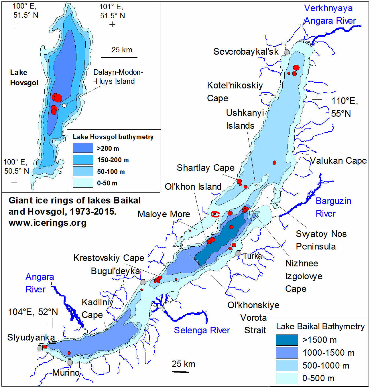
- The ring in the image of Figure 127 formed off the Nizhneye Izgolovye Cape, one of the most common places for rings to occur. Of the 57 rings detected on Baikal, about 13 formed in this area. According to Kouraev, that is likely because a sharp slope on the lake bed tends to “trap” eddies in this area. “People often drive a direct line between Nizhneye Izgolovye Cape and Khoboy Cape,” he said, “but we strongly advise that they take a more southerly route to avoid the frequent ice rings in this dangerous region.”
- For a number of years, one of the most discussed theories in both the scientific community and the news media was that gas hydrates — an ice-like form of methane found at the bottom of the lake — may play a role. Work by Kouraev and colleagues suggests otherwise. When combing through Landsat and MODIS satellite image archives for evidence of rings, scientists identified several over shallow parts of the lake where conditions are not right for gas hydrates. They have also discovered giant rings in satellite imagery of Lake Hovsgol in Mongolia and Lake Teletskoye in Russia’s Altai Republic, both of which are shallower than Lake Baikal and are not known to have gas emissions.
• January 24, 2020: Fifty years ago, Cancún was virtually unknown to the world. With a population of roughly 100 people, the town was located in one of the poorest regions of Mexico. It had odd-shaped sand dunes and a coast occupied by marshes, mangroves, and a snake-infested jungle. Over the past five decades, though, Cancún has been transformed into one of Mexico’s top tourist attractions. The growth didn’t happen by chance. 67)
- In the late 1960s, the Mexican government took an interest in developing the country’s tourism sector to boost the economy. To determine the perfect place, government officials analyzed statistics from several successful resort locations such as Miami Beach and Acapulco. They compiled information on the number of tourists, number of hotel rooms, average temperatures, average rainfall, and hurricane events and fed them into a computer program. The computer selected several candidates for a new resort town. Officials then visited each site along Mexico’s approximately 10,000 km of coastline to personally inspect the beaches, swimming, and living conditions.
- In the end, they selected Cancún because it had good weather year-round, blue seas, and white sand beaches. It was also located near great archeological treasures, such as the Mayan ruins at Chichen Itza and Tulum. It also had a high level of poverty and no existing industry.
- In January 1970, technicians arrived and began building the resort town. By September 1974, Cancún’s first hotel opened its doors. Within a year, Cancún added more hotels and welcomed around 100,000 tourists. Today, Cancún accommodates around two million visitors annually and generates around one-fourth of the country’s tourism revenue.
- The image pair of Figures 130 and 131 show the growth of Cancún between 28 March 1985, and 11 April 2019. The images were acquired by the Thematic Mapper (TM) on Landsat 5 and the Operational Land Imager (OLI) on Landsat-8, respectively. In the late 1980s, Cancún’s population registered around 120,000. A census report in 2015 conducted by the National Institute of Statistics and Geography (INEGI) reported around 740,000 people. Most of the hotels are located on a 27 km stretch of beach known as the Hotel Zone.
- While creating a large source of revenue, Cancún’s tourism also has had major impacts on the environment. One of the biggest issues is water pollution due to sewage from hotels (about 95 percent of all sewage from the area)—significantly more than the local treatment plants can handle. Untreated sewage ends up in the sea and becomes a threat to aquatic ecosystems, sometimes introducing pathogens that affect coral growth. The resort has also significantly increased the amount of garbage produced, a share of which is sent to illegal garbage dumps. Hotel construction and human presence have also eroded beaches, threatening local reef and coral systems.
• January 18, 2020: Approximately 4,000 years ago, a volcano in the South Ocean launched massive amounts of rock and magma—between 30 and 60 km3—into the sky. The eruption had the same severity as the cataclysmic 1991 eruption of Mount Pinatubo. It was the biggest eruption around Antarctica in the past 12,000 years. 68)
- As the volcano’s magma chamber emptied, the sudden drop in pressure inside the volcano caused the top to collapse and form a caldera. The caldera had a diameter of eight to ten kilometers (five to six miles). A collapse at this magnitude is large enough to induce multiple, intense high-magnitude earthquakes, according to researchers.
- These two natural-color images show Deception Island in early autumn (March 23, 2018, Figure 132) and early spring (September 21,2017, Figure 133), as observed by OLI (Operational Land Imager) on Landsat-8.
- Deception Island is one of two active volcanoes around Antarctica, and it has erupted more than twenty times since the 19th century. The most recent eruptions occurred between 1967 and 1970, while seismic activity occurred as recently as 2014-2015. Deception Island remains the one of the only places in the world where ships can sail directly into the center of a restless volcano.
- Despite the island’s eruptive history, its harbor—Port Foster—is considered one of the safest in Antarctica due to the absence of large glaciers. At the beginning of the 19th century, people began visiting the island to hunt seals, a popular commercial frenzy at the time. When the seals were nearly hunted to extinction by the early 1900s, seafarers switched to whaling and set up operations at Whalers Bay on the east side of the port.
- Today, Deception Island is home to scientific research stations, although some have been wiped away by past volcanic activity. The island is also a popular place for tourists, who can haul out on the beach and sit in geothermal baths. Visitors can also see one of the world’s largest rookeries of chinstrap penguins located on the island.
• January 2, 2020: Mountains of sand, some as tall as 300 meters (1000 feet), reach from the floor of Africa’s Namib Desert toward the sky. Driven by wind, these dunes march across the desert, bordered to the west by the Atlantic Ocean and in other directions by solid, rocky land. 69)
- The images show a region along the northern boundary of the Namib Sand Sea, which generally traces the path of the Kuiseb River. The sporadic flow of the Kuiseb River depends on flooding rains that can occur during the rainy season, typically from November to March. Floods, such as one in April 2011, wash away accumulated sand and temporarily halt the northward progression of the dunes. The occasional floodwaters also bring life to the desert, sustaining vegetation along the banks. Analysis of satellite data has shown that extreme floods lead to fast plant growth and a “green-up” that can last for up to two years.
- Without much water, vegetation elsewhere in the sand sea is limited--though not completely absent, thanks to fog from the ocean.
1) ”Textures Around the North Caspian,” NASA Earth Observatory, Image of the Day for 30 December 2020, URL: https://earthobservatory.nasa.gov/images/147722/textures-around-the-north-caspian
2) ”Kaolin Capital of the World,” NASA Earth Observatory, Image of the Day for29 December 2020, URL: https://earthobservatory.nasa.gov/images/147689/kaolin-capital-of-the-world
3) ”A Lagoon in the Desert,” NASA Earth Observatory, Image of the Day for 26 December 2020, URL: https://earthobservatory.nasa.gov/images/147668/a-lagoon-in-the-desert
4) ”Sea of Galilee,” NASA Earth Observatory, Image of the Day for 19 December 2020, URL: https://earthobservatory.nasa.gov/images/147685/sea-of-galilee
5) ”A Swirl of Old Supercontinent Silt,” NASA Earth Observatory, Image of the Day for 8 December 2020, URL: https://earthobservatory.nasa.gov/images/147629/a-swirl-of-old-supercontinent-silt
6) ”An Unexpected Expanse of Sand in Alaska,” NASA Earth Observatory, Image of the Day for 2 December 2020, URL: https://earthobservatory.nasa.gov
/images/147600/an-unexpected-expanse-of-sand-in-alaska
7) ”Painting Pennsylvania Hills,” NASA Earth Observatory, 28 November 2020, URL: https://earthobservatory.nasa.gov/images/147580/painting-pennsylvania-hills
8) ”Lituya Bay’s Apocalyptic Wave,” NASA Earth Observatory, Image of the Day for 23 November 2020, URL: https://earthobservatory.nasa.gov/images/147557/lituya-bays-apocalyptic-wave
9) ”Tremendous Tides in Broad Sound,” NASA Earth Observatory, Image of the Day for 21 November 2020, URL: https://earthobservatory.nasa.gov/images/147567/tremendous-tides-in-broad-sound
10) ”Stained Winyah Bay,” NASA Earth Observatory, Image of the Day for 12 November 2020, URL: https://earthobservatory.nasa.gov/images/147517/stained-winyah-bay
11) ”Jason and the Bloomonauts,” NASA Earth Observatory, Image of the Day for 8 November 2020, URL: https://earthobservatory.nasa.gov/images/147513/jason-and-the-bloomonauts
12) ”Copper River Valley Dust Cloud,” NASA Earth Observatory, Image of the Day for 5 November 2020, URL: https://earthobservatory.nasa.gov/images/147504/copper-river-valley-dust-cloud
13) ”East Troublesome Fire Spreads to the Rockies,” NASA Earth Observatory, Image of the Day for 27 October 2020, URL: https://earthobservatory.nasa.gov/
images/147452/east-troublesome-fire-spreads-to-the-rockies
14) ”Iran’s Rainbow Island,” NASA Earth Observatory, Image of the Day for 26 October 2020, URL: https://earthobservatory.nasa.gov/images/147428/irans-rainbow-island
15) ”Rebounding in Hudson Bay,” NASA Earth Observatory, Image of the Day for 19 October 2020, URL: https://earthobservatory.nasa.gov/images/147405/rebounding-in-hudson-bay
16) ”Romania’s Patchwork of Farm Fields,” NASA Earth Observatory, Image of the Day for 14 October 2020, URL: https://earthobservatory.nasa.gov/images/147400/romanias-patchwork-of-farm-fields
17) ”Spalte Splits,” NASA Earth Observatory, Image of the Day for 1 October 2020, URL: https://earthobservatory.nasa.gov/images/147350/spalte-splits
18) ”Bobcat Fire Scorches Southern California,” NASA Earth Observatory, Image of the Day for 28 September 2020, URL: https://earthobservatory.nasa.gov
/images/147324/bobcat-fire-scorches-southern-california
19) ”Iraq Lakes Bounce Back,” NASA Earth Observatory, Image of the Day for 26 September 2020, URL: https://earthobservatory.nasa.gov/images/147315/iraq-lakes-bounce-back
20) ”Where Ice Still Flows into Glacier Bay,” NASA Earth Observatory, Image of the Day for 16 September 2020, URL: https://earthobservatory.nasa.gov/images/147264/where-ice-still-flows-into-glacier-bay
21) ”How Rivers Shape States,” NASA Earth Observatory, Image of the Day for 8 September 2020, URL: https://earthobservatory.nasa.gov/images/147242/how-rivers-shape-states
22) Sarah J. Popelka, Laurence C. Smith, ”Rivers as political borders: a new subnational geospatial dataset,” Water Policy (2020), Volume 22 , Issue 3, pp: 293–312, 1 June 2020, https://doi.org/10.2166/wp.2020.041
23) ”A Global Water Hyacinth Invasion,” NASA Earth Observatory, Image of the Day for2 September 2020, URL: https://earthobservatory.nasa.gov/images/147198/a-global-water-hyacinth-invasion
24) ”Mapping the Roots of Mangrove Loss,” NASA Earth Observatory, Image of the Day for 25 August 2020, URL: https://earthobservatory.nasa.gov/images/147142/mapping-the-roots-of-mangrove-loss
25) ”Beguiling Bloom in The Baltic Sea,” NASA Earth Observatory, Image of the Day for 24 August 2020, URL: https://earthobservatory.nasa.gov/images/147135/beguiling-bloom-in-the-baltic-sea
26) ”A Sandy Flower in the Pacific,” NASA Earth Observatory, Image of the Day for 18 August 2020, URL: https://earthobservatory.nasa.gov/images/147129/a-sandy-flower-in-the-pacific
27) ”Farming in Turkey’s Mountains,” NASA Earth Observatory, Image of the Day for 15 August 2020, URL: https://earthobservatory.nasa.gov/images/147125/farming-in-turkeys-mountains
28) ”Grand Plateau Glacier,” NASA Earth Observatory, Image of the Day for 13 August 2020, URL: https://earthobservatory.nasa.gov/images/147110/grand-plateau-glacier
29) ”Early Detection of Algae Yields Savings,” NASA Earth Observatory, Image of the Day for4 August 2020, URL: https://earthobservatory.nasa.gov/images/146983/early-detection-of-algae-yields-savings
30) ”Jez like Mars,” NASA Earth Observatory, Image of the Day for 30 July 2020, URL: https://earthobservatory.nasa.gov/images/147041/jez-like-mars
31) ”Yangtze Dams Spill Water,” NASA Earth Observatory, Image of the Day for 24 July 2020, URL: https://earthobservatory.nasa.gov/images/147013/yangtze-dams-spill-water
32) ”The River of No Return,” NASA Earth Observatory, Image of the Day for 22 July 2020, URL: https://earthobservatory.nasa.gov/images/146964/the-river-of-no-return
33) ”Fueled by the Nile,” NASA Earth Observatory, Image of the Day for 8 July 2020, URL: https://earthobservatory.nasa.gov/images/146932/fueled-by-the-nile
34) ”Scouting Watering Holes from Space,” NASA Earth Observatory, Image of the Day for 2 July 2020, URL: https://earthobservatory.nasa.gov/images/146490/scouting-watering-holes-from-space
35) ”Contrasting Landscape in Namibia,” NASA Earth Observatory, Image of the Day for 25 June 2020, URL: https://earthobservatory.nasa.gov/images/146892/contrasting-landscape-in-namibia?
utm_source=card_4&utm_medium=direct&utm_campaign=home
36) ”Green Lagoons No More,” NASA Earth Observatory, Image of the Day for 18 June 2020, URL: https://earthobservatory.nasa.gov/images/146839/green-lagoons-no-more
37) ”Bush Fire Scorches Lands Near Phoenix,” NASA Earth Observatory, Image of the Day for 17 June 2020, URL: https://earthobservatory.nasa.gov/images/146851/bush-fire-scorches-lands-near-phoenix
38) ”The Blooming Blues,” NASA Earth Observatory, Image of the Day for 11 June 2020, URL: https://web.archive.org/web/20250806020449/https://earthobservatory.nasa.gov/images/146835/the-blooming-blues
39) Jeff C. Ho, Anna M. Michalak and Nina Pahlevan, ”Widespread global increase in intense lake phytoplankton blooms since the 1980s,” Nature, Volume 574, pp: 667-670, Published: 14 October 2019, https://doi.org/10.1038/s41586-019-1648-7
40) ”Frozen Finland Thaws,” NASA Earth Observatory, Image of the Day for 7 June 2020, URL: https://earthobservatory.nasa.gov/images/146821/frozen-finland-thaws?
utm_source=card_1&utm_medium=direct&utm_campaign=home
41) ”Temperatures Predict Bird Biodiversity,” NASA Earth Observatory, Image of the Day for 4 June 2020, URL: https://earthobservatory.nasa.gov/images/146800/temperatures-predict-bird-biodiversity
42) Paul R. Elsen, Laura S. Farwell, Anna M. Pidgeon, Volker C. Radeloff, ”Landsat 8 TIRS-derived relative temperature and thermal heterogeneity predict winter bird species richness patterns across the conterminous United States,” Remote Sensing of Environment, Volume 236, January 2020, 111514, https://doi.org/10.1016/j.rse.2019.111514
43) ”Sandy Shores of Moreton Bay,” NASA Earth Observatory, Image of the Day for 30 May 2020, URL: https://earthobservatory.nasa.gov/images/146776/sandy-shores-of-moreton-bay
44) ”Still Sandy After All These Years,” NASA Earth Observatory, Image of the Day for 14 May 2020, URL: https://earthobservatory.nasa.gov/images/146697/
still-sandy-after-all-these-years?utm_source=carousel&utm_campaign=home
45) ”Denman Glacier Losing Some of Its Footing,” NASA Earth Observatory, Image of the Day for 13 May 2020, URL: https://earthobservatory.nasa.gov/images/146709/denman-glacier-losing-some-of-its-footing
46) ”A Windbreak Grid in Hokkaido,” NASA Earth Observatory, Image of the Day for 6 May 2020, URL: https://earthobservatory.nasa.gov/images/146664/a-windbreak-grid-in-hokkaido
47) ”Montana’s Moon-Like Rocks,” NASA Earth Observatory, Image of the Day for 4 May 2020, URL: https://earthobservatory.nasa.gov/images/146650/montanas-moon-like-rocks
48) ”Iceland’s Longest Fjord,” NASA Earth Observatory, Image of the Day for 2 May 2020, URL: https://earthobservatory.nasa.gov/images/146657/icelands-longest-fjord
49) ”Orange You Glad It’s Spring?,” NASA Earth Observatory, Image of the Day for 30 April 2020, URL: https://earthobservatory.nasa.gov/images/146642/orange-you-glad-its-spring
50) ”Filling up Lake Carnegie,” NASA Earth Observatory, Image of the Day for 25 April 2020, URL: https://earthobservatory.nasa.gov/images/146628/filling-up-lake-carnegie
51) ”Beautiful Banc d'Arguin National Park,” NASA Earth Observatory, Image of the Day for 18 April 2020, URL: https://earthobservatory.nasa.gov/images/146600/beautiful-banc-daposarguin-national-park
52) ”Violent Puffs from Krakatau,” NASA Earth Observatory, Image of the Day for 15 April 2020, URL: https://earthobservatory.nasa.gov/images/146581/violent-puffs-from-krakatau
53) ”A Strained Water System in Chile,” NASA Earth Observatory, Image of the Day for14 April 2020, URL: https://earthobservatory.nasa.gov/images/146577/a-strained-water-system-in-chile
54) ”A Delta Oasis in Southeastern Kazakhstan,” NASA Earth Observatory, Image of the Day for 9 April 2020, URL: https://earthobservatory.nasa.gov/images/146552/a-delta-oasis-in-southeastern-kazakhstan
55) ”Relentless Floods,” NASA Earth Observatory, Image of the Day for 1 April 2020, URL: https://earthobservatory.nasa.gov/images/146515/relentless-floods
56) ”An Ash-Damaged Island in the Philippines,” NASA Earth Observatory, Image of the Day for 18 March 2020, URL: https://earthobservatory.nasa.gov/images/146444/an-ash-damaged-island-in-the-philippines
57) ”Slowly Flooding History,” NASA Earth Observatory, Image of the Day for 17 March 2020, URL: https://earthobservatory.nasa.gov/images/146439/slowly-flooding-history
58) ”A Space Communications Hub in Australia,” NASA Earth Observatory, Image of the Day for 16 March 2020, URL: https://earthobservatory.nasa.gov/images/146421/a-space-communications-hub-in-australia
59) ”The Largest Solar Power Plant in Europe (For Now),” NASA Earth Observatory, Image of the Day for 7 March 2020, URL: https://earthobservatory.nasa.gov/
images/146374/the-largest-solar-power-plant-in-europe-for-now
60) ”Phenomenal Faults and Folds,” NASA Earth Observatory, Image of the Day for 27 February 2020, URL: https://earthobservatory.nasa.gov/images/146342/phenomenal-faults-and-folds?utm=carousel
61) ”Antarctica Melts Under Its Hottest Days on Record,” NASA Earth Observatory, Image of the Day for 21 February 2020, URL: https://earthobservatory.nasa.gov/images
/146322/antarctica-melts-under-its-hottest-days-on-record
62) ”Remnants of an Ancient Lake,” NASA Earth Observatory, Image of the Day for 17 February 2020, URL: https://earthobservatory.nasa.gov/images/146304/remnants-of-an-ancient-lake
63) ”Pine Island Glacier’s Newest Iceberg,” NASA Earth Observatory, Image of the Day for 14 February 2020, URL: https://earthobservatory.nasa.gov/images/146289/pine-island-glaciers-newest-iceberg
64) ”Thwaites Glacier Transformed,” NASA Earth Observatory, Image of the Day for 6 February 2020, URL: https://earthobservatory.nasa.gov/images/146247/thwaites-glacier-transformed
65) ”Eddy Extravaganza off the Italian Coast,” NASA Earth Observatory, Image of the Day for 1 February 2020, URL: https://earthobservatory.nasa.gov/images/146231/eddy-extravaganza-off-the-italian-coast
66) ”Baikal’s Giant Ice Rings,” NASA Earth Observatory, Image of the Day for 30 January 2020, URL: https://earthobservatory.nasa.gov/images/146220/baikals-giant-ice-rings
67) ”How Cancún Grew into a Major Resort,” NASA Earth Observatory, Image of the Day for 24 January 2020, URL: https://earthobservatory.nasa.gov/images/146194/how-cancun-grew-into-a-major-resort
68) ”The Island Shaped like a Horseshoe,” NASA Earth Observatory, Image of the Day for 18 January 2020, URL: https://earthobservatory.nasa.gov/images/146164/the-island-shaped-like-a-horseshoe
69) ”Where the Dunes End,” NASA Earth Observatory, Image of the day for 2 January 2020, URL: https://earthobservatory.nasa.gov/images/146064/where-the-dunes-end