Landsat-8 - 2021
Landsat-8 Imagery in the period 2021
• December 28, 2021: The saguaro cactus (Carnegiea gigantea), with its spiny, branching arms, is an icon of the American West. It is also the largest cactus in the United States, growing up to 60 feet (18 meters) tall. The saguaro only grows in the Sonoran Desert, with its habitat range limited to southern Arizona, southeast California, and western Sonora, Mexico. Although not listed as threatened or endangered, the saguaro is protected by state laws against harvesting or destruction. 1)

- Under the right conditions, saguaro cacti can live to be 150 to 200 years old. The extremely slow-growing saguaro is particularly sensitive to temperature range and water abundance, and highly variable or extreme weather can stress the plants and limit reproduction. In Saguaro National Park, scientists have long monitored the climate. Over the past century, winter minimum temperatures in the area have risen 10 to 15º Fahrenheit (6 to 8ºC). Researchers have also recorded less rain falling in the winter, but more in the summer, when the cacti are thought to take up most of their water. When rain is abundant, a fully hydrated saguaro can weigh 3,200 to 4,800 pounds (1,500 to 2,200 kg). However, due to drought over the past few decades, fewer young saguaros are surviving in the park.

- Ecologists are looking for new tools to help monitor plant populations, and some are training computers to identify plants in remotely sensed images, either aerial or satellite. Some recent studies have used such machine learning to survey and map populations of saguaro, which cast shadows that can be identified in imagery. The researchers suggest such tools could be especially useful for monitoring remote, arid environments.
• December 27, 2021: A survey team on a remote island in Arctic Canada came across a grisly sight in the summer of 2016. Caribou carcasses, dozens of them, lay strewn across the tundra of Prince Charles Island, just north of the Arctic Circle in Nunavut. Based on the condition of the carcasses and the decomposition of internal organs, death was estimated to have occurred at least several weeks prior to the team’s arrival, perhaps in late winter. While some animals died lying down, others appeared to have simply collapsed. 2)
- A half-century earlier and more than 4,200 miles (6,800 km) west, a similar scene confronted biologists on a remote speck of land in the Bering Sea. Forty-two reindeer were found foraging among the skeletal remains of a reindeer herd on St. Matthew Island that only three years earlier had numbered 6,000 animals.

- While caribou and reindeer are the same species (Rangifer tarandus), they are not the same animal. Caribou, which live in North America, are migratory and travel in large herds between breeding grounds. Reindeer inhabit Europe and Asia and have adapted to domestication. They can be used for pulling sleighs and can be milked like cows and goats. (Reindeer cheese is reported to be mild and creamy.)
- One key attribute caribou and reindeer share is that they are herbivores that feed on lichens and plants. In late fall and early spring, they use their sharp hooves to break through the icy crust on northern lands to reach this food source. While the animals are adapted to efficiently managing their energy reserves over the long Arctic winter, timing is everything. And at both Prince Charles Island and St. Matthew Island, time ran out for the herds.

- Unusually harsh winter weather also was the culprit on St. Matthew Island. Scientists reanalyzing meteorological data found that the winter of 1963–1964 was one of the harshest ever recorded in the Bering Sea islands. The reindeer endured storms with hurricane-force gusts, wind chills as low as -71.5° Fahrenheit (-57.5° Celsius), and a record amount of snow. As at Prince Charles Island, the hard crust on the snowpack made it difficult, if not impossible, for the huge reindeer herd to access vital nutrients. For the 6,000 reindeer, there simply was not enough food available when it was most needed. By 1966, only 42 survivors remained.
- Through the use of remotely sensed data, scientists were able to close the cold case of the mysterious deaths of caribou in Canada and reindeer in the Bering Sea islands occurring a half-century apart. The data told the tale.
• December 21, 2021: Before Cumbre Vieja split open on September 19, 2021, the western flank of La Palma was dotted with houses, roads, pools, and crops. After slow-moving lava flows bulldozed their way down the small volcanic peak in the Canary Islands for months, parts of the island now look more like a moonscape than a tropical paradise. 3)

- The slow-moving lava flows have caused tremendous amounts of damage to homes, infrastructure, and farmland. Some areas that were not directly overrun by lava have been blanketed with ash. According to a mid-December update from the Copernicus Emergency Management Service, the eruption has destroyed at least 1,600 buildings. Lava has consumed at least 12 km2 of land, including at least 4 km2 of crops. Initial estimates say that the eruption has caused at least 550 to 700 million euros in damages.
- After three months of vigorous lava flows and explosive activity, there are signs that the eruption may be ending. On December 14, geologists with the Canary Islands Volcanology Institute (INVOLCAN) noticed a sharp decline in seismic activity; explosive activity, sulfur dioxide emissions, and lava flows also waned. While activity could pick up again, ten days of inactivity would prompt local scientific authorities to declare the eruption over, according to Canarian Weekly.

• December 15, 2021: During the time of the pharaohs, the fertile soils along the Nile River likely supported a civilization of roughly 3 million people. Now there are 30 times that number of people living in Egypt, with 95 percent of them clustered in towns and cities in the Nile’s floodplain. Much of the growth has come in recent decades, with the Egyptian population soaring from 45 million in the 1980s to more than 100 million now. 4)
- Just 4 percent of Egypt’s land is suitable for agriculture, and that number is shrinking quickly due to a wave of urban and suburban development accompanying the population growth. “It’s not an exaggeration to say that this is a crisis,” said Nasem Badreldin, a digital agronomist at the University of Manitoba. “Satellite data shows us that Egypt is losing about 2 percent of its arable land per decade due to urbanization, and the process is accelerating. If this continues, Egypt will face serious food security problems.”

- While the conversion of farmland to human settlements here has occurred for decades, multiple researchers observed sharp increases in the practice after the “Arab Spring” roiled the political and economic climate in Egypt starting in 2011. In recent years, Egyptian authorities have vowed to put an end to unlicensed building on farmland, though it remains a difficult practice to stamp out.
- Urbanization is not the only process putting pressure on Egypt’s farmland. Sea level rise of 1.6 mm per year has contributed to problems with saltwater intrusion and the salinization of farmland in Egypt, particularly in the fringes of the delta southwest of Alexandria. About 15 percent of Egypt’s most fertile farmland has already been damaged by sea level rise and saltwater intrusion, according to the UN Food and Agriculture Organization. While global warming is responsible for about half of the sea level rise affecting the Nile Delta, the sinking of the land (subsidence) is responsible for the other half. Natural compaction, as well as the extraction of groundwater and oil, contribute to subsidence.

- While that project has not come to full fruition yet, large swaths of desert have been converted to farmland in recent decades. The pair of images below shows new farmland and the emergence of several new towns along the Cairo Highway. A mixture of center-pivot irrigation and drip irrigation—fed by groundwater pumps—makes farming in this area possible, explained Badreldin. While small-scale sustenance farming is common in the main part of the delta, most of the growers on the desert edge raise grains, fruits, and vegetables for export abroad.
- “It is certainly possible to establish new farmland from the desert by tapping groundwater resources, but it’s a difficult, resource-intensive, and expensive process,” said Badreldin. “The poor soils and the intensive resources needed to farm in the western desert are a poor replacement for the richer, more fertile soils in the delta.”
- Boston University researchers Curtis Woodcock and Kelsee Bratley have analyzed decades of Landsat observations as part of a Boston University effort to track how the availability of farmland in the delta is changing over time. “We certainly see expansion into the desert, but there’s nuance to this story,” said Woodcock. “After being farmed for a time, we also see a significant amount of that new farmland being decommissioned and reverting to desert.”
• December 9, 2021: A low-pressure system called a “Kona low” developed northwest of Hawai’i in the first week of December 2021, dropping snow on the peaks of Mauna Kea and Mauna Loa. The storm also brought high winds, intense rainfall, and flash flooding, along with reports of landslides, downed trees, and power outages. Some roads and schools were closed, and Hawai’i Governor David Ige declared a state of emergency. 5)


- While blizzard conditions are rare in Hawai’i, snow is not uncommon on the two tallest volcanoes in the island chain. Snow is often associated with a Kona low, which occurs when winds that typically blow out of the northeast shift and begin to blow from the southwest, over the leeward or “Kona” side of the islands. As the air, laden with moisture from the tropical Pacific, is forced up by the mountainous topography, the moisture precipitates as heavy rain and snow. Kona storms are common between October and April.
• December 6, 2021: At roughly 325 km2, the Ebro Delta on the northeastern coast of Spain is one of the largest wetlands along the Mediterranean Sea coast. It is an important habitat for wildlife, including flamingos and birds using the wetlands as a stopover on migratory journeys. The site in southern Catalonia has been designated a UNESCO Biosphere Reserve. 6)
- The 50-kilometer-long coastline features two sand spits: El Fangar on the north shore and La Banya on the south. These appendages are the remnants of the river's previous deltas, which were reworked when the river changed course over the past few thousand years.


- The delta, which is home to 62,000 people, has also been greatly modified by human use. In the past 150 years, wetlands have been converted into fields of rice, which now cover up to 80 percent of the delta. To supply water for irrigation and to generate hydroelectric power, more than 187 dams have been built on Ebro River and its tributaries—development that trapped most of the sediment supply in Spain’s largest river in reservoirs and behind dams. Erosion and land subsidence followed downstream.
- Today, the shape and form of the delta is no longer controlled by the river, but by sea waves. And with sea-level rise and more frequent and intense storms, those waves are getting bigger, leading to further shoreline retreat. In January 2020, the narrow sandbar that connects the southern spit to the main delta was flooded by storm Gloria, along with 3,000 hectares of rice fields. Storms also exacerbate the shrinking and loss of dune fields on the beaches.
- The Ebro Delta illustrates the hard choices to come for communities facing rising seas—try to hold back the ocean or manage the retreat.
- The Spanish government recently announced a plan to buy coastal land to create a buffer zone. If the plan is adopted, the purchase would constitute the largest land buyout in Europe so far due to climate change. But it is opposed by many of the delta's inhabitants, some of whom instead favor beach nourishment, pumping, and seawalls to protect the coast. Some farmers are experimenting with strains of rice that can better withstand saltwater intrusion.
• December 4, 2021: Mount Michael, an active stratovolcano in the South Sandwich Islands, is viewed more often by penguins than by people. It is located on Saunders Island, about 1,600 km (1,000) miles from Antarctica and 2,400 km (1,500 miles) from South America, and there are no permanent human residents nearby. For satellites looking down from space, the mountain is usually obscured by clouds. Still, the nearly 1,000-meter-tall volcano frequently finds a way to put on a show. 7)

- The feature is possibly a type of cloud known as a volcano track. These “tracks” occur when passing clouds interact with the gases and particles from a volcano. The extra particles from the volcano produce more and smaller cloud droplets, which make the cloud appear brighter. “As the cloud moves over the volcano, the imprint of those smaller droplets stay in the cloud, resembling a stream or a track of different texture when seen from above,” said NASA atmospheric scientist Santiago Gassó, who spotted the feature and routinely hunts for volcano tracks in satellite images.
- Volcano tracks can be difficult to discern in natural-color images. This image is false color, composed with a combination of shortwave infrared and blue light (OLI bands 7-6-2) to help distinguish the track from the rest of the cloud deck. Also notice the striking lenticular cloud. Unrelated to the volcanic activity, these clouds can develop at the crest of atmospheric waves that form when wind encounters a topographic barrier and is forced up.
- Volcano tracks are a useful tool for scientists trying to spot cases of less intense volcanic activity. Such activity—the simple “puffs” of water vapor, particles, and gases—is common, but often goes unreported because the emissions usually stay below (or within) the clouds. By studying the clouds around these volcanic puffs, scientists have been gaining insight into how clouds form and evolve.
- There is also the chance that the plume from Mount Michael on November 7 rose above the cloud deck, meaning the feature would be a typical volcanic plume, and not a volcano track. “The Landsat image has so much detail. I can see several shadows suggesting that what I called a volcano track is actually a plume positioned immediately above the cloud deck—low enough to cast a small shadow,” Gassó said. “But at the same time, it is unusual to have such an organized plume above the cloud deck without dissipating or thinning out more readily.”
- Without lidar data to measure the feature’s height, it is not possible to know if the feature is volcano track or a plume. Either way, Gassó notes: “There is some beauty in it, right? In that same way, it triggers curiosity to find more.”
• December 2, 2021: After a planning and construction process that spanned decades, a flood control system in Venice is now regularly protecting the low-lying city from high water. Satellites caught a rare glimpse of the system in action during a high-water storm event in November 2021. 8)
- On the afternoon of November 3, 2021, the flood gates were raised as a storm brewed in the Adriatic Sea. At the time, forecasters warned that water levels might rise 140 cm above normal when high tide peaked and strong sirocco winds battered the Venetian coast. Water at that level is enough to flood 60 percent of the city, including the iconic St. Mark’s Square, the lowest part of the city.
![Figure 14: While some of the barrier gates at the Lido inlet were kept closed for the duration of the high-water event, the gates at Malamocco and Chioggia inlets were retracted during low tide to let water out of the lagoon. The left image, from the Multispectral Instrument (MSI) on Sentinel-2, shows sediment stirred into a zigzag pattern as the barrier gates at the Malamocco inlet retracted on November 4, 2021. Two days later, the Operational Land Imager (OLI) on Landsat-8 captured an image (right) showing the same inlet with the barrier gates fully activated and standing above the water surface. At the time of the Landsat overpass, strong winds (61 km/hr) blew from the east, stirring up sediment on both sides of the barriers [image credit: NASA Earth Observatory images by Joshua Stevens, using Landsat data from the U.S. Geological Survey and modified Copernicus Sentinel data (2021) processed by the European Space Agency. Story by Adam Voiland, with input and fact checking by Luca Zaggia (CNR), Federica Braga (CNR), Gian Marco (CNR), and Vittorio Brando (CNR)]](https://eoportal.org/ftp/satellite-missions/l/LS82021_310122/LS82021_Auto87.jpeg)
- The system, named MOSE (Modulo Sperimentale Elettromeccanico) — includes 78 submerged barrier gates that are normally tucked into the seafloor. When weather forecasts show damaging floods (above 130 cm or 4.3 feet) are imminent, operators rotate the gates upward to form a temporary seawall that rises above the water surface. As shown by the Landsat-8 and Sentinel-2 images on this page, the seawall prevents water from the Adriatic Sea from flowing through key inlets into or out of the shallow lagoon that surrounds Venice.
- “It is quite rare to get Landsat or Sentinel imagery showing the barriers closed because they are only activated and above the surface during storms—when there is usually too much cloud cover to see them from above,” explained Luca Zaggia, a coastal oceanographer at Padua’s Institute of Geosciences and Earth Resources of the Italian National Research Council (CNR). “It is even more unusual for satellites to capture images of sediment stirred up by the movement of the barriers because this phase lasts less than 30 minutes.”

- Landsat-8 passes over the area once every 8 days; one of the Sentinel-2 satellites make observations once every 2 to 3 days. Zaggia is part of a research team from Venice’s Institute of Marine Science that is investigating how the operation of MOSE could affect the movement and abundance of sediment around the lagoon.
- Activating the flood gates proved successful in this case. While high tide water levels rose above 130 cm in the Adriatic Sea, they reached just 83 cm in Venice, enough to prevent major flooding. MOSE has been used several times in recent years as engineers test it and work toward making it fully operational by 2022. The floodgates were activated five times in 2021 and 20 times the previous winter. In 2019, before the system was available for use, more than 25 high-water events swamped Venice, including a November flood that proved to be the second worst on record.
- Though MOSE has prevented several high-tide floods, sometimes high water has eluded system operators due to inaccurate weather and water height forecasts. For instance, much of Venice flooded in December 2020 after forecasts underestimated the maximum height of high tide by 5 cm — enough to prevent operators from elevating the barriers in time.
- Rising global sea levels might affect the level of protection the system provides in coming decades. With relative sea levels rising by roughly 0.25 cm per year, the frequency of high-water events in Venice has already increased in recent decades, going from two per decade during the first half of the 20th Century to more than 40 per decade now. “In the best case emissions scenarios (RCP-2.6), the system should work well until the end of this century,” said Federica Braga, a remote sensing expert at Venice’s Institute of Marine Sciences, though he cautioned the system could begin to be overwhelmed sooner under worst case emissions and sea level rise scenarios.
- Some researchers have calculated that the system will need to be closed for 3 weeks per year by the end of this century under a low-emissions scenario and for at least two months by 2080 under a high-emissions scenario. “A reduction in the number of water exchanges could trigger other problems in the long term even if the system mitigates the worst of the flooding,” said Zaggia. “For instance, it could change the sediment budget and negatively affect salt marshes or the water quality of the lagoon.”
• December 1, 2021: Some of the highest diurnal tides in the world—nearly 14 meters (46 feet)—have been recorded in the Sea of Okhotsk. In the Russian Far East, narrow bays funnel and amplify the incoming tides, making it a prime location for tidal power generation. 9)

- The currents around the Shantar Islands are heavily influenced by the strong tides and by freshwater discharge from rivers draining into Uda Bay. The waters here are frozen for much of the year. When the sea ice melts and freshwater snowmelt swells the Uda River, plumes of low-salinity water can reach far offshore.
- As the strong tides and currents flow through straits in the Shantar Islands, they encounter rocky outcrops, headlands, capes, and small islands that disrupt the laminar flow. This can create chains of spiral eddies that rotate in alternate directions as they form. These chains are known as vortex streets or von Kármán vortices. The physical processes that create the vortices were first described in 1912 by Theodore von Kármán, a Hungarian-American physicist and a co-founder of NASA's Jet Propulsion Laboratory. In the Shantar Islands, vortices in the chain propagate mainly to the east at low tide and to the west at high tide.
• November 29, 2021: Greenland’s glaciers function like bulldozers, grinding away and pulverizing rocks along the land surface as they creep through valleys toward coastal waters. The process produces a fine-grained powder of silt and clay called glacial flour that accumulates underneath and around glaciers. This powder often accumulates in deltas and in meltwater lakes and streams that form along the edges of these slow-moving rivers of ice. Since the particles are so fine, they are slow to sink and often remain suspended in water longer than other types of sediment. 10)

- The presence of silt can sharply change the appearance of water. When sunlight hits silt-rich water, particles absorb the shortest wavelengths: the purples and indigos. Water absorbs the longer wavelengths: reds, oranges, and yellows. That leaves mainly blues and greens that get scattered back to our eyes, often giving silty water a striking turquoise color. Water full of glacial flour can also appear milky green or brown depending on lightning conditions and the concentration of the silt.
- Ocean currents had carried two plumes of silt about 40 km (25 miles) to the south when Landsat-8 acquired this image on November 15, 2021. However, that was not the only day when satellites captured striking images of silty plumes stretching into the Labrador Sea. On November 10, an unusually narrow sediment plume stretched more than 180 km (120 miles) to the east.
- Silty plumes coming from Frederikshåb and other glaciers in Greenland are actually quite common. According to one analysis of satellite data, Greenland delivers about 8 percent of all the sediment deposited in the oceans each year even though it provides just 1 percent of the total fresh water. About 15 percent of Greenland’s glaciers—Frederikshåb among them—deliver more than 80 percent of all the sediment from the island. The researchers also found evidence that the volume of suspended sediment delivered to the ocean from glaciers in this part of Greenland has increased substantially in recent decades as the pace of retreat has quickened.
- While increased rates of ice loss in Greenland are a worrisome sign for future sea levels on Earth, some scientists think that an increasing abundance of sand and glacial flour deposited along Greenland’s coasts could have some practical uses for Greenlanders. The sediment could be collected to help relieve global shortages of sand, according to some researchers. Other scientists are looking into whether Greenland’s glacial flour could be used as a fertilizer for crops.
• November 23, 2021: There are few other places like Daintree rainforest in far north Queensland. Thought to be among the most ancient forests in the world, Daintree has many plants with lineages that scientists have traced back hundreds of millions of years to a time when several continents were joined together as Gondwana. All seven of the world’s oldest surviving fern species can still be found in Daintree, as well as 12 of the world’s 19 most primitive flowering plants. 11)

- Many of the species found in Daintree are exclusive to the area. For the 40 million years since Australia broke from the Gondwana, evolutionary processes have hummed along in geographic isolation, yielding unusual types of animals such as marsupials and monotremes. That long period of isolation, along with northern Queensland’s stable and mild climate and rugged topography, has resulted in remarkable biodiversity. This one ecosystem provides habitat for 65 percent of Australia’s fern species, 60 percent of its butterflies, and 50 percent of its birds.
- Among the birds is the endangered southern cassowary — a large, flightless ratite with a blue head, two red wattles, and a distinctive dinosaur-like bony casque on its head. Cassowaries, the third largest type of bird in the world, have the helpful habit of distributing and seeding at least 70 different types of trees as they forage for fallen fruit.
- In September 2021, the Queensland government returned ownership of Daintree National Park to the Eastern Kuku Yalanji, an indigenous group that has had a presence in Australia’s rainforests for at least 50,000 years. Daintree, Ngalba-bulal, Kalkajaka and the Hope Islands national parks are managed jointly by the Eastern Kuku Yalanji people and the Queensland Government since the handover.
• November 16, 2021: Since the 1960s, archaeologists have been gathering physical evidence that Norse people landed and settled for at least a few years in far northern Newfoundland, Canada, long before Columbus sailed to the Americas. At L’Anse aux Meadows, the Vikings constructed housing and workshops of timber and sod, and left behind food, tools, and bits of building material that scientists have been analyzing. But exactly when were they there? The latest answer comes from the Sun and its electromagnetic relationship to Earth. 12)
- Using clues from literature and history—such as tales of Vinland from Norse sagas—and from radiocarbon dating of wood and bone fragments, researchers previously estimated that the Vikings were frequent visitors or settlers at L’Anse aux Meadows between 970 and 1030 CE. Many researchers suggested they lived there three to ten years, with one team claiming it may have been as long as one hundred years.


- In a new study published in October 2021, scientists found that the Vikings were in L’Anse aux Meadows in 1021, exactly 1000 years ago. Led by scientists from the University of Groningen and Parks Canada, the team used geochemical dating techniques to analyze wood fragments and nail down the precise year the trees were cut down near the site. 13)
- Earth is regularly bombarded by radiation from space, mostly from the Sun, including benign visible light and radio waves and less benign ultraviolet light and X rays. (Much of it is absorbed, reflected, or refracted by our atmosphere.) The universe also pulses our planet with cosmic rays and other radiation, a phenomenon that creates carbon-14 when the energy collides with gases in our atmosphere. Sometimes the Sun also releases violent bursts of radiation that can make carbon-14 and beryllium.
- Such an outburst helped Michael Dee, Margot Kuitems, and colleagues pinpoint the date of Viking life in Newfoundland to 1021. Other researchers previously found evidence of an extreme space weather event in late 992 and early 993 CE; historic records from Germany, Korea, and Iceland described vivid red auroras at middle latitudes that winter. (Auroras are usually provoked by solar storms.) The event created an increase in atmospheric carbon-14 on Earth, and such increases are absorbed into the tissues of trees as they grow. By studying gnarled wood fragments from L’Anse aux Meadows, Dee and colleagues were able to spot the carbon-14 boost and then count tree rings in three separate samples. All three pieces of wood were cut from trees in 1021.
- Whether the Vikings were in Newfoundland before or after 1021 is not certain, but the evidence says they were there for at least that year, cutting trees and building things. Today you can visit remnants of their stay, along with recreations of a forge, church, and other buildings, at L’Anse aux Meadows National Historic Park, a UNESCO World Heritage Site. It is the earliest known European settlement in the Americas, and it resembles similar Norse settlements from that era found in Iceland and Greenland. Archaeologists are also investigating evidence that Native American people lived in or passed through the L’Anse aux Meadows area about 5,000 years ago before the Vikings.
• November 13, 2021: In early October 2021, the James Webb Space Telescope arrived in Kourou, French Guiana, where it is scheduled to launch from Europe's Spaceport in mid-December. Once deployed, Webb—a collaboration between NASA, the European Space Agency (ESA), and the Canadian Space Agency (CSA)—will be the world's largest and most powerful space telescope. 14)
- Before its sea voyage, the telescope was folded for the last time at Northrop Grumman's facility in Redondo Beach, California. It was then loaded aboard the French ship MN Colibri, which sailed through the Panama Canal and up the mouth of the Kourou River, from which sediment had to be dredged to accommodate the large ship's draft.


- The facility's location, just 500 km north of the Equator, gives a boost to rockets launched to the east—an extra 460 m/s of speed due to Earth's rotation. The position on the northeastern coast of South America also provides clear launch trajectories to the north and east for both polar-orbiting and geostationary satellites, taking them out over the ocean and away from population centers.
- The site was also chosen for its low risk of cyclones and earthquakes. French Guiana's stable, crystalline basement rocks date back 2.2 billion years to the Paleoproterozoic Era, which also give this "overseas department" the claim to the oldest rocks in France.
- The spaceport has hosted more than 240 launches since 1990, mainly those employing Ariane, Soyuz, and Vega rockets. Notable missions include the joint ESA/Japan Aerospace Exploration Agency BepiColombo mission to orbit Mercury; ESA's Envisat Earth-observing satellite in March 2002; and four satellites in ESA's Sentinel series of Earth-observers.
- The launch of the James Webb Space Telescope in December 2021 will be the culmination of more than two decades of work by a team of 10,000 people, spanning 14 countries and 29 U.S. states. Commissioning will take six months, during which time Webb will carry out the most complicated series of deployments of any NASA mission ever.
- The immense telescope had to be folded to fit inside the fairing of the Ariane 5 spacecraft, the only rocket large enough to hold it. Once in space, the telescope's final destination is the second Lagrange Point (L2), a stable gravitational point 1.5 million kilometers from Earth where it will orbit the Sun. The trip to L2, four times the distance from the Earth to the Moon, will take a month. Upon arrival at L2, Webb will have to do "origami in reverse," as it unfolds its mirror and deploys the sunshields, said Alphonso Stewart, the Webb deployment systems lead at GSFC.
- The launch is only the beginning for the community of astronomers, astrophysicists, and cosmologists who anticipate using the telescope to resolve unanswered questions about the origins of the universe. Webb's 6.6-meter mirror has six times the collecting power of the Hubble Space Telescope, which collects light in the visible, ultraviolet, and a portion of the near-infrared spectrum. Webb will collect light in the red, and near- and mid-infrared range of the spectrum. This will allow it to see through massive clouds of gas and dust that are opaque to telescopes like Hubble, and to detect light from the early universe that has been stretched by its expansion and "red shifted" into the infrared part of the spectrum.
- Like a veritable time machine, Webb will allow scientists to look back 13.5 billion years to the first light in the universe and see how the first stars and galaxies formed and evolved over millions of years.
• November 8, 2021: Change is constant and common on Earth across geologic time. But in the icy polar regions, change has been dramatic and swift in the past few decades. One example is northwest Greenland, where quite a lot has changed in 21 years. 15)
![Figure 23: The image pair shows part of Greenland along Melville Bay (a sub-section of Baffin Bay) on September 21, 2021 and on September 3, 2000. The images were acquired with the OLI instrument on Landsat-8 (Figure 23) and the Enhanced Thematic Mapper Plus (ETM+) on Landsat-7, respectively. (Note that Earth Observatory originally published a version of the 2000 image in false color. Both images are natural color and show a slightly wider view.) - [image credit: NASA Earth Observatory images by Lauren Dauphin, using Landsat data from the U.S. Geological Survey. Story by Kathryn Hansen]](https://eoportal.org/ftp/satellite-missions/l/LS82021_310122/LS82021_Auto7E.jpeg)
- The images show a 80-kilometer (50-mile) stretch of coastline. Like so many places around the edges of Greenland, a series of glaciers here carry ice from the island’s interior toward the coast and onto the ocean. Most of these marine-terminating glaciers are retreating. Kjer and Hayes—the two main outlet glaciers shown above—are also speeding up.
- Notice that in 2000, Kjer Glacier abutted a few rocky outcrops. These rocks helped buttress the ice and slowed its oceanward flow. Then sometime in 2012, the glacier’s floating ice shelf disintegrated. The rocks became free-standing islands, surrounded in the 2021 image by open water and a mixture of sea ice and icebergs, or mélange. Having lost contact with the rocks, the glacier’s inland ice can flow even more rapidly toward the ocean.
- According to Alex Gardner, a snow and ice scientist at NASA’s Jet Propulsion Laboratory, data from ITS_LIVE and the NASA MEaSUREs program show that one year before the ice shelf’s breakup, the glacier flowed at an average speed of 1,200 meters per year. By 2018, the glacier’s average speed was more than 4,000 meters per year.
- “Kjer is experiencing a nearly four-fold increase in ice flow due to the collapse of its floating ice shelf, likely due to melting by warmer ocean waters,” Gardner said. “This has led to increased contributions of ice to the ocean and is accelerating sea level rise.”
- In the 1970s, the Greenland Ice Sheet gained about as much ice as it lost—a balanced state that lasted until the mid 1990s, at which point ice loss sped up. Between 2002 and 2021, Greenland shed about 280 gigatons of ice per year, adding 0.8 mm (0.03 inches) per year to global sea level rise.

• October 28, 2021: In October 2021, natural-color images from the Landsat and Terra satellites returned striking views of record-breaking backlogs of container ships idling offshore of some of America’s largest ports. Surging demand for consumer goods, labor and equipment shortages, and an array of COVID-related supply chain snarls have contributed to the backlogs. 16)
- Now atmospheric scientists are working with air pollution data collected by satellites to find out whether the unusual shipping activity is affecting air quality near ports. Though other industries and processes may be playing a role, a preliminary look at satellite observations of nitrogen dioxide pollution offshore of ports suggests that shipping may be contributing to an uptick in pollution.
![Figure 25: The maps (Figures 25 & 26) show the concentration of the air pollutant nitrogen dioxide (NO2) between October 1-23, 2021, as compared to the same period in 2019 and 2018 (before the COVID-19 pandemic upended global trade). The ports of Los Angeles, Long Beach, New York/New Jersey—the busiest ports in the United States—show apparent increases in NO2 in October 2021 [image credit: NASA Earth Observatory images by Joshua Stevens, using modified Copernicus Sentinel 5P data processed by the European Space Agency. Story by Adam Voiland, with fact-checking and interpretation from Daniel Goldberg (George Washington University), Ted Russell (Georgia Tech), and Aristeidis Georgoulias (Aristotle University of Thessaloniki)]](https://eoportal.org/ftp/satellite-missions/l/LS82021_310122/LS82021_Auto7C.jpeg)

- These data were collected by the Tropospheric Monitoring Instrument (TROPOMI) on the European Commission’s Copernicus Sentinel-5P satellite, built by the European Space Agency. The predecessor to TROPOMI, the Ozone Monitoring Instrument (OMI) on NASA’s Aura satellite, makes similar measurements. (Note: a recent algorithm change can artificially elevate more recent TROPOMI observations of NO2 by 10 to 15 percent. The maps on this page have corrected for this.)
- The elevated concentrations of NO2 near the ports appear to be at least partly a consequence of having dozens of ships waiting several days to unload their cargo. On October 21, there were 105 ships waiting for a berth at the Los Angeles and Long Beach ports, according to data from the Marine Exchange of Southern California. While ship backups are not as severe off of New York/New Jersey, those port facilities have also seen some backlogs and unusually high cargo movement in recent months.
- Since there is only enough room for roughly 60 cargo ships to drop anchor in shallow waters near the Los Angeles and Long Beach ports, the rest of the waiting ships are held in deeper waters, where they keep their main engines running and move in circles to maintain their position. Even ships that are anchored still need to run auxiliary engines to keep key systems operational. On multiple occasions in October 2021, anchored ships had to activate their main engines or move to deeper water to ride out inclement weather. All of these scenarios generate emissions of nitrogen dioxide, sulfur dioxide, fine particulate matter (PM2.5), and other pollutants that can lead to more smog and ozone downwind in more populated areas.
- In addition to the large numbers of waiting ships, another factor that may be contributing to higher pollution levels is that all three ports are processing significantly more goods than in previous years due to surging consumer demand. The Los Angeles and Long Beach ports have seen roughly 50 percent increases in the movement in cargo in some months in 2021 compared to 2019, according to a report from the California Air Resources Board. Likewise, the port of New York/New Jersey reports record-breaking cargo volumes in 2021.
- The satellite observations of nitrogen dioxide also hint at other processes happening onshore. The small area of elevated NO2 near Santa Barbara is related to the smoke plume from the Alisal fire, which burned through chaparral along the California coast in mid-October. Meanwhile, the blue area immediately over Los Angeles points toward reductions in urban emissions over the city core.
- “Part of what we may be seeing over Los Angeles is that the controls on mobile (trucks, cars, trains) and stationary (factories) sources of NO2 that have come into effect in recent years have been effective, especially some of the controls at the port itself,” said Ted Russell, a Georgia Tech atmospheric scientist and member of a NASA Applied Sciences team focused on air quality. Since 2006, the LA and Long Beach ports have enacted a clean air plan that has led to significant reductions in NO2 emissions.
- Other researchers note the COVID-related changes in transportation habits may be a factor. “The blue spot over downtown Los Angeles may be the result of fewer people commuting into offices downtown and working remotely instead,” said Daniel Goldberg, an atmospheric scientist at George Washington University. “When you are looking at satellite data showing changing concentrations of pollution, you always have to keep in mind that there are multiple factors at play that can be hard to disentangle.”
- Goldberg, Russell, and other atmospheric scientists all caution that other factors—especially wind and weather conditions—can make it quite challenging to interpret changes in nitrogen dioxide. “Double the wind velocity, and you can approximately halve the concentrations. Change the wind direction, and one area appears to have more, another less,” said Russell. One recent analysis by Goldberg found that strong winds or the direction of the winds could change NO2 concentrations over Los Angeles by as much as 80 percent.
- In this case, it is possible that days with strong Santa Ana winds in 2018-19 could have exaggerated the apparent increase in NO2 over Riverside and Irvine. “Without taking a careful look at the meteorology, what I can say is that this preliminary data certainly supports the idea that we’re seeing increased emissions offshore due to the shipping backlogs,” said Russell. “In another month or two, it might be possible to tell a much clearer story.”
• October 5, 2021: If it seems like enormous wildfires have been constantly raging in California in recent summers, it's because they have. Eight of the state’s ten largest fires on record—and twelve of the top twenty—have happened within the past five years, according to the California Department of Forestry and Fire Protection (Cal Fire). Together, those twelve fires have burned about 4 percent of California’s total area—a Connecticut-sized amount of land. 17)


- The total area burned by fires each year and the average size of fires is up as well, according to Keith Weber, a remote sensing ecologist at Idaho State University and the principal investigator of the Historic Fires Database, a project of NASA’s Earth Science Applied Sciences program. The database shows that about 3 percent of the state’s land surfaces burned between 1970-1980; from 2010-2020 it was 11 percent. The shift toward larger fires is clear in the decadal maps (above) of fire perimeter data from the National Interagency Fire Center.
- “The numbers are really worrisome, but they are not at all surprising to fire scientists,” said Jon Keeley, a U.S. Geological Survey scientist based in Sequoia National Park. He is among several experts who say a confluence of factors has driven the surge of large, destructive fires in California: unusual drought and heat exacerbated by climate change, overgrown forests caused by decades of fire suppression, and rapid population growth along the edges of forests.

- “The current drought is unprecedented,” said Keeley. “Each of the past three decades has had substantially worse drought than any decade over the last 150 years.” In the short-term, drought exacerbates fires by sapping trees and plants of moisture and making them easier to burn. Over the long-term, it adds vast amounts of dead wood to the landscape and makes intense fires more likely.
- The 2020-2021 drought has been especially extreme. “The last two years in California have brought compound drought conditions—effectively, very dry winters followed by relentless summer heat and atmospheric aridity,” explained John Abatzoglou, a climate scientist at the University of California, Merced. “This has left soil and vegetation parched across much of California, so the landscape is capable of carrying fire that resists suppression.”
- Data from the Western Regional Climate Center indicates that the northern two-thirds of the state received only half of normal rainfall over the past few years. The U.S. Drought Monitor has categorized about 85 to 90 percent of California as experiencing “exceptional” or “extreme” drought for all of summer 2021. And the period between September 2019 and August 2021 ranked as the second-driest on record for the state, according to data from the National Centers for Environmental Information.

- Daniel Swain, a climatologist at the University of California, Los Angeles, added that one of the most direct ways that climate change is influencing California fires is by dialing up the temperature. “Heat essentially turns the atmosphere into a giant sponge that draws moisture from plants and makes it possible for fires to burn hotter and longer,” he said. Meteorological data shows that the two-year period from September 2019 through August 2021 ranks as the third-warmest on record in California, with temperatures that were roughly 2.9° (1.6°C) degrees warmer than average. Air can absorb about 7 percent more water for every degree Celsius it warms.
- Abatzoglou noted that some of the harrowing scenes across Northern California in 2020 were due to an extreme and unusual dry lightning siege in mid-August that ignited thousands of fires in one night. “But in 2021 I am less convinced of bad luck,” he said. “Climate change is aiding in the warming and the more rapid drying of fuels that predispose the land to large fires.”
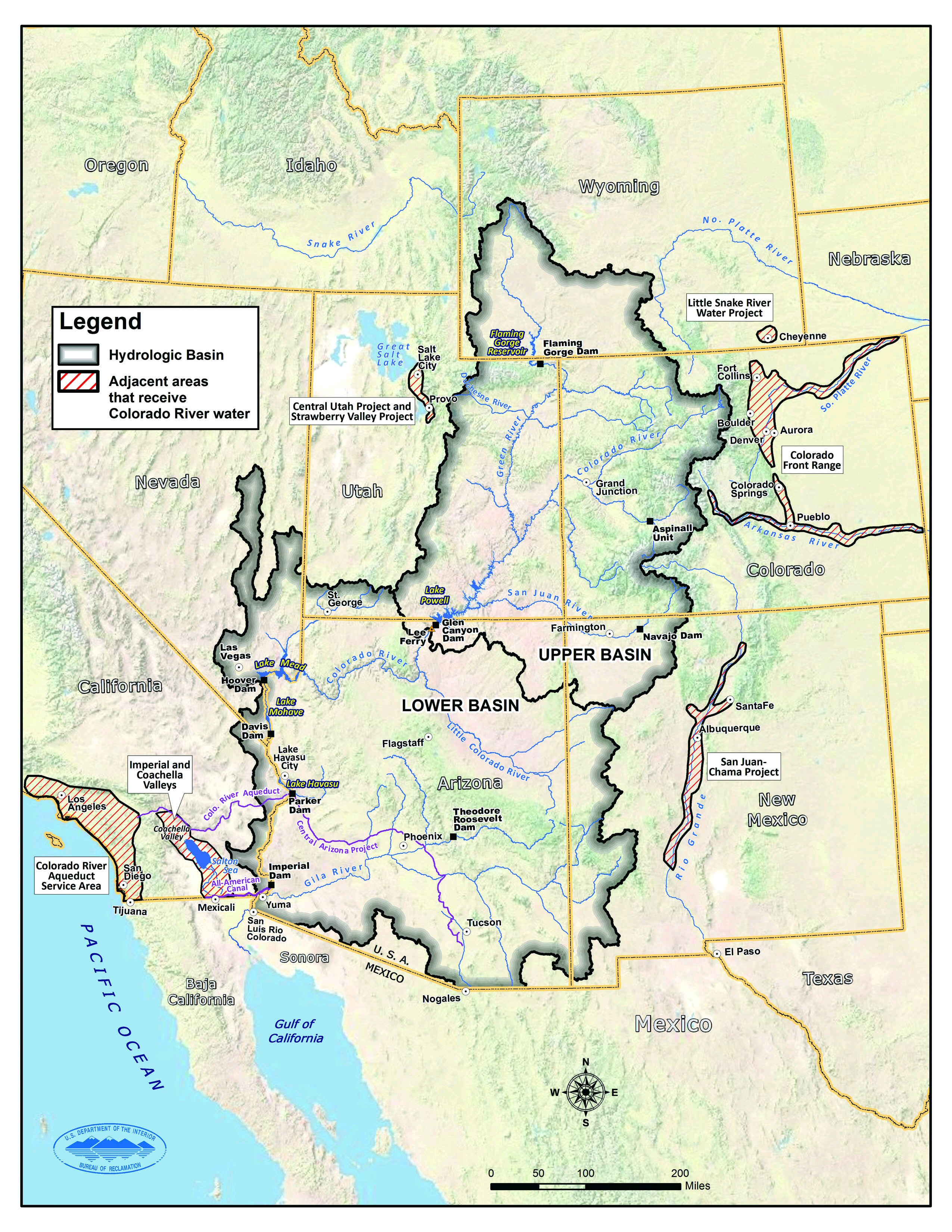
• September 24, 2021: As North America approaches the end of the 2021 water year, the two largest reservoirs in the United States stand at their lowest levels since they were first filled. After two years of intense drought and two decades of long-term drought in the American Southwest, government water managers have been forced to reconsider how supplies will be portioned out in the 2022 water year. 18)
- Straddling the border of southeastern Utah and northeastern Arizona, Lake Powell is the second largest reservoir by capacity in the United States. In July 2021, water levels on the lake fell to the lowest point since 1969 and have continued dropping. As of September 20, 2021, the water elevation at Glen Canyon Dam was 3,546.93 feet, more than 153 feet below “full pool” (elevation 3,700 feet). The lake held just 30 percent of its capacity. To compensate, federal managers started releasing water from upstream reservoirs to help keep Lake Powell from dropping below a threshold that threatens hydropower equipment at the dam.


- Downstream in the Colorado River water management system, Lake Mead is filled to just 35 percent of capacity. More than 94 percent of the land area across nine western states is now affected by some level of drought, according to the September 23 report from the U.S. Drought Monitor.
- In an announcement on September 22, the U.S. Bureau of Reclamation (USBR) explained that updated hydrological models for the next five years “show continued elevated risk of Lake Powell and Lake Mead reaching critically-low elevations as a result of the historic drought and low-runoff conditions in the Colorado River Basin. At Lake Powell, the projections indicate the potential of falling below minimum power pool as early as July 2022 should extremely dry hydrology continue into next year.” Minimum power pool refers to an elevation—3,490 feet—that water levels must remain above to keep the dam’s hydropower turbines working properly.
- With the entire Lower Colorado River water storage system at 39 percent of capacity, the Bureau of Reclamation recently announced that water allocations in the U.S. Southwest would be cut over the next year. ”Given ongoing historic drought and low runoff conditions in the Colorado River Basin, downstream releases from Glen Canyon Dam and Hoover Dam will be reduced in 2022 due to declining reservoir levels,” the USBR statement said. “In the Lower Basin the reductions represent the first “shortage” declaration—demonstrating the severity of the drought and low reservoir conditions.”

- The Colorado River basin is managed to provide water to millions of people—most notably the cities of San Diego, Las Vegas, Phoenix, and Los Angeles—and 4 to 5 million acres of farmland in the U.S. and Mexico. Water is allotted through laws like the 1922 Colorado River Compact and by a recent drought contingency plan announced in 2019.
- In a report and op-ed released on September 22, members of a NOAA Drought Task Force offered some context for the low water levels across the region. “Successive dry winter seasons in 2019-2020 and 2020-2021, together with a failed 2020 summer southwestern monsoon, led precipitation totals since January 2020 to be the lowest on record since at least 1895 over the entirety of the Southwest. At the same time, temperatures across the six states considered in the report (Arizona, California, Colorado, Nevada, New Mexico and Utah) were at their third highest on record. Together, the exceptionally low precipitation and warm temperatures reduced snowpack and increased evaporation of soil moisture, leading to a persistent and widespread drought over most of the American West.“
• September 20, 2021: Numerous craters on Earth are exceptionally compelling when viewed from space, displaying clearly visible rims and well-defined bowls. Not Sudbury Basin. It can take a moment looking at images to discern the shape of this impact structure amid the modern landscape. But few craters are as large or as old. 19)
- The object responsible for creating Sudbury Basin crashed into Earth about 1.8 billion years ago. That makes this crater in Canada fifty times older than Popigai—one of the world’s most well-preserved craters—which was created a mere 36 million years ago. Much of Sudbury’s original crater, thought to have measured at least 200 km (120 miles) across, has been deformed and eroded. Despite this, the crater has had a lasting impact on the region.

- This region of Canada owes its unique geology to that powerful collision—initially thought to be an asteroid and later interpreted as a comet. The collision punctured Earth’s crust, allowing material from the mantle to well up from below and fill the basin with melted rock. Then after a shockwave shattered the surrounding rocks, minerals from the melted rock below infiltrated the cracks.

- People have been making use of the minerals in Sudbury Basin for thousands of years. Large-scale mining operations started with the Murray Mine (now defunct) in the late 1800s. The mining took a toll on the landscape, polluting the region with sulfur dioxide and metals released during smelting processes. In recent decades, efforts have been made to capture emissions and restore the health of the basin’s land and water.
• September 17, 2021: In the midst of another brutal fire season that has threatened many lives, homes, and businesses, several of California’s natural treasures have also been threatened. Still burning after nearly nine weeks, the Caldor fire has encroached on Lake Tahoe. Now some of the world’s oldest and largest trees are being threatened by fires at the southern end of the Sierra Nevada range. 20)

- According to InciWeb and other sources, the KNP complex was ignited by a significant lightning storm on September 9–10. The Paradise fire and the Colony fire started separately near Sequoia National Park and have been marching across the drought-ravaged landscape toward a merger. By the morning of September 16, the KNP complex had burned 8,940 acres (36 km2). (A complex includes two or more separate fires that burn in very close proximity, have the potential to merge, and are managed by a unified firefighting group.)
- The KNP complex has led to the closure of Sequoia National Park and the evacuation of parts of the nearby community of Three Rivers. Fire officials told The Los Angeles Times on September 15 that the blazes were about a mile from the “Giant Forest,” the largest concentration of giant sequoias in the park and home to the 275-foot (83 m) General Sherman tree. Nearby Kings Canyon National Park remains open, but air quality is poor.
- The KNP fires are raging in very steep, dangerous terrain, so most of the firefighting has been done by aircraft so far. The National Park Service wrote in an update: “In the case of the Paradise Fire, extremely steep topography and a total lack of access has prevented any ground crew operations, and in the case of the Colony Fire, only a limited amount of ground crew access has been possible. Both fires are utilizing extensive aerial resources performing water and retardant drops.”
- Due south of the KNP complex, the Windy fire is burning in Sierra National Forest. It started in the Tule River Reservation during the September 9–10 lightning storm. About 2,800 acres have burned so far in an area not far from Giant Sequoia National Monument.
- According to CalFire, 1.97 million acres (nearly 3,100 square miles) have burned in California so far this year, and the fire season still has several months to go. The total is about half of the 2020 fire season—the worst on record—and roughly equal to the total burned in all of 2018. Near the end of the last severe drought in the state (2012-16), fire totals were 30 to 40 percent of the 2021 count.

• September 12, 2021: Hurricane Ida left an extensive trail of damaged homes, infrastructure, and lives from Louisiana to New England. It also has left a stain on the sea. Two weeks after the storm, several federal and state agencies and some private companies are working to find and contain oil leaks in the Gulf of Mexico. 21)
- The U.S. Coast Guard has assessed more than 1,500 reports of pollution in the Gulf and in Louisiana, and it “is prioritizing nearly 350 reported incidents for further investigation by state, local, and federal authorities in the aftermath of Hurricane Ida.” The Coast Guard is working with the Environmental Protection Agency, the state of Louisiana, the National Ocean Service, and other agencies to chronicle and monitor the state of coastal waters and infrastructure.

- Hurricane Ida caused the disruption of 90 to 95 percent of the region’s crude oil and gas production, while also damaging current and abandoned pipelines and structures. According to many news reports, the surface oil slicks near Port Fourchon (shown above) are likely related to as many as three damaged or ruptured submarine pipelines. It is unclear how much oil has spilled into the Gulf of Mexico.
- NOAA (National Oceanic and Atmospheric Administration) has conducted aerial surveys of some offshore waters and has released the photos online. The NASA-sponsored Delta-X research team has also been working in the area and was called upon to make some observations of the slicks and other coastal changes with synthetic aperture radar.
- Beyond active oil and gas extraction platforms, the seafloor of the Gulf of Mexico is covered in a maze of pipelines, capped wellheads, and other infrastructure that can be vulnerable to storm events. In a report issued earlier this year, the U.S. Government Accountability Office stated: “Since the 1960s, the Bureau of Safety and Environmental Enforcement has allowed the offshore oil and gas industry to leave 97 percent of pipelines (18,000 miles) on the seafloor when no longer in use. Pipelines can contain oil or gas if not properly cleaned in decommissioning.”
• August 30, 2021: Lake Mead is the largest reservoir in the United States and part of a system that supplies water to at least 40 million people across seven states and northern Mexico. It stands today at its lowest level since Franklin Delano Roosevelt was president. This means less water will be portioned out to some states in the 2022 water year. 22)

- The lake elevation data below come from the U.S. Bureau of Reclamation, which manages Lake Mead, Lake Powell, and other portions of the Colorado River watershed. At the end of July 2021, the water elevation at the Hoover Dam was 1067.65 feet (325 meters) above sea level, the lowest since April 1937, when the lake was still being filled. The elevation at the end of July 2000—around the time of the Landsat 7 images above and below—was 1199.97 feet (341 meters).

- At maximum capacity, Lake Mead reaches an elevation 1,220 feet (372 meters) near the dam and would hold 9.3 trillion gallons (36 trillion liters, corresponding to 36,000 km3) of water. The lake last approached full capacity in the summers of 1983 and 1999. It has been dropping ever since.
- In most years, about 10% of the water in the lake comes from local precipitation and groundwater, with the rest coming from snowmelt in the Rocky Mountains that melts and flows down to rivers, traveling through Lake Powell, Glen Canyon, and the Grand Canyon on the way. The Colorado River basin is managed to provide water to millions of people—most notably the cities of San Diego, Las Vegas, Phoenix, and Los Angeles—and 4-5 million acres of farmland in the Southwest. The river is allotted to states and to Mexico through laws like the 1922 Colorado River Compact and by a recent drought contingency plan announced in 2019.
- With the Lake Mead reservoir at 35 percent of capacity, Lake Powell at 31 percent, and the entire Lower Colorado system at 40 percent, the Bureau of Reclamation announced on August 16 that water allocations would be cut over the next year. “The Upper [Colorado] Basin experienced an exceptionally dry spring in 2021, with April to July runoff into Lake Powell totaling just 26 percent of average despite near-average snowfall last winter,” the USBR statement said. ”Given ongoing historic drought and low runoff conditions in the Colorado River Basin, downstream releases from Glen Canyon Dam and Hoover Dam will be reduced in 2022 due to declining reservoir levels. In the Lower Basin the reductions represent the first “shortage” declaration—demonstrating the severity of the drought and low reservoir conditions.”

- For the 2022 water year, which begins October 1, Mexico will receive 80,000 fewer acre-feet, approximately 5% of the country’s annual allotment and Nevada’s take will be cut by: 21,000 acre-feet (about 7% of the state’s annual apportionment). The biggest cuts will come to Arizona, which will receive 512,000 fewer acre-feet, approximately 18 % of the state’s annual apportionment and 8 % of the state’s total water use (for agriculture and human consumption). An acre-foot is enough water to supply one to two households a year.
• August 26, 2021: Since 2017, August 26 has been known as Katherine Johnson Day in West Virginia. The celebration commemorates the birthday of the ground-breaking NASA mathematician who was born on August 26, 1918, in White Sulphur Springs. 23)
- Katherine Johnson contributed her mathematical expertise to the first human space travel missions in the United States. In 1953, in a time of racial segregation, she started a job as a human “computer” with the National Advisory Committee for Aeronautics (NACA), the predecessor to NASA. She worked in the West Area Computing section at Langley Research Center on a team of Black women headed by fellow West Virginian Dorothy Vaughan.
- In 1961, Johnson did trajectory analysis for Alan Shepard’s Freedom 7 mission, America’s first human spaceflight. Her work was also instrumental in John Glenn’s successful orbit around Earth in 1962.
- Glenn became a household name in the United States, but it wasn’t until recently that Katherine Johnson’s name became well-known. Her story came to light in 2016 through the book and film Hidden Figures by Margot Lee Shetterly. In a pivotal scene in the movie, John Glenn hesitated over trusting his fate in space to a network of new IBM computers. He asked Johnson to check the equations for his orbit against the computer output. “If she says they’re good, I am ready to go,” said Glenn.

- Because of the segregated school system at the time, Black Americans could not attend high school in White Sulphur Springs. Her father moved the family to Institute, West Virginia, so that Katherine and her siblings could attend a high school that was on the West Virginia State University campus. Johnson graduated high school at 14, and then graduated summa cum laude from West Virginia State when she was 18, earning a double major in mathematics and French.

- Johnson’s fingerprints are on some of NASA’s greatest achievements. She precisely calculated trajectories for the 1969 Apollo 11 flight to the Moon, and she worked on the Space Shuttle and the Earth Resources Technology Satellite (later renamed Landsat 1). Across three decades at Langley, she authored or co-authored more than two dozen research reports before retiring in 1986.
- In 2015, President Barack Obama awarded Johnson the Presidential Medal of Freedom, citing her as a pioneering example of African-American women in science, technology, engineering, and mathematics. “Katherine G. Johnson refused to be limited by society’s expectations of her gender and race, while expanding the boundaries of humanity’s reach,” said Charles Bolden, NASA's first Black administrator and a former astronaut.
- In 2019, NASA renamed its Independent Verification and Validation Facility in Fairmont, West Virginia, for Katherine Johnson. When she died on February 24, 2020, then-NASA Administrator James Bridenstine said: “She was an American hero and her pioneering legacy will never be forgotten.”
• August 17, 2021: Eleven years after an earthquake devastated the Haitian capital of Port-Au-Prince, another major earthquake has shaken the Caribbean nation. The epicenter of the magnitude 7.2 earthquake was centered about 100 km (60 miles) west of the 2010 quake, in a mountainous area between Petit-Trou-de-Nippes and Aquin. Like the previous event, this earthquake occurred along the Enriquillo-Plantain Garden fault, an area where two tectonic plates grind against each other. 24)

- The earthquake exposed more than one million people to very strong to severe shaking, according to the U.S. Geological Survey. In preliminary estimates, news media and Haiti’s civil protection agency are reporting large numbers of deaths and extensive damage to buildings and infrastructure.
- Many of the landslides in this image appear to be in sparsely populated areas. It is possible that landslides also occurred in areas south and east of the park that experienced intense shaking, but cloud cover on August 14 prevented Landsat from acquiring a clear view. Additional imagery from Landsat and other satellites should eventually provide more clarity about the extent of the landslides.
- The situation could be exacerbated in the coming days by heavy rains from tropical depression Grace. Some forecasts call for the storm to drop between 13 to 25 cm (5 to 10 inches) of rain on the areas hit hardest by the earthquake.

- “Some hillslopes that have been destabilized by the earthquake but did not become landslides may be pushed past the limit of stability by the rain, leading to further landslides,” said Robert Emberson, a landslide expert with NASA’s Earth Applied Sciences Disasters Program. “Debris and rock already mobilized by the earthquake may be transported by flash flooding as devastating debris flows. The material is mostly at the base of hills currently, but rivers quickly filled by rain could push that downstream and cause severe impacts to communities living farther from the location of the landslides.”
- NASA’s disasters program is monitoring the situation and coordinating with the United States Agency for International Development and other partners to share relevant data about the event with emergency responders. Data and updates from the team will be shared here.
• August 12, 2021: In the first two weeks of August 2021, Greece has endured a series of wildland fires that have charred a large swath of the island of Evia and several areas of the Peloponnese region. The fires followed closely after one of the worst heatwaves in the country since the 1980s, which dried up scarce moisture and left forests primed to burn. Greek Prime Minister Kyriakos Mitsotakis told several news agencies that the fire outbreak has been a “disaster of unprecedented proportions.” 25)

- According to data from the European Forest Fire Information System (EFFIS), more than 110,000 hectares (424 square miles) have burned in Greece this year, more than five times the yearly average from 2008 to 2020 (21,000 hectares). EFFIS counted 58 fires (30 hectares or larger) in the country in 2021, already above the yearly average total of 46.

- Some of the worst fires in the country have burned on Evia, the second largest island in Greece and a major hub for tourism. Much of the island has been in a state of high fire alert for a week. The Associated Press reported that an estimated 50,000 hectares (123,000 acres) have burned on Evia, as well as hundreds of homes.
- Significant fires also broke out near Athens, Olympia, and Arcadia, and 63 organized evacuations have been reported across Greece in the past nine days. Firefighters and equipment have been sent from at least 15 countries to help Greek authorities.
- As of August 11, EFFIS reported that more than 338,000 hectares (1,300 square miles) have already burned across Europe in 2021, more than the 2008-2020 average for an entire year (295,000). More than 109,000 hectares have burned so far in Italy, 2.5 times the annual average. Large fires have also been burning in Algeria and Turkey.

- The heatwaves and fires fit with patterns described in the latest assessment report from the Intergovernmental Panel on Climate Change (IPCC), to which NASA-funded scientists contribute. In its summary of climate conditions in Europe, the IPCC noted: “The frequency and intensity of hot extremes ... have increased in recent decades and are projected to keep increasing regardless of the greenhouse gas emissions scenario. Despite strong internal variability, observed trends in European mean and extreme temperatures cannot be explained without accounting for anthropogenic factors.”
• August 11, 2021: Every year, scientists at the University of Maryland publish new data about the state of Earth’s forests based on observations from Landsat satellites. As has often been the case in recent years, the update for 2020 painted a bleak picture. In that one year, Earth lost nearly 26 million hectares of tree cover—an area larger than the United Kingdom. 26)

- The raw numbers can tell us how much and where forests were lost, but they do not explain what was driving those losses. How much deforestation was due to wildfires? Food production? Forestry management? An ongoing effort by researchers from The Sustainability Consortium and the World Resources Institute (WRI) attempts to answer such questions with maps and datasets that categorize and quantify the major drivers of annual forest losses. In doing so, the researchers have put a spotlight on the impact that food production has on forests, particularly in the tropics.
- In 2020, for instance, Earth lost about 4.2 million hectares (16,000 square miles) of humid tropical primary forest—an area about the size of the Netherlands. Nearly half of that, their analysis shows, was due to food production, and half of that was due to commodity crops. In recent years, commodity crop production has pushed rates of forest loss to record levels.

- “In many cases, commodity-driven deforestation is essentially a permanent change compared to shifting agriculture,” explained Christy Slay, a conservation ecologist and the senior director of science and research applications at The Sustainability Consortium. “These areas will likely never be forests again.”
- In contrast, forests cleared for forestry management or by wildfires generally grow back over time. In the U.S. Southeast, for instance, managers maintain certain ecosystems and animal habitats by periodically burning and planting forests to mimic natural cycles of burning and regrowth. Likewise, forests in the Pacific Northwest and Europe are often managed for timber in ways that cycle between periods of forest clearing and periods of regrowth.
- Note that food production was once a major driver of deforestation in North America and Europe, but much of the clearing happened a hundred or more years ago. Since many forests in these areas were already gone by 2000, their absence does not register as forest loss. Nor does the map capture the impact of large-scale conversion of natural grasslands to agriculture, a common practice in both North and South America.
- With tropical forest cover dwindling and the effect of climate change becoming more acute, some companies and consumers are trying to ensure that food production does not lead to new deforestation. In recent years, hundreds of companies have committed to eliminating or reducing products in their supply chains that cause deforestation. But ensuring that is often challenging.
- “Global supply chains can be complicated and opaque,” said Slay. “You often have companies buying commodities off the spot market, such that the source regions change frequently or even daily. Retailers and food manufacturers often don't know the source of their ingredients down to the individual farm and field scale.”
- By regularly collecting data on the health of forests, satellites are making it easier for scientists to untangle which commodities and regions are the biggest contributors to deforestation. Doug Morton, a forest ecologist at NASA’s Goddard Space Flight Center, has witnessed a shift in the dominant drivers of deforestation.
- “Forty years ago, we often saw small-scale deforestation creating roads that look like fishbone patterns,” said Morton, who monitors agricultural frontiers in the Amazon. At the time, many people were moving into the Amazon to escape drought and hunger in eastern Brazil. “By the middle of the Landsat record, we see large-scale commodity production taking hold. Today’s deforestation isn’t about individual families. It’s often tractors and bulldozers clearing large tracts of forest for industrial scale cattle ranching and crops.”
- For companies trying to keep their supply chains free of deforestation, knowing which commodity crops are being grown where is critical. “If we know where deforestation is common and what crops are involved, we can go to companies and say: ‘Be careful if you’re working with suppliers that are sourcing this particular product from this particular part of the world,’ ” said Slay. “Satellite data of forest change and loss is the first step in the process.”
- One recent WRI analysis combined Landsat imagery with economic and land-use data to parse the impact of seven different commodities on forests around the world. “One of the big things you notice in the data is the outsized role of cattle pastures in driving deforestation,” said Mikaela Weisse, one of the report’s authors. “Cattle pastures caused about five times more deforestation than any of the other commodities we analyzed.”

- In Southeast Asia, where deforestation rates have dropped recently, most forest losses are associated with palm oil, which is used in many types of processed foods and various health and beauty products like deodorant, shampoo, toothpaste, soap, and lipstick. Deforestation for cocoa production had a sizable impact in certain countries—notably Ghana and Côte d'Ivoire—but only represented 3 percent of total forests losses. Other commodities with similarly modest effects on global forests included rubber, coffee, and wood fiber.
- While new tools are making it easier to understand where food production is intersecting with new deforestation, huge challenges remain. “Deforestation rates are going up instead of down,” said Elizabeth Goldman of WRI. “There’s a lot of work left to do.”
• August 4, 2021: In the midst of a severe heatwave and following months of dry weather, Turkey is facing some of its worst wildfires in years. Over the past seven days, more than 130 wildfires have been reported across 30 Turkish provinces. Most of the fires have ignited along the Mediterranean and Aegean Sea coasts, several in resort areas around Antalya, Mugla, and Marmaris. 27)


- The European Forest Fire Information Service reported more than 136,000 hectares (525 square miles) have burned in Turkey already this year, about three times the average for an entire year. The European Space Agency’s Sentinel-3 satellite also acquired a view of the fires on July 30.

- Fires were still being fed by strong winds, air temperatures above 40º Celsius (104° Fahrenheit), and low humidity. Croatia, Iran, Spain, Russia, Ukraine, and Azerbaijan provided equipment and personnel to help Turkish firefighters bring the blazes under control.
- Much of southern Europe has been baking for weeks under extreme heat not seen since the 1980s. National temperature records were set in both Greece and Turkey in the past month. Air temperatures reached 45°C (113°F) in Greece and surrounding areas yesterday, and the heat is forecasted to continue for several days. Fires are also burning this week in Greece and Lebanon.
• July 21, 2021: Covered with lakes, forests, and mountains, Dalarna County has been called “Sweden in miniature.” But the same region that today draws people to its idyllic lakeside villages and midsummer celebrations was also the site of an ancient, catastrophic impact. 28)

- Around 380 million years ago, in the Late Devonian period, an asteroid slammed into the land that is now south-central Sweden. The impact left quite a mark. Even after hundreds of millions of years of erosion, the scar is still recognizable. It is especially apparent when viewed from above.
- Surveys of the structure have shown that the ground is slightly raised up across parts of the crater’s center. It is surrounded by a ring-like graben, or depression, which today is partially filled with water. Lake Siljan, on the crater’s southwest side, is the largest lake; it connects to Lake Orsa via a small river.
- People have lived for millennia near the crater without knowing its cosmic origin. In the late 1960s, scientists used drill cores to uncover the complex and ancient geology deep below the ground.
- Research at Siljan is ongoing today. In a 2019 study, scientists described how they used drill cores to find that the deep, fractured rocks in the crater were suitable for ancient life. A subsequent paper in 2021 described the fossilized remains of fungi discovered at a depth of more than 500 meters.
• July 19, 2021: For several months, communities along the west coast of Florida have observed substantial blooms of the harmful algae Karenia brevis. The algae occur naturally in the waters around Florida, but the bloom in 2021 has been particularly bad near Tampa Bay, causing large-scale fish kills in what some people refer to as a ‘red tide’ event. The bloom is also unusual for how early it is occurring. 29)

- Karenia brevis is a microscopic algae that, like other phytoplankton, can multiply into massive blooms when there are enough nutrients in the water—often in the autumn along the Gulf Coast. The algae produce neurotoxins that can kill fish and cause skin irritation and respiratory problems for humans, particularly those prone to asthma and other lung diseases. In extreme concentrations, K. brevis can turn water brown, red, black, or green; however, it is not always visible from space.

- “This Karenia brevis ‘red tide’ bloom is doubly unusual,” said Richard Stumpf, an oceanographer for the National Oceanic and Atmospheric Administration (NOAA). “It is summer, which is rare, and it is intense well into Tampa Bay, which is rare even during a ‘normal’ fall bloom.”
- “If a bloom is out on the continental shelf, it is more easily diluted,” said Chuanmin Hu, an optical oceanographer at the University of South Florida (USF). “The bloom this year is so troublesome because it is both inside Tampa Bay and around the Tampa Bay mouth.”

- “Although Karenia brevis blooms are common to the West Florida Shelf and have been observed in almost every coastal region of the Gulf of Mexico, I have never seen anything like that inside Tampa Bay,” said Inia Soto Ramos, an ocean color specialist at NASA’s Goddard Space Flight Center (GSFC) and former researcher at USF. “Massive blooms were observed back in the late 1990s, and even the Spanish conquistadors described them in their books. But the bloom this year inside the bay is worrisome. It could be a one-year thing, and hopefully it is. But if water quality in the bay continues to decline, residents should prepare for more blooms, and not only K. brevis.”
- Since early June 2021, Karenia brevis has been abundant along the Gulf Coast from just north of Clearwater to Sarasota. In a July 14 report, the Florida Fish and Wildlife Conservation Commission noted: “A bloom of the red tide organism, Karenia brevis, persists on the Florida Gulf Coast. Over the past week, K. brevis was detected in 107 samples.”
- According to the Sarasota Herald-Tribune, coastal work crews have collected more than 600 tons of dead fish and marine life killed by the bloom. On July 15, the city council of St Petersburg asked the governor to declare a state of emergency over the bloom. Officials are still trying to pinpoint the trigger for the event, but many scientists note that the area has been unusually rich with algae-sustaining nutrients in 2021.
- “Karenia brevis blooms, although studied for decades, do not follow a strict recipe. Some years, circulation and advection are the main drivers,” said Soto Ramos. “However, we know if there is an excess of nutrients, the algae will utilize them. I think the bloom right now is due to a combination of available nutrients, warm temperatures, and circulation patterns keeping the algae contained within the bay. Once the algae are there, they stay for a while.”
- NASA is currently developing the Plankton, Aerosol, Cloud, ocean-Ecosystem (PACE) satellite mission for launch around 2024. The satellite is being designed with sensors tuned to the signatures of blooms. “Whereas heritage ocean color instruments observe roughly six visible wavelengths, PACE will collect a continuum of colors that span the visible rainbow,” said Jeremy Werdell, project scientist for PACE at NASA GSFC. “Its ocean color instrument will be the first of its kind to collect hyperspectral radiometry on global scales, which will allow unique and highly advanced identification of aquatic phytoplankton communities, including potentially harmful algae such as these on the West Florida Shelf.”
• July 17, 2021: In recent decades, aquaculture has boomed in Andhra Pradesh. The state has become one of India’s largest producers of farmed fish and shrimp. Among the reasons for the boom:a major expansion a of inland aquaculture farms along rivers and canals where people once raised crops. 30)

- According to satellite imagery, aquaculture was scarce in this area in the mid-1980s. Now carp, catfish, and other types of finned fish are commonly raised in the area. There are numerous shrimp ponds, too, which tend to be the narrow according to one satellite survey of the area.
- The Indian government established the first aquaculture ponds in this area in the 1970s around Lake Kolleru. Since then, the initial success of those projects has made aquaculture an appealing and profitable choice for many farmers in the region who regularly dealt with crops being flooded, the intrusion of salt into water used for irrigation, and Bay of Bengal cyclones.

- Despite the expansion, India’s aquaculture sector has faced challenges recently. One recent study calculated that its shrimp farming sector may have lost as much as $1.5 billion in 2020-2021 due to disruptions related to the pandemic. The state of Andhra Pradesh accounts for about 70 percent of India’s shrimp production.
• July 11, 2021: In research published in 2017, scientists reported that summer pulses of freshwater from melting glaciers along Greenland’s southwest coast often coincide with phytoplankton blooms. The flow of fresh meltwater out to sea carries nutrients that can sustain and promote abundant growth of the floating, plant-like organisms that form the center of the ocean food web. 31)

- The waters of the Labrador Sea, Davis Strait, and Baffin Bay—between Greenland and Nunavut, Canada—form a transitional zone between the Arctic and Atlantic oceans. Fresh meltwater from the ice sheets and strong regional tides (which promote nutrient mixing) help make these waters biologically rich, particularly in summertime. The abundant phytoplankton draw in copepods and other grazers that ultimately feed shrimp, cod, and other species up to the size of whales.
- In the 2017 paper, Stanford University ocean scientist Kevin Arrigo and colleagues noted that summer blooms tend to start in early July and can extend as far as 300 kilometers (200 miles) offshore from Greenland. Fed by sunlight and water rich in iron, silicate, and phosphorous, the blooms account for about 40 percent of annual net primary production for the region.
- Blooms in high-latitude and Arctic waters are happening more often and lasting longer, according to another study published in 2020 by Arrigo’s research group. Incorporating satellite data from NASA’s SeaWiFS and MODIS instruments, they found that the rate of growth of phytoplankton biomass across the Arctic Ocean increased by 57 percent between 1998 and 2018. The study contradicted an older idea that increasing glacier melting might lead to fewer nutrients and blooms.
• July 8, 2021: Toward the end of the last Ice Age, as mile-thick glaciers weighed down the land surface and then melted, parts of New England and eastern Canada became inundated by water. Some lowlands flooded and formed inland basins like the Champlain Sea. 32)
- Ten thousand years later, with seas now rising because of global warming, scientists are combing through an array of data and building increasingly detailed models to understand the processes that drive regional and local changes in sea level. The goal is to project when, where, and how much seas are likely to rise in the coming decades and centuries. It's an incredibly complicated set of interdependent calculations.

- “People tend to think that sea level is like a bathtub with the water level simply rising and falling depending on how much water is coming out of the faucet,” said paleoclimatologist Anders Carlson of the Oregon Glaciers Institute. “In reality, it’s more like a spinning bathtub that’s changing shape, moving up and down, and has water pouring into and out of different drains and over the sides. Where the water will ultimately slosh over the edge of the tub is influenced by many things, making it difficult to say where the overtopping will occur.”
- Despite the complexities, the scientific understanding of the factors that control sea level has improved dramatically in recent decades, as have measurements of past sea level change and projections of future change.
- “We can tell you how much the ocean has warmed in recent decades, and how much more space the water takes up. We have satellites and other tools that have measured that,” said Ben Hamlington, the current lead of NASA’s sea level change team. “The same thing is true for several of other factors that influence sea level, such as the mass of the ocean, the salinity, and how much water is stored on land.”
- That growing knowledge base is why scientific organizations like the Intergovernmental Panel on Climate Change (IPCC) are publishing sea level rise projections with increasing levels of confidence. In its 2019 report, the IPCC projected (chart Figure 64) 0.6 to 1.1 meters (1 to 3 feet) of global sea level rise by 2100 (or about 15 mm per year) if greenhouse gas emissions remain at high rates (RCP8.5). By 2300, seas could stand as much as 5 meters higher under the worst-case scenario. If countries do cut their emissions significantly (RCP2.6), the IPCC expects 0.3 to 0.6 meters of sea level rise by 2100.
- A host of competing factors will influence how global sea changes translate to regional and local scales. Among them: the rising or falling of the land surface due to plate tectonics and human activity; gravity anomalies that can create regional bulges and dips in sea surface height; variations in the temperature and salinity of seawater; changes in the amount of water stored on land in reservoirs; isostatic adjustment due to the addition, loss, and movement of land ice; and changes in erosion and how much sediment rivers carry to coastal areas.

- But it is hard to predict human settlement patterns—and the subsidence it causes—decades or centuries from now. Many IPCC projections do not even attempt to incorporate estimates of this subsidence partly because of the uncertainties in future land use and human behavior and because there is a lack of readily available, large-scale data on vertical land motion to feed into models of sea level rise.

- Likewise, teams of scientists have been surveying the fast-sinking Mississippi River Delta to get a better understanding of how changes in sediment and vegetation affect the delta. Scientists participating in NASA’s Delta-X campaign have collected several types of data to develop and calibrate a model of how the delta might respond to rising sea levels in the next century.
- “The combination of anthropogenic subsidence and increasing rates of sea level rise is a five-alarm fire for many delta cities,” said Shirzaei. “Places like New Orleans, Kolkata, Yangon, Bangkok, Ho Chi Min City, and Jakarta will undoubtedly face increasing pressures from flooding and saltwater intrusion.”
- Still, the long-term picture—hundreds of years into the future—is unlikely to be perfectly clear. “When you think about future impacts of sea level rise, you also have to consider what people might do in response," said Hamlington. Some countries—like The Netherlands and the United States—have already built elaborate sea walls and water-control systems that protect vulnerable deltas like the Rhine and the Sacramento-San Joaquin. They will likely continue reinforcing these systems as sea levels rise. In others deltas, like the Krishna (Figure 65) or Ganges in India, the Chao Phraya in Thailand, and the Mekong in Vietnam, coastal defenses are more limited so far.
- “The reason people within the scientific community are working so hard on regional sea level rise projections is that if we can get them right, it will give cities and nations a chance to prepare,” said Hamlington. “Even if some of the more distant projections are inexact, they still provide critical constraints that could end up being the difference between places that successfully adapt to rising seas and those that experience the most damaging consequences.”
• July 6, 2021: With heights ranging from 600 to 1800 meters (2,000 to 5,900 feet), the Barberton Makhonjwa Mountains in South Africa and Eswatini are not particularly tall. What distinguishes the belt of greenstone rock formations found here is their age. 33)

- Beneath the rolling, grassy uplands and forested valleys of the mountain range, lie some of the oldest, best-preserved, and diverse sequences of volcanic and sedimentary rock layers found anywhere on the planet. They hold evidence of some of Earth’s earliest forms of life, including microfossils, stromatolites, and other biologically derived material. Geological sampling indicates that some rock formations in these mountains are 3.2 to 3.6 billion years old.
- One type of rock in this area that especially intrigues geologists is komatiite. The rare igneous rock formed from magmas that were hotter, more liquid, and denser than any lavas found on Earth today. Geologists still debate what conditions allowed komatiite to form, but many think Earth’s mantle was likely hotter or wetter 3 billion years ago than today, and that likely played an important role.
• July 3, 2021: On March 19, 2021, the Fagradalsfjall volcano erupted after lying dormant for 800 years. Three months later, the volcano on Iceland’s Reykjanes peninsula is still spewing lava and expanding its flow field. 34)

- The Icelandic Met Office reported that by May 3, the lava flow was largely confined to one main crater, a fifth fissure that opened in April. In late May, lava flows broke through an artificial barrier built to contain it; the lava continued flowing south towards Nátthagi Valley. The lava flow has since cut off access to the most popular hiking trail to the eruption site. As of June 15, the lava flows were estimated to cover a total area of 3 square kilometers (about 1 square mile), with an estimated volume of 63 million cubic meters.
- Icelandic officials are concerned that a prolonged eruption will cause lava to flow south and cross the Suðurstrandarvegur, a road used to transport goods and connects Reykjanes peninsula to South Iceland. After crossing the road, the lava flow could continue toward the ocean.
• June 30, 2021: Skies were clear and the waters of Mistastin Lake were placid when the Operational Land Imager (OLI) on Landsat 8 captured this natural-color image of Labrador, Canada, on a fall day in 2017. 35)

- The scene would have looked quite different about 36 million years ago when an asteroid smashed into Earth and left an impact crater where the lake (called Kamestastin by the Innu people) now sits. While erosion has changed and obscured some of the features, a 50-meter (164-foot) wall still rings much of the crater. Geologists estimate the original crater had a diameter of about 28 kilometers (17 miles)—about twice the size of the current lake.
- Parts of the central peak are also visible in the lake as Horseshoe Island. These mound-like features are often found in the center of large craters as a product of the melting and rebound of subsurface rocks. Meanwhile, the elongated, elliptical appearance of the crater is a result of periods when glaciers slid across this area during several ice ages.
- Based on the presence of an unusual diamond-like mineral called cubic zirconia, the asteroid impact must have heated rocks at the site to at least 2370°C (4,300°F). That would be the hottest-known temperature recorded by a surface rock on Earth, according to one team of researchers.
• June 21, 2021: The Yukon-Kuskokswim Delta is one of the world’s largest deltas, and it stands as remarkable example of how water and ice can shape the land. These images show the delta’s northern lobe, where the Yukon River spills into the Bering Sea along the west coast of Alaska. 36)

- While the image could be considered a work of art, there are some useful aspects to looking at the land this way. For example, you can easily distinguish areas of live vegetation (green) from land that is bare or contains dead vegetation (light brown) from the network of sediment-rich rivers and ponded flood water (dark brown). A sprinkling of thermokarst lakes are also part of the scene.

- In general, the green areas across the delta are tall willow shrublands. They are especially apparent on either side of the river channels in the detailed image above. The light-brown areas are primarily moist sedge meadows; they appear brown because much of it is the dead remains of last year’s growth. Away from the delta (right side of the image) the vegetation is shrub-tussock tundra.
- “To me, one of the interesting things about the delta is that it is a highly transitional area, with some elements of Arctic tundra and some of boreal forest,” Frost said.
- The delta also transitions with the seasons. At the time of this image, the signature of spring flooding is written across the delta. Melting snow and ice cause the rivers to spill over their banks and by late May, many of the marshes are filled with floodwater, which appears as dark-brown ponds.
- According to Lawrence Vulis, a graduate student at the University of California, Irvine, the delta would have appeared much more inundated immediately following the melting of snow and ice a few weeks prior to this image. Stream gauges and satellite images suggest that the bulk of the flooding had already subsided. Still, the flooding was recent enough that the plenty of ponding remained on May 29. As summer advances, the floodwater will continue to recede and the wetlands will continue to green up with vegetation.
- Also notice the colorful water where the delta meets the Bering Sea. This is a product of glacial runoff far upstream, which carries a large amount of sediment toward the coast. This sediment is also instrumental to the formation of tall “levees” on the sides of the channels, deposited there when floodwaters spill over their banks. These “levees” support stands of tall willows—important habitat for moose.
- “Interestingly, tall shrubs have expanded a lot on the delta in recent decades, and the moose have followed,” Frost said. “Today, the delta has one of the highest moose densities in the state of Alaska.”
- The delta did not always look this way. Studies have shown that the modern Yukon Delta is just a few thousand years old. It’s young age “is incredible to think about,” Vulis said. “We are used to thinking about relatively ancient landscapes, but modern river deltas have only formed in the last 10,000 to 8,000 years since global sea level has stabilized.”
- The delta could quite possibly look different in the future. “The Yukon and other Arctic deltas are thought to be particularly vulnerable to climate change,” Vulis noted, “due to the roles of permafrost and ice in shaping these deltas.”
• June 16, 2021: Over the past three decades, small-scale gold mining has led to more than 100,000 hectares (250,000 acres) of forest loss in the Peruvian Amazon. While government agencies and conservation groups have successfully curbed such activity in recent years, new mining hotspots still pop up in unauthorized zones. 37)

- Peruvian researchers from Conservación Amazónica (ACCA), working with NASA and the Peruvian government, have developed a satellite-based tool to locate emerging mining hotspots in the Amazon. The Radar Mining Monitoring Tool (RAMI) identifies areas that appear to have new mining activity and examines their proximity to protected buffer zones, indigenous lands, mining concessions, and already degraded lands. The information is shared with Peruvian authorities to help pinpoint new activity and stop illegal mining.
- “Authorities may have limited resources to find all of the mining hotspots in a region,” said Sidney Novoa, project manager for SERVIR-Amazonia and a researcher at ACCA. “There are many systems that monitor forests in Peru, but no one else is focused just on gold mining. Our main goal is to empower authorities and give them enough resources to prioritize and focus their efforts.”

- The research team is particularly interested in detecting small-scale, artisanal gold mining, typically operated by independent miners known as garimperos. In recent decades, the number of artisanal mines in the Madre de Dios department of Peru has increased, carving out a larger environmental footprint than industrial mines. Artisanal miners use mercury, which can pollute water sources and lead to neurological disorders or kidney issues in humans who are exposed to it. Illegal mining in protected zones also can compromise the homes of indigenous people, as well as endemic plants and animals.

- “I used to put aside looking at mining activity during the rainy season because authorities thought it would not occur intensely during those months,” said Novoa. “We finally have information to demonstrate the importance of monitoring mining activities during the rainy season.” He explained that activity typically intensifies once the peak of the rainy season passes in February and March, as garimperos use the accumulated water in forests and waterways for their mining.
- RAMI mining alerts are updated every 15 days depending on the availability of satellite data. Novoa’s team creates private reports about new hotspots for the Monitoring of the Andean Amazon Project (MAAP), an initiative from Amazon Conservation Association and ACCA. Summaries are also shared directly with Peruvian authorities. The RAMI tool is hosted on the Internet and open to the public.
- RAMI is supported by SERVIR-Amazonia, a joint program of NASA and the U.S. Agency for International Development (USAID) that uses remote sensing to provide support for sustainable development. It is led locally by the Alliance of Bioversity International and the International Center for Tropical Agriculture (CIAT). The RAMI tool was co-developed with and incorporated data from ACCA, Peru’s Ministry of Environment, and Peru’s National Forest Conservation Program.
• June 15, 2021: People have been mining for gold in Ghana for centuries. Long before European colonists set foot in the area in the 1400s, Ghanaians looked for gold with pickaxes, shovels, and pans. They washed or “panned” for gold along river banks or dug holes on the surface to find deposits of gold dust and nuggets. Serious indigenous miners dug deep tunnels—records indicate some up to 80 feet deep. 38)

- A version of this small-scale mining persists—known today as artisanal mining—but new research shows it is having a growing and sometimes devastating effect on the environment. Researchers from NASA, U.S. universities, and government agencies in Ghana recently used satellite data to estimate the extent of vegetation lost to artisanal mining in the southwestern portion of the country, where the majority of gold mining takes place. They found artisanal mining accounted for 25 percent of vegetation loss in the region from 2005-2019.
- “The accumulation of the small-scale mines across the landscape is startling. The deforestation impact is huge compared to industrial mines,” said Abigail Barenblitt, the main author of the study and data analyst in the biosphere sciences lab at NASA’s Goddard Space Flight Center. Although it only accounts for about one-third of the country’s gold production today, artisanal mining caused seven times more deforestation than industrial efforts between 2007-2017.
- The differing impact of artisanal and industrial mines is related to the process of gold extraction, said study co-author Amanda Payton of East Carolina University. Large-scale industrial mines use heavy machinery to dig deep in a concentrated area. Industrial miners are also sometimes required to fill the holes in the landscape after extraction in order to help with remediation.
- Because they typically do not have heavy-duty equipment, artisanal miners tend to dig many shallow holes across large swaths of land. They extract and process gold at the site and then move onto the next area. They usually do not refill holes after extractions. And they often use mercury to remove gold from sediments, which can lead to serious health problems and long-term water and soil contamination. Unregulated artisanal mining is locally known as galamsey, derived from the Ghanaian words “gather” and “sell.”
- “Artisanal mining has a quicker turnaround time on the landscape, with operations excavating a shallower area and then moving on to another section of the river. Some of the artisanal mines stretch for great distances along rivers,” said Payton. “With industrial mining, more research into the gold deposits is done and more resources are committed to a single area of land to excavate deeper.”
- Barenblitt, Payton, and colleagues worked with the Ghana Space Science and Technology Institute and Ghana Statistical Service to determine the total footprint of vegetation loss to artisanal gold mining. They analyzed decades of Landsat data, creating a machine-learning algorithm to classify any vegetation loss in one of four categories: mining, urban development, water, and other (agriculture, bare soil, etc.). The team found more than 160,000 hectares (400,000 acres) of vegetation were lost from 2005-2019. About 28 percent was lost to both industrial and artisanal gold mining, while 29 percent was lost to urban development. About 17 percent was converted to water, mainly due to the formation of a lagoon complex. The remaining 25 percent was attributed to the “other” category of land losses.
- The team further classified mining as large-scale industrial or small-scale artisanal by looking at elevation data and the texture of the landscape. Industrial mines have larger elevation changes since they dig deeper into the surface. Highly textured landscapes tend to indicate artisanal mining due to the small holes compared to wider, smoother industrial areas. Artisanal mines accounted for 85.7 percent of vegetation loss, while industrial mines accounted for 14.3 percent from 2005-2019.


- “There has definitely been an expansion of small-scale mining by more people over time because of the price of gold,” said Lola Fatoyinbo, a forest ecologist at NASA’s Goddard Space Flight Center and a contributor to the study. “The high gold prices probably made artisanal mining worth the labor.” The team calculated a correlation between gold prices and annual mining conversion after a two-year lag. Over the study period, the value of gold jumped from about $700 per ounce to as high as $1,700 in 2012; it is now nearly $1,800 per ounce.
- The team’s next step is to automate their image analysis process so new mining can be detected quickly by African and international organizations addressing the issue. This research is part of larger efforts across NASA to detect unregulated gold mining in Ghana. The team has collaborated and compared methods with researchers of SERVIR-West Africa, a program between NASA and the U.S. Agency for International Development (USAID). SERVIR-West Africa uses similar mining analyses and shares the data to government officials to help curb artisanal activities and reform past mining sites.
• June 4, 2021: Off the coast of Sonoma and Mendocino counties, changing climate and a marine epidemic have combined to decimate one of California’s most productive ecosystems. In the span of a single year, the region’s renowned kelp forests almost completely collapsed, and they are still struggling. Floating forests that once harbored and fed many marine species have turned into barrens devoid of biodiversity. 39)

- Using 34 years of Landsat imagery, a team of researchers led by Meredith McPherson of the University of California, Santa Cruz, documented the fast and catastrophic collapse of the once hardy kelp forest, as well as its struggle to regenerate. The research team found that the Northern California kelp canopy declined more than 95 percent in 2014-15, and the effects persisted for five years.

- Bull kelp is a canopy-forming macroalgae that flourishes in nutrient-rich, cool water and grows as much as 60 cm (nearly 2 feet) per day. The kelp is considered an “ecosystem engineer”—the foundational species of a nearshore ecosystem that feeds and shelters other marine life. It is the dominant kelp species north of Monterey Bay, California, with underwater forests thriving along 160 km (100 miles) of rocky reefs from Fort Bragg to Jenner.
- Unlike the giant kelp more common to the south, bull kelp is an annual species that grows vigorously from June through August. It then disperses its spores before fall and winter storms dislodge the mature plants from their rocky perches. While the exact location and extent of the bull kelp can change from year to year (based on spore dispersal and environmental factors), the underwater forest has historically regenerated regularly.
- Looking across several decades of Landsat observations, McPherson and colleagues found that the geographic distribution of bull kelp contracted, first receding in 2008 in the sandier regions north of Fort Bragg, and then in 2012 in sandier sections south of Jenner. (These areas are just north and south of the map area shown.) But along the rocky substrate in the middle, the bull kelp held strong.

- The nutrient-poor waters associated with marine heatwaves hinder kelp growth, leading to smaller canopies. Historically kelp have been resilient, though, coming back in force once waters have cooled down. But this time, a cascading series of environmental and biological events—exacerbated by climate change—combined to decimate the forests.
- The delicate interplay of species that safeguards kelp forest biodiversity was shifted in 2013 when more than 20 sea star species from Alaska to Mexico started wasting away. In particular, sunflower sea stars, the primary predator of kelp-devouring purple sea urchins, were ravaged by a mysterious wasting syndrome. Renowned regenerators known to grow back entire limbs, the sea stars (starfish) looked as if they had melted to goo.

- By 2015, the kelp forests were mostly gone, replaced by urchin barrens. Divers described the conversion of once-rich kelp forests into spiky purple carpets. With no kelp left to eat, the purple sea urchins now mostly subsist in a starvation state, rousing occasionally to eat any nascent kelp that tries to establish itself. These zombie urchins are effectively killing the chances of kelp recovery.
- The loss of bull kelp forests has meant the loss of the ecosystem services they rendered. California’s recreational abalone fishery—the world’s largest, with over 35,000 fishers—was closed in 2018 after more than 80 percent of these edible sea snails died for lack of kelp sustenance. Kelp harvesting and recreational diving have been clobbered, too. The ecosystem also lost capacity to sequester carbon—kelp are 20 times more efficient than their terrestrial counterparts—and to temper the destructive power of waves.
- Restoring the kelp forests is a priority for marine managers, but it is a massive challenge. The purple urchins are of little nutritional interest to most predators or fishermen in their diminished state, yet they have still been observed spawning. A group of citizen scientists known as Reef Check has taken to diving to remove the urchins manually in an effort to create small urchin-free oases where new kelp can grow. In 2020, they scooped, hauled, and composted 20,000 pounds of urchins. Some innovative conservationists also have been removing emaciated urchins to onshore tanks to fatten them up for humans to eat.
- The dire kelp situation is an expression of catastrophic tipping points and ecosystem shifts that climate change can bring. The collapse of Northern California’s kelp forests was quick and nearly total. Meanwhile, marine heatwaves are increasing in intensity and frequency, making the long-term recovery of kelp forests uncertain.
- Yet there are some hopeful signs. Closer to Alaska, sunflower sea stars are starting to recover. Near Monterey Bay, urchin-eating sea otters have been able to protect local kelp forests. And in spring 2021, Reef Check reported new bull kelp growing at one of the surviving patches off the Mendocino coast.
- Freely availability satellite data can provide insights about the environmental drivers influencing kelp productivity, potentially helping managers time their restoration efforts for years when conditions will best support kelp growth, McPherson explained. “Landsat has allowed managers to observe regional trends in kelp canopy area and biomass across more than 30 years,” she said. “This is very valuable.”
• June 2, 2021: Ghana is one of the leading producers of gold in Africa and the seventh leading producer in the world. Large commercial companies mine the majority of it using heavy machinery. But about 35 percent is extracted through small-scale mines, many of which operate informally or without a valid license. 40)
- This unregulated small-scale and artisanal gold mining is known locally as galamsey, a slang word derived from the Ghanaian words “gather” and “sell.” About one million Ghanaians engage in the practice, supporting about 4.5 million people in the country. Many of the galamseyers live in poverty, and their activities often come at a cost to both human health and the environment.
- Although individual galamsey sites cover less area than an industrial mine, their cumulative effect on the landscape outweighs those of larger mines. In the southwestern forests of Ghana, for instance, the footprint of small-scale mines is nearly seven times greater than that of industrial mines. The mercury and heavy metals used in galamsey can contaminate drinking water for entire communities. It also causes major health issues, such as kidney problems and neurological disorders, to those continually exposed to the metals.

![Figure 84: Researchers are using satellite data to locate small mines that can cause long-term damage to forest communities and human health [image credit: NASA Earth Observatory images by Lauren Dauphin, using Landsat data from the U.S. Geological Survey, protected area data from the World Database on Protected Areas (WDPA), and mining data from Center for Remote Sensing and Geographic Information Services (CERSGIS) and SERVIR West Africa. Story by Kasha Patel]](https://eoportal.org/ftp/satellite-missions/l/LS82021_310122/LS82021_Auto44.jpeg)
- “Local authorities may have knowledge about a specific area, but if the mines are scattered all over the place, then they are difficult to find,” said Foster Mensah, executive director at the Center for Remote Sensing and Geographic Information Services (CERSGIS) in Ghana. “The maps and products we can generate through satellite imagery help them see areas that need attention and intervention.”
- Mensah and colleagues at CERSGIS have been working with the SERVIR-West Africa program to identify and quantify mining activities in highly forested areas, which are mostly located in southern Ghana. SERVIR-West Africa is a program between NASA and the U.S. Agency for International Development (USAID) that uses remote sensing to provide support for protection of food and water resources and sustainable development.
- Mensah’s team uses radar data from the European Space Agency’s Sentinel satellites, which can penetrate clouds to see the ground activities below. The team also uses Landsat data to decipher long-term changes in forest coverage and degradation. The visualization at the top of this page shows mining activities from 2015-2020 in southern Ghana. As of 2018, galamsey had led to about 29,000 hectares (72,000 acres) of deforestation, with 1,000 hectares (2,600 acres) occurring in protected areas of the country.
- “It can be hard to distinguish between illegal mining and legal mining in an area,” said Mary Amponsah, also a researcher with CERSGIS and SERVIR-West Africa. “When you look at the maps, most illegal activity sits close to legal mining concessions.”
- When the government grants legal mining concessions to large companies, Amponsah noted, galamseyers explore the surrounding areas for other places to mine. However, they may not have a license or they may be mining in unauthorized or protected areas. Some license holders also mine more area than allowed.
- Together with the non-governmental organization A Rocha Ghana, the CERSGIS and SERVIR teams have met with community leaders and showed how galmasey is affecting the landscape and resources. They demonstrated a mobile app that allows anyone to report illegal mining that they see. The satellite data and the crowdsourced information are stored on a web-based portal that the public can access.
- The team has also been working with Ghana’s Environmental Protection Agency and its Forestry Commission to highlight areas where mining is affecting forest coverage and degradation. For closed or abandoned mines, the team is also using the satellite data to help inform reclamation projects. Knowing the location and extent of degraded forests can help land managers better project the labor and expense to reclaim an area (by planting tree seedlings or adding plants that could detoxify the area, for instance).
- “It boils down to providing authorities information and data they did not have before, especially over a wide area,” said Mensah. “The satellite data is cost effective and gives them a head start on how to pinpoint mining hot spots that need immediate attention.”

• May 31, 2021: Most asteroids that survive an encounter with Earth’s atmosphere ultimately plummet into water, simply because oceans cover 70 percent of the planet. But massive space rocks occasionally hit land. That was the case 50,000 years ago when an iron asteroid smashed into North America and left a gaping hole in what is today northern Arizona. 41)

- Even at 50,000 years old, the crater is relatively young and remarkably well-preserved compared to other craters. Because of this, scientists have studied the site extensively to learn about cratering processes—how they work on Earth and elsewhere in the solar system—and about the modern hazards posed by asteroid impacts.
- “A similar-size impact event today could destroy a city the size of Kansas City,” said David Kring, an impact cratering expert at the Lunar and Planetary Institute. Meteor Crater measures 0.75 miles (1.2 km) across and about 600 feet (180 m) deep. The size of the asteroid that produced the impact is uncertain—likely in the range of 100 to 170 feet (30 to 50 meters) across—but it had to be large enough to excavate 175 million metric tons of rock.
- The wide perspective pictured above gives a sense of the crater in context with the surrounding area. This part of the Colorado Plateau drains from Anderson Mesa (lower left) and across a surface that dips toward the Little Colorado River near Winslow. The red blotchy areas near the crater are Moenkopi red siltstone amid light-brown Kaibab limestone. Volcanic landforms dot part of the wider landscape, including Anderson Mesa and the West and East Sunset Mountains.
- Note how the crater’s rim and areas just outside it are much lighter tan. This is the debris that was ejected from the crater, consisting primarily of Kaibab limestone and Coconino sandstone. Also notice how the crater is not exactly circular, exhibiting almost a square shape. According to Kring, this is because pre-existing flaws in the rock caused it to peel back farther in four directions upon impact. These cracks, oriented northwest-southeast and northeast-southwest, formed when the Colorado Plateau was uplifted from below sea level to its current mile-high elevation.
- The landscape has not always looked like this. When the asteroid hit, humans had not yet reached North America. The terrain of forested rolling hills was likely inhabited by mammoths, mastodons, and giant ground sloths. Now the crater stands amid shrub-covered desert.
- Kring continues to host a NASA-sponsored field training and research program at Meteor Crater, in which graduate students train to study impact craters on Earth, the Moon, Mars, and other planets. He also trains astronauts “so they are familiar with impact-cratered planetary surfaces,“ Kring said. “NASA’s Artemis astronauts will, for example, be landing in an impact-cratered terrain around the lunar south pole.”
• May 29, 2021: Strong northwesterly winds routinely blow down the eastern side of the Andes Mountains and whip across the central Patagonia Desert. In the process, they lift abundant dust from Argentina’s Lake Colhué Huapi, making it the largest and most active source of dust storms in the region. 42)

- While dust storms are common here, scientists are only beginning to track them rigorously and research the role they play in the regional environment. Colhué Huapi dust likely affects the region in several ways, explained NASA remote sensing scientist Santiago Gassó. Field research and ice cores suggest that winds may transport Colhué Huapi dust as far as East Antarctica, where it could have consequences for how quickly snow and ice melts. The dust storms also may be a significant fertilizer for the South Atlantic Ocean, providing key minerals that may trigger blooms of phytoplankton.
- To better understand the role of Colhué Huapi dust storms, Gassó recently analyzed satellite and surface weather data from the past five decades, assessing the year-to-year variability in dust storms and identifying periods of high activity. Dust storms peak during the summer (December through March), though wintertime events (May through August) are also common, Gassó found. Most years brought 15 to 30 moderate to large events. There has also been steady increase in the number of dusty days observed since the 1970s, according to his analysis.
- “Events like these are a reminder that dust activity is not just a warm weather phenomenon,” said Gassó. “It can happen in cold places, too. You just need loose soil, limited moisture, and winds.”
• May 28, 2021: Point Roberts, Washington, is like many small coastal towns in the Pacific Northwest, with access to epic places to fish, hike on the beach, and watch whales. But unlike other coastal towns, getting to Point Roberts is a bit more complicated. To drive there from mainland Washington, you must cross an international border twice. 43)

- The wide view shows Point Roberts dangling below the 49th parallel—the line of latitude that was established in 1846 as the political boundary between the northwestern United States and Canada. Point Roberts is further isolated by the Strait of Georgia to the west and south and Boundary Bay to the east. The image of Figure 89 shows a detailed view of Tsawwassen peninsula and Point Roberts.

- Political boundaries can sometimes affect built landscapes in ways that are visible from space. In this case, the green expanse of the Bald Eagle Golf Club abruptly ends south of the border; just north of the border in Canada, the geometric patterns of the suburban community of Tsawwassen take shape.
- Point Roberts is a popular vacation spot for Canadians, which helps drive the town’s economy. Since the closing of the U.S.-Canada border in mid-March 2020 due to COVID-19, news reports have likened it to a ghost town in the making. The closure put a halt to routine border crossings to mainland Washington—just 25 miles away—temporarily ending previously routine trips by the town’s residents to schools and medical care.
- The ferry terminal visible in these images connects two Canadian points—the town of Tsawwassen and Vancouver Island. For now, emergency ferry service is available as necessary from the Point Roberts marina to Bellingham, Washington. At the time of this story, the border was expected to remain closed until at least June 21, 2021.
- Some natural features are unaffected by political borders. Notice, for example, the striking plume streaming from the mouth of the Fraser, the longest river in British Columbia. The river carries about 20 million tons of silt each year, much of it into the Strait of Georgia. Moved around by winds, currents, and tides, the silt provides nutrients that fertilize the region’s waters and support its salmon populations, which in turn make Point Roberts a great place to view the local pods of orcas.
• May 21, 2021: Zombie fires, holdover fires, hibernating fires, or overwintering fires: Whatever you choose to call them, you’re probably going to hear a lot more about them in the coming years. New research shows that this type of wildfire—which can survive the snow and rain of winter to re-emerge in spring—is becoming more common in high northern latitudes as the climate warms. 44)
- “Smoldering fires are flaming fires that have entered ‘energy-saver mode,’” said Rebecca Scholten of Vrije Universiteit Amsterdam. The fires start above ground, then continue to smolder in the soil or under tree roots through winter. “These fires are only just surviving based on the resources they have—oxygen and fuel—and can transition back into flaming fires once conditions are more favorable.”


- The incident was not an isolated case. The study points to numerous fires that overwintered after Alaska’s large fire years of 2009 and 2015, although they can happen after other hot and active fire years, too.
- “Although our satellite record of these fires in itself is too short to look at long-term trends, we found that the number of fires that overwinter is strongly linked to summer temperatures and large fire seasons,” Scholten said. “And for these we do see a pronounced upward trend—hotter summers and more burned area—with continued climate warming.”
• May 19, 2021: This is the first section in a three-part story about the history and regional aspects of sea level rise. The other sections will be published later this month. 45)
- In August 1849, a farmer named George Thorp noticed some odd, grooved bones poking up from a pile of dirt unearthed by railroad workers building a new line through Charlotte, Vermont. The bone came from a large animal, but not something familiar like a horse or cow. Thorp boxed up the mysterious bone and some others he found in the pile and sent them by wagon to University of Vermont naturalist Zadock Thompson.

- After scrutinizing the bones and consulting with leading American and European scientists, Thompson offered an answer: they were whale bones. Specifically, a beluga whale. “How do you get a whale in Vermont?” Thompson wondered. The bones were excavated from a landlocked central part of the state, about 200 feet (60 meters) above sea level and 200 miles (300 kilometers) from the ocean.
- It was a question that would occupy some of the greatest scientific minds of the day, recounts Jeff Howe, author of a book about the “Charlotte Whale.” Discovered at a time when little was understood about how or why Earth had ice ages, the whale bones eventually became a key piece of evidence that a huge sheet of glacial ice had once covered much of eastern Canada and New England. The bones also served as a hint of something that wasn’t initially obvious. It was not just higher sea levels put this part of Vermont underwater about 13,000 years ago; the land itself had sunk.
- The Laurentide ice sheet covered almost all of Canada and New England at the peak of the last glacial maximum. Like the ice sheets on Antarctica and Greenland today, much of the Laurentide ice sheet was at least one mile thick. Since Earth’s crust sits on a layer of flexible rock in the upper mantle, the immense weight of so much ice would have pushed the Earth’s surface down by hundreds of feet.

- After the peak of the glacial maximum, as the climate warmed significantly, the height of the land and sea changed. “A great deal of ice was lost from the global ice sheets during that period—equivalent to about 130 feet (40 meters) of global mean sea level rise,” explained Ivins, who studies past and current sea level rise. As the ice sheet retreated north, ocean water and meltwater inundated the vast depression in the land surface that had been created by the weight of the ice— an area that included the St. Lawrence Valley, southern Quebec, eastern Ontario, and parts of New York. The Champlain Sea was formed.
- At its greatest extent, the sea likely covered an area as large as modern Lake Michigan. Its northern shores were flanked by cliffs of towering ice that dropped a steady supply of icebergs into the sea; its southern shores transitioned into marshy tundra and forests. Based on the diversity of fossils found in the fine-grained sediments below it, the Champlain Sea must have teemed with sea life ranging from barnacles and clams to seals and walruses—much like Hudson Bay today.
- Subtle shifts in Earth’s orbit called Milankovitch cycles have played a key role in triggering and ending ice ages for millions of years. By about 12,000 years ago, orbital conditions had grown less favorable to ice, pushing Earth into our current warmer, interglacial period known as the Holocene.
- “Despite continued melting of glacial ice during the Holocene, sea level rise could not keep up with a competing effect — the rising of the land,” said Ivins. After being pressed down and compressed by so much ice, land surfaces slowly bounced back after the icy weight was lifted. The process—known as glacial isostatic adjustment—occurs slowly because Earth’s crust “floats” on a layer of slow-flowing, partially molten rock called the asthenosphere.
- “Eastern Canada was rising about 5 to 8 times faster than sea level between 12,000 and 8,000 years ago. Within a few thousand years, this rising cut the young Champlain Sea off from the Atlantic Ocean, and it slowly began to disappear,” explained Ivins. As the land rose, the Champlain Sea turned first into a series of freshwater lakes. Over time, most of these lakes dried up, though one large relic persists to this day as Lake Champlain.
- The uplift of land due to glacial isostatic adjustment continues, though at a slowing rate. Most scientists think the land in New England will take several tens of thousands of years to rebound completely.
• May 13, 2021: The eruption at Fagradalsfjall volcano in southwestern Iceland has put on quite a show this year, lighting up the night sky and even appearing to influence the clouds above it. This natural-color satellite image shows the volcano by daytime, with a rare clear view of the eruption and the geologic features of the landscape. 46)

- A volcano activity update from the Icelandic Met Office on May 12 noted that the vents associated with this eruption have spilled nearly 30 million cubic meters of lava since the start of the eruption in late March. Measurements on May 10 indicated that the lava discharge rate was increasing, reaching 13 cubic meters per second.
- According to a video by Reykjavík Newscast, the nearby town of Grindavík has voted to name the lava field Fagradalshraun: beautiful valley lava.
• May 12, 2021: With global temperatures rising and ice sheets melting, plenty of coastal cities face a growing risk of flooding due to sea level rise. Few places, however, face challenges like those in front of the Jakarta metropolitan area, a conglomeration of 32 million people on the Indonesian island of Java. 47)
- Since the city’s early days, flooding has been a problem because Jakarta is situated along several low-lying rivers that swell during the monsoon season. In recent decades, the flooding problems have grown even worse, driven partly by widespread pumping of groundwater that has caused the land to sink, or subside, at rapid rates. By some estimates, as much as 40 percent of the city now sits below sea level.
- With mean global sea levels rising by 3.3 mm per year, and amid signs that rainstorms are getting more intense as the atmosphere heats up, damaging floods have become commonplace. Since 1990, major floods have happened every few years in Jakarta, with tens of thousands of people often displaced. The monsoon in 2007 brought especially damaging floods, with more than 70 percent of the city submerged.
- Rapid urbanization, land use change, and population growth have exacerbated the problem. The Landsat images above show the evolution of the city over the past three decades. The widespread replacement of forests and other vegetation with impervious surfaces in inland areas along the Ciliwung and Cisadane rivers has reduced how much water the landscape can absorb, contributing to runoff and flash floods. With the population of the metropolitan area more than doubling between 1990 and 2020, more people have crowded into high-risk floodplains. Also, many river channels and canals have narrowed or become periodically clogged with sediment and trash, making them especially prone to overflowing.

- Since the image of Figure 95 was captured in 1990, artificial land and new development has spread into the shallow waters of Jakarta Bay. According to one analysis of Landsat data, people have built at least 1185 hectares (5 square miles) of new land along the coast. Much of the land has been used for high-end residential developments and a golf course, explained Dhritiraj Sengupta, a remote sensing scientist at East China Normal University. Such developments come with risks because they sit at the front lines of Jakarta’s inevitable battle against sea level rise and storm surges, cautioned Sengupta.
- Artificial islands are often among the fastest types of land to subside because their sand and soils settle and become compacted over time. Satellites and ground-based sensors have recorded parts of North Jakarta subsiding by dozens of mm per year. On new artificial islands, that rate has soared as high as 80 mm per year, Sengupta said.
- Some of the new islands were built as part of Jakarta’s National Capital Integrated Coastal Development master plan—an effort to protect the city from flooding and to foster economic development. A key initiative was the construction of a giant seawall and 17 new artificial islands around Jakarta Bay. Though work on the project began in 2015, a range of environmental, economic, and technical concerns have slowed construction and reduced the scope.
- The plan to construct a huge seawall is still in place, but it may not be enough to preserve the status quo in Jakarta. With environmental pressures mounting, Indonesian politicians hope to move the seat of government from Jakarta to a new location on the island of Borneo.

• May 10, 2021: Floods have long plagued Saint Petersburg, Russia’s canal-filled “Venice of the North.” Spread across 42 marshy islands of the Neva River Delta, the historical core of the city rises just 1 to 2 meters (3 to 7 feet) above sea level. 48)
- In 1703, construction had barely begun on Saint Petersburg’s first building—the star-shaped Peter and Paul Fortress—when floodwaters washed away construction materials at the site. Since then, more than 300 floods have hit the city, including three catastrophic events where water levels rose more than 3 meters and swamped thousands of buildings.
- The largest floods are typically triggered when cyclones in the Baltic Sea push water east into the Gulf of Finland and Neva Bay. The narrow, shallow gulf can set up powerful seiche waves that are especially dangerous if they coincide with high tides or seasonal floods on the Neva River.


• May 07, 2021: When parallel rows of clouds lined up over southwestern Iceland on April 30, 2021, they appeared to be strikingly pretty, but relatively common, wave clouds. But this instance becomes more compelling when you consider what lies below the blanket of white. 49)
- Wave clouds are a visible component of waves in the atmosphere, which form for a variety of reasons. Sometimes they are caused by land topography, such as when an air mass is forced over an obstacle like a mountain ridge, an iceberg, an island, or a volcano. According to cloud researcher Bastiaan Van Diedenhoven of SRON Netherlands Institute for Space Research, this is a reasonable explanation for the cloud pattern visible on April 30. He pointed to similar patterns in images from 2020.

- Some scientists think that the clouds might have been influenced by the eruption at Fagradalsfjall, a shield volcano on Iceland’s Reykjanes peninsula. If this is the case, the waves in the atmosphere were formed by the collision of different air masses, not by the topography.
- “The difference in density between air heated by the volcano—even if not explosive—and the surrounding environment is very likely responsible for creating turbulence through Kelvin waves that propagate downwind,” said Jean-Paul Vernier, a NASA atmospheric scientist.
- Though it is not erupting explosively, the volcanic system has spewed plenty of hot lava since the start of the eruption in late March 2021. Activity from one of the cones intensified in late April, with fountains of lava reaching hundreds of meters into the air.

- Throstur Thorsteinsson, a scientist at the University of Iceland, also thinks the cloud waves were probably influenced by the eruption. He noted that in early May, the eruption displayed even greater activity and began to pulsate—starting and stopping in intervals of minutes. The plume from those fiery spasms produced its own unique pattern in the atmosphere.
• May 4, 2021: Unlike the sea ice that caps the Arctic Ocean—some of which can survive the summer—the ice on the northern Baltic Sea will completely melt away before summer starts. These images offer a late-season look at some icy features before they are wiped away by spring melting. 50)

- The wide view shows plenty of ice still clinging to the coast of Sweden. This “land-fast ice” is anchored to the shore and does not drift. Farther out in the bay, drift ice moves freely with the winds or currents.

- When this image was acquired on April 19, the fast ice was still mostly intact. By May 1, ice charts from the Finnish Meteorological Institute indicate that much of this fast ice was in an advanced state of disintegration, or “rotten.” This is typical for the bay’s fast ice, which usually starts to decline by mid-April and disappears completely by mid-May.
- Though seasonal, the presence of ice in Bothnian Bay each year is hugely important for the region’s wildlife. Seals, for example, use the icy habitat for giving birth to their pups. People also find utility in the seasonal ice, using it to easily access the bay’s archipelagos. Thousands of islands are clustered off the shores of Sweden and Finland; some are populated, others have seasonal fishing villages, and many are uninhabited. Some of the linear features on the ice close to shore are likely tracks made by people during these offshore excursions.
- Other patterns in the ice, especially those farther offshore, are caused by natural processes. The bright white spaghetti-like features on the ice just west of the island of Germandön (detailed image) are ridges—areas where ice floes have collided, causing broken pieces to pile up on the sea ice surface. Ridges can stand many meters high and become quite dense across the sea ice, making winter navigation for ships especially challenging and slow. Observations from a Finnish icebreaker from April 18-20 indicate that areas of sea ice east of this image were still heavily ridged.
- In a new research paper accepted for publication in The Cryosphere, researchers described how they could use satellite data to enhance the safety of navigation in ice-covered waters. The research, led by Renée Mie Fredensborg Hansen of the Finnish Meteorological Institute, used high-resolution topographic measurements from NASA’s Ice, Cloud, and land Elevation Satellite 2 (ICESat-2) to estimate the degree of ridging in Bothnian Bay sea ice.
- According to study co-author Sinead Farrell of the University of Maryland, the study makes a case for the rapid, near-real-time release of ICESat-2 data for similar uses in the Arctic and other ice-covered seas.
• May 1, 2021: With its rocky terrain, mountain caves, and beautiful beaches, Hingol National Park is one of the natural wonders of Pakistan. It is also has significant cultural importance. 51)

- The park is named for the Hingol River, which flows through this dry region year round and is the longest in Balochistan. Before emptying into the Arabian Sea, the Hingol flows into an estuary that supports threatened fish, birds, and crocodiles. It is part of the largest national park for the protection of endangered species in the country. The park is also home to wild Sindh Ibex, Balochistan Urial, and Chinkara Gazelle.
- Located approximately 200 km (120 miles) northwest of Karachi, Hingol National Park features several distinct ecosystems. In the north, it includes an arid subtropical forest, while dry, mountainous terrain covers the western portion. In the east, the park is renowned for a group of mud volcanoes that spew methane and mud instead of lava. Along the coast, Hingol includes caves, beaches, and a marine ecological zone that is home to dolphins, sea turtles, and mangroves. The water body in the image above is an ephemeral lake near Sapat Beach.

- Many Hindus travel to the park to visit the Hinglaj Mata Mandar, a famous religious site located in a mountain cave on the banks of the Hingol River. On their pilgrimage, worshippers walk on rock outcrops and between steep cliffs, while also performing ritual bathing in the river.
- The park is also well known for its unique rock statues (just out of the image to the west). One formation, called the Princess of Hope, resembles a woman looking into the distance. The Balochistan Sphinx is a natural rock formation that looks like the Great Sphinx of Giza. A portion of the national Makran Coastal Highway runs through the park and provides drivers with a front row seat to the many of these rock formations and landscapes.
• April 29, 2021: Beginning on April 9, 2021, intermittent explosive eruptions from La Soufriére volcano have hurled plumes of ash and gas high into the air above the Caribbean island of Saint Vincent. Although winds have carried some ash plumes great distances, clouds of the tiny pulverized rock and glass shards have also rained down on the island and the Atlantic Ocean. 52)

- Volcanic ash is quite different than the soft, fluffy material you might find in a fireplace, and the sharp edges and other properties of volcanic particles make them especially problematic. Ash plumes pose a threat to aircraft because the particles can damage jet engines, propellers, and other aircraft systems in ways that can cause them to fail. Roughly ten times denser than snow, ash also can accumulate into heavy layers that can smother crops, collapse roofs, and taint water supplies. When soaked by rain, it can form slurries of muddy debris called lahars that rush down slopes and into valleys. Wet volcanic ash can even conduct electricity, meaning it can trigger short circuits and the failure of some electronic equipment.
- The layers of ash that fell on Saint Vincent in April 2021—along with several pyroclastic flows of hot debris rushing down La Soufriére’s slopes—have caused widespread destruction. Most island residents and tourists evacuated the most affected areas in time, but large numbers of buildings were flattened and farms and infrastructure have sustained extensive damage.

- The ATLAS instrument was designed to measure changes—on the scale of centimeters—in ice and land surfaces. In fact, volcanologists at the University of Buffalo are using ICESat-2 data to identify small bulges in volcanic domes that can precede explosive eruptions. They hope such observations might someday aid warnings about imminent eruptions.
- ATLAS can make observations of the atmosphere up to a height of 14 km. Though the ICESat-2 mission is focused on measurements of icy surfaces, it collects data relevant to atmospheric features like wildfire smoke, dust, clouds, blowing snow, and the height of the planetary boundary layer. Since real-time data showing the height of volcanic plumes is often scarce, data like this can serve as an important tool for atmospheric scientists developing ash dispersion models.
- A few other satellite sensors can also measure plume height, but having multiple sensors tracking an eruption increases the chances that one will make a measurement in near-real time, which is useful for aviation safety and air quality warnings. “One of the most important things about this type data is that it shows the vertical distribution of the plume,” said Stephen Palm, a research meteorologist based at NASA’s Goddard Space Flight Center. “That’s key to getting warnings to aircraft pilots.”
- “I don’t think the volcanology community is well aware of ICESat-2 atmospheric data,” said Michigan Tech volcanologist Simon Carn. “However, it certainly provides useful atmospheric observations, especially when ash is dense and at night.”
• April 28, 2021: In northwestern China’s Gansu province, at the northernmost extent of the Tibetan Plateau, the landscape offers layer upon layer of spectacularly colorful rocks. The formations have a compelling geological history that dates back tens of millions of years and involves a continental collision more than 2,000 kilometers away. 53)
- The image of Figure 107 shows Zhangye National Geological Park, which spans 322 km2 (124 square miles) of the prefecture of Zhangye. The widespread rusty color is sandstone, which was colored deep red during its formation by iron oxide. Other oxides imparted browns, yellows, and even greens to the various layers of rocks.
- It is a geologic marvel that the park’s colorful layers—deposited tens of millions of years ago during the Cretaceous Period—are visible at all. Folding and faulting processes have since lifted and deformed the rock, exposing layers that would otherwise have remained out of sight. Much of this crumpling and disruption of the stratigraphy is thought to have resulted from the “recent” collision of the Indian and Eurasian plates about 50 million years ago during the Cenozoic Era. Recent research suggests, however, that some of the deformation is even older.
- “The implications are that there was somewhat rugged, pre-existing topography prior to the India-Asia collision,” said Andrew Zuza, a scientist at the University of Nevada. “The Qinghai-Gansu province areas of the northern Tibetan Plateau may have already had some topography before development of the Tibetan Plateau.”
- Erosion from wind and water have continued to shape the rock, sculpting natural pillars, towers, and ravines. In July 2020 the site was designated as a UNESCO Global Geopark due to its geological significance.
- Colorful rocks are not confined within the park boundaries. The second image shows an area about 150 km (100 miles) northwest of the geological park. Like the park’s rusty rocks, these sandstones are from the Cretaceous and appear strikingly red. But even just a hundred miles away, different geological and erosional processes have played out. “That region just doesn’t have the same tilted colorful beds and small-scale rugged topography that the park area has.”


• April 20, 2021: Fertilizers used in farming contain high amounts of nutrients, such as phosphorous, to help crops grow. But these same nutrients can cause unwanted plant growth and potentially harm ecosystems miles away if agricultural runoff flows into nearby rivers, lakes, or coastal waters. 54)
- These effects represent one of the many ways that the different parts of the Earth system are connected. Waterways like rivers and streams are natural highways that connect areas hundreds to thousands of miles apart. They are also essential ecosystems for fish and other aquatic life, as well as sources of drinking water and recreational areas for people. Earth-observing satellites from NASA and its partners have a unique perspective from which to study the links between water and other parts of the Earth system – and are uniquely poised to help researchers address the consequences of those links, namely water quality.
- Most bodies of water contain microscopic, photosynthesizing organisms called cyanobacteria, which are harmless at normal levels. Individual cyanobacteria are tiny, visible only under a microscope. But certain conditions – lots of sunlight, stagnant water, and high amounts of nutrients like those in fertilizers – allow cyanobacteria populations to grow exponentially. The result is scummy green water that can be seen from space. These events, called harmful algal blooms, can lead to economic losses and poor water quality, and pose a health risk to humans and animals.
Green Lakes and Satellites
- Cyanobacteria have a photosynthesizing pigment called chlorophyll-a, which gives algal blooms a green hue when seen from space. Satellites can measure the concentration of chlorophyll-a in a body of water, allowing scientists to estimate the amount of cyanobacteria in the water. Several Earth-observing satellites are used to monitor algal blooms from space: NASA’s Terra and Aqua satellites, the joint NASA/USGS Landsat satellites, and the European Space Agency’s Copernicus Sentinel-2 and Copernicus Sentinel-3 satellites. Which one is used often depends on the resolution of the satellite instrument and which satellite passes over the algal bloom at the right time to capture a cloud-free image.
- Harmful algal blooms are often hard to predict. NASA is part of a multi-agency Cyanobacteria Assessment Network (CyAN project), which includes the Environmental Protection Agency (EPA), National Oceanic and Atmospheric Administration (NOAA) and U.S. Geological Survey (USGS), to monitor harmful algal blooms and other water quality issues. In 2021, NASA will launch Landsat 9, gaining another Earth-observing satellite to help track algal blooms from space.
The Cost of Harmful Algal Blooms
- During an algal bloom, the water becomes covered with clumpy green scum that gives off a musty smell. Aquatic recreation like swimming and water sports are often suspended until the levels of cyanobacteria return to safe levels. Harmful algal blooms also lead to economic losses in a less obvious sector: healthcare.
- A NASA-funded study found that detecting harmful algal blooms early led to significant savings on healthcare, lost work hours and other economic losses totaling approximately $370,000. The study, published in the journal GeoHealth, focused on a 2017 algal bloom in Utah Lake. The team compared the economic losses from two scenarios: the real-world scenario in which satellites detected the bloom, and a hypothetical scenario in which the decision was based on human observers and on-site testing.
- Satellite data showed the beginnings of an algal bloom in time for Utah public health officials to put up warning posters by June 29, 2017 to alert visitors to use caution while boating, not to swim or water ski, and how to fish safely. In the hypothetical scenario, scientists calculated what would’ve happened if officials waited for human observers to report the bloom and confirm with on-site testing, then posted signs on July 6. The week-long delay would have cost $370,000 according to health economics models, showing how detecting harmful algal blooms early can result in significant savings on healthcare and other economic costs.
- Harmful algal blooms pose a health risk to fish and other wildlife as well as humans. During an algal bloom, cyanobacteria grow exponentially. That algae uses up oxygen in the water as it decomposes, which decreases the amount of oxygen dissolved in the water and can asphyxiate fish and other aquatic animals. The most severe cases lead to massive fish die offs. In 2016, some lagoons in Florida became obscured by the upturned white bellies of thousands of dead fish after an algal bloom.
- Instances like these are a reminder that ecosystems on Earth are interconnected, and actions in one part of the planet have downstream impacts on other ecosystems and humans.

• April 14, 2021: Eruptions at La Soufrière volcano have propelled ash and gas high into the air over the Caribbean islands of Saint Vincent and Barbados. The eruption—the volcano’s first explosive event since 1979—prompted thousands of people to evacuate. 55)

- According to Jean-Paul Vernier, an atmospheric scientist with NASA’s Earth Applied Sciences Disasters Program, activity was apparent months before the explosive eruptions. It started with an effusive eruption in which magma that reached the surface slowly built up a lava dome. In April, the dome “finally turned out a massive explosion without many precursor signs,” Vernier said. Explosive eruptions result from the rapid expansion of pressurized gasses trapped in the rock or magma; the pressure violently breaks rocks apart and produces a plume of rock, ash, and gas.

- These images show ash aloft in the atmosphere, but some of it fell back to the ground. According to news reports, ashfall has blanketed parts of Saint Vincent and Barbados. It also has threatened food and water supplies on Saint Vincent and has reduced visibility, which can complicate evacuation efforts. People displaced to the island’s southern side—away from the volcano and generally safer—still had to contend with falling ash and poor air quality.
- Scientists are investigating the extent and height reached of the ash and gas plume. They think some ash has risen all the way into the stratosphere, where strong winds can potentially carry it great distances. Other satellite instruments have detected sulfur dioxide reaching Cape Verde, an archipelago in the central Atlantic Ocean. Sulfur dioxide near ground level can irritate the human nose and throat; higher in the atmosphere it can make sulfuric acid aerosols and, in extreme cases, lead to a cooling effect.
- The NASA Disasters team is working with several science institutions and agencies to continue assessing the eruption and to make data available to emergency responders and aid groups. “Our program has been working with stakeholders in the region since the first signs of the eruption,” Vernier said.
• April 3, 2021: Located along the southwest coast of South Korea, Sinan County attracts people from many walks of life. Its world-renowned tidal flats host unique marine life as well a thriving salt production industry. Meanwhile, purple-painted islands draw tourists from around the country. 56)
- Sinan County includes more than 1,000 islands, about a quarter of all islands in the country. The majority are surrounded by shallow tidal flats that are alternately covered or exposed by the rise and fall of tides. Depending on the time of the year, the flats can be muddier, sandier, or a combination of both. Finer mud tends to build in the zones during the summer, then erodes in the winter. Monsoons and strong waves in the winter create sandier flats.

- Reclaimed mudflats are also used for commercial salt production. The region’s fresh air, clean seawater, and abundant sunshine create prime conditions for making salt. Salt production begins by storing sea water in reservoirs and moving it to evaporation ponds (appearing as checkered fields) to naturally increase the water’s salinity with the help of the Sun and wind. On crystallization ponds, the saline water turns into salt crystals, which are stored in silos for two to three years to remove the bitter-tasting solution and improve the taste.
- Shinean sea salt contains low concentrations of sodium chloride, but relatively high amounts of moisture, calcium, potassium, magnesium, and sulfuric acid ions that help bring out the flavor in traditional Korean foods. Jeungdo Island (Figure 114), which contains the most extensive mudflat in South Korea, is home to the country’s largest sun-dried salt producer. The island also contains a salt museum and sea salt ice cream shop.


• March 25, 2021: Persistent, heavy rain fell for several days in late summer in New South Wales, Australia, leading to the region’s worst flooding in six decades. The Australian Bureau of Meteorology reported that areas around Sydney and in the Hunter and Mid North Coast regions were drenched with 400 to 600 mm (16 to 24 inches) of rain across four days, with the most extreme totals approaching one meter. 57)
- Water levels rose to major flood levels along the Clarence, Gwydir, Mehi, Lower Hunter, Manning, and Colo rivers, among others. The Hawkesbury-Nepean River system around Sydney saw its highest crests since 1961. At least 40,000 people were evacuated and several died across New South Wales (NSW) state, while farmers suffered significant crop and livestock losses.
- Upstream from Sydney, the Warragamba Dam has been overflowing since March 20 and is expected to continue doing so for a week. The BBC reported: “Warragamba Dam discharged 500 gigalitres on Sydney—equivalent to the volume of Sydney Harbour.” The downstream Hawkesbury-Nepean valley has several choke points that cause river water to pile up and rise onto floodplains west of Sydney in what emergency management authorities refer to as a bathtub effect.
![Figure 116: Persistent heavy rain raised rivers to levels not seen since 1961. On March 23, 2021, the Operational Land Imager (OLI) on Landsat-8 acquired a natural-color image of flooding in the Hawkesbury-Nepean River system along the western edge of Sydney [image credit: NASA Earth Observatory, images by Lauren Dauphin, using modified Copernicus Sentinel data (2021), processed by ESA and analyzed by the National Central University of Taiwan in collaboration with NASA-JPL and Caltech. Landsat data from the U.S. Geological Survey and topographic data from the Shuttle Radar Topography Mission (SRTM). Story by Michael Carlowicz]](https://eoportal.org/ftp/satellite-missions/l/LS82021_310122/LS82021_Auto25.jpeg)


- Many of the areas affected by floods in March 2021 were afflicted with extreme drought and wildfire in the summer of 2020. Burn-scarred landscapes often produce more runoff during extreme rain events because the heat from fires reduces the capacity of the soil to absorb and hold on to water. Furthermore, fire strips away plants and trees that could intercept raindrops before they reach the ground.
- Preliminary estimates from NASA’s IMERG analysis indicate that more than 600 mm (24 inches) of rain fell just off the coast across the week, with accumulations in coastal areas exceeding 400 mm (16 inches). The region usually sees 1000 to 1500 mm (40 to 60 inches) of rainfall in a year.
- La Niña patterns in the tropical Pacific have brought more rain than usual to eastern and southeastern Australia this summer. That extra rain likely left the soils and waterways with less capacity for absorbing new rainfall in March.
• March 24, 2021: Few rivers carry as much sediment as the Huang He (Yellow River) in China. The name itself comes from the muddy color of the water—a consequence of the river’s upper and middle reaches flowing through a region in northwestern China with unusually fine and powdery soil called loess. 58)
- All of the silt in the water supercharges the river’s ability to build new land at its delta, the area where it dumps its sediment into the shallows of the Bo Hai Sea. In this pair of Landsat images, note how much the easternmost lobe of the delta changed shape between 1989 and 2020 as the river delivered new sediment to some parts of the delta and erosion ate away at older coastlines. (Read our Yellow River Delta World of Change story to see more imagery of the delta.)
- One of the most noticeable changes resulted from a diversion project that Chinese engineers completed in 1996, blocking the main channel and steering water and sediment to the northeast. The project’s purpose was to create new land in an area with offshore oil and gas to make the resource easier to extract. Before completion, new land formed along a rounded peninsula oriented to the southeast; afterward, the abandoned channel narrowed and new land began forming to the northeast, even as erosion ate away at parts of the older peninsula.
- Other features in this area have seen equally dramatic changes. Aquaculture and salt evaporation ponds—the green and blue rectangular features along the coasts—have proliferated. So has oil drilling infrastructure (small rectangular features) due to the rapid expansion of Shengli Oil Field, now China’s largest. Several smooth-edged sea walls and dykes have been built along the coast in an attempt to protect the new oil, aquaculture, and other infrastructure from encroaching tides.
- On the youngest land, different types of vegetation&mdash:notably the cordgrass Spartina alterniflora—have spread widely, creating dense new pockets of green in the 2020 image. The invasive cordgrass first reached the Yellow River Delta in the late-1980s, and began to spread rapidly in the intertidal zone in the early 2000s. While the grass does stabilize the shoreline, it has crowded out a local reed species (Phragmites australis) and an annual plant (Suaeda salsa), significantly reducing how much carbon the delta ecosystem stores and increasing methane emissions. By replacing S. salsa, the cordgrass has also made the area less habitable for certain rare birds, including red-crowned cranes and black-billed gulls.
- Like many deltas around the world, the Yellow River Delta faces growing pressure from the sea for several reasons. By 2020, many of the coastlines shown here had retreated inland by a few kilometers as the sea overwhelmed tidal mud flats and marshes. This is partly because the delta itself is sinking. Freshly deposited mud naturally settles and compresses over time.
- Human activity—particularly the pumping of groundwater for aquaculture—has accelerated the process. Though less influential, the process of pumping oil from below the surface and bringing in heavy equipment may have contributed to the subsidence as well. For much of the area shown in this image, scientists have reported subsidence rates of 20 millimeters (0.8 inches) per year. Layered onto both phenomena is global warming and sea level rise. Warming ocean water and the addition of fresh water to the oceans from melting ice sheets and glaciers is thought to contribute about 3 millimeters of sea level rise per year in this area.
- Finally, the Yellow River now carries only a tenth of the sediment that it did during the 1960s and about half of what it did in the 1980s. Several dams, erosion-control projects, and reforestation projects in upstream farming areas now trap much of the water and sediment that would otherwise reach the delta naturally.
- Efforts to flush sediment from clogged reservoirs and to scour sediment from the river bed led to a spurt of accelerated land formation in the delta between 2002-2014. However, the volume of sediment reaching the delta began dwindling in 2014 as coarser sediments coated and “armored” the river channel in key areas, preventing additional scouring. Since 2014, the delta has once again begun to lose more land each year than it gains.


• March 22, 2021: Come summer, Utahns will flock to the state’s lakes and reservoirs to boat, swim and picnic along the shore. And every week, if not every day, scientists like Kate Fickas of Utah State University in Logan will use satellite images and other data to monitor recreation sites to check for rapid growth of algae into a bloom, and make sure the water is safe for people and pets. 59)

- From the vantage point of space, satellites, including the NASA and U.S. Geological Survey’s (USGS) Landsat 8, can help scientists identify lakes where a bloom has formed. It’s a complicated data analysis process, but one that researchers are automating to assist resource managers in identifying potential problems.
- “I grew up swimming in the Willamette River in Oregon, and diving in lakes over the summer,” said Fickas. “So it means a lot to me that I’m able to not only help develop algorithms for monitoring cyanobacteria blooms, which is interesting in itself, but to be able to take that next step and keep the public safe, and allow them to safely recreate and enjoy the water the way that I do.”
- Blooms are made up of naturally occurring algae, phytoplankton, and cyanobacteria that explode in number under the right conditions: warm temperatures, lots of nutrients, and calm waters. Many water bodies in Utah meet those conditions, Fickas said, especially with warming temperatures due to climate change, as well as nutrient-rich runoff from agricultural fields and other sources.
- Satellites including Landsat-8 and ESA's (the European Space Agency) Sentinel-3 can detect when a lake changes color due to the mats of greenish organisms – allowing scientists like Fickas to tell water managers where to test to see if the waters are harmful or not. The two satellites have different strengths: Sentinel-3 collects data on individual lakes more frequently and measures wavelengths of light that are more indicative of phytoplankton, but Landsat-8 has a higher spatial resolution, so it can observe smaller lakes and identify specific problem areas within a larger lake.
- Landsat satellite-based detection of a 2017 bloom in Lake Utah helped save an estimated $370,000 in healthcare and related costs for the area, according to a 2020 study published in the journal GeoHealth. The case study builds on a larger multi-agency project to track algal blooms.
- When Landsat-8 measures a bloom, it detects chlorophyll-a, a green pigment found in phytoplankton, said Nima Pahlevan, a scientist at NASA’s Goddard Space Flight Center in Greenbelt, Maryland. Water is a tricky thing for Landsat satellites to measure since it’s dark compared to brightly reflective trees, buildings, and other landscapes. But Landsat-8 is more sensitive than its predecessors, able to distinguish between many more intensities of light, essentially detecting more shades of green.
- “Any increased level of chlorophyll-a over the norm could be alarming, and that’s what we’re looking for from the satellite data,” he said.
- Nima and his team have developed an algorithm to take the data collected by Landsat-8 over lakes, analyze it, and create a product that tells local water or recreation managers where that increase in chlorophyll-a might be. To get from the raw data to the usable product involves multiple steps, including accounting for atmospheric particles and gases that might otherwise skew the results.
- “Not everyone has access to the computing power to be able to process satellite images, or the time or expertise,” Pahlevan said. “Having these products readily available to the community will significantly increase the number of people who can use the satellite data products.”
- These Landsat aquatic reflectance products are still provisional, he stressed, but they are newly available from the USGS, which provides all Landsat data as well as other data products for free.
- While this data product could help decision-makers spot potential problem areas for boaters and swimmers, other Landsat data products measure things like forested areas, burned areas, and snow cover.
- “Data products convert the complex observations made by the instrument to the kind of information people need,” said Jeff Masek of NASA Goddard, project scientist for the upcoming Landsat 9 satellite. “They allow allow people who aren’t as familiar with remote sensing complexities to make use of the data.”
- Landsat-9, which is scheduled to launch in September 2021, has all the attributes of Landsat-8 that allow it to quantify chlorophyll-a, and will have added capabilities to distinguish between even more intensities of light reflecting from water bodies and other surfaces. Scientists are looking forward to future satellites as well. Landsat Next, the satellite following Landsat-9, could have additional capabilities that allow it to better detect the specific organisms that cause harmful blooms, and not just benign phytoplankton growth that doesn’t release any concerning toxins.
- “We’re seeing more water quality issues around the world,” Masek said, “which is why we’re so interested in the capability to monitor them.”
• March 17, 2021: Humans have inhabited Egypt’s Sinai Peninsula since prehistoric times. As a land bridge between Asia and Africa, the Sinai has provided a path to countless travelers, conquerors, and settlers over the centuries. The southwestern region still has traces of some of the peninsula’s earliest inhabitants, from fragments of an ancient alphabet to remnants of turquoise mines. 60)

- The Sinai Peninsula has a dry desert climate, yet is also one of the colder provinces of Egypt due to its topography and relatively high elevation. Not many animals live in the area, but species of ibex, gazelles, wildcats, jackals, and sand foxes have been spotted there. Shrubs grow on steep slopes in the south, while succulents and salt-tolerant plants are found on coastal plains. The mountains of the Sinai have long been a destination for human hermits and mystics. Today, people make a living on the peninsula through the petroleum industry, agriculture, mining, fishing, and tourism.

- Archeologists estimate the earliest inhabitants in the southwestern Sinai were miners who excavated copper and turquoise deposits around 3,500 B.C.E. Two popular mining locations were Serabit el-Khadim and Wadi Maghareh (also known as the “Valley of Caves”). In many cases, the miners were slaves captured by Egyptians in war. They mined turquoise by hollowing out portions of the mountains, and then transported the mineral to the Egyptian mainland. The turquoise was used for jewelry and color pigments. Ancient Egyptians called the Sinai Mafkat, meaning “Country of Turquoise.”
- Serabit el-Khadim is well-known today for its ancient ruins. Excavators have found scattered relics of a temple, including a red sandstone sphinx. Dedicated to the goddess Hathor, the temple is one of the few known monuments to a pharaoh in the Sinai.
- The temple ruins also contain inscriptions believed to be precursors to an alphabet. The scripts were hieroglyphic signs—symbols were used to represent sounds. For example, linguists determined an inscription on the sphinx read “mahbalt,” meaning “beloved of the Lady.” An ox-head character is thought to be a forerunner of the letter a in the Latin alphabet. The script may also have been used to write the names of miners and keep track of their labors. There are also multiple engravings near the temple, including drawings of ships carrying turquoise.
• March 9, 2021: Though it covers just 1 percent of Earth’s land surfaces, Indonesia’s rainforest is believed to shelter 10 percent of the world’s known plant species, 12 percent of mammal species, and 17 percent of bird species. Spread across 18,000 islands, it covers an area large enough to make it the world’s third-largest rainforest, trailing only those in the Amazon and Congo basins. 61)

- While satellite data indicate that Indonesia has had high rates of forest loss in recent decades, the situation seems to be changing. Deforestation declined significantly between 2017-2019, according to data from Global Forest Watch. The forest change data used in the analysis was collected by Landsat satellites and processed by a team from the University of Maryland.
- But even as deforestation slows on major Indonesian islands such as Sumatra and Kalimantan, there are signs of a shift to other areas. One of those areas is Papua (also called Western New Guinea). Papua’s rugged terrain and scarcity of transportation infrastructure has led to less development and economic growth than in other parts of Indonesia. But in some parts of the island, there has been noticeable new activity in the past decade.

- The smaller, more scattered clearings along rivers are likely associated with selective logging, natural shifts in water courses, and small-scale clearing by subsistence farmers, explained remote sensing scientist David Gaveau, the author of a new study about deforestation trends in Papua. In the lower third of the map, an area where forests transition into the Trans-Fly savanna and grasslands, some of the changes are likely associated with seasonal fires.
- “The slowdown in Sumatra and Kalimantan is due, at least in part, to the exhaustion of available suitable land for plantation agriculture and increasing land prices on these islands,” explained Kemen Austin, an analyst with the non-profit research organization RTI International and the author of a 2019 study about the drivers of deforestation in Indonesia. “Papua is seen as the next frontier, and recent investments in infrastructure have made plantation agriculture in the region more economically compelling.”
- According to Gaveau’s analysis of two decades of Landsat data, nearly 750,000 hectares of forest were cleared in Papua between 2001-2019—about 2 percent of the island’s forests. Of that total, the analysis found that about 28 percent was cleared for industrial plantations (oil palm and pulpwood), 23 percent for shifting cultivation, 16 percent for selective logging, 11 percent for rivers and lakes expanding or changing course, 15 percent for urban expansion and roads, 5 percent for fires, and 2 percent for mining. (Shifting cultivation is a type of farming where fields are only used temporarily and then left to regrow naturally for a number of years before being cleared again.)
- Biological surveys have been rare on the relatively undeveloped New Guinea, so the island’s immense biodiversity remains only partly catalogued and understood. Since the island was once connected to Australia, it is home to unusual marsupials, such as tree kangaroos and forest wallabies. Among the island’s more notable animals are two species of egg-laying mammals (monotremes) called echidna.
• March 8, 2021: Since late January 2021, blue-green algae have spread across Lake Burrinjuck in New South Wales, Australia. Authorities issued warnings to stay out of the lake, which usually attracts many people for waterskiing and fishing around this time of the year. 62)
- Blue-green algae, also known as cyanobacteria, typically appear as greenish clumps or scum on the surface of the water and have a strong musty odor. They occur naturally in modest numbers but can reproduce quickly under favorable circumstances—namely sufficient sunlight, stagnant water, and high amounts of dissolved nutrients, such as fertilizer runoff.
- Blue-green algae blooms can be fatal for pets and can cause stomach problems, rashes, and even vomiting for humans, if ingested. They could also harm the fish population at the lake, which is known for its golden perch, Murray cod, rainbow trout, and more. When the algae die, they sink to the bottom of the lake, where they are decomposed by bacteria. If the concentrations of algae and bacteria are high enough, the process can deplete oxygen concentrations in the water, causing fish to suffocate.
- Based on algal samples, the state-owned water supplier and river operator WaterNSW issued alerts in late January and February to stay out of the water and to stop recreational activities in the lake. As of March 2, it reported lower concentrations of algae but still advised people not to drink untreated lake water and to exercise caution if partaking in water activities.
- Longtime local residents told The Canberra Times that the algal outbreaks were the worst they have seen in more than a decade. According to WaterNSW, the blooms were somewhat unusual since the lake is located in a cooler part of the state and the Burrinjuck Dam recently received a large inflow of water. A spokesperson for WaterNSW said, however, the inflows may have brought in nutrients from other catchments.

• March 3, 2021: Antarctica’s Brunt Ice Shelf finally calved a large iceberg in February 2021, two years after rifts opened rapidly across the ice and raised concerns about the shelf’s stability. 63)
![Figure 130: The break was first detected by GPS equipment on February 26, 2021, and then confirmed the next day with radar images from the European Space Agency’s Sentinel-1A satellite. On March 1, clouds were sparse enough for the Operational Land Imager (OLI) on Landsat-8 to acquire this natural-color image of the new iceberg [image credit: NASA Earth Observatory image by Joshua Stevens, using Landsat data from the U.S. Geological Survey and data © OpenStreetMap contributors via CC BY-SA 2.0. Story by Kathryn Hansen with information from Christopher Shuman (NASA GSFC/UMBC JCET)]](https://eoportal.org/ftp/satellite-missions/l/LS82021_310122/LS82021_Auto19.jpeg)
- Named A-74, the berg spans about 1270 km2 (490 square miles), or about twice the size of Chicago. That’s a large piece of ice for the Brunt Ice Shelf, but Antarctica is known for churning out some enormous bergs. For comparison, Iceberg A-68A was almost five times that size when it calved from the Larsen C Ice Shelf in 2017.
- A-74 broke from the ice shelf northeast of the McDonald Ice Rumples—an area where the flow of ice is impeded by an underwater formation that causes pressure waves, crevasses, and rifts to form at the surface. The rift that spawned the new berg appeared near the rumples in satellite images in September 2019, and it advanced across the ice shelf with remarkable speed during the austral summer of 2020-2021.
- “I would not have thought that this rift could go zipping across the northeast side of the Brunt Ice Shelf and cause a significant calving—all in a tiny fraction of the time it has taken Chasm 1 to extend toward the ice rumples from the south,” said Christopher Shuman, a University of Maryland, Baltimore County, glaciologist based at NASA’s Goddard Space Flight Center.
- Chasm 1 is a separate rift located south of the ice rumples and the Halloween Crack. After decades of growth and then a rapid acceleration in 2019, that rift appeared poised to spawn its own iceberg, prompting safety concerns for researchers “upstream” at the British Antarctic Survey’s Halley VI Research Station. This section of the shelf is still holding on, but when it eventually breaks the berg will likely measure about 1700 km2 (660 square miles).
- Scientists are waiting to see how the complex structure responds to the recent calving. “The Halloween Crack may or may not be the first to respond,” Shuman said. “We’ll be closely watching that pinning point for changes to the larger Brunt Ice Shelf remnant.”
- It also remains to be seen what will become of the new iceberg. Most likely, it will eventually get caught up in the Weddell Gyre—similar to the fate of A-68. But first it needs to be pushed offshore, and to date it does not appear to have moved very far.
• February 25, 2021: Sheer, glacier-covered ridges separated by gorges soar over the Chamoli district in northern India. On the morning of February 7, 2021, this spectacular terrain in Uttarakhand turned deadly when a torrent of rock, ice, sediment, and water surged through the Rishiganga River valley past multiple villages and slammed into two hydropower stations. 64)
![Figure 131: On February 21, 2021, the Operational Land Imager (OLI) on Landsat-8 captured a view of the landscape in the wake of the event. In the image, natural-color Landsat-8 data were overlaid on a digital elevation model from the Shuttle Radar Topography Mission (SRTM) to depict the rugged topography [image credit: NASA Earth Observatory images by Joshua Stevens, using Landsat data from the U.S. Geological Survey and topographic data from the Shuttle Radar Topography Mission (SRTM). Story by Adam Voiland, with information from Dan Shugar (University of Calgary) and Christopher Shuman (NASA GSFC/UMBC JCET)]](https://eoportal.org/ftp/satellite-missions/l/LS82021_310122/LS82021_Auto18.jpeg)
- The scale of the damage in the Himalayan district was devastating. Hundreds of people were swept away by the chaotic rush of water and debris. Dozens of people, many of them workers at the power plants, lost their lives; others ended up trapped in tunnels, prompting dramatic rescue attempts. Numerous homes, bridges, and roads were ruined.

- Initially, there was some confusion about what caused the catastrophe, but a group of remote sensing scientists have mined satellite data for clues to fill in the sequence of events.
- Months before the landslide, satellite images showed a crack opening on an ice-covered flank of Ronti, a 6,029-meter (19,780-foot) mountain peak. On February 7, 2021, a huge chunk of a steep slope broke off from the peak, bringing down part of a hanging glacier perched on the ridge. After freefalling for roughly two kilometers, the rock and ice shattered as it slammed into the ground, producing an enormous landslide and dust cloud. As the accelerating rock and ice raced through Ronti Gad and then Rishiganga River valley, it picked up glacial sediments and melted snow. All the materials mixed into a fast-moving slurry that overwhelmed the river and churned wildly as it rushed through the river valley.
- What triggered the rock and hanging glacier to fall in Uttarakhand remains an open question. University of Calgary geomorphologist Dan Shugar is among a group of scientists trying to find an answer to that and other questions about the disaster. As part of the effort, they are analyzing several types of meteorological, geologic, and modeling data to supplement and contextualize the satellite imagery. They hope to determine what role weather conditions, the tectonic environment, and shifting climate conditions might have played in priming the rock and ice for collapse.
- “Unfortunately, there were no weather stations that we know of that were nearby, but we are looking at things like whether cycles of ongoing freezing and thawing may have weakened the rock,” said Shugar. “Climate change may have even helped destabilize the rock face through increased water infiltration over a period of years and by thawing permafrost. For now, we can hypothesize about these possibilities, but careful work is required to understand exactly what happened.”
• February 23, 2021: Earth science satellites are generally used to observe certain features of the planet—landforms, atmospheric chemistry, ocean patterns. But at the same time, they periodically show us things that few people have seen or even looked for. 65)
- In February 2020, our team noticed a twitter message with a peculiar and beautiful image from Russia near 66 degrees north latitude. It turned into a scientific detective story and an unresolved case.


- There are several possible causes for the distinctive striping pattern, and the answers vary by the season and by the expertise of the researcher.
- This portion of the Central Siberian Plateau lies within the Arctic Circle, where air temperatures remain below freezing for most of the year. Much of the landscape is covered in permafrost that can stretch tens to hundreds of meters below the surface. There are different levels of intensity, but this area generally has permafrost coverage for 90 percent of the year.
- The land does occasionally thaw, and cycles of freezing and thawing are known to create polygon, circle, and stripe patterns on the surface (referred to as “patterned ground”). In the case of the images above, the stripes could be elongated circles stretched out on the slopes by such thawing cycles. Yet studies have shown that this type of striping usually occurs at a much smaller scale and tends to be oriented downslope.

- To geomorphologists, the nature of the soil offers another explanation for the stripes. In regions this cold, soils can turn into Gelisols—soils with permafrost in their top two meters and often with darker and lighter layers distinguished by more organic matter or more mineral and sediment content. As the ground freezes and thaws, the layers break up and mix vertically in a process called cryoturbation. The persistent freezing and thawing action through the seasons can cause layers to align in a striping pattern. Different tundra vegetation—lichens, low shrubs, and moss—might grow preferentially on these Gelisol layers, accentuating the stripes we see from above. But this hypothesis has not been proven at large scales.

- From a geologist’s perspective, the different stripes appear similar to sedimentary rock layers. Thomas Crafford of the U.S. Geological Survey called the pattern “layer cake geology,” where sedimentary rock layers have been exposed and dissected by erosion. As snowmelt or rain travels downhill, pieces of sedimentary rock are chipped away and sent down to the ravines below. Such erosion could cause a step-like pattern that appears as stripes from space similar to a slice of layer cake. This pattern is also referred to as “cliff and bench topography.”
- In the winter Landsat image of Figure 134, snow causes the striping pattern to stand out more than in other seasons. The benches would be the lighter stripes (covered in snow) and the cliffs would be darker stripes. The Arctic digital elevation map above, based on data from the ArcticDEM Project, gives a clearer perspective on the possible cliff and bench features.
- “It looks like small canyons, maybe like the Badlands of South Dakota. The horizontal striping appears to be different layers of sedimentary rock,” said Walt Meier, an ice specialist at the U.S. National Snow and Ice Data Center. “The shape of the erosion pattern looks a bit different than standard sedimentary erosion, but my guess is that is due to the permafrost. The rivers are eroding through frozen ground. There could also be some effect from frost heaves affecting the topography.”
- Louise Farquharson, an Arctic geologist at the University of Alaska-Fairbanks, pointed to a region in northern Alaska with a very similar stripe pattern that could be formed by a similar process.
• February 15, 2021: For much of the year, an efflorescent salt crust makes Lake Lefroy stand out as a bright, white spot in satellite images. But after heavy rains, the ephemeral lake in Western Australia takes on a different look. 66)

- The smaller pools of green water in the center of the lake are areas where a mine discharges groundwater, a process called mine dewatering. The mine, built along a causeway that bisects the lake, taps into rich deposits of gold and nickel. Mining pits, roads, tailing ponds, and other mining infrastructure are visible along the causeway.

- Large volumes of water do not persist for long in Lake Lefroy because the region’s hot, dry climate encourages evaporation. While water pooled in early February in a pattern that resembles a tropical fish, it’s unlikely the pattern will last. Lake Lefroy is frequently reshaped by changes in the prevailing winds that transport water back and forth between different parts of the playa. Nor are fish often found in these waters. Aside from certain flies, small crustaceans, phytoplankton, and algae, not much thrives in the hypersaline and impermanent waters.
• February 12, 2021: Beneath Earth’s crust lies 2,900 km (1,800 miles) of viscous mineral and rock known as the mantle. Famous and fanciful literature aside, no human is likely to visit the mantle or deep interior of Earth. But at Gros Morne National Park, people can step on fragments of the mantle without having to dig an inch. 67)
- Gros Morne provides some of the world’s best exhibits of the process of plate tectonics. The park contains a portion of the Long Range Mountains, a subrange of the Canadian Appalachians that dates back to around 1.2 billion years ago, when present-day North America collided with another continent. Those mountains have since eroded and left behind the gneiss and granite peaks of the Long Range. The park contains some of the tallest peaks of the Long Range mountains, including Big Level and Gros Morne Mountain (French for “great somber”).
- The Tablelands, located on the south end of the park, are considered one of its most striking features. The flat-topped, rust-colored land is rich with peridotite rock from the upper part of Earth’s mantle. The rock was thrust towards the surface around 500 million years ago through a process known as subduction. When two plates on Earth’s crust collide, one is often pushed back (subducted) toward the mantle. Standing out amid the lush green park, the yellowish-red Tablelands played a crucial role in confirming the theory of plate tectonics.
- The Canadian Space Agency has also studied the area to aid in the search for life beyond Earth. Scientists study how microscopic life forms can survive in the iron-rich Tablelands to better understand how they might survive on the extreme environment on Mars.
- Gros Morne National Park also features some recent geologic history at the Western Brook Pond. The freshwater fjord was carved by advancing glaciers tens of thousands of years ago during the most recent ice age. After the glaciers melted and receded, the land rebounded and cut off the outlet from the sea. Saltwater was slowly and naturally flushed from the 30 km (20-mile) long pond. Today, the fjord is surrounded by steep rock walls up to 600 meters (2,000 feet) high and contains nearly pure fresh water. The setting is a favorite for photographers.
- Today, the park is protected by the Canada National Parks Act. One of the biggest natural threats to the park is a large moose population, which is five to 20 times higher here than in other parts of Canada. Introduced into the area about 100 years ago, the hungry population has eaten through large portions of the boreal forest and hindered regrowth.


• February 9, 2021: Snow is not as rare as you might think in the Hawaiian Islands. But it never stops being beautiful. 68)
- Starting with a moderate storm on January 18, 2021, snow has fallen three times on the highlands of Hawai'i in the past three weeks. The snow cover has persisted on Mauna Kea and Mauna Loa—the two tallest volcanoes in the island chain—since January 25. Some snow also briefly crowned Haleakalā volcano (elevation 10,000 feet/3000 meters) on the island of Maui.


- According to news and social media accounts, Hawaiians have found their way up the volcanic mountains with snowboards and boogie boards to sled through the fluffy white blanket. Others have filled their pickup truck beds to bring snow down to friends. Hawaiian weather blogger Weatherboy posted several photos from the scene.
- Snowfall in Hawai'i is often associated with a weather phenomenon referred to as a Kona low. Winds that typically blow out of the northeast shift and blow from the southwest. The winds from the leeward or “Kona” side draw moisture from the tropical Pacific, turning it from rain to snow as the air rises up into the high elevations.
- With the recent snowfall in Hawai'i, Florida is now the only state that has not yet seen snow this winter, according to The Weather Channel.
• February 3, 2021: In late January 2021, Tropical Cyclone Eloise caused widespread damage and heavy flooding in central Mozambique. The storm displaced more than 16,000 people, damaged around 17,000 houses, and killed more than a dozen people across a few countries in southeast Africa. 69)

- After crossing northern Madagascar and before making landfall on mainland Africa, Eloise slightly strengthened due to warm waters in the Mozambique Channel. Stations in Beira recorded 25 cm (10 inches) of rain in 24 hours. Several rivers burst their banks, and roads became impassable. Tens of thousands of hectares of farmland were submerged in brown water, which could affect harvest this April. The storm, which brought winds up to 160 kilometers (100 miles) per hour, also blew over trees, power lines, and signs.
- Most of the areas hit by Eloise are still recovering from cyclones Idai and Kenneth in 2019, which claimed hundreds of lives. When Eloise hit, some villages were already flooded. In Dec. 2020, Beira and other surrounding areas endured heavy rains and flooding from severe weather.


- After making landfall in Mozambique, Eloise continued across southern Africa, though in a weakened state. The storm caused damage and flooding to South Africa, Eswatini, and Zimbabwe.
• January 30, 2021: Gold has been found on every continent except Antarctica, but the lustrous yellow metal is not exactly ubiquitous. The element (Au on the periodic table) is actually quite rare, accounting for just one out of every billion atoms in Earth’s crust. But in places such as the Central Aldan ore district in the Russian Far East—where concentrations of the precious metal have been discovered — mining operations are large enough to be seen from space. 70)

- Central Aldan is one of Russia’s largest gold ore districts, with the mineral occurring in numerous deposits, or “lodes,” in the fractured rock. One of the largest lodes lies in the Kuranakh deposit, a shallow, ribbon-like orebody (up to 50 meters thick and 25 kilometers long) sandwiched between Cambrian limestone below and Jurassic sandstone above. Mining sites developed to to extract this gold are visible in the detailed images of Figures 147 and 148).

- The Kuranakh gold deposit was discovered in 1947, and a moderate amount of gold was extracted by 1955. Ten years later, large-scale open-pit mining began and continues today. Open-cut, drilling, and blasting techniques are now used to access the ore, which is processed at an onsite mill. In 2019, the Kuranakh mine produced 224,700 ounces of refined gold.
- Not all of the region’s gold shows up as lode deposits. In areas where a lode has been eroded, pieces of gold can become concentrated by rivers and streams into placer deposits.
- To excavate the placer, bucket-lined dredges scoop up material in the front and dump the tailings behind in curved piles. The accumulation of arc-shaped piles forms the long, maze like-pattern, which is visible in the image above. From April to December in the 2019 mining season, three dredges extracted 18,600 ounces of gold from the Bolshoy Kuranakh placer deposit.

• January 20, 2021: Two years after the Brunt Ice Shelf seemed poised to produce a berg twice the size of New York City, the ice is still hanging on. But the calving of one, maybe two, large icebergs is inevitable. The question is: when? Ice scientists are watching to see if a rapidly accelerating crack will cause the shelf to rip apart before the sunlit summer season ends. 71)

- The breaking, or “calving,” of icebergs from ice shelves is part of a natural, cyclical process of growth and decay at the limits of Earth’s ice sheets. As glacial ice flows from land and spreads out over the sea, shelf areas farthest from shore grow thinner. These areas are stretched thin, and can be melted from above or below, making them more prone to forming rifts and eventually breaking away. The Brunt Ice Shelf appears to be in a period of instability, with cracks spreading across its surface.
- The major rifts are visible in the wide view of Figure 149. In late October 2016, the “Halloween crack” appeared and rapidly extended eastward. In early 2019, Chasm 1 extended northward as fast as 4 km per year. Now, a new crack is zippering across the shelf north of the Halloween crack, far faster than the fissure to its south.
- “It is impossible to know exactly what caused this new rift to extend so quickly,” said Christopher Shuman, a University of Maryland, Baltimore County, glaciologist based at NASA’s Goddard Space Flight Center. “It’s likely that fracture dynamics near the McDonald Ice Rumples played a role, as they did in the quick propagation of the ‘Halloween Crack’ in 2016. The unusual mix of ice blocks and mélange in this part of the Brunt Ice Shelf ‘system’ is another factor.”
- The rumples are the result of ice that flows over an underwater formation, where the bedrock rises high enough to reach into the underside of the floating ice shelf. This rocky formation impedes the flow of ice and causes pressure waves, crevasses, and rifts to form at the surface.
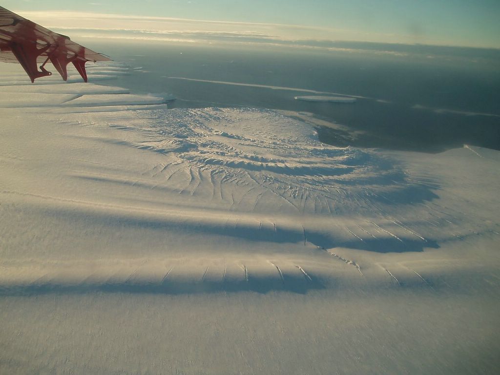
- All of these cracks, combined with a recent speed up at the leading edge of the ice shelf (detected by ESA’s Sentinel-1), point to an instability that is likely to spawn a new iceberg or two. The exact timing is uncertain, but until the break occurs and the shelf has been reformed, Halley Research Station is being kept minimally staffed for safety reasons. In 2016-2017, the Halley VI station was relocated to a safer location (Halley VIa) upstream of the then-growing Chasm 1.
- “I think we are going to see big changes here,” Shuman said. And with more than two months left of sunlight, changes should be visible in natural-color satellite images for a while longer before the onset of winter darkness.

• January 19, 2021: Smooth, stationary clouds are occasionally reported by the public as sightings of “unidentified flying objects.” But these clouds are not as mysterious as they might first seem. 72)
![Figure 151: On December 29, 2020, the OLI instrument on Landsat-8 acquired these images of soft-edged clouds hovering over the Eisenhower Range of Antarctica’s Transantarctic Mountains. The range is bounded to the north by Priestley Glacier and to the south by Reeves Glacier, both of which feed into the Nansen Ice Shelf on Terra Nova Bay [image credit: NASA Earth Observatory images by Joshua Stevens, using Landsat data from the U.S. Geological Survey. Story by Kathryn Hansen with image interpretation by Bastiaan Van Diedenhoven (NASA GISS/Columbia) and Jan Lenaerts (CU Boulder)]](https://eoportal.org/ftp/satellite-missions/l/LS82021_310122/LS82021_Auto4.jpeg)
- The clouds have the hallmarks of lenticular clouds that can form along the crests of mountain waves. Mountain waves form when fast moving wind is disturbed by a topographic barrier—in this case, the Eisenhower Range. Air is forced to flow up and over the mountains, causing waves of rising and falling air downwind of the range. The rising air cools and water vapor condenses into clouds. Conversely, falling air leads to evaporation.
- Adding to their mystique, this cloud type appears to stay put—sometimes for hours—defying the strong horizontal winds. In reality, the clouds are constantly building around the crest of the wave and then dissipating just beyond.

- In the United States, lenticular clouds are particularly common around the Rocky Mountains. They have been known to occur over Antarctic mountains, too, but there are not many witnesses besides satellites. The white-on-white color of clouds over ice make the Antarctic versions harder to discern, even in satellite images. This natural-color image has been enhanced with infrared light to separate the white clouds from the white snow and ice below. The clouds also threw rounded shadows on the landscape.
- Still, a few people have witnessed lenticular clouds in Antarctica firsthand. Scientists working with NASA’s Operation IceBridge shot photos of the phenomenon near Mount Discovery in 2013 and over Penny Ice Cap in 2015.
• January 11, 2021: With its population rising three times faster than the national average, the Charleston metropolitan area in South Carolina is among the fastest growing places in the United States. 73)


- A similar story is playing out in cities all across the United States, but the Charleston area stands out in one critical way—much of the new development has happened on low-lying land that is especially vulnerable to sea level rise and flooding. Older, more established parts of Charleston—often on slightly higher land but surrounded by water on three sides—faces similar challenges. As one form of remediation, local and federal government officials are moving forward with plans to build a seawall to protect the city’s historic downtown from encroaching water.
- “Other southeastern coastal cities face similar problems but with one caveat: the lowcountry of South Carolina is low,” said Norman Levine, director of the Santee Cooper GIS Laboratory and Lowcountry Hazards Center at the College of Charleston. “Over one-third of all homes are built on land that sits below 10 feet (3 meters) of elevation.”
- However, hurricane storm surges up to 9 feet have been measured in the past, and climatologists expect surges to grow larger as global climate warms and storms become more intense.
- High tide, or “nuisance flooding,” is already far more common now than it was decades ago, according to Dale Morris, the coauthor of a 2019 report that assessed the region’s flood risks. On average, Charleston saw 10 to 25 tidal floods per year in the 1990s. There were 89 such events in 2019 and 69 in 2020, he said. In other words, the city now sees tidal flooding every 4 to 5 days.
- Both problems are amplified by sea level rise. Relative sea level in Charleston has risen by 10 inches (25 cm) since 1950, with an acceleration to 1 inch (3 cm) every 2 years since 2010.
- “If you look at a lot of the recent development, it impinges upon or is in low-lying floodplains and adjacent land,” said Morris. “These areas used to flood and no one really noticed. Now they flood and impact people’s lives, resources, and livelihoods.”
- The report offers some general principals and recommendations for future development. Development should respect the landscape's natural drainage patterns and soil qualities. Coastal forests—which sponge up water—should be preserved wherever possible. And according to the report authors, development on the lowest-lying areas should not happen.
- “We are not saying don’t develop at all,” said Morris. “We are saying to develop wisely, carefully, sensibly given the current and future flood risks. Those risks are not going to decrease.”
• January 7, 2021: Popocatépetl volcano—the name is Aztec for “smoking mountain”—is one of Mexico’s most active volcanoes. The glacier-clad stratovolcano has been erupting since January 2005, with daily low-intensity emissions of gas, steam, and ash. 74)

- On January 6, the Washington Volcanic Ash Advisory Center (VAAC) reported a volcanic ash plume that rose to around 6,400 meters (21,000 feet) above the volcano. Mexico’s National Center for Prevention of Disasters (CENAPRED), which continuously monitors Popo, warned people not to approach the volcano or its crater due to falling ash and rock fragments. Some ashfall was blown downwind to the city of Puebla, located about 45 kilometers (30 miles) away from the volcano.
- At 5,426 meters (17,802 feet) above sea level, Popocatépetl is the second tallest volcano in Mexico (after Citlaltépetl). It is comprised of alternating layers of volcanic ash, lava, and rocks from earlier eruptions. The volcano is located around 70 kilometers (40 miles) southeast of Mexico City and more than 20 million people live close enough to be affected by a major eruption. However, most of the eruptions in the past 600 years have been relatively mild.
1) ”Saguaro National Park,” NASA Earth Observatory, Image of the Day for 28 December 2021, URL: https://earthobservatory.nasa.gov/images/149266/saguaro-national-park
2) ”Cold Case File: Death in the Arctic,” NASA Earth Observatory, Image of the Day for 27 December 2021, URL: https://earthobservatory.nasa.gov/images/149256/cold-case-file-death-in-the-arctic
3) ”A Changed Landscape on La Palma,” NASA Earth Observatory, Image of the Day for 21 December 2021, URL: https://earthobservatory.nasa.gov/images/149231/a-changed-landscape-on-la-palma
4) ”The Nile Delta’s Disappearing Farmland,” NASA Earth Observatory, Image of the Day for 15 December 2021, URL: https://earthobservatory.nasa.gov/images/149183/the-nile-deltas-disappearing-farmland
5) ”Snow Caps Mauna Kea and Mauna Loa,” NASA Earth Observatory, Image of the Day for 9 December 2021, URL: https://earthobservatory.nasa.gov/images/149189/snow-caps-mauna-kea-and-mauna-loa
6) ”Spain’s Changing Mediterranean Coastline,” NASA Earth Observatory, Image of the Day for 6 December 2021, URL: https://earthobservatory.nasa.gov/
images/149170/spains-changing-mediterranean-coastline
7) ”Mount Michael, Volcano Track or Plume?,” NASA Earth Observatory, Image of the Day for 4 December 2021, URL: https://earthobservatory.nasa.gov/images/149160/mount-michael-volcano-track-or-plume
8) ”Venice Holds Back the Adriatic Sea,” NASA Earth Observatory, Image of the Day for 2 December 2021, URL: https://earthobservatory.nasa.gov/images/149151/venice-holds-back-the-adriatic-sea
9) ”Tidal Vortices in the Sea of Okhotsk,” NASA Earth Observatory, Image of the Day for 1 December 2021, URL: https://earthobservatory.nasa.gov/images/149148/tidal-vortices-in-the-sea-of-okhotsk
10) ”Silting the Cold Sea,” NASA Earth Observatory, Image of the Day for 29 November 2021, URL: https://earthobservatory.nasa.gov/images/149135/silting-the-cold-sea
11) ”A Rainforest Like No Other,” NASA Earth Observatory, Image of the Day for 23 November 2021, URL: https://earthobservatory.nasa.gov/images/149124/a-rainforest-like-no-other
12) ”Burst of New Evidence for Viking Travels,” NASA Earth Observatory, Image of the Day for 16 November 2021, URL: https://earthobservatory.nasa.gov/
images/149071/burst-of-new-evidence-for-viking-travels?src=eoa-iotd
13) Margot Kuitems, Birgitta L. Wallace, Charles Lindsay, Andrea Scifo, Petra Doeve, Kevin Jenkins, Susanne Lindauer, Pınar Erdil, Paul M. Ledger, Véronique Forbes, Caroline Vermeeren, Ronny Friedrich & Michael W. Dee, ”Evidence for European presence in the Americas in ad 1021,” Nature, Published: 20 October 2021, https://doi.org/10.1038/s41586-021-03972-8 URL: https://www.nature.com
/articles/s41586-021-03972-8.pdf
14) ”Reaching for the Stars from Kourou,” NASA Earth Observatory, Image of the Day for13 November 2021, URL: https://earthobservatory.nasa.gov/images/149082/reaching-for-the-stars-from-kourou
15) ”Kjer Glacier, Then and Now,” NASA Earth Observatory, Image of the Day for 8 November 2021, URL: https://earthobservatory.nasa.gov/images/149050/kjer-glacier-then-and-now
16) ”Scientific Questions Arrive in Ports,” NASA Earth Observatory, Image of the Day for 28 October 2021, URL: https://earthobservatory.nasa.gov/images/149004/scientific-questions-arrive-in-ports
17) ”What’s Behind California’s Surge of Large Fires?,” NASA Earth Observatory, Image of the Day for 5 October 2021, URL: https://earthobservatory.nasa.gov/
images/148908/whats-behind-californias-surge-of-large-fires
18) ”Lake Powell Reaches New Low,” NASA Earth Observatory, Image of the Day for 24 September 2021, URL: https://earthobservatory.nasa.gov/images/148861/lake-powell-reaches-new-low
19) ”Sudbury Impact Structure,” NASA Earth Observatory, Image of the Day for 20 September 2021, URL: https://earthobservatory.nasa.gov/images/148844/sudbury-impact-structure
20) ”Fire Encroaching on Giant Sequoias,” NASA Earth Observatory, Image of the Day for 17 September 2021, URL: https://earthobservatory.nasa.gov/images/148840/fire-encroaching-on-giant-sequoias
21) ”Hurricane Ida Leaves a Trail of Oil,” NASA Earth Observatory, Image of the Day for 12 September 2021, URL: https://earthobservatory.nasa.gov/images/148820/hurricane-ida-leaves-a-trail-of-oil
22) ”Lake Mead Drops to a Record Low,” NASA Earth Observatory, Image of the Day for 30 August 2021, URL: https://earthobservatory.nasa.gov/images/148758/lake-mead-drops-to-a-record-low
23) ”Birthplace of a Hidden Figure,” NASA Earth Observatory, Image of the Day for 26 August 2021, URL: https://earthobservatory.nasa.gov/images/148738/birthplace-of-a-hidden-figure
24) ”Earthquake in Haiti Triggers Landslides,” NASA Earth Observatory, Image of the Day for 17 August 2021, URL: https://earthobservatory.nasa.gov/images/148713/earthquake-in-haiti-triggers-landslides
25) ”Fire Consumes Large Swaths of Greece,” NASA Earth Observatory, Image of the Day for 12 August 2021, URL: https://earthobservatory.nasa.gov/images/148682/fire-consumes-large-swaths-of-greece
26) ”Sizing Up How Agriculture Connects to Deforestation,” NASA Earth Observatory, Image of the Day for 11 August 2021, URL: https://earthobservatory.nasa.gov/
images/148674/sizing-up-how-agriculture-connects-to-deforestation
27) ”Fires Rage in Turkey,” NASA Earth Observatory, Image of the Day for 4 August 2021, URL: https://earthobservatory.nasa.gov/images/148650/fires-rage-in-turkey?src=eoa-iotd
28) ”Sweden’s Siljan Ring,” NASA Earth Observatory, Image of the Day for 21 July 2021, URL: https://earthobservatory.nasa.gov/images/148577/swedens-siljan-ring
29) ”Algae Abound Along Florida Coast,” NASA Earth Observatory, Image of the Day for 19 July 2021, URL: https://earthobservatory.nasa.gov/images/148590/algae-abound-along-florida-coast
30) ”An Abundance of Aquaculture in Andhra Pradesh,” NASA Earth Observatory, 17 July 2021, URL: https://earthobservatory.nasa.gov/images/148581/an-abundance-of-aquaculture-in-andhra-pradesh
31) ”Autotrophs Abound in Arctic Waters,” NASA Earth Observatory, Image of the Day for 11 July 2021, URL: https://earthobservatory.nasa.gov/images/148552/autotrophs-abound-in-arctic-waters
32) ”Anticipating Future Sea Levels,” NASA Earth Observatory, Image of the Day for 8 July 2021, URL: https://earthobservatory.nasa.gov/images/148494/anticipating-future-sea-levels
33) ”The Ancient Barberton Makhonjwa Mountains,” NASA Earth Observatory, Image of the Day for 6 July 2021, URL: https://earthobservatory.nasa.gov/images/148488/the-ancient-barberton-makhonjwa-mountains
34) ”Fagradalsfjall Continues to Erupt,” NASA Earth Observatory, Image of the Day for 3 July 2021, URL: https://earthobservatory.nasa.gov/images/148510/fagradalsfjall-continues-to-erupt
35) ”Violent Formation for Mistastin Lake,” NASA Earth Observatory, Image of the Day for 30 June 2021, URL: https://earthobservatory.nasa.gov/images/148491/violent-formation-for-mistastin-lake
36) ”Yukon-Kuskokswim in Colorful Transition,” NASA Earth Observatory, Image of the Day for 21 June 2021, URL: https://earthobservatory.nasa.gov/images/148464/yukon-kuskokswim-in-colorful-transition
37) ”Finding Gold Mining Hotspots in Peru,”NASA Earth Observatory, Image of the Day for 16 June 2021, URL: https://earthobservatory.nasa.gov/images/148439/finding-gold-mining-hotspots-in-peru
38) ”The Large Footprint of Small-Scale Mining in Ghana,” NASA Earth Observatory, Image of the Day for 15 June 2021, URL: https://earthobservatory.nasa.gov/
images/148434/the-large-footprint-of-small-scale-mining-in-ghana
39) ”Monitoring the Collapse of Kelp Forests,” NASA Earth Observatory, Image of the Day for 4 June 2021, URL: https://earthobservatory.nasa.gov/images/
148391/monitoring-the-collapse-of-kelp-forests
40) ”Detecting Gold Mining in Ghana,” NASA Earth Observatory, 2 June 2021, URL: https://earthobservatory.nasa.gov/images/148376/detecting-gold-mining-in-ghana
41) ”Arizona’s Meteor Crater,” NASA Earth Observatory, Image of the Day for 31 May 2021, URL: https://earthobservatory.nasa.gov/images/148384/arizonas-meteor-crater
42) ”A Dusty Day in Patagonia,” NASA Earth Observatory, Image of the Day for 29 May 2021, URL: https://earthobservatory.nasa.gov/images/148381/a-dusty-day-in-patagonia
43) ”Point Roberts,” NASA Earth Observatory, Image of the Day for 28 May 2021, URL: https://earthobservatory.nasa.gov/images/148367/point-roberts
44) Overwintering Fires on the Rise,” NASA Earth Observatory, Image of the Day for 21 May 2021, URL: https://earthobservatory.nasa.gov/images/148342/overwintering-fires-on-the-rise
45) ”Discovering the Charlotte Whale,” NASA Earth Observatory, Image of the Day for 19 May 2021, URL: https://earthobservatory.nasa.gov/images/148329/discovering-the-charlotte-whale
46) ”Lava Flows From Fagradalsfjall,” NASA Earth Observatory, Image of the Day for 13 May 2021, URL: https://earthobservatory.nasa.gov/images/148312/lava-flows-from-fagradalsfjall
47) ”As Jakarta Grows, So Do the Water Issues,” NASA Earth Observatory, Image of the Day for 12 May 2021, URL: https://earthobservatory.nasa.gov/images/148303/as-jakarta-grows-so-do-the-water-issues
48) Saint Petersburg Keeps the Sea at Bay,” NASA Earth Observatory, Image of the Day for 10 May 2021, URL: https://earthobservatory.nasa.gov/images/148293/saint-petersburg-keeps-the-sea-at-bay
49) ”A Curious Case of Clouds in Iceland,” NASA Earth Observatory, Image of the Day for 7 May 2021, URL: https://earthobservatory.nasa.gov/images/148282/a-curious-case-of-clouds-in-iceland
50) ”Bothnian Bay Before the Breakup,” NASA Earth Observatory, Image of the Day for 4 May 2021, URL: https://earthobservatory.nasa.gov/images/148266/bothnian-bay-before-the-breakup
51) ”Hingol National Park,” NASA Earth Observatory, Image of the Day for 01 May 2021, URL: https://earthobservatory.nasa.gov/images/148262/hingol-national-park
52) ”Rock and Glass Shards Blanket La Soufriére,” NASA Earth Observatory, 29 April 2021, URL: https://earthobservatory.nasa.gov/images/148240/rock-and-glass-shards-blanket-la-soufriere
53) ”China’s Red Rocks and Rainbow Ridges,” NASA Earth Observatory, Image of the Day for 28 April 2021, URL: https://earthobservatory.nasa.gov/images/148234/chinas-red-rocks-and-rainbow-ridges
54) Sofie Bates, ”Downstream Consequences: How NASA Satellites Track Harmful Algal Blooms,” NASA Feature, 20 April 2021, URL: https://www.nasa.gov/feature/goddard/
2021/downstream-consequences-how-nasa-tracks-harmful-algal-blooms
55) ”Eruption at La Soufrière,” NASA Earth Observatory, Image of the Day for 14 April 2021, URL: https://earthobservatory.nasa.gov/images/148176/eruption-at-la-soufriere
56) ”A Thousand Islands in South Korea,” NASA Earth Observatory, Image of the Day for 3 April 2021, URL: https://earthobservatory.nasa.gov/images/148136/a-thousand-islands-in-south-korea
57) ”Historic Floods in New South Wales,” NASA Earth Observatory, Image of the Day for 25 March 2021, URL: https://earthobservatory.nasa.gov/images/148093/historic-floods-in-new-south-wales?src=eoa-iotd
58) ”A Fast-Changing Delta in China,” NASA Earth Observatory, Image of the Day for 24 March 2021, URL: https://earthobservatory.nasa.gov/images/148075/a-fast-changing-delta-in-china
59) Kate Ramsayer, ”Landsat Satellite Data Warns of Harmful Algal Blooms,” NASA Feature, 22 March 2021, URL: https://www.nasa.gov/feature/goddard/2021
/landsat-satellite-data-warns-of-harmful-algal-blooms
60) ”Dry Country of Turquoise,” NASA Earth Observatory, Image of the Day for 17 March 2021, URL: https://earthobservatory.nasa.gov/images/148048/dry-country-of-turquoise
61) ”Deforestation in Papua,” NASA Earth Observatory, Image of the Day for9 March 2021, URL: https://earthobservatory.nasa.gov/images/148021/deforestation-in-papua
62) ”Blue-green Algae at Lake Burrinjuck,” NASA Earth Observatory, Image of the Day for 8 March 2021, URL: https://earthobservatory.nasa.gov/images/148016/blue-green-algae-at-lake-burrinjuck
63) ”Breakup at Brunt,” NASA Earth Observatory, Image of the Day for 3 March 2021, URL: https://earthobservatory.nasa.gov/images/148009/breakup-at-brunt
64) ”A Deadly Debris Flow in India,” NASA Earth Observatory, Image of the Day for 25 February 2021, URL: https://earthobservatory.nasa.gov/images/147973/a-deadly-debris-flow-in-india
65) ”From Russia with Questions,” NASA Earth Observatory, Image of the day for 23 February 2021, URL: https://earthobservatory.nasa.gov/images/147960/from-russia-with-questions
66) ”A Watery Day for Lake Lefroy,” NASA Earth Observatory, Image of the Day for 15 February 2021, URL: https://earthobservatory.nasa.gov/images/147929/a-watery-day-for-lake-lefroy
67) ”A Short Journey to the Center of the Earth,” NASA Earth Observatory, Image of the Day for 12 February 2021, URL: https://earthobservatory.nasa.gov/images
/147917/a-short-journey-to-the-center-of-the-earth?src=eoa-iotd
68) ”Trading Surfboards for Snowboards,” NASA Earth Observatory, Image of the Day for 9 February 2021, URL: https://earthobservatory.nasa.gov/images/147895/trading-surfboards-for-snowboards
69) ”Eloise Floods Mozambique,” NASA Earth Observatory, Image of the Day for 3 February 2021, URL: https://earthobservatory.nasa.gov/images/147866/eloise-floods-mozambique
70) ”Gold Mining in Russia ’s Central Aldan Ore District,” NASA Earth Observatory, Image of the Day for 30 January 2021, URL: https://earthobservatory.nasa.gov/
images/147854/gold-mining-in-russias-central-aldan-ore-district
71) ”Brunt Breaking Up with Antarctica this Year?,” NASA Earth Observatory, Image of the Day for 20 January 2021, URL: https://earthobservatory.nasa.gov/
images/147799/brunt-breaking-up-with-antarctica-this-year
72) ”Curious Clouds in the Transantarctic Mountains,” NASA Earth Observatory, Image of the Day for 19 January 2021, URL: https://earthobservatory.nasa.gov/
images/147772/curious-clouds-in-the-transantarctic-mountains
73) ”Rising Seas in Charleston,” NASA Earth Observatory, Image of the Day for 11 January 2021, URL: https://earthobservatory.nasa.gov/images/147761/rising-seas-in-charleston
74) ”An Outburst from Popocatépetl,” NASA Earth Observatory, Image of the Day for 7 January 2021, URL: https://earthobservatory.nasa.gov/images/147750/an-outburst-from-popocatepet